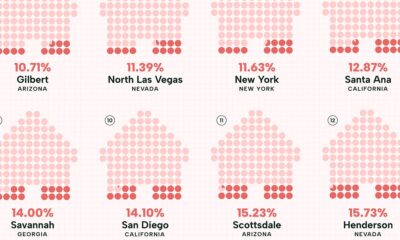

Visualizing the least affordable U.S. cities for renters by the percentage of affordable rentals available on an average salary.
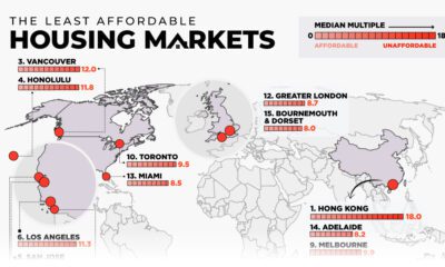

This map examines middle-income housing market affordability across eight major countries, highlighting some of the least affordable cities.
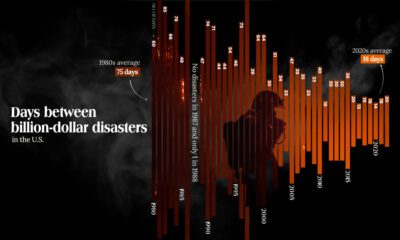

The Maui fire is the latest of many disasters in the U.S. And data shows that frequency of costly weather disasters has increased.
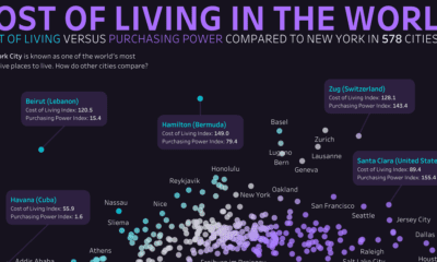

This graphic compares the cost of living and purchasing power of 578 cities worldwide, using New York City as a benchmark for comparison.
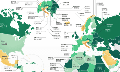

These maps show the most (and least) costly countries for starting a business by relative costs.
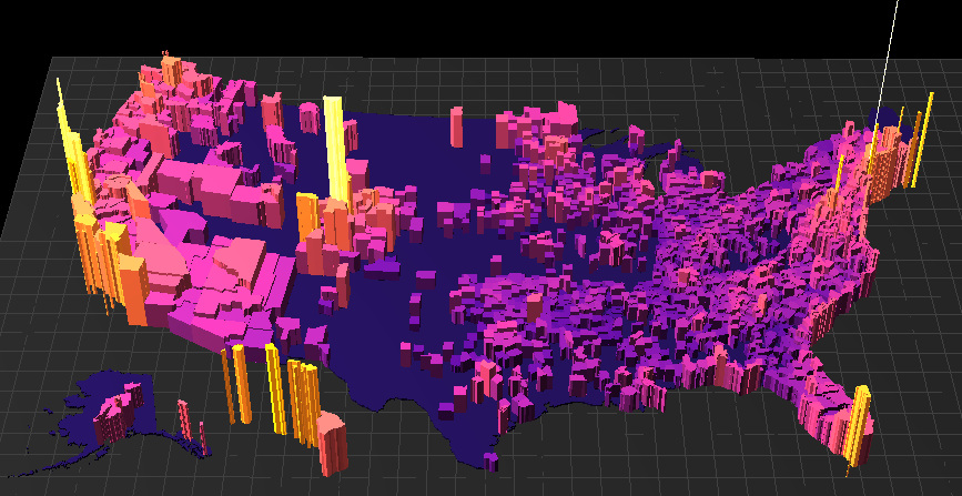
What are the most expensive U.S. housing markets? This interactive 3D map looks at county-level data by price per square foot to provide an answer.


 Creator Program