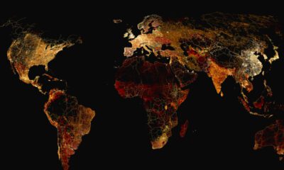

What does a road map of the world look like? Here’s a deep view of roads visualized by type across countries and continents.
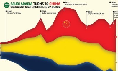

This graphic charts Saudi Arabia’s trading history with the EU, the U.S., and it's new largest trading partner — China.
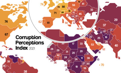

Which countries are the most (and least) corrupt? This map shows corruption around the world, and the movers and shakers over the last decade.
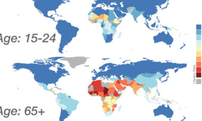

Global literacy mapped by generation, as well as a look at how the data on literacy has changed over time by country.
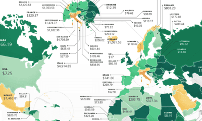

These maps show the most (and least) costly countries for starting a business by relative costs.
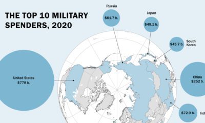

Global military spending is now at a 32-year high. We show countries' military spending by dollars and as a portion of GDP.
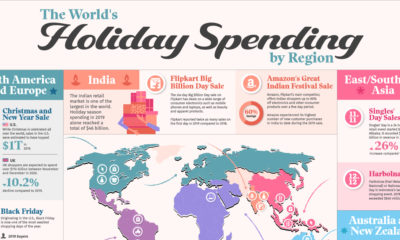

This graphic illustrates some of the largest and most anticipated retail holidays by region and explores their origins.
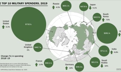

Global military spending surpassed $1.9 trillion in 2019, but nearly 75% of this total can be traced to just 10 countries.
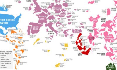

How much do your vacations contribute to your destination of choice? This visualization shows the countries that receive the most tourist spending.
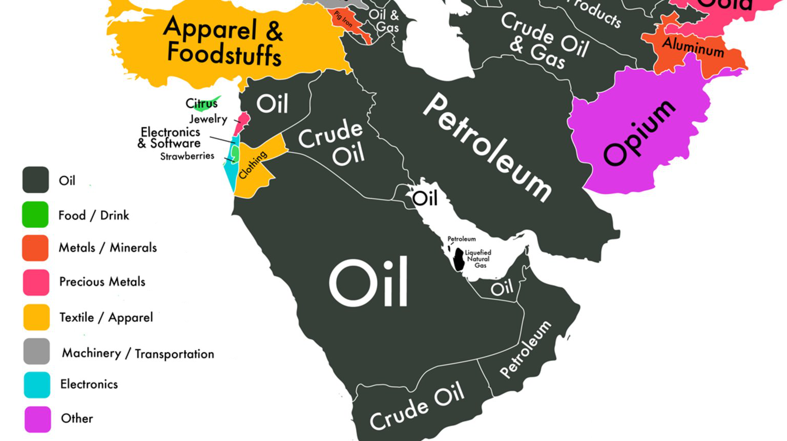
If we could only show you one map to explain the economy of the Middle East, it would be this one.


 Creator Program