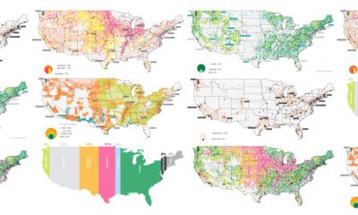

The U.S. covers an immense 3.8 million square miles—what is all this land currently used for, and what does that mean for the future?
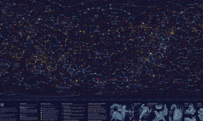

This striking map depicts all the stars and celestial bodies that are visible in the night sky, all on one giant backdrop.
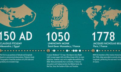

What did ancient maps look like, before we had access to airplanes and satellites? See the evolution of the world map in this nifty infographic.
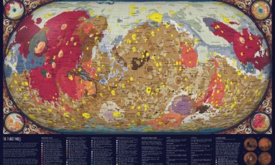

For centuries, humankind has looked at Mars from afar. In the past 75 years, space exploration has made it possible to create a map of Mars...
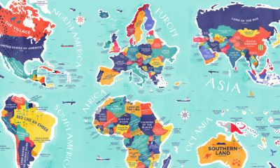

From Colombia to China, explore this map to uncover the diverse histories and cultures represented in the literal translation of each country's name.
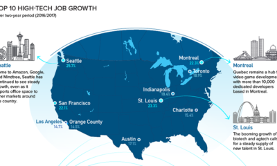

Silicon Valley is no longer the only place to be for a career in tech. Here are the fastest growing tech markets across North America, and...
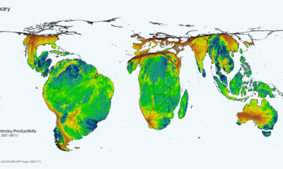

This cartogram animation shows the cycle of nature's productivity - which resembles a rhythmic heartbeat over the course of a year.
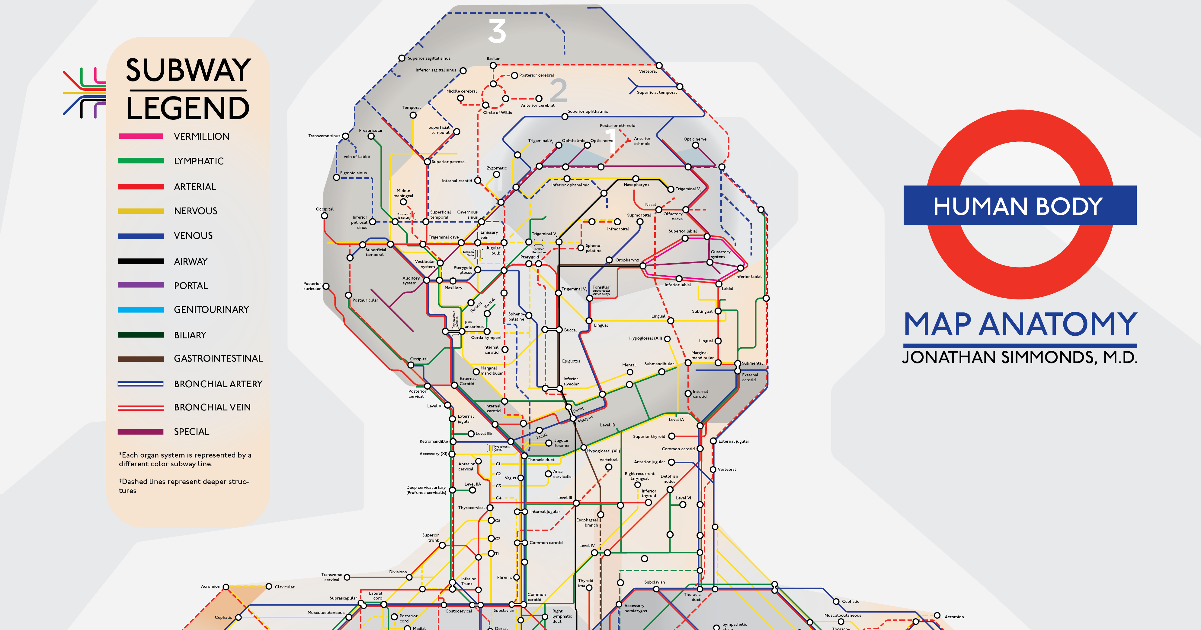
Embark on a visual tour of the human body, where each and every part of the human anatomy is re-imagined as a subway stop.
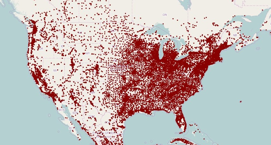
These maps of North America and Europe use a deceivingly simple method to plot population density: replacing each town with a single dot.
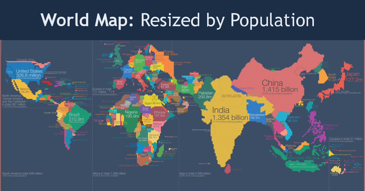
Look at global population in a whole new light, when countries on the world map are drawn based on population numbers instead of their usual borders.


