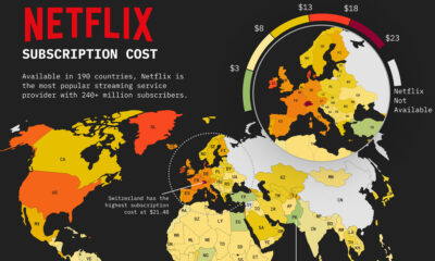

This map of Netflix price by country shows how much a basic subscription package costs around the world.
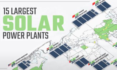

Solar power has grown rapidly over the last decade, and so have solar plants. This map shows the world's 15 largest solar power plants.
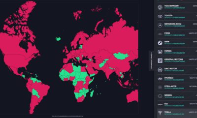

This graphic looks at the revenue of the world’s top carmakers and compares them to the GDP of 196 countries worldwide.
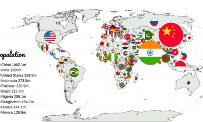

Which countries have the largest populations, or the highest GDP? This animation compares countries based on 20 different metrics.
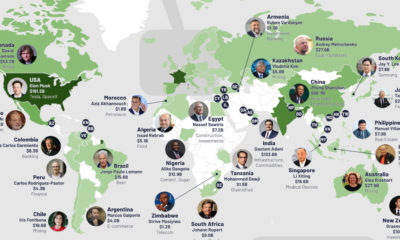

Of the 195 officially recognized countries worldwide, only 76 are home to billionaires. Here are the richest billionaires from those countries.
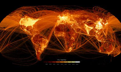

This graphic maps out carbon emissions around the world and where they come from, using data from the European Commission.


This graphic shows the 32 teams that will be playing in the 2022 FIFA World Cup, and breaks down the groups and each team's World Ranking
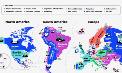

This series of maps shows a regional breakdown of the most popular types of businesses people want to start, based on online search results.
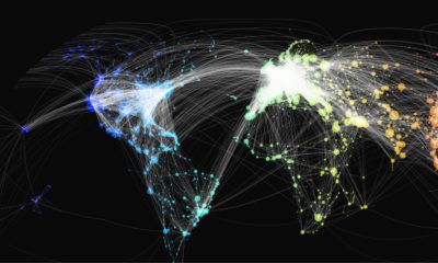

This map shows over 65,000 of the world’s flight paths and the various airports that each route connects, using data from Open Flights.
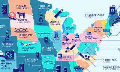

Petroleum is the top import in twelve states, making it the most commonly imported commodity across America. Here are America’s top imports.


 Creator Program