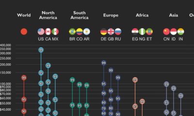

This graphic shows income distributions in 16 different countries around the world, using data from the World Inequality Database.
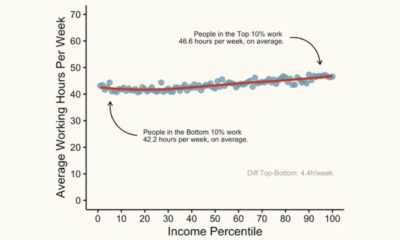

This graphic shows the average working hours between higher and lower-income groups in America, based on income percentile.
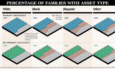

White families are more likely to hold assets of any type compared to other races. This chart highlights the substantial racial wealth gap.


 Creator Program