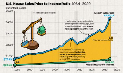

We chart the ever-widening gap between median incomes and the median price of houses in America, using data from the Federal Reserve from 1984 to 2022.
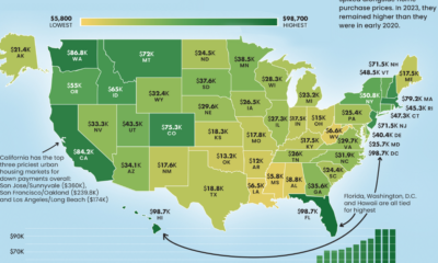

From coast to coast, the median down payment on a single family home can be close to $100,000 or less than $10,000.
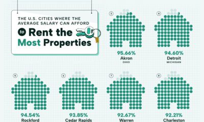

Visualizing the most affordable U.S. cities for renters by the percentage of affordable rentals available on an average salary.
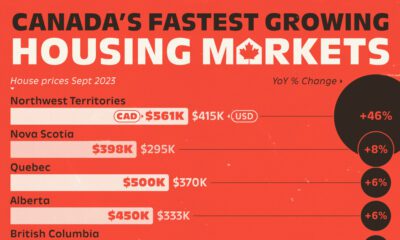

House prices are climbing at a brisk rate across most of the Great White North but one Canadian housing market is seeing outsized growth.
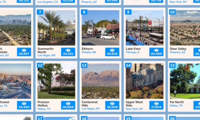

This infographic ranks the 20 most popular neighborhoods in the U.S. for homebuyers based on search interest.
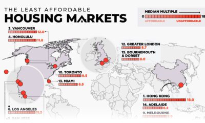

This map examines middle-income housing market affordability across eight major countries, highlighting some of the least affordable cities.
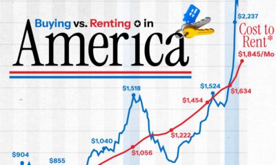

The U.S. has witnessed the biggest numerical gap in the monthly cost between buying a home and renting in over 50 years.
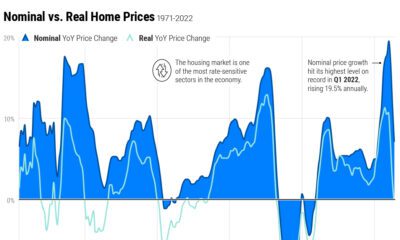

Home price growth has moderated amid rising interest rates and a narrow housing supply. Here's how prices compare to historical trends.
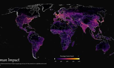

How far has humanity spread, and where haven't we gone? This graphic maps the extent of humanity’s impact on the world from 1993 to 2009.
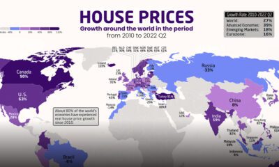

Which countries have seen the biggest spikes in housing prices? These maps show the change in real and nominal housing prices since 2010.


 Creator Program