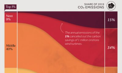

We visualize global CO2 emissions by income group, showing the impact of different wealth brackets on carbon generation.
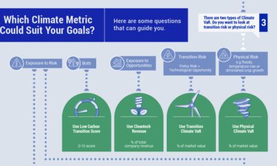

When selecting climate metrics, it is important to consider your purpose, the applicability and acceptability of the climate strategy, and the availability of historical data.
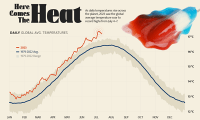

Four days straight in July 2023 set or equaled global temperature records on average.
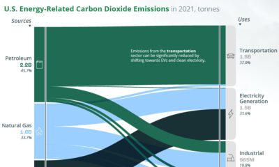

A look at the flow of energy-related CO2 emissions from the sources that generate energy to the sectors that use it.
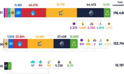

Despite the advent of renewable sources of energy, fossil fuels and their carbon emissions, haven’t gone anywhere.
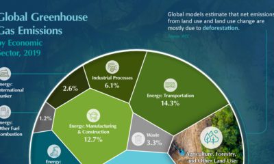

10 million hectares of forests are lost every year. What are the knock-on effects of such drastic tropical deforestation?
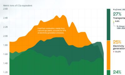

The U.S. emits about 6 billion metric tons of greenhouse gases a year. Here's how these emissions rank by sector.
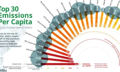

Roughly 25% of all GHG emissions come from electricity production. See how the top 30 IOUs rank by emissions per capita.
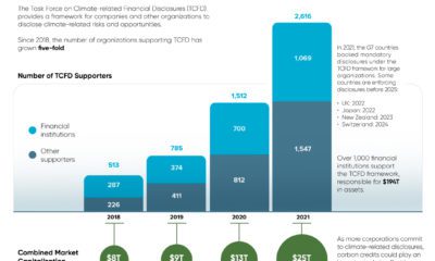

The number of organizations supporting TCFD climate disclosures has grown five-fold since 2018. (Sponsored Content)
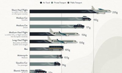

What's the lowest-carbon way to travel? Here's how much CO2 different types of vehicles emit per passenger-kilometer.