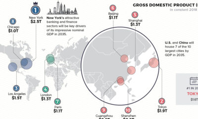

Cities are heavy hitters in the global economy. Where will the top 10 cities be in 2035—based on GDP, population, and annual growth?
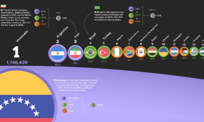

The annual Misery Index ranks the most and least miserable countries, based on four economic factors—unemployment, inflation, lending rates, and GDP growth.


After adjusting GDP for purchasing power parity (PPP), here is how the composition of the world economy breaks down by country.
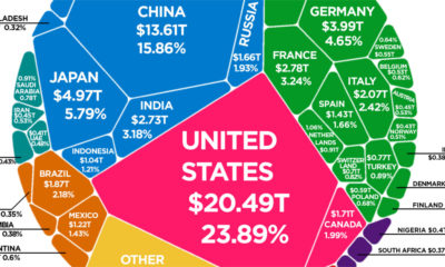

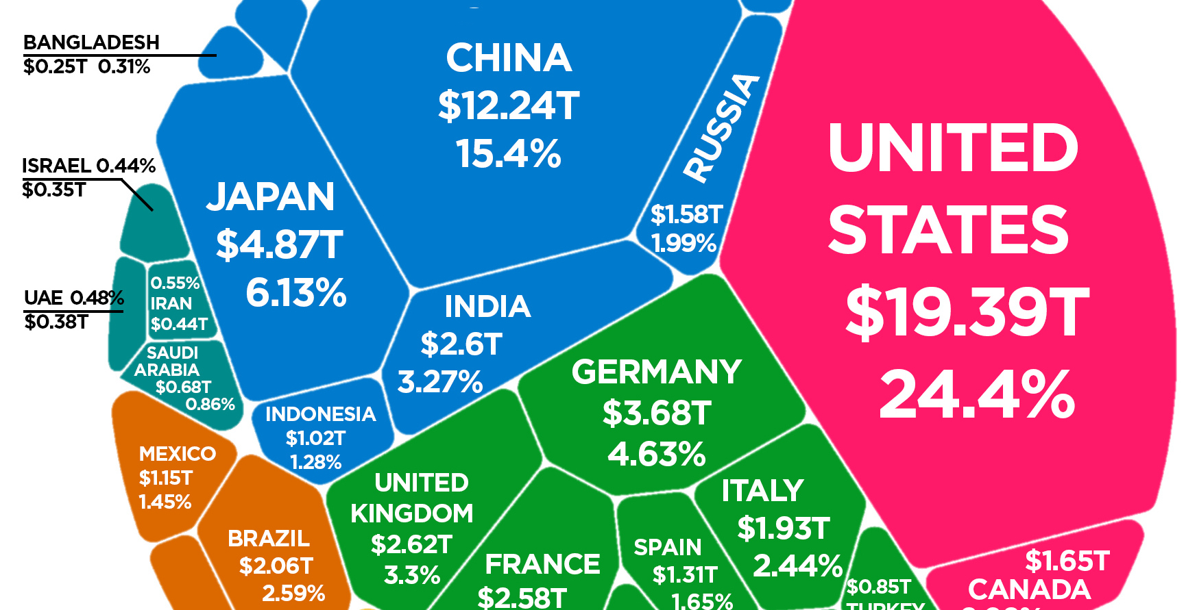
According to the latest World Bank data, the global economy is now $85.8 trillion in nominal terms. Here's how it breaks down.
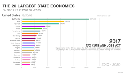

This animation shows how the largest state economies by GDP have changed over the last five decades of time, and what such a ranking looks like...
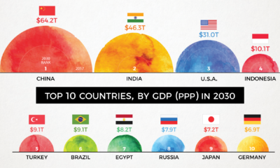

By 2030, the complexion of the global economy could look very different. This animation shows how the world's biggest economies will change over time.
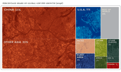

Global economics is effectively a numbers game - here are the countries and regions projected to contribute the most to global growth in 2019.
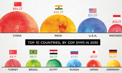

According to projections by a prominent multinational bank, 7 of the world's 10 largest economies will be in emerging markets in 2030.
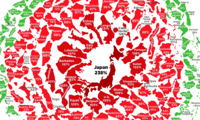

See the latest levels of government debt, based on the IMF's most recent data. Where does your country sit in the snowball?
Latest estimates put the world economy at about $80 trillion in nominal GDP. Here is how each individual country stacks up in terms of size.


