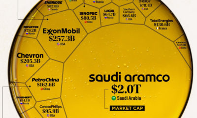

Oil still makes up the largest share of the global energy mix. Here are the largest oil and gas companies by market cap in 2021.
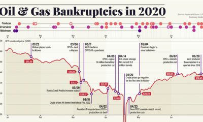

Dropping crude prices and a worsening pandemic have led to a growing wave of energy bankruptcies. Here’s what that fallout looks like.
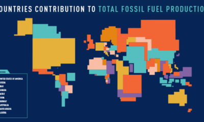

These four animated cartograms show the nations leading the world in fossil fuel production, in terms of oil, gas, coal, and total hydrocarbons.
What role do independent oil and gas producers play in the energy industry - and how do these Craft Oil companies differ from the giants also...
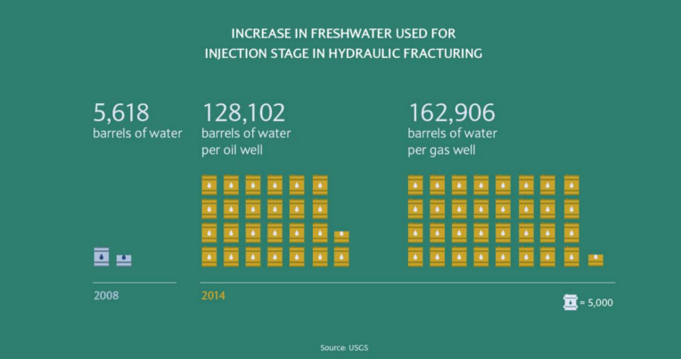
The average oil or gas well uses at least 20x more water than it did in 2008, and water scarcity is a problem the industry will...
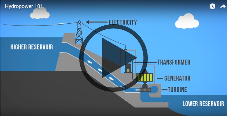
Want to learn about how different energy sources work? Check out these short, fact-driven videos on topics like oil, hydro, solar, wind, LNG, or fracking.
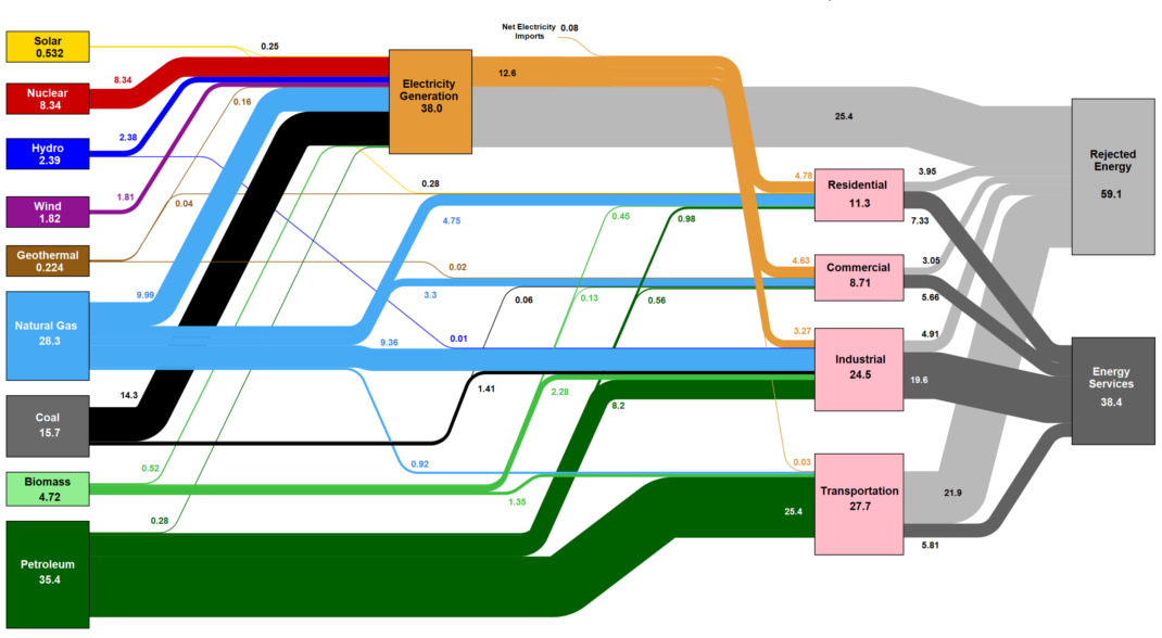
This massive diagram shows all energy created in the U.S., and where it goes. It's not sexy, but it gives a great 10,000 ft overview of...
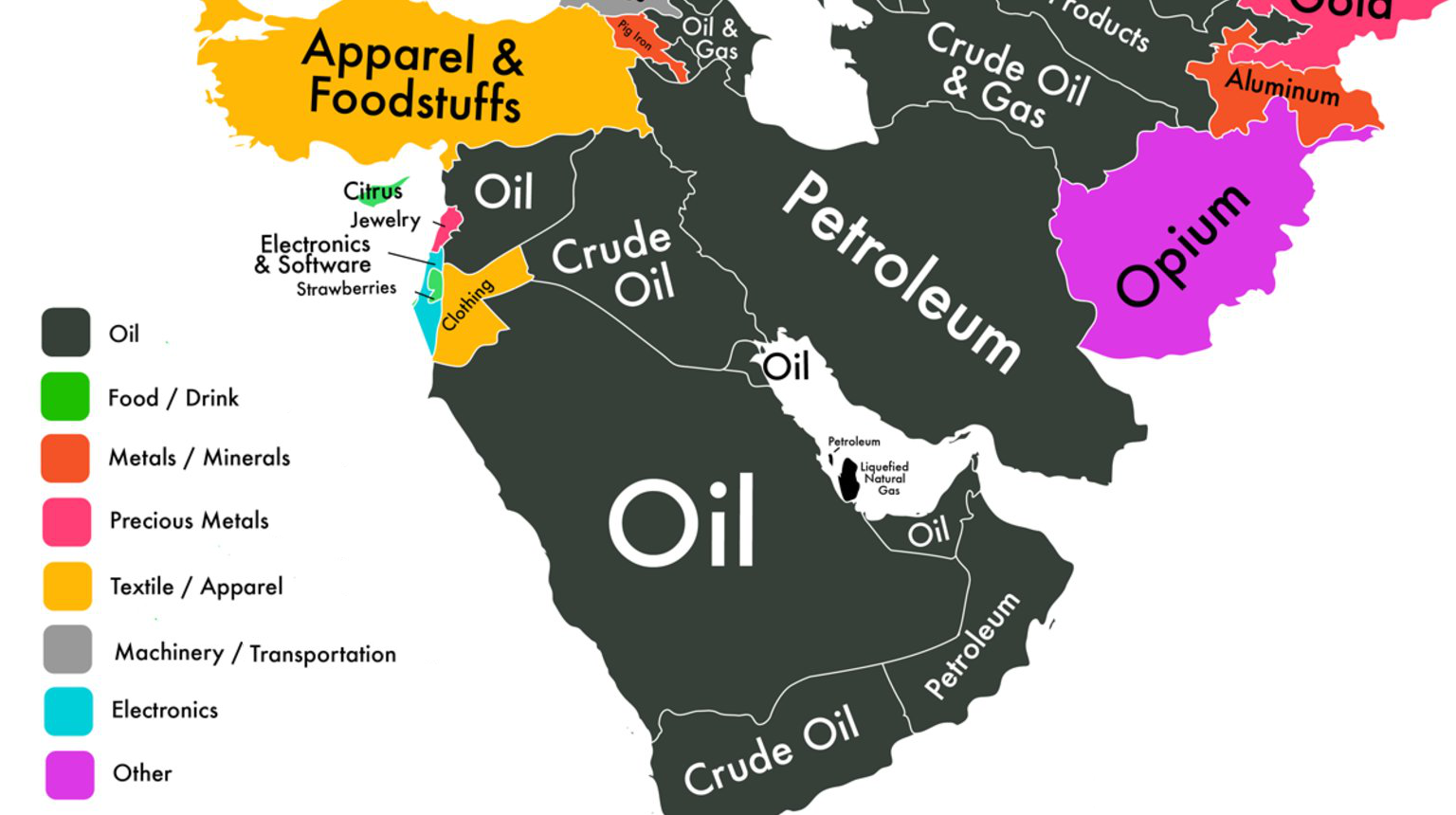
If we could only show you one map to explain the economy of the Middle East, it would be this one.
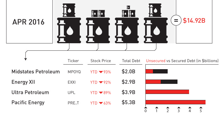
April was a record-setting month for bankruptcies in the oil patch. We put the 11 bankruptcies and $15 billion of outstanding debt in context.
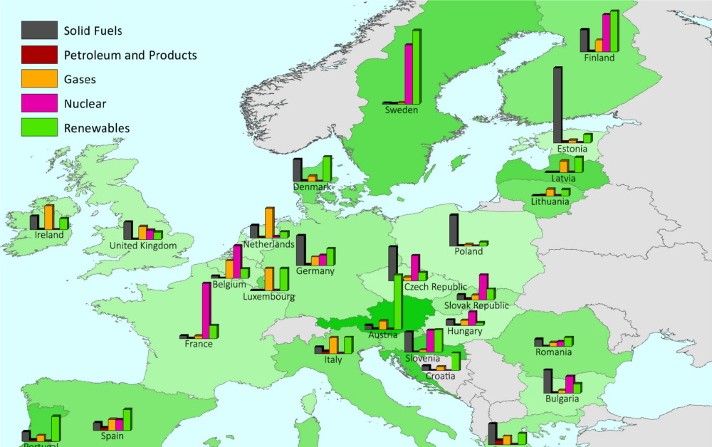
This series of charts and maps show an overview of Europe's energy consumption, as well as consumption (per capita) by country and source.


