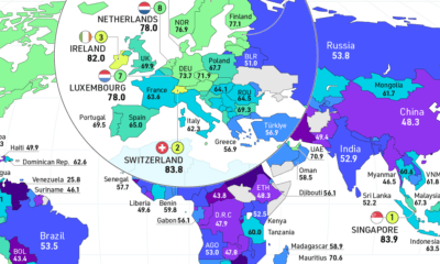

How free are people to control their own labor, property, and finances? This map reveals the state of economic freedom globally.
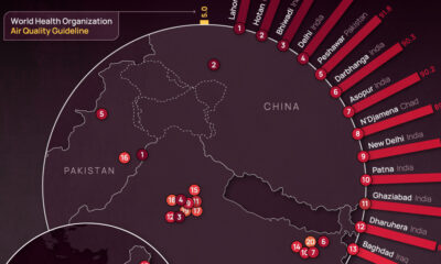

Using 2022 average PM2.5 concentrations, we've ranked the most polluted cities in the world according to IQAir.
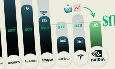

America's biggest chipmaker Nvidia has joined the trillion dollar club as advancements in AI move at lightning speed.
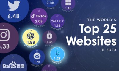

OpenAI is now one of the world's top websites, rapidly approaching the level of traffic received by TikTok and Amazon.
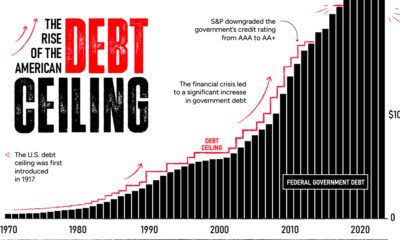

By June 1, a debt ceiling agreement must be finalized. The U.S. could default if politicians fail to act—causing many stark consequences.
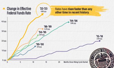

The effective federal funds rate has risen nearly five percentage points in 14 months, the fastest interest rate hikes in modern history.
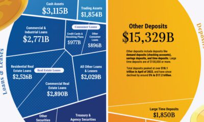

Banks play a crucial role in the U.S. economy, and understanding their balance sheets can offer insight into why they sometimes fail.
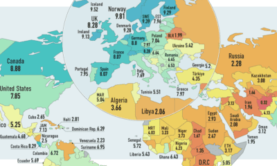

How many countries globally are true democracies? This map showcases the state of democracy in every country worldwide.


To celebrate the launch of our VC+ archive, we're offering a bonus gift with the best visual insights. See what else VC+ members receive in April!
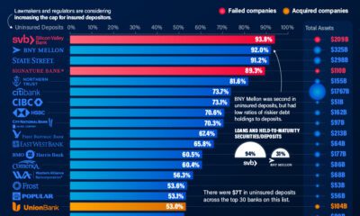

Uninsured deposits in the U.S. total at least $7 trillion. We show the top 30 banks with the highest level of these deposits.