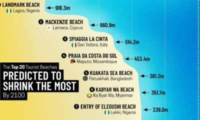

Sandy beaches make up over one-third of the world's coastline, yet nearly half of them could disappear by 2100.
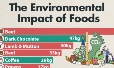

Which foods are linked with high CO2 emissions and high water use? We look at the environmental impacts of food production in this chart.
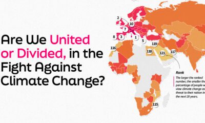

This graphic explores 121 nations thoughts on climate change and ranks them by the volume of their population who views it as a threat.
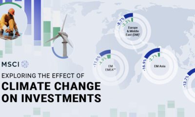

This infographic shows the effects of climate change on investments, and how climate risks may affect a portfolio's value.
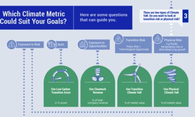

When selecting climate metrics, it is important to consider your purpose, the applicability and acceptability of the climate strategy, and the availability of historical data.
Antarctica's ice extent has reached record lows. This visual details and maps Antarctica sea ice loss over the last two years.
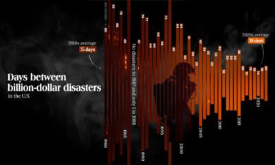

The Maui fire is the latest of many disasters in the U.S. And data shows that frequency of costly weather disasters has increased.
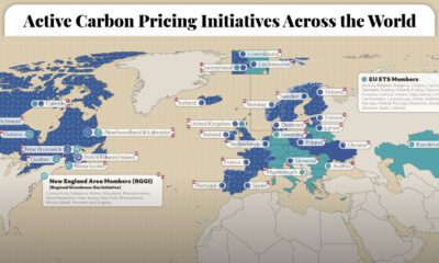

This graphic maps the 70 active carbon pricing initiatives worldwide, their established price of carbon, and the global emissions they cover.
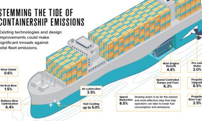

The shipping industry is responsible for 2.89% of all carbon emissions. Here are three ways it could evolve to address climate change.
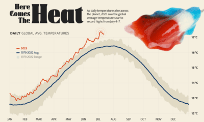

Four days straight in July 2023 set or equaled global temperature records on average.


 Creator Program