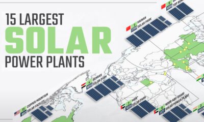

Solar power has grown rapidly over the last decade, and so have solar plants. This map shows the world's 15 largest solar power plants.
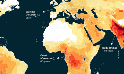

This world map of life expectancy gains shows how much longer people could potentially live by reducing pollution.
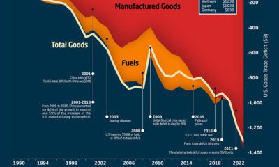

This graphic the U.S. trade deficit growth since 1990, and how manufactured goods and fuels factor in over the last three decades.
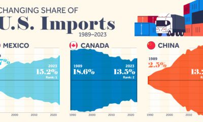

We highlight seven key U.S. trade partners and their changing share in the sources of U.S. imports from 1989–2023.
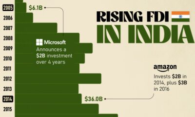

Mirroring the country's rapid economic growth, India's FDI (foreign direct investment) inflows have skyrocketed over the last twenty years.
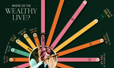

Major financial centers—London, Singapore, and Hong Kong—feature in these rankings of cities with the most millionaires.
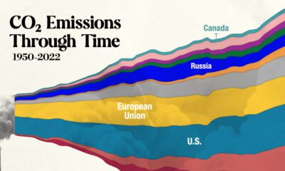

In this streamgraph, we break down global CO2 emissions between 1950 and 2022 using data from Berkeley Earth and Global Carbon Project.
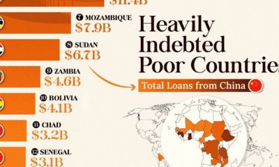

This infographic lists countries in Africa and other developing regions that received billions in loans from China.
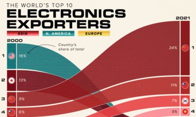

Here are the largest electronics exporters by country, highlighting how electronics trade has increasingly shifted to Asia over 20 years.
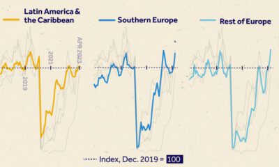

We visualize monthly foreign visitor arrivals, indexed to December 2019, indicating global tourism has all but recovered from COVID-19 disruptions.


 Creator Program