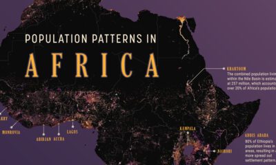

We map out Africa’s population density, spotlighting the continent’s most populous countries and cities.
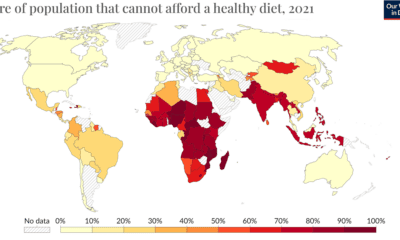

The wash of red in Africa, South Asia, and Southeast Asia indicates the regions where food unaffordability is at its peak.
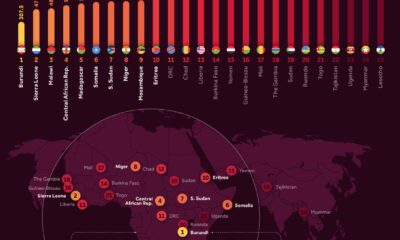

Analyzing 2023 per capita GDP numbers from the International Monetary Fund lets us know where the poorest countries are.
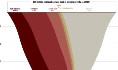

This graphic shows the regional breakdown of the world’s working poor, and how this demographic has changed since 1995.
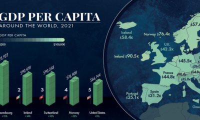

GDP per capita is one of the best measures of a country's standard of living. This map showcases the GDP per capita in every country globally.


 Creator Program