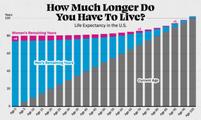

Visualizing the number of years left to live for Americans at every age, reveals the broader trends in American life expectancy.


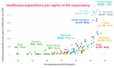
This graphic looks at average life expectancies in countries around the world, compared to each country's healthcare spending per capita.