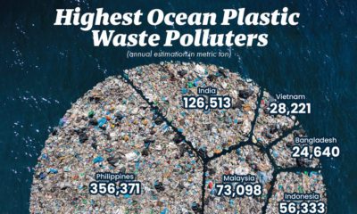

This graphic visualizes the top 10 countries emitting plastic pollutants into our oceans.
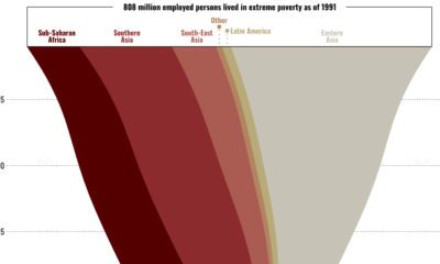

This graphic shows the regional breakdown of the world’s working poor, and how this demographic has changed since 1995.
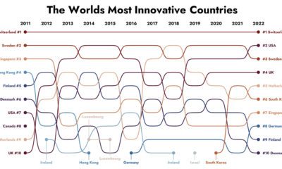

How have the world's most innovative countries changed over time? This graphic tracks the top 10 most innovative countries from 2011-2022.
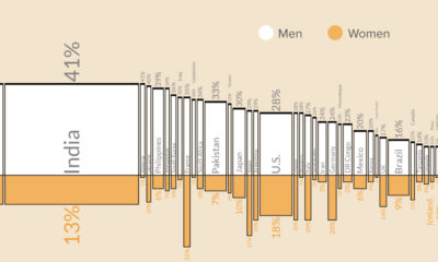

This graphic shows what percentage of men versus women are smokers in the 50 most populous countries worldwide.
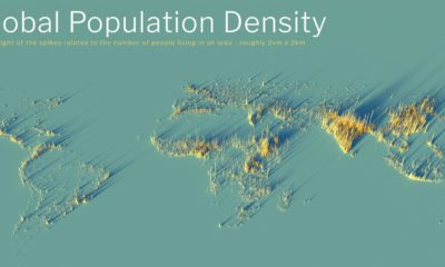

What does population density look like on a global scale? These detailed 3D renders illustrate our biggest urban areas and highlight population trends.
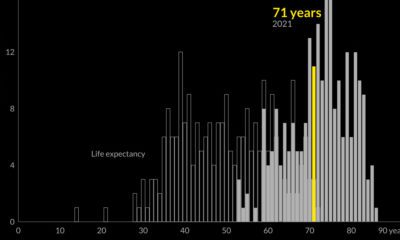

Global life expectancy has been increasing worldwide over the last 70 years. But how does the picture break down by region and by sex?
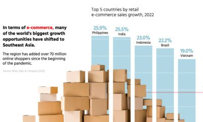

Asia's digital economy is expanding quicker than ever, but cooperation between governments is needed to reduce barriers.
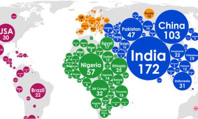

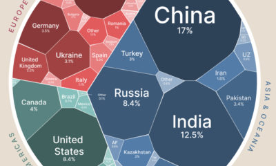
This graphic paints a picture of the world's population, showing which countries are most likely to welcome the next 1,000 babies.

Global wheat production is concentrated in just a handful of countries. Here’s a look at the top wheat-producing countries worldwide.
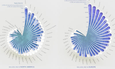

Here's a look at how people around the world could be impacted by coastal flooding by 2100, based on rising sea level projections.


 Creator Program