

From Fords in the Midwest to Toyotas on the coasts, here are the best selling vehicles in America, visualized by state.
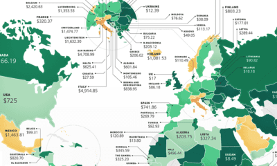

These maps show the most (and least) costly countries for starting a business by relative costs.
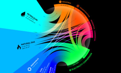

From renewables to fossil fuels, we've visualized the diverse mix of energy sources that powered U.S. energy consumption in 2020.
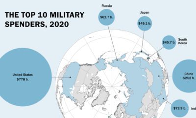

Global military spending is now at a 32-year high. We show countries' military spending by dollars and as a portion of GDP.
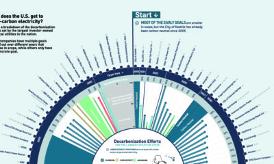

How are utilities reducing carbon emissions? Here are the decarbonization targets of the largest U.S. utilities.
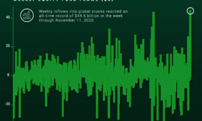

Investor optimism regarding vaccine news and the U.S. presidential election has led to record breaking inflows into the stock market.
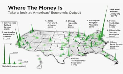

The total U.S. GDP stands at a whopping $21 trillion, but which metro areas contribute to the most in terms of economic output?
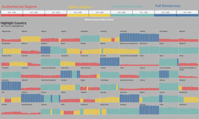

Has the world become more or less free? To find out, this graphic highlights the changing state of democracy in 167 countries since 2006.
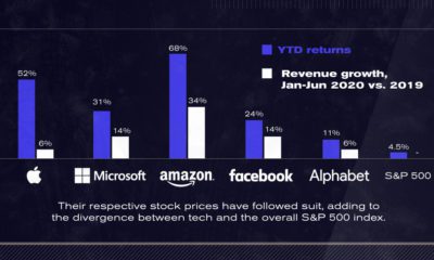

After a strong start to 2020, U.S. tech giants continue to advance to unprecedented highs. The Big Five now account for 25% of the S&P 500.


Since the 1990s, the opioid crisis has claimed thousands of lives. This visualization shows how the epidemic has come in three distinct waves.


