

We visualize the amount of money Americans lost from scam text messages in the year 2022, accessing data from the Federal Trade Commission.
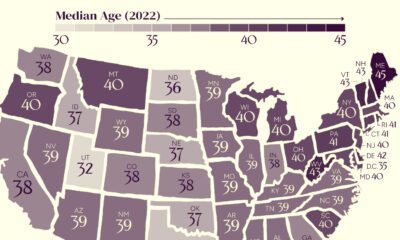

The U.S. might have a median age of 39, but the median age by state ranges from the low 30s to the mid 40s.


Empower explores the roadblocks and stressors faced by Americans on the road to financial happiness.
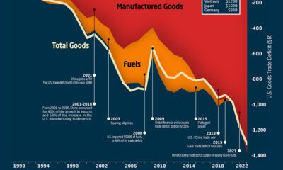

This graphic the U.S. trade deficit growth since 1990, and how manufactured goods and fuels factor in over the last three decades.


Industry stars, new entrants, and local models all populate this map of the most searched-for electric vehicles by country in 2022.
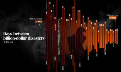

The Maui fire is the latest of many disasters in the U.S. And data shows that frequency of costly weather disasters has increased.
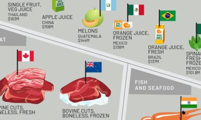

This infographic shows the top exporting countries for U.S. food imports, ranging from exotic fruits to meat, oils, spices, and more.
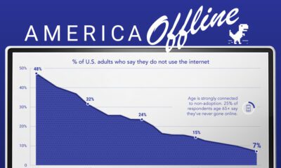

Internet adoption is widespread in the U.S. In fact, only 7% of Americans do not use the internet. Who are these non-adopters?
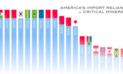

The U.S. is heavily reliant on imports for many critical minerals. How import-dependent is the U.S. for each one, and on which country?
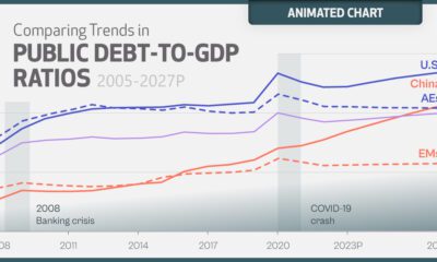

The surge in global debt poses significant risks to government balance sheets. Here's where it's projected to reach over the next five years.


 Creator Program