Visualizing the 3 Scopes of Greenhouse Gas Emissions
The Briefing
- There are three groups or ‘scopes’ of emissions as defined by the Greenhouse Gas (GHG) Protocol Corporate Standard
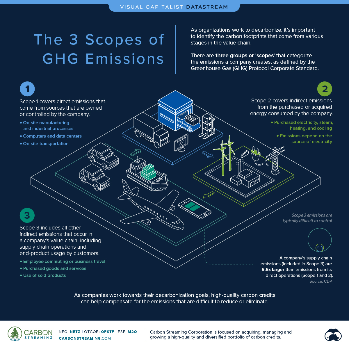
- A company’s supply chain emissions (included in Scope 3) are on average 5.5 times more than its direct operations (Scope 1 and Scope 2)
Visualizing the 3 Scopes of Greenhouse Gas Emissions
Net-zero pledges are becoming a common commitment for nations and corporations striving to meet their climate goals.
However, reaching net-zero requires companies to shrink their carbon footprints, which comprise greenhouse gas (GHG) emissions from various stages in the value chain. As more companies work to decarbonize, it’s important for them to identify and account for these different sources of emissions.
This infographic sponsored by Carbon Streaming Corporation explains the three scopes of GHG emissions and how they make up a company’s carbon footprint.
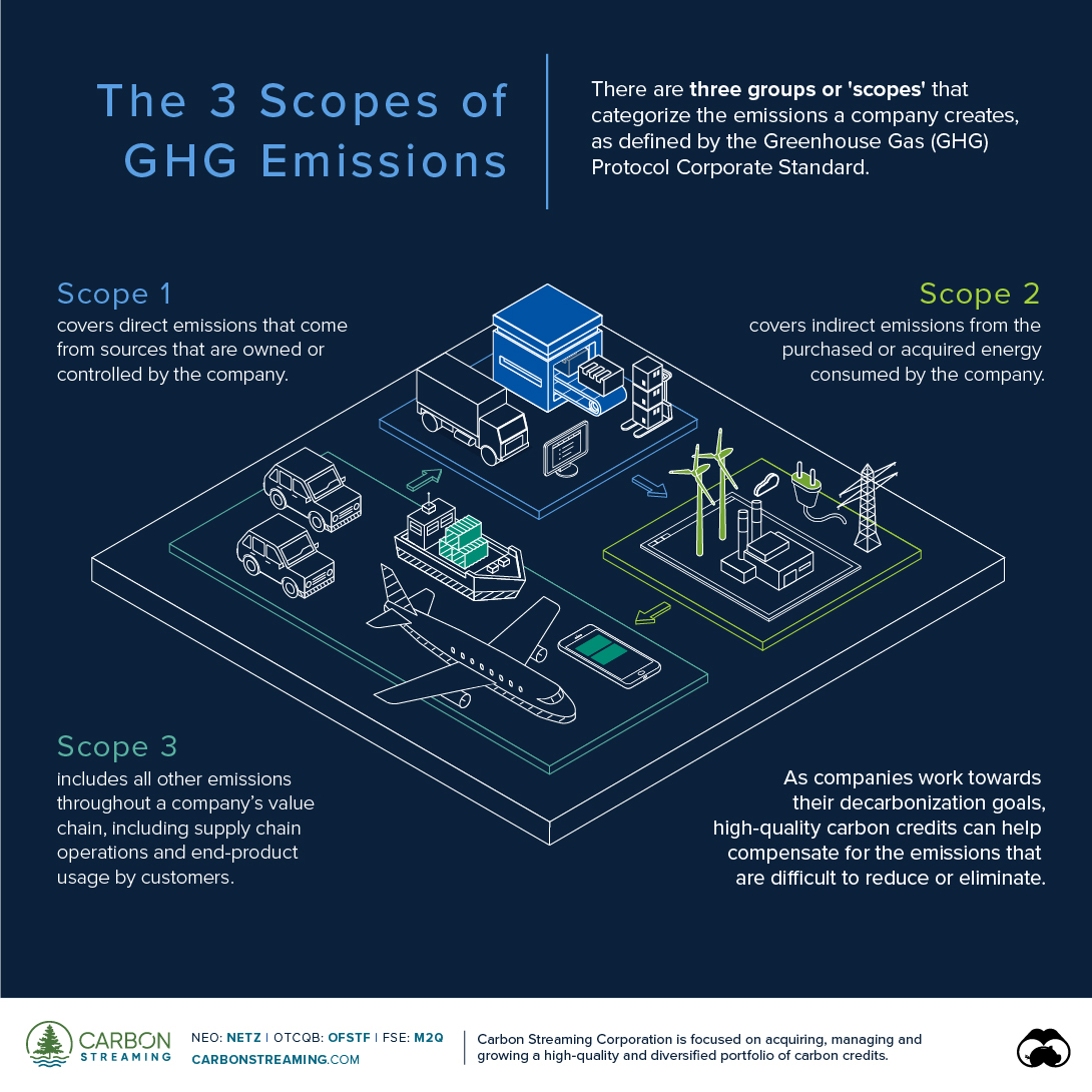
The 3 Scopes of GHG Emissions
According to the Greenhouse Gas Protocol, there are three groups or ‘scopes’ that categorize the emissions a company creates. The GHG Protocol Corporate Accounting and Reporting Standard, referred to as the GHG Protocol Corporate Standard, provides the most widely accepted standards for reporting and accounting for emissions and is used by businesses, NGOs and governments.
Scope 1 Emissions
These are direct emissions from sources that are owned or controlled by the company. Consequently, they are often the easiest to identify and then reduce or eliminate. Scope 1 emissions include:
- On-site manufacturing or industrial processes
- Computers, data centers, and its owned facilities
- On-site transportation or company vehicles
Scope 2 Emissions
These are indirect emissions from the generation of purchased or acquired energy that the company consumes. Scope 2 emissions physically occur at the site that produces the energy and the emissions depend on both the company’s level of consumption and the means by which the energy was generated (e.g. fossil fuels vs renewable energy). Scope 2 emissions include:
- Purchased electricity, heating, cooling, and steam
Scope 3 Emissions
Scope 3 includes all other indirect emissions that occur throughout a company’s value chain. These occur from sources not owned or controlled by the company and are typically difficult to control and thereby reduce.
Scope 3 emissions often make up the largest portion of a company’s carbon footprint. According to the CDP, a company’s supply chain emissions (included in Scope 3) are on average 5.5 times more than emissions from its direct operations (Scope 1 and 2). These include emissions from:
- Employee commuting or business travel
- Purchased goods and services
- Use of sold products
- Transportation and distribution of products
Companies can reduce their Scope 1 and Scope 2 emissions by improving operational efficiency and using renewable energy sources. However, managing and reducing Scope 3 emissions can be difficult depending on the company’s upstream and downstream activities.
For example, controlling the emissions from the extraction of raw materials used in a company’s end-product or from the usage of such product by a customer is not entirely in the company’s hands. But this is where carbon offsets can help.
Offsetting Emissions with Carbon Offsets
One carbon offset, also referred to as a carbon credit, represents one metric ton of GHG emissions that has been avoided, reduced or removed from the atmosphere. By purchasing carbon credits, companies can offset the emissions that are difficult to reduce or eliminate, such as Scope 3 emissions.
In fact, the voluntary carbon markets reached close to $2 billion in annual transaction value in 2021. As decarbonization plans pick up pace, carbon credits will play an important role in helping companies achieve their climate goals.
Carbon Streaming Corporation is focused on acquiring, managing and growing a high-quality and diversified portfolio of investments in carbon credits.

-
 Datastream10 months ago
Can You Calculate Your Daily Carbon Footprint?
Discover how the average person’s carbon footprint impacts the environment and learn how carbon credits can offset your carbon footprint.
-
 Datastream11 months ago
The 10 Longest Range EVs for 2023
This infographic lists 10 of the longest range EVs currently for sale in the U.S. in 2023. The Lucid Air takes first place at 516 miles.
-
 Economy11 months ago
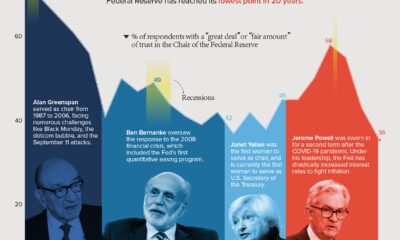
Charted: Public Trust in the Federal Reserve
Public trust in the Federal Reserve chair has hit its lowest point in 20 years. Get the details in this infographic.
-
 Datastream12 months ago
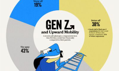
How Gen Z Feels About Its Financial Future
Despite the looming uncertainty, members of Gen Z maintains an optimistic outlook about their financial future
-
 Datastream1 year ago
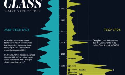
More U.S. Tech Companies are Adopting Unequal Dual-Class Voting Structures
Dual-class share structures are rising in popularity, and they give executives much more voting power within a public company.
-
 Datastream1 year ago
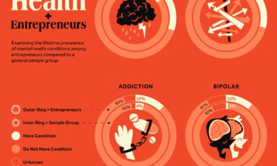
The Link Between Entrepreneurship and Mental Health Conditions
Research explores the link between entrepreneurship and mental health conditions such as ADHD and bipolar disorder