Markets
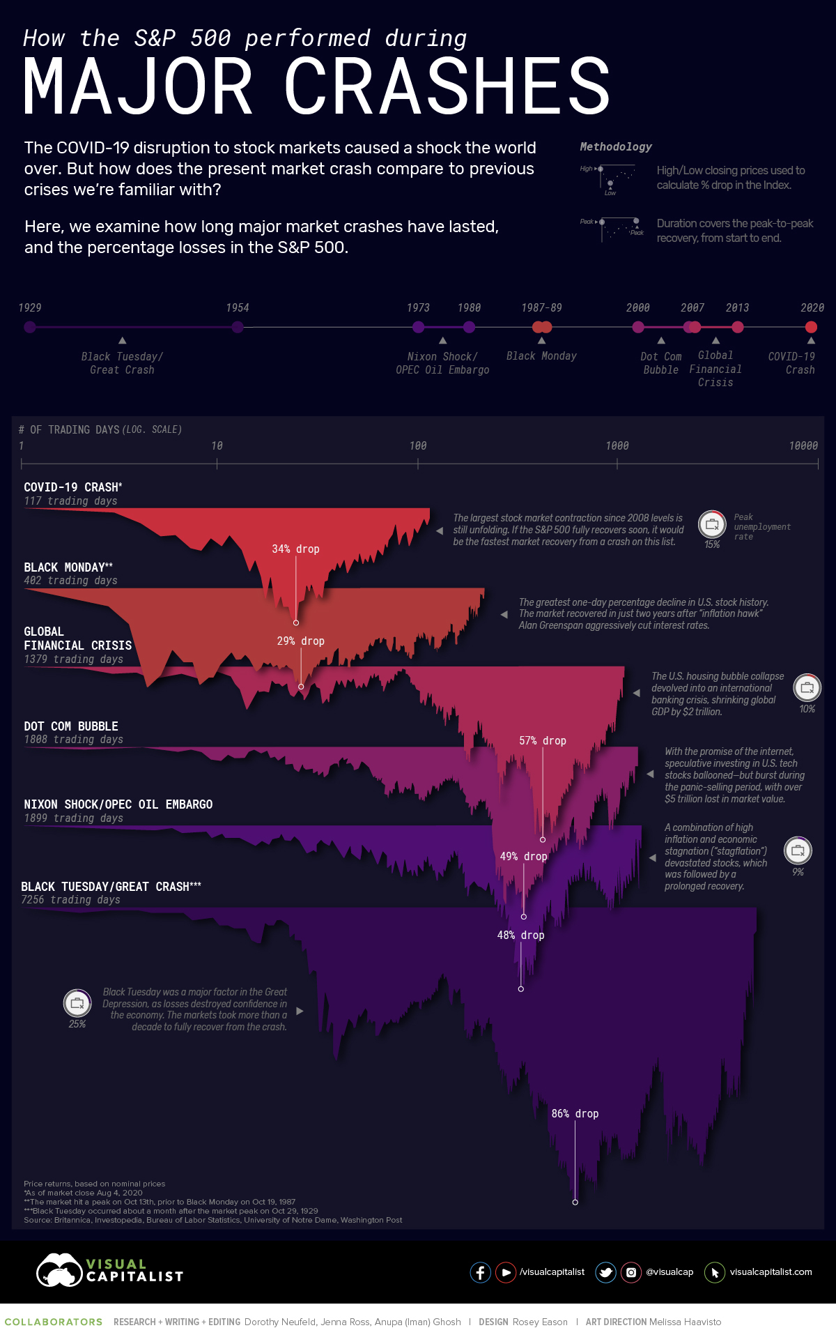
How the S&P 500 Performed During Major Market Crashes


How the S&P 500 Performed During Major Market Crashes
Like spectacular market peaks, market crashes have been a persistent feature of the S&P 500 throughout time.
Still, the forces underpinning each rise and fall are often less clear. Take the COVID-19 crash, for example. Despite lagging economic growth and historic unemployment levels, the S&P 500 bounced back 47% in just five months, in a stunning reversal.
Drawing data from Macrotrends, the above infographic compares six historic market crashes—examining the length of their recoveries and the contextual factors influencing their durations.
The Big Picture
How does the current COVID-19 crash of 2020 stack up against previous market crashes?
| Title | Start — End Date | Duration (Trading Days) | % Drop |
|---|---|---|---|
| Black Tuesday / Great Crash* | Sep 16, 1929 — Sept 22, 1954 | 300 months (7,256 days) | -86% |
| Nixon Shock / OPEC Oil Embargo | Jan 11, 1973 — Jul 17, 1980 | 90 months (1,899 days) | -48% |
| Black Monday** | Oct 13, 1987 — May 15, 1989 | 19 months (402 days) | -29% |
| Dot Com Bubble | Mar 24, 2000 — May 30, 2007 | 86 months (1,808 days) | -49% |
| Global Financial Crisis | Oct 9, 2007 — Mar 28, 2013 | 65 months (1,379 days) | -57% |
| COVID-19 Crash*** | Feb 19, 2020 — Ongoing | 5 months+ (117+ days) | -34% |
Price returns, based on nominal prices
*Black Tuesday occurred about a month after the market peak on Oct 29, 1929
**The market hit a peak on Oct 13th, prior to Black Monday on Oct 19,1987
***As of market close Aug 4, 2020
By far, the longest recovery of this list followed the devastation of Black Tuesday, while the shortest was Black Monday of 1987—where it took 19 months for the market to fully recover.
Let’s take a closer look at each market crash to navigate the economic climate at the time.
After the Fall
What were some factors that can help provide context into the crash?
1929: Black Tuesday / Great Crash
Following Black Tuesday in 1929, the U.S. stock market took 7,256 days—equal to about 25 years—to fully recover from peak to peak. In response to the market crisis, a coalition of banks bought blocks of shares, but with negligible effects. In turn, investors fled the market.
Meanwhile, the Federal Reserve Board rose the discount lending rate to 6%. As a result, borrowing costs climbed for consumers, businesses, and the central banks themselves. The tightening of rates led to unintended consequences, with the economy capitulating into the Great Depression. Of course, factors that contributed to its prolonged recovery have been debated, but these are just a few of the actions that had implications at the time.
1973: Nixon Shock / OPEC Oil Embargo
The Nixon Shock corresponded with a series of economic measures in response to high inflation. Soaring inflation devastated stocks, consuming real returns on capital. Around the same time, the oil embargo also occurred, with OPEC member countries halting oil exports to the U.S. and its allies, causing a severe spike in oil prices. It took seven years for the S&P 500 to return to its previous peak.
1987: Black Monday
While the exact cause of the 1987 crash has been debated, key factors include both the advent of computerized trading systems and overvalued markets.
To curtail the impact of the crash, former Federal Reserve chairman Alan Greenspan aggressively slashed interest rates, repeatedly promising to take great lengths to stabilize the market. The S&P took under two years to recover.
2000: Dot Com Bubble
To curb the stratospheric rise of U.S. tech stocks, the Federal Reserve raised interest rates five times in eight months, sending the markets into a tailspin. Virtually $5 trillion in market value evaporated.
However, a number of well-known companies survived, including eBay and Amazon. At the time, Amazon’s stock price cratered from $107 to $11 while eBay lost 75% of its market value. Meanwhile, a number of Dot Com flops included Pets.com, WorldCom, and FreeInternet.com.
2007: Global Financial Crisis
Relaxed credit policies, the proliferation of subprime mortgages, credit default swaps, and commercial mortgage-backed securities were all factors behind the market turmoil of 2007. As banks carved out risky loans packaged in opaque tranches of debt, risk in the market accelerated.
Similar to 1987, the Federal Reserve initiated a number of rescue actions. Interest rates were brought down to historical levels and $498 billion in bailouts were injected into the financial system. Crisis-related bailouts extended to Fannie Mae and Freddie Mac, the Troubled Asset Relief Program (TARP), the Federal Housing Administration, and others.
2020: COVID-19 Crash
In 2020, historic fiscal stimulus measures along with trillions in Fed financing have factored heavily in its swift reversal. The result has been one of the steepest rallies in S&P 500 history.
At the same time, the economy is mirroring Great Depression-level unemployment numbers, reaching 14.7% in April 2020. In short, this starkly exposes the sharp disconnect between the markets and broader economy.
Bearing Witness
History offers many lessons, and in this case, a view into the shape of a post-coronavirus market recovery.
Although the stock market is likely rallying off Fed liquidity, investor optimism, and the promise of potential vaccines, it’s interesting to note that the trajectory of this crash in some ways resembles the initial rebound shown during the Great Depression—which means we may not be out of the woods quite yet.
As the S&P 500 edges 2% shy of its February peak, could the market post a hastened recovery—or is a protracted downturn in the cards?
This graphic has been inspired by this Reddit post.


Markets
U.S. Debt Interest Payments Reach $1 Trillion
U.S. debt interest payments have surged past the $1 trillion dollar mark, amid high interest rates and an ever-expanding debt burden.


U.S. Debt Interest Payments Reach $1 Trillion
This was originally posted on our Voronoi app. Download the app for free on iOS or Android and discover incredible data-driven charts from a variety of trusted sources.
The cost of paying for America’s national debt crossed the $1 trillion dollar mark in 2023, driven by high interest rates and a record $34 trillion mountain of debt.
Over the last decade, U.S. debt interest payments have more than doubled amid vast government spending during the pandemic crisis. As debt payments continue to soar, the Congressional Budget Office (CBO) reported that debt servicing costs surpassed defense spending for the first time ever this year.
This graphic shows the sharp rise in U.S. debt payments, based on data from the Federal Reserve.
A $1 Trillion Interest Bill, and Growing
Below, we show how U.S. debt interest payments have risen at a faster pace than at another time in modern history:
| Date | Interest Payments | U.S. National Debt |
|---|---|---|
| 2023 | $1.0T | $34.0T |
| 2022 | $830B | $31.4T |
| 2021 | $612B | $29.6T |
| 2020 | $518B | $27.7T |
| 2019 | $564B | $23.2T |
| 2018 | $571B | $22.0T |
| 2017 | $493B | $20.5T |
| 2016 | $460B | $20.0T |
| 2015 | $435B | $18.9T |
| 2014 | $442B | $18.1T |
| 2013 | $425B | $17.2T |
| 2012 | $417B | $16.4T |
| 2011 | $433B | $15.2T |
| 2010 | $400B | $14.0T |
| 2009 | $354B | $12.3T |
| 2008 | $380B | $10.7T |
| 2007 | $414B | $9.2T |
| 2006 | $387B | $8.7T |
| 2005 | $355B | $8.2T |
| 2004 | $318B | $7.6T |
| 2003 | $294B | $7.0T |
| 2002 | $298B | $6.4T |
| 2001 | $318B | $5.9T |
| 2000 | $353B | $5.7T |
| 1999 | $353B | $5.8T |
| 1998 | $360B | $5.6T |
| 1997 | $368B | $5.5T |
| 1996 | $362B | $5.3T |
| 1995 | $357B | $5.0T |
| 1994 | $334B | $4.8T |
| 1993 | $311B | $4.5T |
| 1992 | $306B | $4.2T |
| 1991 | $308B | $3.8T |
| 1990 | $298B | $3.4T |
| 1989 | $275B | $3.0T |
| 1988 | $254B | $2.7T |
| 1987 | $240B | $2.4T |
| 1986 | $225B | $2.2T |
| 1985 | $219B | $1.9T |
| 1984 | $205B | $1.7T |
| 1983 | $176B | $1.4T |
| 1982 | $157B | $1.2T |
| 1981 | $142B | $1.0T |
| 1980 | $113B | $930.2B |
| 1979 | $96B | $845.1B |
| 1978 | $84B | $789.2B |
| 1977 | $69B | $718.9B |
| 1976 | $61B | $653.5B |
| 1975 | $55B | $576.6B |
| 1974 | $50B | $492.7B |
| 1973 | $45B | $469.1B |
| 1972 | $39B | $448.5B |
| 1971 | $36B | $424.1B |
| 1970 | $35B | $389.2B |
| 1969 | $30B | $368.2B |
| 1968 | $25B | $358.0B |
| 1967 | $23B | $344.7B |
| 1966 | $21B | $329.3B |
Interest payments represent seasonally adjusted annual rate at the end of Q4.
At current rates, the U.S. national debt is growing by a remarkable $1 trillion about every 100 days, equal to roughly $3.6 trillion per year.
As the national debt has ballooned, debt payments even exceeded Medicaid outlays in 2023—one of the government’s largest expenditures. On average, the U.S. spent more than $2 billion per day on interest costs last year. Going further, the U.S. government is projected to spend a historic $12.4 trillion on interest payments over the next decade, averaging about $37,100 per American.
Exacerbating matters is that the U.S. is running a steep deficit, which stood at $1.1 trillion for the first six months of fiscal 2024. This has accelerated due to the 43% increase in debt servicing costs along with a $31 billion dollar increase in defense spending from a year earlier. Additionally, a $30 billion increase in funding for the Federal Deposit Insurance Corporation in light of the regional banking crisis last year was a major contributor to the deficit increase.
Overall, the CBO forecasts that roughly 75% of the federal deficit’s increase will be due to interest costs by 2034.

-

 Green1 week ago
Ranked: The Countries With the Most Air Pollution in 2023
-

 Misc2 weeks ago
Almost Every EV Stock is Down After Q1 2024
-

 AI2 weeks ago
The Stock Performance of U.S. Chipmakers So Far in 2024
-

 Business2 weeks ago
Charted: Big Four Market Share by S&P 500 Audits
-

 Real Estate2 weeks ago
Ranked: The Most Valuable Housing Markets in America
-

 Money2 weeks ago
Which States Have the Highest Minimum Wage in America?
-

 AI2 weeks ago
Ranked: Semiconductor Companies by Industry Revenue Share
-

 Travel2 weeks ago
Ranked: The World’s Top Flight Routes, by Revenue