Markets
Shapes of Recovery: When Will the Global Economy Bounce Back?
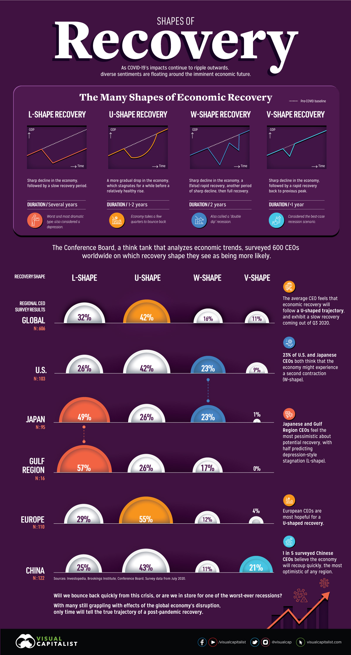
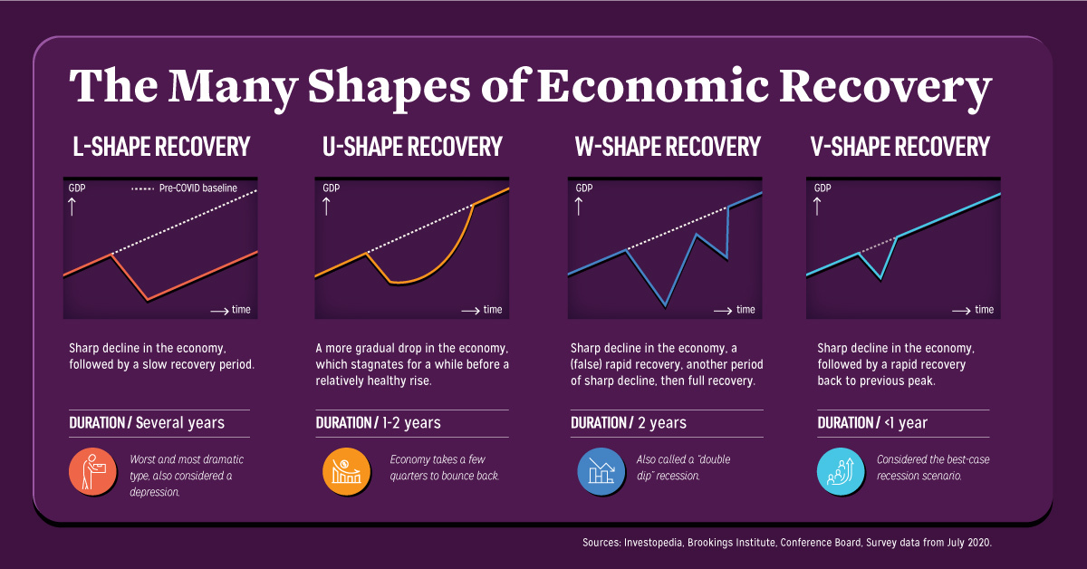
The Shape of Economic Recovery, According to CEOs
Is the glass half full, or half empty?
Whenever the economy is put through the ringer, levels of optimism and pessimism about its potential recovery can vary greatly. The current state mid-pandemic is no exception.
This graphic first details the various shapes that economic recovery can take, and what they mean. We then dive into which of the four scenarios are perceived the most likely to occur, based on predictions made by CEOs from around the world.
The ABCs of Economic Recovery
Economic recovery comes in four distinct shapes—L, U, W, and V. Here’s what each of these are characterized by, and how long they typically last.
- L-shape
This scenario exhibits a sharp decline in the economy, followed by a slow recovery period. It’s often punctuated by persistent unemployment, taking several years to recoup back to previous levels. - U-shape
Also referred to as the “Nike Swoosh” recovery, in this scenario the economy stagnates for a few quarters and up to two years, before experiencing a relatively healthy rise back to its previous peak. - W-shape
This scenario offers a tempting promise of recovery, dips back into a sharp decline, and then finally enters the full recovery period of up to two years. This is also known as a “double-dip recession“, similar to what was seen in the early 1980s. - V-shape
In this best-case scenario, the sharp decline in the economy is quickly and immediately followed by a rapid recovery back to its previous peak in less than a year, bolstered especially by economic measures and strong consumer spending.
Another scenario not covered here is the Z-shape, defined by a boom after pent-up demand. However, it doesn’t quite make the cut for the present pandemic situation, as it’s considered even more optimistic than a V-shaped recovery.
Depending on who you ask, the sentiments about a post-pandemic recovery differ greatly. So which of these potential scenarios are we really dealing with?
How CEOs Think The Economy Could Recover
The think tank The Conference Board surveyed over 600 CEOs worldwide, to uncover how they feel about the likelihood of each recovery shape playing out in the near future.
The average CEO felt that economic recovery will follow a U-shaped trajectory (42%), eventually exhibiting a slow recovery coming out of Q3 of 2020—a moderately optimistic view.
However, geography seems to play a part in these CEO estimates of how rapidly things might revert back to “normal”. Over half of European CEOs (55%) project a U-shaped recovery, which is significantly higher than the global average. This could be because recent COVID-19 hotspots have mostly shifted to other areas outside of the continent, such as the U.S., India, and Brazil.
Here’s how responses vary by region:
| Region | L-shape | U-shape | W-shape | V-shape |
|---|---|---|---|---|
| Global (N=606) | 32% | 42% | 16% | 11% |
| U.S. (N=103) | 26% | 42% | 23% | 9% |
| Europe (N=110) | 29% | 55% | 12% | 4% |
| China (N=122) | 25% | 43% | 11% | 21% |
| Japan (N=95) | 49% | 26% | 23% | 1% |
| Gulf Region (N=16) | 57% | 26% | 17% | - |
In the U.S. and Japan, 23% of CEOs expect a second contraction to occur, meaning that economic activity could undergo a W-shape recovery. Both countries have experienced quite the hit, but there are stark differences in their resultant unemployment rates—15% at its peak in the U.S., but a mere 2.6% in Japan.
In China, 21% of CEOs—or one in five—anticipate a quick, V-shaped recovery. This is the most optimistic outlook of any region, and with good reason. Although economic growth contracted by 6.8% in the first quarter, China has bounced back to a 3.2% growth rate in the second quarter.
Finally, Gulf Region CEOs feel the most pessimistic about potential economic recovery. In the face of an oil shock, 57% predict the economy will see an L-shaped recovery that could result in depression-style stagnation in years to come.
The Economic Recovery, According to Risk Analysts
At the end of the day, CEO opinions are all over the map on the potential shape of the economic recovery—and this variance likely stems from geography, cultural biases, and of course the status of their own individual countries and industries.
Despite this, portions of all cohorts saw some possibility of an extended and drawn-out recovery. Earlier in the year, risk analysts surveyed by the World Economic Forum had similar thoughts, projecting a prolonged recession as the top risk of the post-COVID fallout.
It remains to be seen whether this will ultimately indeed be the trajectory we’re in store for.


Markets
U.S. Debt Interest Payments Reach $1 Trillion
U.S. debt interest payments have surged past the $1 trillion dollar mark, amid high interest rates and an ever-expanding debt burden.


U.S. Debt Interest Payments Reach $1 Trillion
This was originally posted on our Voronoi app. Download the app for free on iOS or Android and discover incredible data-driven charts from a variety of trusted sources.
The cost of paying for America’s national debt crossed the $1 trillion dollar mark in 2023, driven by high interest rates and a record $34 trillion mountain of debt.
Over the last decade, U.S. debt interest payments have more than doubled amid vast government spending during the pandemic crisis. As debt payments continue to soar, the Congressional Budget Office (CBO) reported that debt servicing costs surpassed defense spending for the first time ever this year.
This graphic shows the sharp rise in U.S. debt payments, based on data from the Federal Reserve.
A $1 Trillion Interest Bill, and Growing
Below, we show how U.S. debt interest payments have risen at a faster pace than at another time in modern history:
| Date | Interest Payments | U.S. National Debt |
|---|---|---|
| 2023 | $1.0T | $34.0T |
| 2022 | $830B | $31.4T |
| 2021 | $612B | $29.6T |
| 2020 | $518B | $27.7T |
| 2019 | $564B | $23.2T |
| 2018 | $571B | $22.0T |
| 2017 | $493B | $20.5T |
| 2016 | $460B | $20.0T |
| 2015 | $435B | $18.9T |
| 2014 | $442B | $18.1T |
| 2013 | $425B | $17.2T |
| 2012 | $417B | $16.4T |
| 2011 | $433B | $15.2T |
| 2010 | $400B | $14.0T |
| 2009 | $354B | $12.3T |
| 2008 | $380B | $10.7T |
| 2007 | $414B | $9.2T |
| 2006 | $387B | $8.7T |
| 2005 | $355B | $8.2T |
| 2004 | $318B | $7.6T |
| 2003 | $294B | $7.0T |
| 2002 | $298B | $6.4T |
| 2001 | $318B | $5.9T |
| 2000 | $353B | $5.7T |
| 1999 | $353B | $5.8T |
| 1998 | $360B | $5.6T |
| 1997 | $368B | $5.5T |
| 1996 | $362B | $5.3T |
| 1995 | $357B | $5.0T |
| 1994 | $334B | $4.8T |
| 1993 | $311B | $4.5T |
| 1992 | $306B | $4.2T |
| 1991 | $308B | $3.8T |
| 1990 | $298B | $3.4T |
| 1989 | $275B | $3.0T |
| 1988 | $254B | $2.7T |
| 1987 | $240B | $2.4T |
| 1986 | $225B | $2.2T |
| 1985 | $219B | $1.9T |
| 1984 | $205B | $1.7T |
| 1983 | $176B | $1.4T |
| 1982 | $157B | $1.2T |
| 1981 | $142B | $1.0T |
| 1980 | $113B | $930.2B |
| 1979 | $96B | $845.1B |
| 1978 | $84B | $789.2B |
| 1977 | $69B | $718.9B |
| 1976 | $61B | $653.5B |
| 1975 | $55B | $576.6B |
| 1974 | $50B | $492.7B |
| 1973 | $45B | $469.1B |
| 1972 | $39B | $448.5B |
| 1971 | $36B | $424.1B |
| 1970 | $35B | $389.2B |
| 1969 | $30B | $368.2B |
| 1968 | $25B | $358.0B |
| 1967 | $23B | $344.7B |
| 1966 | $21B | $329.3B |
Interest payments represent seasonally adjusted annual rate at the end of Q4.
At current rates, the U.S. national debt is growing by a remarkable $1 trillion about every 100 days, equal to roughly $3.6 trillion per year.
As the national debt has ballooned, debt payments even exceeded Medicaid outlays in 2023—one of the government’s largest expenditures. On average, the U.S. spent more than $2 billion per day on interest costs last year. Going further, the U.S. government is projected to spend a historic $12.4 trillion on interest payments over the next decade, averaging about $37,100 per American.
Exacerbating matters is that the U.S. is running a steep deficit, which stood at $1.1 trillion for the first six months of fiscal 2024. This has accelerated due to the 43% increase in debt servicing costs along with a $31 billion dollar increase in defense spending from a year earlier. Additionally, a $30 billion increase in funding for the Federal Deposit Insurance Corporation in light of the regional banking crisis last year was a major contributor to the deficit increase.
Overall, the CBO forecasts that roughly 75% of the federal deficit’s increase will be due to interest costs by 2034.

-

 Real Estate2 weeks ago
Visualizing America’s Shortage of Affordable Homes
-

 Technology1 week ago
Ranked: Semiconductor Companies by Industry Revenue Share
-

 Money1 week ago
Which States Have the Highest Minimum Wage in America?
-

 Real Estate1 week ago
Ranked: The Most Valuable Housing Markets in America
-

 Business2 weeks ago
Charted: Big Four Market Share by S&P 500 Audits
-

 AI2 weeks ago
The Stock Performance of U.S. Chipmakers So Far in 2024
-

 Misc2 weeks ago
Almost Every EV Stock is Down After Q1 2024
-

 Money2 weeks ago
Where Does One U.S. Tax Dollar Go?