Misc
The Shape of the World, According to Old Maps
The Shape of the World, According to Ancient Maps
A Babylonian clay tablet helped unlock an understanding for how our ancestors saw the world.
Dating all the way back to the 6th century BCE, the Imago Mundi is the oldest known world map, and it offers a unique glimpse into ancient perspectives on earth and the heavens.
While this is the first-known interpretation of such a map, it would certainly not be the last. Today’s visualization, designed by Reddit user PisseGuri82, won the “Best of 2018 Map Contest” for depicting the evolving shapes of man-made maps throughout history.
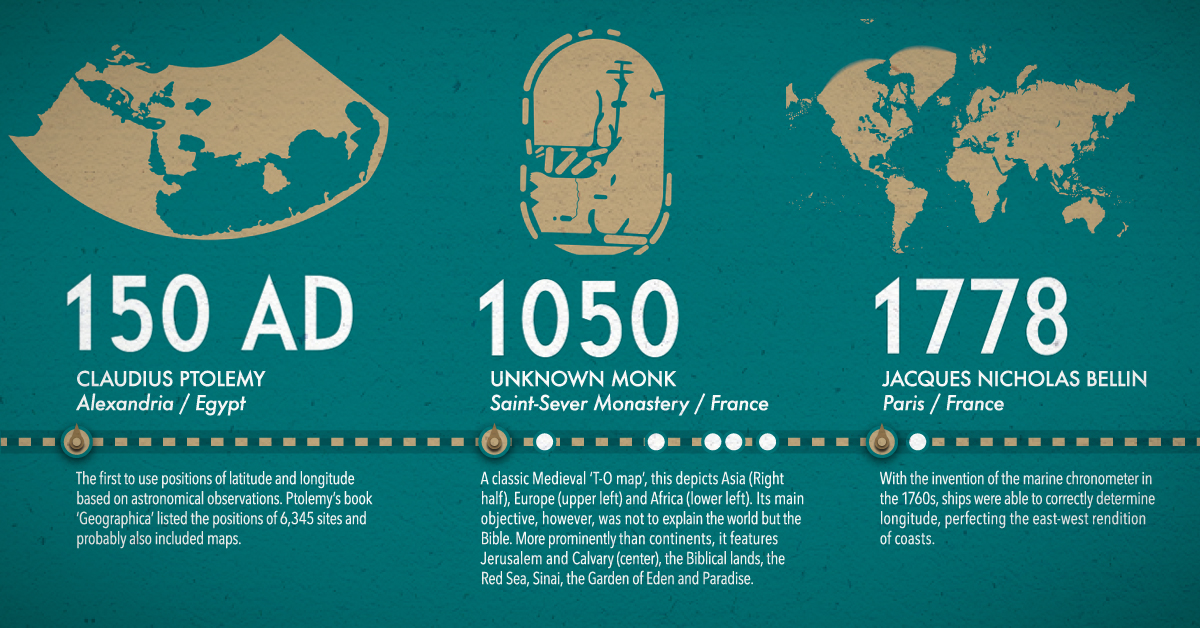
AD 150: Once Upon A Time in Egypt
In this former location of the Roman Empire, Ptolemy was the first to use positions of latitude and longitude to map countries into his text Geographia. After these ancient maps were lost for centuries, Ptolemy’s work was rediscovered and reconstructed in the 15th century, serving as a foundation for cartography throughout the Middle Ages.
1050: Pointing to the Heavens
The creation of this quintessential medieval T-and-O Beatine map is attributed not to an unknown French monk, but to the Spanish monk Beatus of Liébana. Although it shows several continents—Africa, Asia, and Europe—its main objective was to visualize Biblical locations. For example, because the sun rises in the east, Paradise (The Garden of Eden) can be seen pointing upwards and towards Asia on the map.
1154: The World Turned Upside Down
The Arabic geographer Muhammad al-Idrisi made one of the most advanced medieval world maps for King Roger II of Sicily. The Tabula Rogeriana, which literally translates to “the book of pleasant journeys into faraway lands”, was ahead of the curve compared to contemporaries because it used information from traveler and merchant accounts. The original map was oriented south-up, which is why modern depictions show it upside down.
1375: The Zenith of Medieval Map Work
The Jewish cartographer Abraham Cresques created the most important map of the medieval period, the Catalan Atlas, with his son for Prince John of Aragon. It covers the “East and the West, and everything that, from the Strait [of Gibraltar] leads to the West”. Many Indian and Chinese cities can be identified, based on various voyages by the explorers Marco Polo and Sir John Mandeville.
After this, the Age of Discovery truly began—and maps started to more closely resemble the world map as we know it today.
1489: Feeling Ptolemy and Polo’s Influences
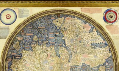
The 15th century was a radical time for map-makers, once Ptolemy’s geographical drawings were re-discovered. Henricus Martellus expanded on Ptolemaic maps, and also relied on sources like Marco Polo’s travels to imagine the Old World. His milestone map closely resembles the oldest-surviving terrestrial globe, Erdapfel, created by cartographer Martin Behaim. Today, it’s preserved at the Yale University archives.
1529: A Well-Kept Spanish Secret
The first ever scientific world map is most widely attributed to the Portuguese cartographer Diego Ribero. The Padrón Real was the Spanish Crown’s official and secret master map, made from hundreds of sailors’ reports of any new lands and their coordinates.
1599: The Wright Idea
English mathematician and cartographer Edward Wright was the first to perfect the Mercator projection—which takes the Earth’s curvature into consideration. Otherwise known as a Wright-Molyneux world map, this linear representation of the earth’s cylindrical map quickly became the standard for navigation.
1778-1832: The Emergence of Modern World Maps
The invention of the marine chronometer transformed marine navigation—as ships were now able to detect both longitude and latitude. Jacques-Nicolas Bellin, a French geographer, was responsible for the 18th century’s highly accurate world maps and nautical charts. His designs favored functionality over the decorative flourishes of cartographers past.
Finally, the German cartographer and lawyer Adolf Stieler was the man behind Stieler’s Handatlas, the leading German world atlas until the mid-20th century. His maps were famous for being updated based on new explorations, making them the most reliable map possible.
Is There Uncharted Territory Left?
It is worth mentioning that these ancient maps above are mostly coming from a European perspective.
That said, the Islamic Golden Age also boasts an impressive cartographic record, reaching its peak partially in thanks to Muhammad al-Idrisi in the 11th century. Similarly, Ancient Chinese empires had a cartographic golden age after the invention of the compass as well.
Does this mean there’s nothing left to explore today? Quite the contrary. While we know so much about our landmasses, the undersea depths remain quite a mystery. In fact, we’ve explored more of outer space than we have 95% of our own oceans.
If you liked the visualization above, be sure to explore the world’s borders by age, broken down impressively by the same designer.


Misc
How Hard Is It to Get Into an Ivy League School?
We detail the admission rates and average annual cost for Ivy League schools, as well as the median SAT scores required to be accepted.
How Hard Is It to Get Into an Ivy League School?
This was originally posted on our Voronoi app. Download the app for free on iOS or Android and discover incredible data-driven charts from a variety of trusted sources.
Ivy League institutions are renowned worldwide for their academic excellence and long-standing traditions. But how hard is it to get into one of the top universities in the U.S.?
In this graphic, we detail the admission rates and average annual cost for Ivy League schools, as well as the median SAT scores required to be accepted. The data comes from the National Center for Education Statistics and was compiled by 24/7 Wall St.
Note that “average annual cost” represents the net price a student pays after subtracting the average value of grants and/or scholarships received.
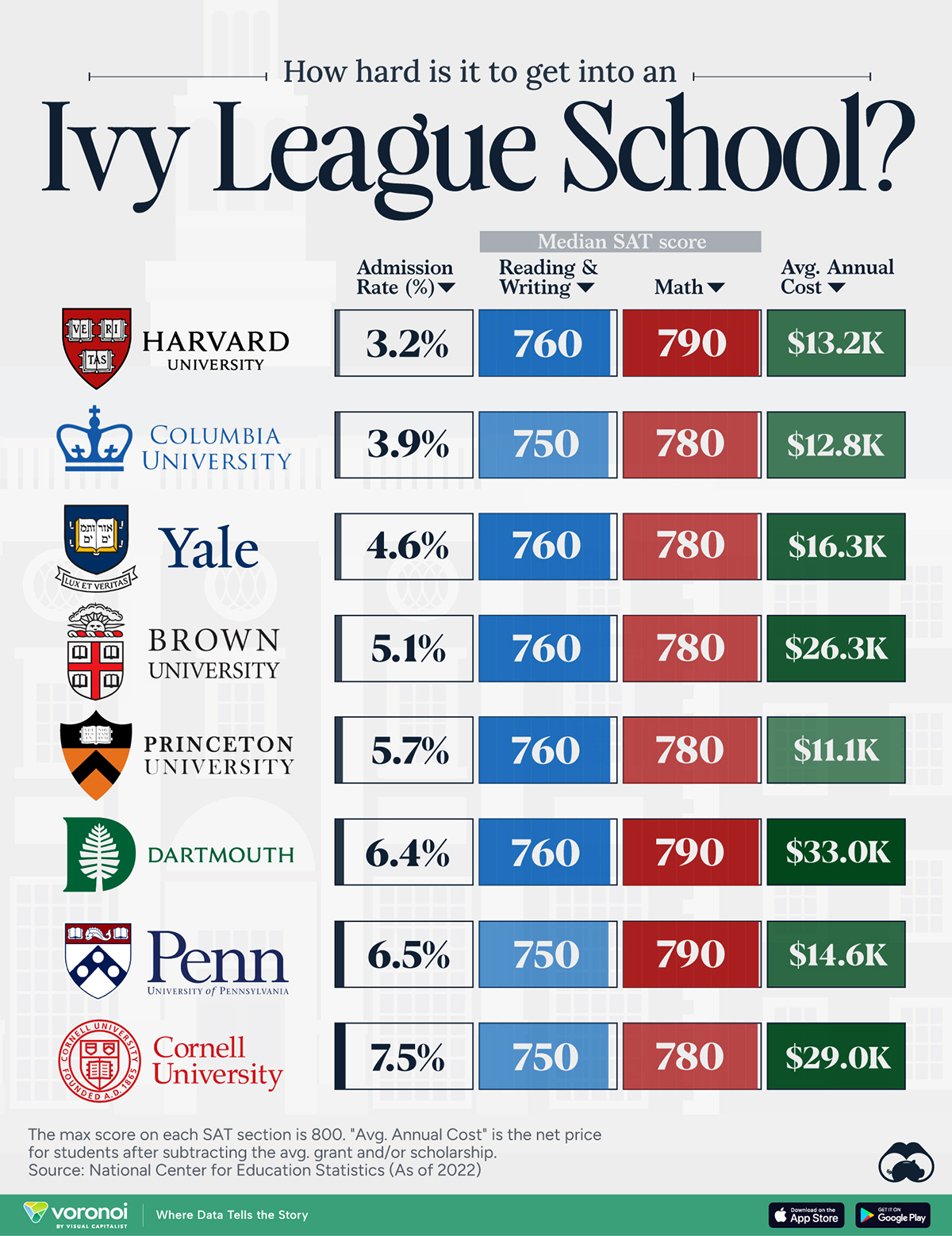
Harvard is the Most Selective
The SAT is a standardized test commonly used for college admissions in the United States. It’s taken by high school juniors and seniors to assess their readiness for college-level academic work.
When comparing SAT scores, Harvard and Dartmouth are among the most challenging universities to gain admission to. The median SAT scores for their students are 760 for reading and writing and 790 for math. Still, Harvard has half the admission rate (3.2%) compared to Dartmouth (6.4%).
| School | Admission rate (%) | SAT Score: Reading & Writing | SAT Score: Math | Avg Annual Cost* |
|---|---|---|---|---|
| Harvard University | 3.2 | 760 | 790 | $13,259 |
| Columbia University | 3.9 | 750 | 780 | $12,836 |
| Yale University | 4.6 | 760 | 780 | $16,341 |
| Brown University | 5.1 | 760 | 780 | $26,308 |
| Princeton University | 5.7 | 760 | 780 | $11,080 |
| Dartmouth College | 6.4 | 760 | 790 | $33,023 |
| University of Pennsylvania | 6.5 | 750 | 790 | $14,851 |
| Cornell University | 7.5 | 750 | 780 | $29,011 |
*Costs after receiving federal financial aid.
Additionally, Dartmouth has the highest average annual cost at $33,000. Princeton has the lowest at $11,100.
While student debt has surged in the United States in recent years, hitting $1.73 trillion in 2023, the worth of obtaining a degree from any of the schools listed surpasses mere academics. This is evidenced by the substantial incomes earned by former students.
Harvard grads, for example, have the highest average starting salary in the country, at $91,700.

-

 Maps2 weeks ago
Mapped: Average Wages Across Europe
-

 Money1 week ago
Which States Have the Highest Minimum Wage in America?
-

 Real Estate1 week ago
Ranked: The Most Valuable Housing Markets in America
-

 Markets1 week ago
Charted: Big Four Market Share by S&P 500 Audits
-

 AI1 week ago
The Stock Performance of U.S. Chipmakers So Far in 2024
-

 Automotive2 weeks ago
Almost Every EV Stock is Down After Q1 2024
-

 Money2 weeks ago
Where Does One U.S. Tax Dollar Go?
-

 Green2 weeks ago
Ranked: Top Countries by Total Forest Loss Since 2001