Money
Visualized: The Security Features of American Money


Visualized: The Security Features of American Money
In 1739, Benjamin Franklin sought to tackle the issue of counterfeit money in America, using a printing press and leaves to create unique raised patterns on the colonial notes.
Almost 300 years later, Benjamin Franklin is the face of the U.S. $100 bill, and it is protected by a myriad of security features including secret images, special ink, hidden watermarks, and magnetic signatures, among others.
In this visual, we’ve broken down the $100 bill to showcase the anatomy of American currency.
The Makeup of American Money
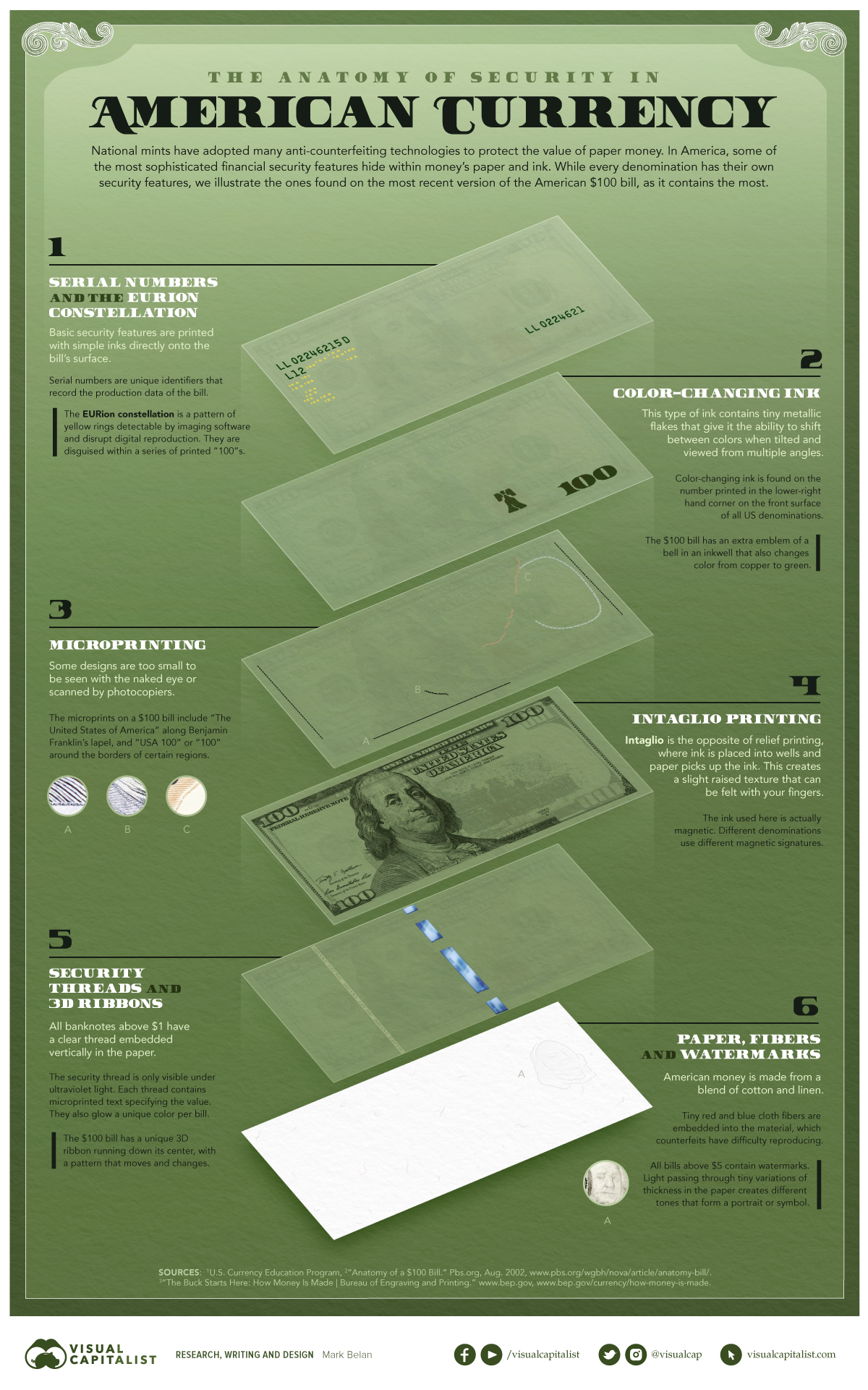
There are 6 key features that identify real bills and protect the falsification of American money.
① Serial Numbers & EURion Constellation
The most basic form of security on an $100 bill is the serial number. Every bill has a unique number to record data on its production and keep track of how many individual bills are in circulation.
The EURion constellation is star-like grouping of yellow rings near the serial number. It is only detectable by imaging software.
② Color Changing Ink
This ink changes color at different angles thanks to small metallic flakes within the ink itself. The $100 bill, like all other paper bills in the U.S., has its value denoted in color changing ink on the bottom right-hand corner; unlike other bills, it also features a liberty bell image using the ink.
③ Microprinting
Microprinting allows for verifiable images that cannot be scanned by photocopiers or seen by the naked eye. The $100 bill has phrases like “USA 100” written invisibly in multiple places.
④ Intaglio Printing
Rather than regular ink pressed onto the paper, intaglio printing uses magnetic ink and every different bill value has a unique magnetic signature.
⑤ Security Threads & 3D Ribbons
The security thread is a clear, embedded, vertical thread running through the bill. It can only be seen under UV light, contains microprinted text specifying the bill’s value, and on each different bill value it glows a unique color.
Additionally, 3D ribbons are placed in the center of $100 bills with a pattern that slightly changes as it moves.
⑥ Paper, Fibers, & Watermarks
Because American money is made of cotton and linen, blue and red cloth fibers are woven into the material as another identifying feature. Finally, watermarks are found on most bills and can only be detected by light passing through the bill.
The Relevance of Cash
Here’s a look at the total number of each paper bill that is physically in circulation in the U.S.:
| Physical Bill | Billions of notes (2021) |
|---|---|
| $1 | 14.0 |
| $2 | 1.4 |
| $5 | 3.4 |
| $10 | 2.3 |
| $20 | 11.9 |
| $50 | 2.5 |
| $100 | 17.7 |
| $500-$10,000 | 0.0004 |
| Total | 53.2 |
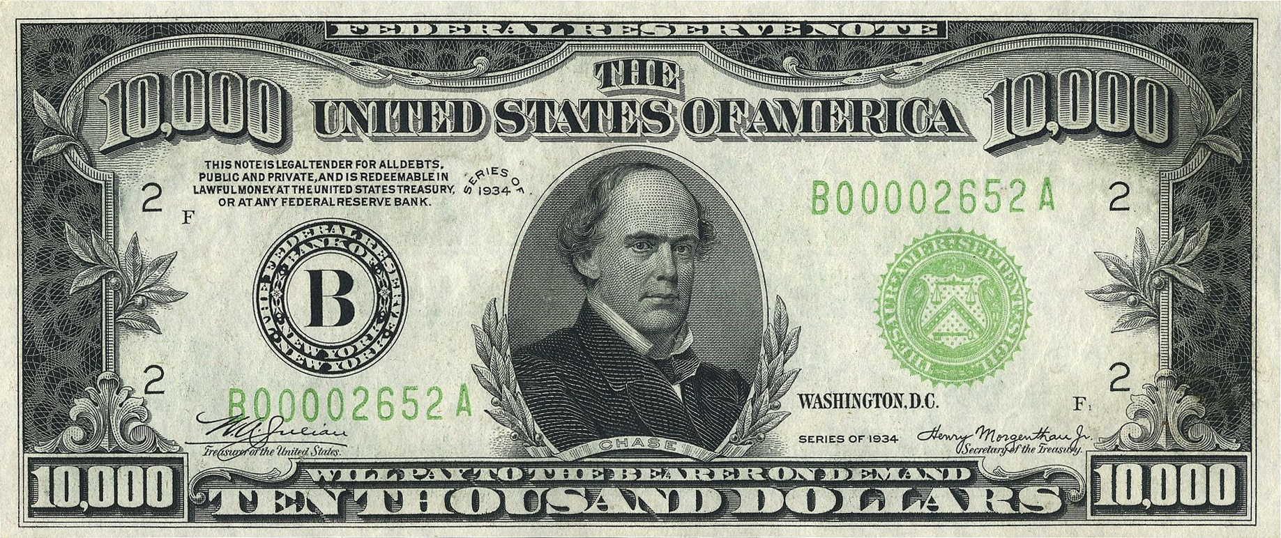
Interestingly, a number of $500-$10,000 dollar bills are in someone’s pockets. And while they are not issued anymore, the Fed still recognizes the originals of these bills that were legally put into circulation in the past.
Additionally, there is fake money passing hands in the U.S. economy. Being the most widely-accepted currency in the world, it’s no wonder many try to falsely replicate American money. According to the U.S. Department of Treasury, there are approximately $70 million in counterfeit bills currently circulating in the country.
Finally, a natural question arises: how many people still use cash anyways?
Well, a study from Pew Research Center found that it while it is a dwindling share of the population, around 58% of people still use cash for some to all of their weekly purchases, down from 70% in 2018 and 75% in 2015.


Money
How Debt-to-GDP Ratios Have Changed Since 2000
See how much the debt-to-GDP ratios of advanced economies have grown (or shrank) since the year 2000.


How Debt-to-GDP Ratios Have Changed Since 2000
This was originally posted on our Voronoi app. Download the app for free on Apple or Android and discover incredible data-driven charts from a variety of trusted sources.
Government debt levels have grown in most parts of the world since the 2008 financial crisis, and even more so after the COVID-19 pandemic.
To gain perspective on this long-term trend, we’ve visualized the debt-to-GDP ratios of advanced economies, as of 2000 and 2024 (estimated). All figures were sourced from the IMF’s World Economic Outlook.
Data and Highlights
The data we used to create this graphic is listed in the table below. “Government gross debt” consists of all liabilities that require payment(s) of interest and/or principal in the future.
| Country | 2000 (%) | 2024 (%) | Change (pp) |
|---|---|---|---|
| 🇯🇵 Japan | 135.6 | 251.9 | +116.3 |
| 🇸🇬 Singapore | 82.3 | 168.3 | +86.0 |
| 🇺🇸 United States | 55.6 | 126.9 | +71.3 |
| 🇬🇧 United Kingdom | 36.6 | 105.9 | +69.3 |
| 🇬🇷 Greece | 104.9 | 160.2 | +55.3 |
| 🇫🇷 France | 58.9 | 110.5 | +51.6 |
| 🇵🇹 Portugal | 54.2 | 104.0 | +49.8 |
| 🇪🇸 Spain | 57.8 | 104.7 | +46.9 |
| 🇸🇮 Slovenia | 25.9 | 66.5 | +40.6 |
| 🇫🇮 Finland | 42.4 | 76.5 | +34.1 |
| 🇭🇷 Croatia | 35.4 | 61.8 | +26.4 |
| 🇨🇦 Canada | 80.4 | 103.3 | +22.9 |
| 🇨🇾 Cyprus | 56.0 | 70.9 | +14.9 |
| 🇦🇹 Austria | 65.7 | 74.0 | +8.3 |
| 🇸🇰 Slovak Republic | 50.5 | 56.5 | +6.0 |
| 🇩🇪 Germany | 59.3 | 64.0 | +4.7 |
| 🇧🇪 Belgium | 109.6 | 106.8 | -2.8 |
| 🇮🇱 Israel | 77.4 | 56.8 | -20.6 |
| 🇮🇸 Iceland | 75.8 | 54.6 | -21.2 |
The debt-to-GDP ratio indicates how much a country owes compared to the size of its economy, reflecting its ability to manage and repay debts. Percentage point (pp) changes shown above indicate the increase or decrease of these ratios.
Countries with the Biggest Increases
Japan (+116 pp), Singapore (+86 pp), and the U.S. (+71 pp) have grown their debt as a percentage of GDP the most since the year 2000.
All three of these countries have stable, well-developed economies, so it’s unlikely that any of them will default on their growing debts. With that said, higher government debt leads to increased interest payments, which in turn can diminish available funds for future government budgets.
This is a rising issue in the U.S., where annual interest payments on the national debt have surpassed $1 trillion for the first time ever.
Only 3 Countries Saw Declines
Among this list of advanced economies, Belgium (-2.8 pp), Iceland (-21.2 pp), and Israel (-20.6 pp) were the only countries that decreased their debt-to-GDP ratio since the year 2000.
According to Fitch Ratings, Iceland’s debt ratio has decreased due to strong GDP growth and the use of its cash deposits to pay down upcoming maturities.
See More Debt Graphics from Visual Capitalist
Curious to see which countries have the most government debt in dollars? Check out this graphic that breaks down $97 trillion in debt as of 2023.

-

 Maps2 weeks ago
Mapped: Average Wages Across Europe
-

 Money1 week ago
Which States Have the Highest Minimum Wage in America?
-

 Real Estate1 week ago
Ranked: The Most Valuable Housing Markets in America
-

 Markets1 week ago
Charted: Big Four Market Share by S&P 500 Audits
-

 AI1 week ago
The Stock Performance of U.S. Chipmakers So Far in 2024
-

 Automotive2 weeks ago
Almost Every EV Stock is Down After Q1 2024
-

 Money2 weeks ago
Where Does One U.S. Tax Dollar Go?
-

 Green2 weeks ago
Ranked: Top Countries by Total Forest Loss Since 2001