Markets
Charting the Rise of America’s Debt Ceiling


Charting the Rise of America’s Debt Ceiling
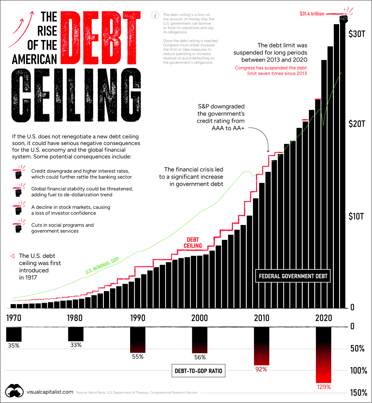
Every few years the debt ceiling standoff puts the credit of the U.S. at risk.
In January, the $31.4 trillion debt limit—the amount of debt the U.S. government can hold—was reached. That means U.S. cash reserves could be exhausted by June 1 according to Treasury Secretary Janet Yellen. Should Republicans and Democrats fail to act, the U.S. could default on its debt, causing harmful effects across the financial system.
The above graphic shows the sharp rise in the debt ceiling in recent years, pulling data from various sources including the World Bank, U.S. Department of Treasury, and Congressional Research Service.
Familiar Territory
Raising the debt ceiling is nothing new. Since 1960, it’s been raised 78 times.
In the 2023 version of the debate, Republican House Majority Leader Kevin McCarthy is asking for cuts in government spending. However, President Joe Biden argues that the debt ceiling should be increased without any strings attached. Adding to this, the sharp uptick in interest rates have been a clear reminder that rising debt levels can be precarious.
Consider that historically, interest payments on the U.S. debt have been equal to about half the cost of defense. More recently, however, the cost of servicing the debt has risen, and is now almost on par with the defense budget as a whole.
Key Moments In Recent History
Over history, raising the debt ceiling has often been a typical process for Congress.
Unlike today, agreements to raise the debt ceiling were often negotiated faster. Increased political polarization over recent years has contributed to standoffs with damaging consequences.
For instance, in 2011, an agreement was made just days before the deadline. As a result, S&P downgraded the U.S. credit rating from AAA to AA+ for the first time ever. This delay cost an estimated $1.3 billion in extra costs to the government that year.
Before then, the government shut down twice between 1995 and 1996 as President Bill Clinton and Republican House Speaker Newt Gingrich went head-to-head. Over a million government workers were furloughed for a week in late November 1995 before the debt limit was raised.
What Happens Now?
Today, Republicans and Democrats have less than two weeks to reach an agreement.
If Congress doesn’t make a deal the result would be that the government can’t pay its bills by taking on new debt. Payment for federal workers would be suspended, certain pension payments would get stalled, and interest payments on Treasuries would be delayed. The U.S. would default under these conditions.
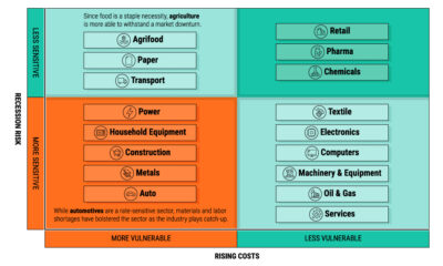
Three Potential Consequences
Here are some of the potential knock-on effects if the debt ceiling isn’t raised by June 1, 2023:
1. Higher Interest Rates
Typically investors require higher interest payments as the risk of their debt holdings increase.
If the U.S. fails to pay interest payments on its debt and gets a credit downgrade, these interest payments would likely rise higher. This would impact the U.S. government’s interest payments and the cost of borrowing for businesses and households.
High interest rates can slow economic growth since it disincentivizes spending and taking on new debt. We can see in the chart below that a gloomier economic picture has already been anticipated, showing its highest probability since 1983.
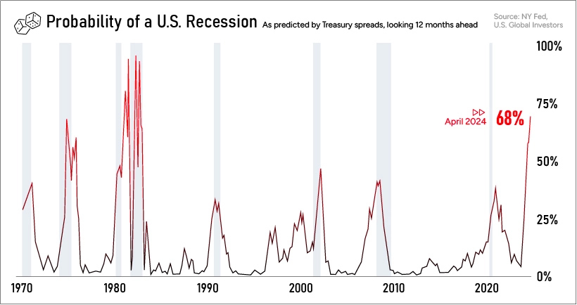
Historically, recessions have increased U.S. deficit spending as tax receipts fall and there is less income to help fund government activities. Additional fiscal stimulus spending can also exacerbate any budget imbalance.
Finally, higher interest rates could spell more trouble for the banking sector, which is already on edge after the collapse of Silicon Valley Bank and Signature Bank.
A rise in interest rates would push down the value of outstanding bonds, which banks hold as capital reserves. This makes it even more challenging to cover deposits, which could further increase uncertainty in the banking industry.
2. Eroding International Credibility
As the world’s reserve currency, any default on U.S. Treasuries would rattle global markets.
If its role as an ultra safe asset is undermined, a chain reaction of negative consequences could spread throughout the global financial system. Often Treasuries are held as collateral. If these debt payments fail to get paid to investors, prices would plummet, demand could crater, and global investors may shift investment elsewhere.
Investors are factoring in the risk of the U.S. not paying its bondholders.
As we can see this in the chart below, U.S. one-year credit default swap (CDS) spreads are much higher than other nations. These CDS instruments, quoted in spreads, offer insurance in the event that the U.S. defaults. The wider the spread, the greater the expected risk that the bondholder won’t be paid.
The US now has higher credit risk than Mexico, Greece, and Brazil pic.twitter.com/je4klBvHZ6
— Genevieve Roch-Decter, CFA (@GRDecter) May 11, 2023
Additionally, a default could add fuel to the perception of global de-dollarization. Since 2001, the USD has slipped from 73% to 58% of global reserves.
Since Russia’s invasion of Ukraine led to steep financial sanctions, China and India are increasingly using their currencies for trade settlement. President of Russia Vladimir Putin says that two-thirds of trade is settled in yuan or roubles. Recently, China has also entered non-dollar agreements with Brazil and Kazakhstan.
3. Financial Sector Turmoil
Back at home, a debt default would hurt investor confidence in the U.S. economy. Coupled with already higher interest rates impacting costs, financial markets could see added strain. Lower investor demand could depress stock prices.
Is the Debt Ceiling Concept Flawed?
Today, U.S. government debt stands at 129% of GDP.
The annualized cost of servicing this debt has jumped an estimated 90% compared to 2011, driven by increasing debt and higher interest rates.
Some economists argue that the debt ceiling helps keep the government more fiscally responsible. Others suggest that it’s structured poorly, and that if the government approves a level of spending in its budget, that debt ceiling increases should come more automatically.
In fact, it’s worth noting that the U.S. is one of the few countries worldwide with a debt ceiling.


Markets
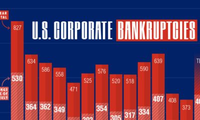
U.S. Debt Interest Payments Reach $1 Trillion
U.S. debt interest payments have surged past the $1 trillion dollar mark, amid high interest rates and an ever-expanding debt burden.


U.S. Debt Interest Payments Reach $1 Trillion
This was originally posted on our Voronoi app. Download the app for free on iOS or Android and discover incredible data-driven charts from a variety of trusted sources.
The cost of paying for America’s national debt crossed the $1 trillion dollar mark in 2023, driven by high interest rates and a record $34 trillion mountain of debt.
Over the last decade, U.S. debt interest payments have more than doubled amid vast government spending during the pandemic crisis. As debt payments continue to soar, the Congressional Budget Office (CBO) reported that debt servicing costs surpassed defense spending for the first time ever this year.
This graphic shows the sharp rise in U.S. debt payments, based on data from the Federal Reserve.
A $1 Trillion Interest Bill, and Growing
Below, we show how U.S. debt interest payments have risen at a faster pace than at another time in modern history:
| Date | Interest Payments | U.S. National Debt |
|---|---|---|
| 2023 | $1.0T | $34.0T |
| 2022 | $830B | $31.4T |
| 2021 | $612B | $29.6T |
| 2020 | $518B | $27.7T |
| 2019 | $564B | $23.2T |
| 2018 | $571B | $22.0T |
| 2017 | $493B | $20.5T |
| 2016 | $460B | $20.0T |
| 2015 | $435B | $18.9T |
| 2014 | $442B | $18.1T |
| 2013 | $425B | $17.2T |
| 2012 | $417B | $16.4T |
| 2011 | $433B | $15.2T |
| 2010 | $400B | $14.0T |
| 2009 | $354B | $12.3T |
| 2008 | $380B | $10.7T |
| 2007 | $414B | $9.2T |
| 2006 | $387B | $8.7T |
| 2005 | $355B | $8.2T |
| 2004 | $318B | $7.6T |
| 2003 | $294B | $7.0T |
| 2002 | $298B | $6.4T |
| 2001 | $318B | $5.9T |
| 2000 | $353B | $5.7T |
| 1999 | $353B | $5.8T |
| 1998 | $360B | $5.6T |
| 1997 | $368B | $5.5T |
| 1996 | $362B | $5.3T |
| 1995 | $357B | $5.0T |
| 1994 | $334B | $4.8T |
| 1993 | $311B | $4.5T |
| 1992 | $306B | $4.2T |
| 1991 | $308B | $3.8T |
| 1990 | $298B | $3.4T |
| 1989 | $275B | $3.0T |
| 1988 | $254B | $2.7T |
| 1987 | $240B | $2.4T |
| 1986 | $225B | $2.2T |
| 1985 | $219B | $1.9T |
| 1984 | $205B | $1.7T |
| 1983 | $176B | $1.4T |
| 1982 | $157B | $1.2T |
| 1981 | $142B | $1.0T |
| 1980 | $113B | $930.2B |
| 1979 | $96B | $845.1B |
| 1978 | $84B | $789.2B |
| 1977 | $69B | $718.9B |
| 1976 | $61B | $653.5B |
| 1975 | $55B | $576.6B |
| 1974 | $50B | $492.7B |
| 1973 | $45B | $469.1B |
| 1972 | $39B | $448.5B |
| 1971 | $36B | $424.1B |
| 1970 | $35B | $389.2B |
| 1969 | $30B | $368.2B |
| 1968 | $25B | $358.0B |
| 1967 | $23B | $344.7B |
| 1966 | $21B | $329.3B |
Interest payments represent seasonally adjusted annual rate at the end of Q4.
At current rates, the U.S. national debt is growing by a remarkable $1 trillion about every 100 days, equal to roughly $3.6 trillion per year.
As the national debt has ballooned, debt payments even exceeded Medicaid outlays in 2023—one of the government’s largest expenditures. On average, the U.S. spent more than $2 billion per day on interest costs last year. Going further, the U.S. government is projected to spend a historic $12.4 trillion on interest payments over the next decade, averaging about $37,100 per American.
Exacerbating matters is that the U.S. is running a steep deficit, which stood at $1.1 trillion for the first six months of fiscal 2024. This has accelerated due to the 43% increase in debt servicing costs along with a $31 billion dollar increase in defense spending from a year earlier. Additionally, a $30 billion increase in funding for the Federal Deposit Insurance Corporation in light of the regional banking crisis last year was a major contributor to the deficit increase.
Overall, the CBO forecasts that roughly 75% of the federal deficit’s increase will be due to interest costs by 2034.

-

 Markets1 week ago
Ranked: The Largest U.S. Corporations by Number of Employees
-

 Green3 weeks ago
Ranked: Top Countries by Total Forest Loss Since 2001
-

 Money2 weeks ago
Where Does One U.S. Tax Dollar Go?
-

 Automotive2 weeks ago
Almost Every EV Stock is Down After Q1 2024
-

 AI2 weeks ago
The Stock Performance of U.S. Chipmakers So Far in 2024
-

 Markets2 weeks ago
Charted: Big Four Market Share by S&P 500 Audits
-

 Real Estate2 weeks ago
Ranked: The Most Valuable Housing Markets in America
-

 Money2 weeks ago
Which States Have the Highest Minimum Wage in America?