Money
The Richest People in Human History, to the Industrial Revolution
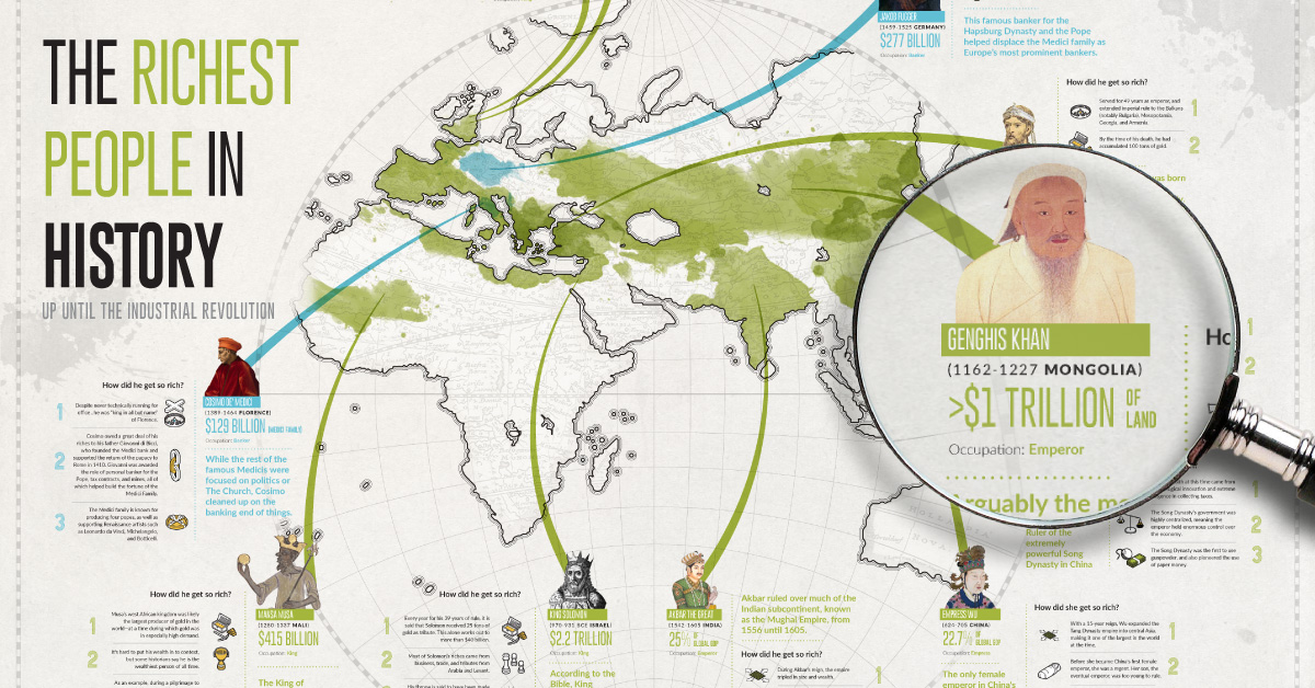
Click here or on the graphic to view the full-screen version.


The Richest People in Human History, to the Industrial Revolution
Click here for a larger, more legible version of the infographic that you can explore in-depth.
When we think of wealth today, we often think of the massive personal fortunes of business magnates like Bill Gates, Elon Musk, Jeff Bezos, or Warren Buffett. However, it is only since the Industrial Revolution that measuring wealth by one’s bank account has been a norm for the world’s richest.
For most of recorded human history, in fact, the lines around wealth were quite blurred. Leaders like Augustus Caesar or Emperor Shenzong had absolute control of their empires—while bankers like Jakob Fogger and Cosimo de Medici were often found pulling the strings from behind.
This infographic we created with Texas Precious Metals focuses on the richest people in history up until the Industrial Revolution, and it highlights key facts and anecdotes on how they created their wealth.
Is This List of People Definitive?
While it is certainly fun to speculate on the wealth of people from centuries past, putting together this list is exceptionally difficult and certainly not definitive.
Here’s why:
Firstly, much wealth in early periods is tied to land (Genghis Khan) or entire empires (Augustus, Akbar), which makes calculations extremely subjective. What is most of Asia’s land worth in the year 1219? What separates personal fortune from the riches of an empire that one has full control of? There are a wide variety of answers to these questions, and they all influence the figures chosen to be represented.
Secondly, records kept from Ancient eras are scarce, exaggerated, or based on legends and oral histories. Think of King Solomon or Mansa Musa—these are characters described as immeasurably rich, so trying to put their wealth in modern context is fun, but certainly not guaranteed to be historically accurate.
Lastly, wealth and conversion rates can be approached in different ways as well. Take Crassus in the Roman Republic, who had a peak fortune of “200 million sesterces”. Well, that’s a problem for us in modernity, because that stash could be worth anywhere from $200 million to $169.8 billion, depending on how calculations are done.
So, enjoy this list of the wealthiest historical figures, but keep in mind that it is mostly for fun—and that the list of the richest people in history may change depending on who you ask!


Money
How Debt-to-GDP Ratios Have Changed Since 2000
See how much the debt-to-GDP ratios of advanced economies have grown (or shrank) since the year 2000.


How Debt-to-GDP Ratios Have Changed Since 2000
This was originally posted on our Voronoi app. Download the app for free on Apple or Android and discover incredible data-driven charts from a variety of trusted sources.
Government debt levels have grown in most parts of the world since the 2008 financial crisis, and even more so after the COVID-19 pandemic.
To gain perspective on this long-term trend, we’ve visualized the debt-to-GDP ratios of advanced economies, as of 2000 and 2024 (estimated). All figures were sourced from the IMF’s World Economic Outlook.
Data and Highlights
The data we used to create this graphic is listed in the table below. “Government gross debt” consists of all liabilities that require payment(s) of interest and/or principal in the future.
| Country | 2000 (%) | 2024 (%) | Change (pp) |
|---|---|---|---|
| 🇯🇵 Japan | 135.6 | 251.9 | +116.3 |
| 🇸🇬 Singapore | 82.3 | 168.3 | +86.0 |
| 🇺🇸 United States | 55.6 | 126.9 | +71.3 |
| 🇬🇧 United Kingdom | 36.6 | 105.9 | +69.3 |
| 🇬🇷 Greece | 104.9 | 160.2 | +55.3 |
| 🇫🇷 France | 58.9 | 110.5 | +51.6 |
| 🇵🇹 Portugal | 54.2 | 104.0 | +49.8 |
| 🇪🇸 Spain | 57.8 | 104.7 | +46.9 |
| 🇸🇮 Slovenia | 25.9 | 66.5 | +40.6 |
| 🇫🇮 Finland | 42.4 | 76.5 | +34.1 |
| 🇭🇷 Croatia | 35.4 | 61.8 | +26.4 |
| 🇨🇦 Canada | 80.4 | 103.3 | +22.9 |
| 🇨🇾 Cyprus | 56.0 | 70.9 | +14.9 |
| 🇦🇹 Austria | 65.7 | 74.0 | +8.3 |
| 🇸🇰 Slovak Republic | 50.5 | 56.5 | +6.0 |
| 🇩🇪 Germany | 59.3 | 64.0 | +4.7 |
| 🇧🇪 Belgium | 109.6 | 106.8 | -2.8 |
| 🇮🇱 Israel | 77.4 | 56.8 | -20.6 |
| 🇮🇸 Iceland | 75.8 | 54.6 | -21.2 |
The debt-to-GDP ratio indicates how much a country owes compared to the size of its economy, reflecting its ability to manage and repay debts. Percentage point (pp) changes shown above indicate the increase or decrease of these ratios.
Countries with the Biggest Increases
Japan (+116 pp), Singapore (+86 pp), and the U.S. (+71 pp) have grown their debt as a percentage of GDP the most since the year 2000.
All three of these countries have stable, well-developed economies, so it’s unlikely that any of them will default on their growing debts. With that said, higher government debt leads to increased interest payments, which in turn can diminish available funds for future government budgets.
This is a rising issue in the U.S., where annual interest payments on the national debt have surpassed $1 trillion for the first time ever.
Only 3 Countries Saw Declines
Among this list of advanced economies, Belgium (-2.8 pp), Iceland (-21.2 pp), and Israel (-20.6 pp) were the only countries that decreased their debt-to-GDP ratio since the year 2000.
According to Fitch Ratings, Iceland’s debt ratio has decreased due to strong GDP growth and the use of its cash deposits to pay down upcoming maturities.
See More Debt Graphics from Visual Capitalist
Curious to see which countries have the most government debt in dollars? Check out this graphic that breaks down $97 trillion in debt as of 2023.

-

 Green2 weeks ago
Ranked: Top Countries by Total Forest Loss Since 2001
-

 Travel1 week ago
Ranked: The World’s Top Flight Routes, by Revenue
-

 Technology1 week ago
Ranked: Semiconductor Companies by Industry Revenue Share
-

 Money2 weeks ago
Which States Have the Highest Minimum Wage in America?
-

 Real Estate2 weeks ago
Ranked: The Most Valuable Housing Markets in America
-

 Markets2 weeks ago
Charted: Big Four Market Share by S&P 500 Audits
-

 AI2 weeks ago
The Stock Performance of U.S. Chipmakers So Far in 2024
-

 Automotive2 weeks ago
Almost Every EV Stock is Down After Q1 2024