Money
Charting the Relationship Between Wealth and Happiness, by Country
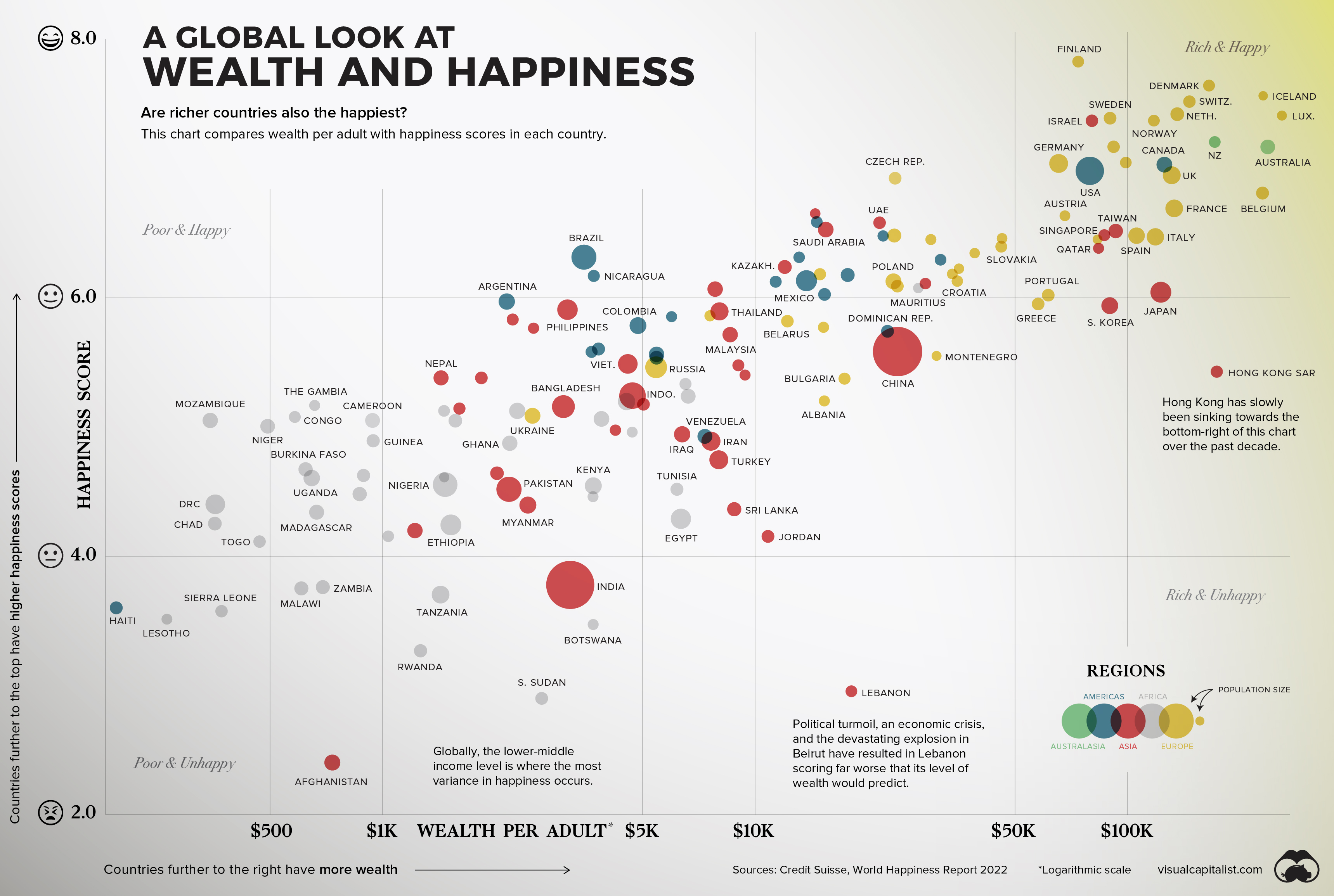


The Relationship Between Wealth and Happiness, by Country
Throughout history, the pursuit of happiness has been a preoccupation of humankind.
Of course, we humans are not just content with measuring our own happiness, but also our happiness in relation to the people around us—and even other people around the world. The annual World Happiness Report, which uses global survey data to report how people evaluate their own lives in more than 150 countries, helps us do just that.
The factors that contribute to happiness are as subjective and specific as the billions of humans they influence, but there are a few that have continued to resonate over time. Family. Love. Purpose. Wealth. The first three examples are tough to measure, but the latter can be analyzed in a data-driven way.
Does money really buy happiness? Let’s find out.
Wealth and Happiness
To crunch the numbers, we looked at data from Credit Suisse, which breaks down the average wealth per adult in various countries around the world.
The table below looks at 146 countries by their happiness score and wealth per adult:
| Country | Median Wealth per Adult (US$) | Happiness Score |
|---|---|---|
| 🇫🇮 Finland | 73,775 | 7.8 |
| 🇩🇰 Denmark | 165,622 | 7.6 |
| 🇮🇸 Iceland | 231,462 | 7.6 |
| 🇨🇭 Switzerland | 146,733 | 7.5 |
| 🇮🇱 Israel | 80,315 | 7.4 |
| 🇸🇪 Sweden | 89,846 | 7.4 |
| 🇳🇴 Norway | 117,798 | 7.4 |
| 🇳🇱 Netherlands | 136,105 | 7.4 |
| 🇱🇺 Luxembourg | 259,899 | 7.4 |
| 🇦🇹 Austria | 91,833 | 7.2 |
| 🇳🇿 New Zealand | 171,624 | 7.2 |
| 🇦🇺 Australia | 238,072 | 7.2 |
| 🇩🇪 Germany | 65,374 | 7.0 |
| 🇺🇸 United States | 79,274 | 7.0 |
| 🇮🇪 Ireland | 99,028 | 7.0 |
| 🇨🇦 Canada | 125,688 | 7.0 |
| 🇨🇿 Czech Republic | 23,794 | 6.9 |
| 🇬🇧 United Kingdom | 131,522 | 6.9 |
| 🇧🇪 Belgium | 230,548 | 6.8 |
| 🇫🇷 France | 133,559 | 6.7 |
| 🇧🇭 Bahrain | 14,520 | 6.6 |
| 🇨🇷 Costa Rica | 14,662 | 6.6 |
| 🇦🇪 United Arab Emirates | 21,613 | 6.6 |
| 🇸🇮 Slovenia | 67,961 | 6.6 |
| 🇸🇦 Saudi Arabia | 15,495 | 6.5 |
| 🇺🇾 Uruguay | 22,088 | 6.5 |
| 🇷🇴 Romania | 23,675 | 6.5 |
| 🇽🇰 Kosovo | 46,087 | 6.5 |
| 🇸🇬 Singapore | 86,717 | 6.5 |
| 🇹🇼 Taiwan | 93,044 | 6.5 |
| 🇪🇸 Spain | 105,831 | 6.5 |
| 🇮🇹 Italy | 118,885 | 6.5 |
| 🇱🇹 Lithuania | 29,679 | 6.4 |
| 🇸🇰 Slovakia | 45,853 | 6.4 |
| 🇶🇦 Qatar | 83,680 | 6.4 |
| 🇲🇹 Malta | 84,390 | 6.4 |
| 🇧🇷 Brazil | 3,469 | 6.3 |
| 🇵🇦 Panama | 13,147 | 6.3 |
| 🇬🇹 Guatemala | 30,586 | 6.3 |
| 🇪🇪 Estonia | 38,901 | 6.3 |
| 🇳🇮 Nicaragua | 3,694 | 6.2 |
| 🇰🇿 Kazakhstan | 12,029 | 6.2 |
| 🇷🇸 Serbia | 14,954 | 6.2 |
| 🇨🇱 Chile | 17,747 | 6.2 |
| 🇱🇻 Latvia | 33,884 | 6.2 |
| 🇨🇾 Cyprus | 35,300 | 6.2 |
| 🇺🇿 Uzbekistan | 7,821 | 6.1 |
| 🇸🇻 El Salvador | 11,372 | 6.1 |
| 🇲🇽 Mexico | 13,752 | 6.1 |
| 🇵🇱 Poland | 23,550 | 6.1 |
| 🇭🇺 Hungary | 24,126 | 6.1 |
| 🇲🇺 Mauritius | 27,456 | 6.1 |
| 🇰🇼 Kuwait | 28,698 | 6.1 |
| 🇭🇷 Croatia | 34,945 | 6.1 |
| 🇦🇷 Argentina | 2,157 | 6.0 |
| 🇭🇳 Honduras | 15,380 | 6.0 |
| 🇵🇹 Portugal | 61,306 | 6.0 |
| 🇯🇵 Japan | 122,980 | 6.0 |
| 🇵🇭 Philippines | 3,155 | 5.9 |
| 🇯🇲 Jamaica | 5,976 | 5.9 |
| 🇲🇩 Moldova | 7,577 | 5.9 |
| 🇹🇭 Thailand | 8,036 | 5.9 |
| 🇬🇷 Greece | 57,595 | 5.9 |
| 🇰🇷 South Korea | 89,671 | 5.9 |
| 🇰🇬 Kyrgyzstan | 2,238 | 5.8 |
| 🇲🇳 Mongolia | 2,546 | 5.8 |
| 🇨🇴 Colombia | 4,854 | 5.8 |
| 🇧🇾 Belarus | 12,168 | 5.8 |
| 🇧🇦 Bosnia and Herzegovina | 15,283 | 5.8 |
| 🇲🇾 Malaysia | 8,583 | 5.7 |
| 🇩🇴 Dominican Republic | 22,701 | 5.7 |
| 🇵🇾 Paraguay | 3,644 | 5.6 |
| 🇧🇴 Bolivia | 3,804 | 5.6 |
| 🇵🇪 Peru | 5,445 | 5.6 |
| 🇨🇳 China | 24,067 | 5.6 |
| 🇻🇳 Vietnam | 4,559 | 5.5 |
| 🇷🇺 Russia | 5,431 | 5.5 |
| 🇪🇨 Ecuador | 5,444 | 5.5 |
| 🇹🇲 Turkmenistan | 9,030 | 5.5 |
| 🇲🇪 Montenegro | 30,739 | 5.5 |
| 🇳🇵 Nepal | 1,437 | 5.4 |
| 🇹🇯 Tajikistan | 1,844 | 5.4 |
| 🇦🇲 Armenia | 9,411 | 5.4 |
| 🇧🇬 Bulgaria | 17,403 | 5.4 |
| 🇭🇰 Hong Kong SAR | 173,768 | 5.4 |
| 🇱🇾 Libya | 6,512 | 5.3 |
| 🇧🇩 Bangladesh | 3,062 | 5.2 |
| 🇿🇦 South Africa | 4,523 | 5.2 |
| 🇮🇩 Indonesia | 4,693 | 5.2 |
| 🇦🇿 Azerbaijan | 5,022 | 5.2 |
| 🇨🇮 Côte d'Ivoire | 6,621 | 5.2 |
| 🇦🇱 Albania | 15,363 | 5.2 |
| 🇲🇰 North Macedonia | 51,788 | 5.2 |
| 🇬🇲 The Gambia | 658 | 5.2 |
| 🇱🇷 Liberia | 1,464 | 5.1 |
| 🇱🇦 Laos | 1,610 | 5.1 |
| 🇩🇿 Algeria | 2,302 | 5.1 |
| 🇺🇦 Ukraine | 2,529 | 5.1 |
| 🇲🇦 Morocco | 3,874 | 5.1 |
| 🇨🇬 Congo | 582 | 5.1 |
| 🇸🇳 Senegal | 1,570 | 5.0 |
| 🇬🇪 Georgia | 4,223 | 5.0 |
| 🇬🇦 Gabon | 4,685 | 5.0 |
| 🇲🇿 Mozambique | 345 | 5.0 |
| 🇳🇪 Niger | 492 | 5.0 |
| 🇨🇲 Cameroon | 941 | 5.0 |
| 🇬🇭 Ghana | 2,198 | 4.9 |
| 🇮🇶 Iraq | 6,378 | 4.9 |
| 🇻🇪 Venezuela | 7,341 | 4.9 |
| 🇮🇷 Iran | 7,621 | 4.9 |
| 🇬🇳 Guinea | 938 | 4.9 |
| 🇹🇷 Turkey | 8,001 | 4.7 |
| 🇧🇫 Burkina Faso | 622 | 4.7 |
| 🇰🇲 Comoros | 1,466 | 4.6 |
| 🇳🇬 Nigeria | 1,474 | 4.6 |
| 🇰🇭 Cambodia | 2,031 | 4.6 |
| 🇺🇬 Uganda | 646 | 4.6 |
| 🇧🇯 Benin | 890 | 4.6 |
| 🇵🇰 Pakistan | 2,187 | 4.5 |
| 🇳🇦 Namibia | 3,677 | 4.5 |
| 🇰🇪 Kenya | 3,683 | 4.5 |
| 🇹🇳 Tunisia | 6,177 | 4.5 |
| 🇲🇱 Mali | 869 | 4.5 |
| 🇲🇲 Myanmar | 2,458 | 4.4 |
| 🇱🇰 Sri Lanka | 8,802 | 4.4 |
| 🇨🇩 DR Congo | 356 | 4.4 |
| 🇪🇬 Egypt | 6,329 | 4.3 |
| 🇹🇩 Chad | 355 | 4.3 |
| 🇲🇬 Madagascar | 666 | 4.3 |
| 🇲🇷 Mauritania | 1,037 | 4.2 |
| 🇾🇪 Yemen | 1,223 | 4.2 |
| 🇪🇹 Ethiopia | 1,527 | 4.2 |
| 🇯🇴 Jordan | 10,842 | 4.2 |
| 🇹🇬 Togo | 468 | 4.1 |
| 🇮🇳 India | 3,194 | 3.8 |
| 🇲🇼 Malawi | 606 | 3.8 |
| 🇿🇲 Zambia | 692 | 3.8 |
| 🇹🇿 Tanzania | 1,433 | 3.7 |
| 🇭🇹 Haiti | 193 | 3.6 |
| 🇸🇱 Sierra Leone | 370 | 3.6 |
| 🇧🇼 Botswana | 3,680 | 3.5 |
| 🇱🇸 Lesotho | 264 | 3.5 |
| 🇷🇼 Rwanda | 1,266 | 3.3 |
| 🇱🇧 Lebanon | 18,159 | 3.0 |
| 🇸🇸 South Sudan | 2,677 | 2.9 |
| 🇦🇫 Afghanistan | 734 | 2.4 |
While the results don’t definitively point to wealth contributing to happiness, there is a strong correlation across the board. Broadly speaking, the world’s poorest countries have the lowest happiness scores, and the richest report being the most happy.
Regional and Country-Level Observations
While many of the countries follow an obvious trend (more wealth = more happiness), there are nuances and outliers worth exploring.
- In Latin America, people self-report more happiness than the trend between wealth and happiness would predict.
- On the flip side, many nations in the Middle East report slightly less happiness than levels of wealth would predict.
- Political turmoil, an economic crisis, and the devastating explosion in Beirut have resulted in Lebanon scoring far worse than would be expected. Over the past decade, the country’s score has fallen by nearly two full points.
- Hong Kong has seen its happiness score sink for years now. Inequality, protests, instability, and now COVID-19 outbreaks have placed the region in an unusual zone on the chart: rich and unhappy.
Examining Inequality and Happiness
We’ve looked at the relationship between wealth and happiness between countries, but what about within countries?
The Gini Coefficient is a tool that allows us to do just that. This measure looks at income distribution across a population, and applies a score to that population. Simply put, a score of 0 would be “perfect equality”, and 1 would be “perfect inequality” (i.e. an individual or group of recipients is receiving the entire income distribution).
Combined with the same happiness scale as before, this is how countries shape up.
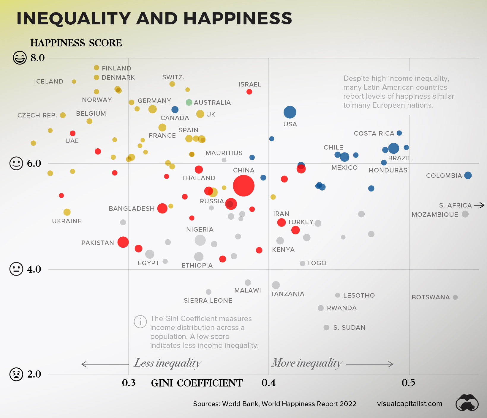
While there is no ironclad conclusion that can be derived from this dataset, there are big picture observations worth highlighting.
The 15 Countries With Highest Income Inequality
| Countries with High inequality | Happiness Score | Gini Score |
|---|---|---|
| 🇿🇦 South Africa | 5.2 | 0.63 |
| 🇳🇦 Namibia | 4.5 | 0.59 |
| 🇿🇲 Zambia | 3.8 | 0.57 |
| 🇨🇴 Colombia | 5.8 | 0.54 |
| 🇲🇿 Mozambique | 5.0 | 0.54 |
| 🇧🇼 Botswana | 3.5 | 0.53 |
| 🇿🇼 Zimbabwe | 3.0 | 0.50 |
| 🇵🇦 Panama | 6.3 | 0.50 |
| 🇨🇷 Costa Rica | 6.6 | 0.49 |
| 🇧🇷 Brazil | 6.3 | 0.49 |
| 🇬🇹 Guatemala | 6.3 | 0.48 |
| 🇭🇳 Honduras | 6.0 | 0.48 |
| 🇧🇫 Burkina Faso | 4.7 | 0.47 |
| 🇪🇨 Ecuador | 5.5 | 0.47 |
| 🇨🇲 Cameroon | 5.0 | 0.47 |
| Average | 5.2 | 52 |
First, countries with lower income inequality tend to also report more happiness. The 15 countries in this dataset with the highest inequality (shown above) have an average happiness score 1.3 lower than the 15 countries with the lowest inequality (shown below).
The 15 Countries With Lowest Income Inequality
| Countries with low inequality | Happy Score | Gini Score |
|---|---|---|
| 🇸🇰 Slovakia | 6.4 | 23.2 |
| 🇧🇾 Belarus | 5.8 | 24.4 |
| 🇸🇮 Slovenia | 6.6 | 24.4 |
| 🇦🇲 Armenia | 5.4 | 25.2 |
| 🇨🇿 Czech Republic | 6.9 | 25.3 |
| 🇺🇦 Ukraine | 5.1 | 25.6 |
| 🇲🇩 Moldova | 5.9 | 26 |
| 🇦🇪 United Arab Emirates | 6.6 | 26 |
| 🇮🇸 Iceland | 7.6 | 26.1 |
| 🇧🇪 Belgium | 6.8 | 27.2 |
| 🇩🇰 Denmark | 7.6 | 27.7 |
| 🇫🇮 Finland | 7.8 | 27.7 |
| 🇳🇴 Norway | 7.4 | 27.7 |
| 🇰🇿 Kazakhstan | 6.2 | 27.8 |
| 🇭🇷 Croatia | 6.1 | 28.9 |
| Average | 6.5 | 26 |
Next, interesting regional differences emerge.
Despite high income inequality, many Latin American countries report levels of happiness similar to many much-wealthier European nations.
The Bottom Line
People have been seeking understanding on happiness for millennia now, and it’s unlikely that slicing and dicing datasets will crack the code. Still though, much like the pursuit of happiness, the pursuit of understanding is human nature.
And, in more concrete terms, the more policymakers and the public understand the link between wealth and happiness, the more likely we can shape societies that give us a better chance at living a happy life.
Where does this data come from?
Source: Credit Suisse Global Wealth Databook 2021, World Happiness Report 2022, World Bank
Data notes: This visualization includes countries that had available data for both happiness and wealth per adult. Credit Suisse notes that due to incomplete data, the following countries are estimates of average wealth per adult: North Macedonia, Kosovo, Guatemala, Dominican Republic, Honduras, Uzbekistan, Côte d’Ivoire, and South Sudan. Happiness data for countries is from the 2022 report, with the exception of: Qatar, DRC, Haiti, and South Sudan, which pull from the 2019 report. For Gini Coefficient calculations, only countries with data from 2014 onward were included. As a result, major economies such as India and Japan are excluded from that visualization.
Chart note: The wealth axis was plotted logarithmically to better show the trend visually. This approach is often used when a small number of results skew the visualization, making it harder to glean insight from. In this case, there are large extremes between the richest and poorest countries around the world.


Money
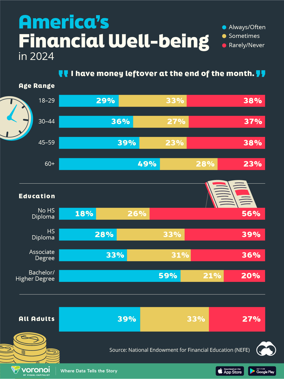
Charted: Who Has Savings in This Economy?
Older, better-educated adults are winning the savings game, reveals a January survey by the National Opinion Research Center at the University of Chicago.
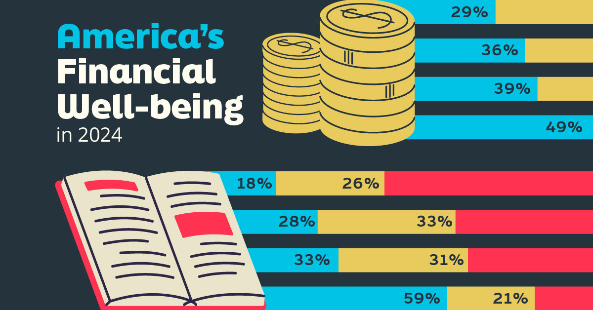
Who Has Savings in This Economy?
This was originally posted on our Voronoi app. Download the app for free on iOS or Android and discover incredible data-driven charts from a variety of trusted sources.
Two full years of inflation have taken their toll on American households. In 2023, the country’s collective credit card debt crossed $1 trillion for the first time. So who is managing to save money in the current economic environment?
We visualize the percentage of respondents to the statement “I have money leftover at the end of the month” categorized by age and education qualifications. Data is sourced from a National Endowment for Financial Education (NEFE) report, published last month.
The survey for NEFE was conducted from January 12-14, 2024, by the National Opinion Research Center at the University of Chicago. It involved 1,222 adults aged 18+ and aimed to be representative of the U.S. population.
Older Americans Save More Than Their Younger Counterparts
General trends from this dataset indicate that as respondents get older, a higher percentage of them are able to save.
| Age | Always/Often | Sometimes | Rarely/Never |
|---|---|---|---|
| 18–29 | 29% | 33% | 38% |
| 30–44 | 36% | 27% | 37% |
| 45–59 | 39% | 23% | 38% |
| Above 60 | 49% | 28% | 23% |
| All Adults | 39% | 33% | 27% |
Note: Percentages are rounded and may not sum to 100.
Perhaps not surprisingly, those aged 60+ are the age group with the highest percentage saying they have leftover money at the end of the month. This age group spent the most time making peak earnings in their careers, are more likely to have investments, and are more likely to have paid off major expenses like a mortgage or raising a family.
The Impact of Higher Education on Earnings and Savings
Based on this survey, higher education dramatically improves one’s ability to save. Shown in the table below, those with a bachelor’s degree or higher are three times more likely to have leftover money than those without a high school diploma.
| Education | Always/Often | Sometimes | Rarely/Never |
|---|---|---|---|
| No HS Diploma | 18% | 26% | 56% |
| HS Diploma | 28% | 33% | 39% |
| Associate Degree | 33% | 31% | 36% |
| Bachelor/Higher Degree | 59% | 21% | 20% |
| All Adults | 39% | 33% | 27% |
Note: Percentages are rounded and may not sum to 100.
As the Bureau of Labor Statistics notes, earnings improve with every level of education completed.
For example, those with a high school diploma made 25% more than those without in 2022. And as the qualifications increase, the effects keep stacking.
Meanwhile, a Federal Reserve study also found that those with more education tended to make financial decisions that contributed to building wealth, of which the first step is to save.

-

 Green1 week ago
Ranked: The Countries With the Most Air Pollution in 2023
-

 Automotive2 weeks ago
Almost Every EV Stock is Down After Q1 2024
-

 AI2 weeks ago
The Stock Performance of U.S. Chipmakers So Far in 2024
-

 Markets2 weeks ago
Charted: Big Four Market Share by S&P 500 Audits
-

 Real Estate2 weeks ago
Ranked: The Most Valuable Housing Markets in America
-

 Money2 weeks ago
Which States Have the Highest Minimum Wage in America?
-

 AI2 weeks ago
Ranked: Semiconductor Companies by Industry Revenue Share
-

 Travel2 weeks ago
Ranked: The World’s Top Flight Routes, by Revenue