Markets
Ranked: The Best and Worst Pension Plans, by Country


Ranked: Countries with the Best and Worst Pension Plans
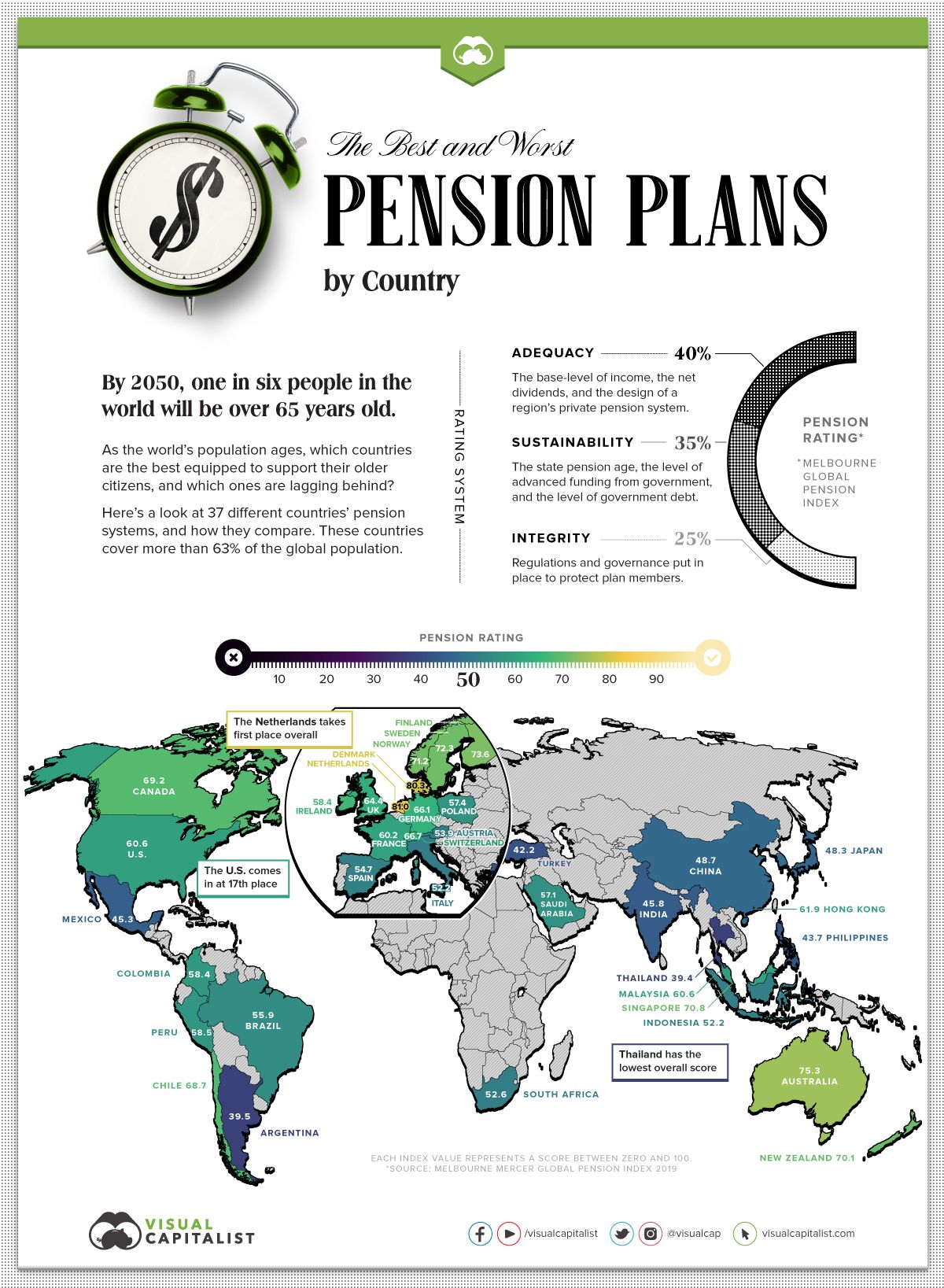
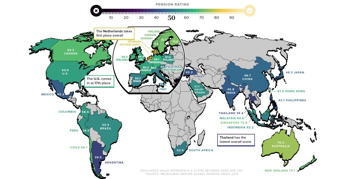
The global population is aging—by 2050, one in six people will be over the age of 65.
As our aging population nears retirement and gets closer to cashing in their pensions, countries need to ensure their pension systems can withstand the extra strain.
This graphic uses data from the Melbourne Mercer Global Pension Index (MMGPI) to showcase which countries are best equipped to support their older citizens, and which ones aren’t.
The Breakdown
Each country’s pension system has been shaped by its own economic and historical context. This makes it difficult to draw precise comparisons between countries—yet there are certain universal elements that typically lead to adequate and stable support for older citizens.
MMGPI organized these universal elements into three sub-indexes:
- Adequacy: The base-level of income, as well as the design of a region’s private pension system.
- Sustainability: The state pension age, the level of advanced funding from government, and the level of government debt.
- Integrity: Regulations and governance put in place to protect plan members.
These three measures were used to rank the pension system of 37 different countries, representing over 63% of the world’s population.
Here’s how each country ranked:
| Country | Overall Value | Adequacy | Sustainability | Integrity |
|---|---|---|---|---|
| Argentina | 39.5 | 43.1 | 31.9 | 44.4 |
| Australia | 75.3 | 70.3 | 73.5 | 85.7 |
| Austria | 53.9 | 68.2 | 22.9 | 74.4 |
| Brazil | 55.9 | 71.8 | 27.7 | 69.8 |
| Canada | 69.2 | 70 | 61.8 | 78.2 |
| Chile | 68.7 | 59.4 | 71.7 | 79.2 |
| China | 48.7 | 60.5 | 36.7 | 46.5 |
| Colombia | 58.4 | 61.4 | 46 | 70.8 |
| Denmark | 80.3 | 77.5 | 82 | 82.2 |
| Finland | 73.6 | 73.2 | 60.7 | 92.3 |
| France | 60.2 | 79.1 | 41 | 56.8 |
| Germany | 66.1 | 78.3 | 44.9 | 76.4 |
| Hong Kong | 61.9 | 54.5 | 54.5 | 86.9 |
| India | 45.8 | 39.9 | 44.9 | 56.3 |
| Indonesia | 52.2 | 46.7 | 47.6 | 67.5 |
| Ireland | 67.3 | 81.5 | 44.6 | 76.3 |
| Italy | 52.2 | 67.4 | 19 | 74.5 |
| Japan | 48.3 | 54.6 | 32.2 | 60.8 |
| Korea | 49.8 | 47.5 | 52.6 | 49.6 |
| Malaysia | 60.6 | 50.5 | 60.5 | 76.9 |
| Mexico | 45.3 | 37.5 | 57.1 | 41.3 |
| Netherlands | 81 | 78.5 | 78.3 | 88.9 |
| New Zealand | 70.1 | 70.9 | 61.5 | 80.7 |
| Norway | 71.2 | 71.6 | 56.8 | 90.6 |
| Peru | 58.5 | 60 | 52.4 | 64.7 |
| Philippines | 43.7 | 39 | 55.5 | 34.7 |
| Poland | 57.4 | 62.5 | 45.3 | 66 |
| Saudi Arabia | 57.1 | 59.6 | 50.5 | 62.2 |
| Singapore | 70.8 | 73.8 | 59.7 | 81.4 |
| South Africa | 52.6 | 42.3 | 46 | 78.4 |
| Spain | 54.7 | 70 | 26.9 | 69.1 |
| Sweden | 72.3 | 67.5 | 72 | 80.2 |
| Switzerland | 66.7 | 57.6 | 65.4 | 83 |
| Thailand | 39.4 | 35.8 | 38.8 | 46.1 |
| Turkey | 42.2 | 42.6 | 27.1 | 62.8 |
| UK | 64.4 | 60 | 55.3 | 84 |
| U.S. | 60.6 | 58.8 | 62.9 | 60.4 |
The Importance of Sustainability
While all three sub-indexes are important to consider when ranking a country’s pension system, sustainability is particularly significant in the modern context. This is because our global population is increasingly skewing older, meaning an influx of people will soon be cashing in their retirement funds. As a consequence, countries need to ensure their pension systems are sustainable over the long-term.
There are several factors that affect a pension system’s sustainability, including a region’s private pension system, the state pension age, and the balance between workers and retirees.
The country with the most sustainable pension system is Denmark. Not only does the country have a strong basic pension plan—it also has a mandatory occupational scheme, which means employers are obligated by law to provide pension plans for their employees.
Adequacy versus Sustainability
Several countries scored high on adequacy but ranked low when it came to sustainability. Here’s a comparison of both measures, and how each country scored:
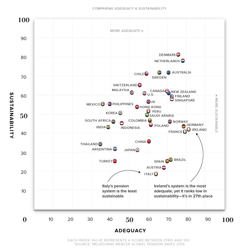
Ireland took first place for adequacy, but scored relatively low on the sustainability front at 27th place. This can be partly explained by Ireland’s low level of occupational coverage. The country also has a rapidly aging population, which skews the ratio of workers to retirees. By 2050, Ireland’s worker to retiree ratio is estimated to go from 5:1 to 2:1.
Similar to Ireland, Spain ranks high in adequacy but places extremely low in sustainability.
There are several possible explanations for this—while occupational pension schemes exist, they are optional and participation is low. Spain also has a low fertility rate, which means their worker-to-retiree ratio is expected to decrease.
Steps Towards a Better System
All countries have room for improvement—even the highest-ranking ones. Some general recommendations from MMGPI on how to build a better pension system include:
- Increasing the age of retirement: Helps maintain a more balanced worker-to-retiree ratio.
- Enforcing mandatory occupational schemes: Makes employers obligated to provide pension plans for their employees.
- Limiting access to benefits: Prevents people from dipping into their savings preemptively, thus preserving funds until retirement.
- Establishing strong pension assets to fund future liabilities: Ideally, these assets are more than 100% of a country’s GDP.
Pension systems across the globe are under an increasing amount of pressure. It’s time for countries to take a hard look at their pension systems to make sure they’re ready to support their aging population.


Markets
U.S. Debt Interest Payments Reach $1 Trillion
U.S. debt interest payments have surged past the $1 trillion dollar mark, amid high interest rates and an ever-expanding debt burden.


U.S. Debt Interest Payments Reach $1 Trillion
This was originally posted on our Voronoi app. Download the app for free on iOS or Android and discover incredible data-driven charts from a variety of trusted sources.
The cost of paying for America’s national debt crossed the $1 trillion dollar mark in 2023, driven by high interest rates and a record $34 trillion mountain of debt.
Over the last decade, U.S. debt interest payments have more than doubled amid vast government spending during the pandemic crisis. As debt payments continue to soar, the Congressional Budget Office (CBO) reported that debt servicing costs surpassed defense spending for the first time ever this year.
This graphic shows the sharp rise in U.S. debt payments, based on data from the Federal Reserve.
A $1 Trillion Interest Bill, and Growing
Below, we show how U.S. debt interest payments have risen at a faster pace than at another time in modern history:
| Date | Interest Payments | U.S. National Debt |
|---|---|---|
| 2023 | $1.0T | $34.0T |
| 2022 | $830B | $31.4T |
| 2021 | $612B | $29.6T |
| 2020 | $518B | $27.7T |
| 2019 | $564B | $23.2T |
| 2018 | $571B | $22.0T |
| 2017 | $493B | $20.5T |
| 2016 | $460B | $20.0T |
| 2015 | $435B | $18.9T |
| 2014 | $442B | $18.1T |
| 2013 | $425B | $17.2T |
| 2012 | $417B | $16.4T |
| 2011 | $433B | $15.2T |
| 2010 | $400B | $14.0T |
| 2009 | $354B | $12.3T |
| 2008 | $380B | $10.7T |
| 2007 | $414B | $9.2T |
| 2006 | $387B | $8.7T |
| 2005 | $355B | $8.2T |
| 2004 | $318B | $7.6T |
| 2003 | $294B | $7.0T |
| 2002 | $298B | $6.4T |
| 2001 | $318B | $5.9T |
| 2000 | $353B | $5.7T |
| 1999 | $353B | $5.8T |
| 1998 | $360B | $5.6T |
| 1997 | $368B | $5.5T |
| 1996 | $362B | $5.3T |
| 1995 | $357B | $5.0T |
| 1994 | $334B | $4.8T |
| 1993 | $311B | $4.5T |
| 1992 | $306B | $4.2T |
| 1991 | $308B | $3.8T |
| 1990 | $298B | $3.4T |
| 1989 | $275B | $3.0T |
| 1988 | $254B | $2.7T |
| 1987 | $240B | $2.4T |
| 1986 | $225B | $2.2T |
| 1985 | $219B | $1.9T |
| 1984 | $205B | $1.7T |
| 1983 | $176B | $1.4T |
| 1982 | $157B | $1.2T |
| 1981 | $142B | $1.0T |
| 1980 | $113B | $930.2B |
| 1979 | $96B | $845.1B |
| 1978 | $84B | $789.2B |
| 1977 | $69B | $718.9B |
| 1976 | $61B | $653.5B |
| 1975 | $55B | $576.6B |
| 1974 | $50B | $492.7B |
| 1973 | $45B | $469.1B |
| 1972 | $39B | $448.5B |
| 1971 | $36B | $424.1B |
| 1970 | $35B | $389.2B |
| 1969 | $30B | $368.2B |
| 1968 | $25B | $358.0B |
| 1967 | $23B | $344.7B |
| 1966 | $21B | $329.3B |
Interest payments represent seasonally adjusted annual rate at the end of Q4.
At current rates, the U.S. national debt is growing by a remarkable $1 trillion about every 100 days, equal to roughly $3.6 trillion per year.
As the national debt has ballooned, debt payments even exceeded Medicaid outlays in 2023—one of the government’s largest expenditures. On average, the U.S. spent more than $2 billion per day on interest costs last year. Going further, the U.S. government is projected to spend a historic $12.4 trillion on interest payments over the next decade, averaging about $37,100 per American.
Exacerbating matters is that the U.S. is running a steep deficit, which stood at $1.1 trillion for the first six months of fiscal 2024. This has accelerated due to the 43% increase in debt servicing costs along with a $31 billion dollar increase in defense spending from a year earlier. Additionally, a $30 billion increase in funding for the Federal Deposit Insurance Corporation in light of the regional banking crisis last year was a major contributor to the deficit increase.
Overall, the CBO forecasts that roughly 75% of the federal deficit’s increase will be due to interest costs by 2034.

-

 Real Estate2 weeks ago
Visualizing America’s Shortage of Affordable Homes
-

 Technology1 week ago
Ranked: Semiconductor Companies by Industry Revenue Share
-

 Money1 week ago
Which States Have the Highest Minimum Wage in America?
-

 Real Estate1 week ago
Ranked: The Most Valuable Housing Markets in America
-

 Business1 week ago
Charted: Big Four Market Share by S&P 500 Audits
-

 AI2 weeks ago
The Stock Performance of U.S. Chipmakers So Far in 2024
-

 Misc2 weeks ago
Almost Every EV Stock is Down After Q1 2024
-

 Money2 weeks ago
Where Does One U.S. Tax Dollar Go?