Misc
The Problem With Our Maps
Maps shape our understanding of the world—and in an increasingly interconnected and global economy, this geographic knowledge is more important than ever.
Unfortunately, billions of people around the world have a skewed perception of the true size of countries thanks to a cartographic technique called the Mercator projection. Used just about everywhere, from classroom wall maps to navigation apps, the Mercator projection is the way most of humanity recognizes the position and size of Earth’s continents.
The Mercator Projection
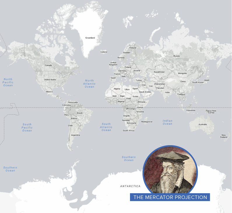
In 1569, the great cartographer, Gerardus Mercator, created a revolutionary new map based on a cylindrical projection. The new map was well-suited to nautical navigation since every line on the sphere is a constant course, or loxodrome. In modern times, this is particularly useful since the Earth can be depicted in a seamless way in online mapping applications.
That said, in this projection style, the sizes of landmasses become increasingly distorted the further away from the equator they get. One trade-off for the utility of Mercator’s map is that it pumps up the sizes of Europe and North America. Visually speaking, Canada and Russia appear to take up approximately 25% of the Earth’s landmass, when in reality they occupy a mere 5%. When Antarctica is excluded (as it often is), Canada and Russia’s visual share of landmass jumps to about 40%.
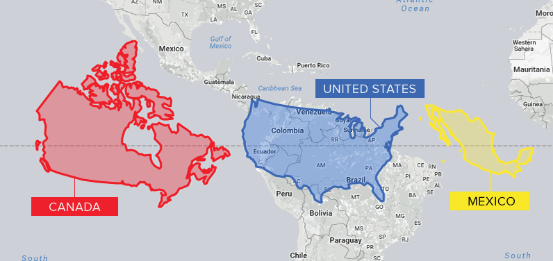
Canada is the second largest country in the world, but not by much. Here is an “at scale” look at Canada, the United States, and Mexico.
Africa, South Asia, and South America all appear much smaller in relation to countries further from the equator.
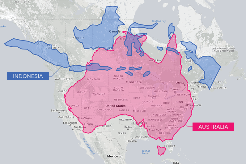
And from a North American perspective, countries such as Australia and Indonesia appear much smaller than they actually are. Comparing the landmasses on the same latitude as Canada helps put sizes into perspective.
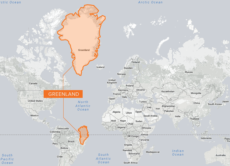
Greenland is the world’s largest island, but looking at its hyper-exaggerated depiction in the map below, you’d be forgiven for wondering why it isn’t a stand-alone continent. In reality, Greenland is about fourteen times smaller than Africa.
Is Bigger Better?
Though Mercator’s map was never intended for use as the default wall map in schools around the world, it has shaped the worldviews of billions of people. Critics of the map—and similar projections—suggest that distortion reinforces a sense of colonialist superiority. As well, the amount of territory a country occupies is often correlated with power and access to natural resources, and map distortions can have the effect of inadvertently diminishing nations closer to the equator.
In our society we unconsciously equate size with importance and even power. – Salvatore Natoli, Educational Affairs Director, AAG
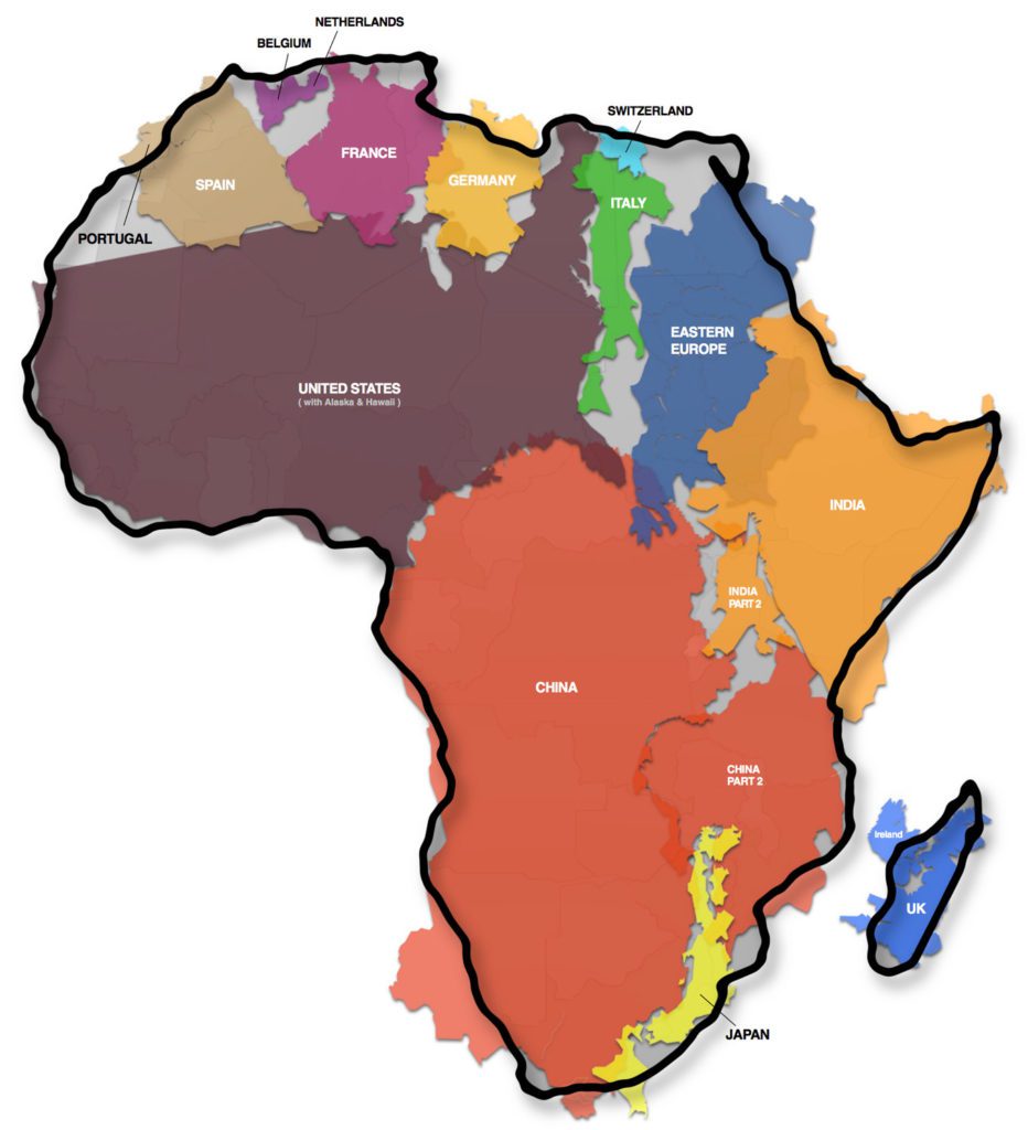
A prime example of this argument is the “True Size of Africa” graphic, which demonstrated to millions of people just how big the continent is.
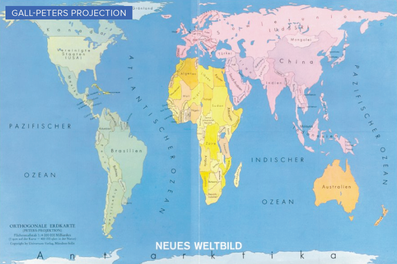
Growing awareness of map distortion is translating into concrete change. Boston public schools, for example, recently switched to the Gall-Peters projection, which more accurately depicts the true size of landmasses.
As well, Google, whose map app is used by approximately one billion people per month, took the bold step of using different projections for different purposes in 2018. The Earth is depicted as a globe at further zoom levels, sidestepping map projection issues completely and displaying the world as it actually is: round.
The Road to Equal-Area Mapping
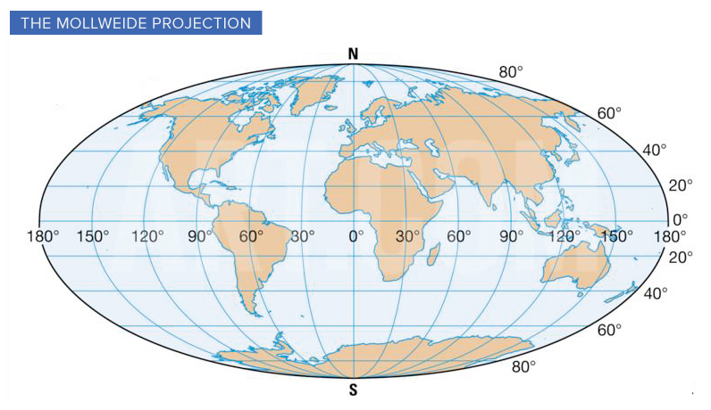
In 1805, mathematician and astronomer, Karl Mollweide, created a namesake projection that trades accuracy of angles and shape for accuracy of proportion. The Mollweide projection has inspired many other attempts at a user-friendly equal area map.
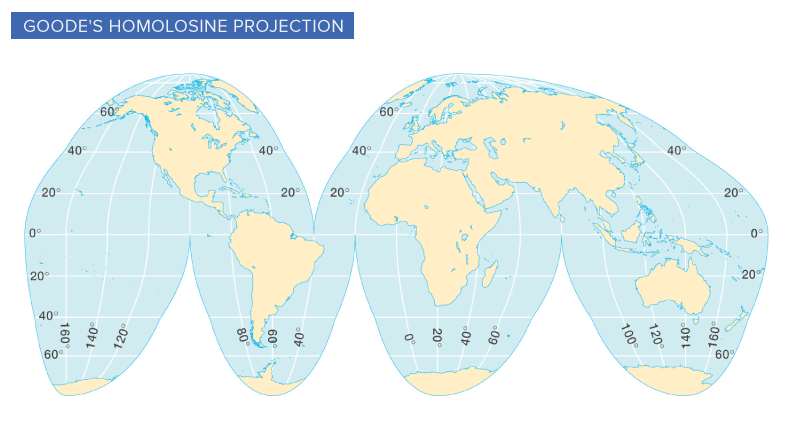
John Paul Goode’s attempt, known as the Goode Homolosine Projection, took this concept a step further by adding interruptions at strategic locations to help reduce the distortion of continents. The resulting shape is sometimes referred to as an “orange peel map”.
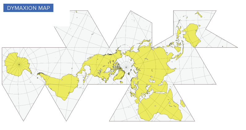
Another evolution in cartography was the Dymaxion map, invented by Buckminster Fuller and patented in 1946. In this version, the continents are no longer in their familiar positions—however, there is more spacial fidelity than in previous projection methods. We’re able to see the true proportions of Africa, Northern Canada, Antarctica, and other distortion hot spots.
The Dymaxion map wasn’t created for purely practical purposes. Fuller believed that humans would be better equipped to address global challenges if they were given a way to visualize the Earth’s continents in a contiguous manner.
The AuthaGraph Map
Using a new map-making method called AuthaGraph, Japanese architect, Hajime Narukawa, may have created the most accurate map of the world yet. AuthaGraph divides the globe into 96 triangles, transfers them to a tetrahedron and unfolds into a rectangle.
The end result? Landmasses and seas are more accurately proportioned than in traditional projections.
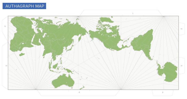
The biggest downfall of the AuthaGraph map is that longitude and latitude lines are no longer a tidy grid. As well, continents on the map are repositioned in a way that will be unfamiliar to a population that is already geographically challenged.
That said, depicting our round world on a flat surface will always come with some trade-offs. As demand grows for a true equal-area map, it will be exciting to see what the next generation of map projections have to offer.
Map It Yourself
Looking to learn more about maps and map projections? This fantastic tool, created by Florian Ledermann, allows users to take a vast selection of projection styles, and modify them in different ways. This hands-on approach is a fun way to learn how the shape of landmasses shift as the projection changes.


Misc
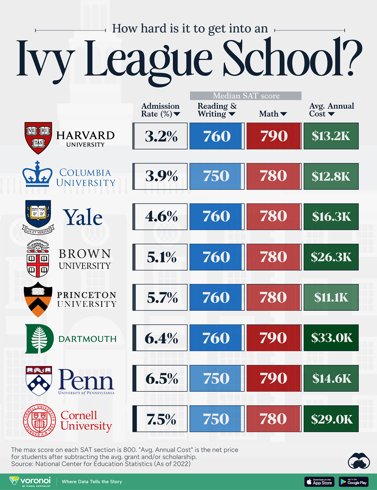
How Hard Is It to Get Into an Ivy League School?
We detail the admission rates and average annual cost for Ivy League schools, as well as the median SAT scores required to be accepted.
How Hard Is It to Get Into an Ivy League School?
This was originally posted on our Voronoi app. Download the app for free on iOS or Android and discover incredible data-driven charts from a variety of trusted sources.
Ivy League institutions are renowned worldwide for their academic excellence and long-standing traditions. But how hard is it to get into one of the top universities in the U.S.?
In this graphic, we detail the admission rates and average annual cost for Ivy League schools, as well as the median SAT scores required to be accepted. The data comes from the National Center for Education Statistics and was compiled by 24/7 Wall St.
Note that “average annual cost” represents the net price a student pays after subtracting the average value of grants and/or scholarships received.
Harvard is the Most Selective
The SAT is a standardized test commonly used for college admissions in the United States. It’s taken by high school juniors and seniors to assess their readiness for college-level academic work.
When comparing SAT scores, Harvard and Dartmouth are among the most challenging universities to gain admission to. The median SAT scores for their students are 760 for reading and writing and 790 for math. Still, Harvard has half the admission rate (3.2%) compared to Dartmouth (6.4%).
| School | Admission rate (%) | SAT Score: Reading & Writing | SAT Score: Math | Avg Annual Cost* |
|---|---|---|---|---|
| Harvard University | 3.2 | 760 | 790 | $13,259 |
| Columbia University | 3.9 | 750 | 780 | $12,836 |
| Yale University | 4.6 | 760 | 780 | $16,341 |
| Brown University | 5.1 | 760 | 780 | $26,308 |
| Princeton University | 5.7 | 760 | 780 | $11,080 |
| Dartmouth College | 6.4 | 760 | 790 | $33,023 |
| University of Pennsylvania | 6.5 | 750 | 790 | $14,851 |
| Cornell University | 7.5 | 750 | 780 | $29,011 |
*Costs after receiving federal financial aid.
Additionally, Dartmouth has the highest average annual cost at $33,000. Princeton has the lowest at $11,100.
While student debt has surged in the United States in recent years, hitting $1.73 trillion in 2023, the worth of obtaining a degree from any of the schools listed surpasses mere academics. This is evidenced by the substantial incomes earned by former students.
Harvard grads, for example, have the highest average starting salary in the country, at $91,700.

-

 Real Estate2 weeks ago
Visualizing America’s Shortage of Affordable Homes
-

 Technology1 week ago
Ranked: Semiconductor Companies by Industry Revenue Share
-

 Money1 week ago
Which States Have the Highest Minimum Wage in America?
-

 Real Estate1 week ago
Ranked: The Most Valuable Housing Markets in America
-

 Business1 week ago
Charted: Big Four Market Share by S&P 500 Audits
-

 AI2 weeks ago
The Stock Performance of U.S. Chipmakers So Far in 2024
-

 Misc2 weeks ago
Almost Every EV Stock is Down After Q1 2024
-

 Money2 weeks ago
Where Does One U.S. Tax Dollar Go?