Tracking Gallup survey data for more than a decade reveals some countries are witnessing big happiness declines, reflecting their shifting...


click for more →


Scan with your phone's camera or QR code app to view
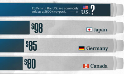

This visualization compares EpiPen prices around the world, with the U.S. having the highest prices by far.


From athletes and musicians to actors and celebrity personalities, here are the top 10 most followed people on Instagram.


Advanced economies are the happiest countries for older people, likely due to their stronger social security systems.


We visualize Asia’s population patterns to see where 4.6 billion people, or two-thirds of the world’s population, actually live.
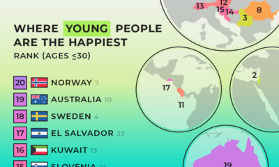

We summarized results from the World Happiness Report 2024 to see where young people are the happiest.
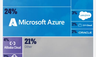

Cloud computing service providers generated $270 billion in revenues last year, concentrated among a few giants.
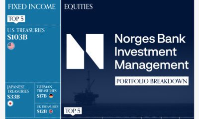

This graphic breaks down the portfolio of the world's largest sovereign wealth fund, valued at $1.4 trillion.
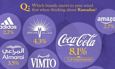

Ramadan is the ninth month of the Islamic calendar, observed by Muslims worldwide as a month of fasting, prayer, reflection, and community.


The 12 worst investment funds have destroyed $56 billion in shareholder wealth over the past decade, as of Dec. 2023.
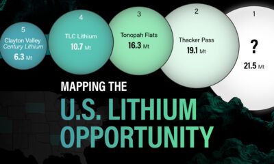

In this graphic, Visual Capitalist partnerered with EnergyX to explore the size and location of U.S. lithium mines.
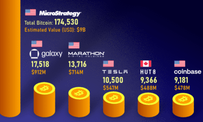

From MicroStrategy to Tesla, this graphic shows who holds the most bitcoins globally across corporate companies.


Japan’s birth rate has been declining. Here, we illustrate the number of live births each year compared to the number of annual deaths.
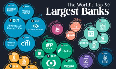

How big are the world's biggest banks? In this visualization, we show the top 50 banks by assets and headquarters location.


With trillion dollar valuations becoming more common, we've compared the five biggest companies by stock exchange.
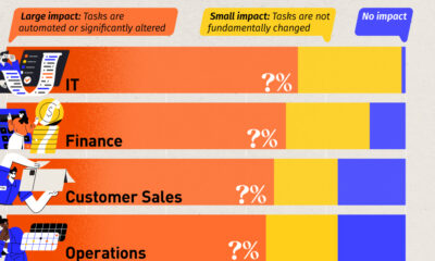

We visualized the results of an analysis by the World Economic Forum, which uncovered the jobs most impacted by AI.
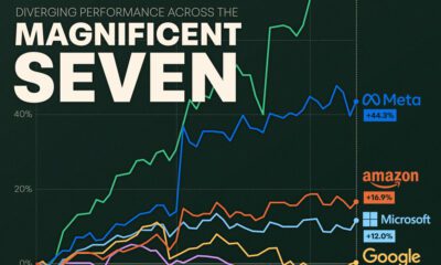

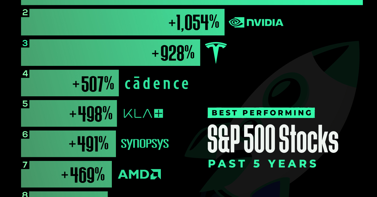
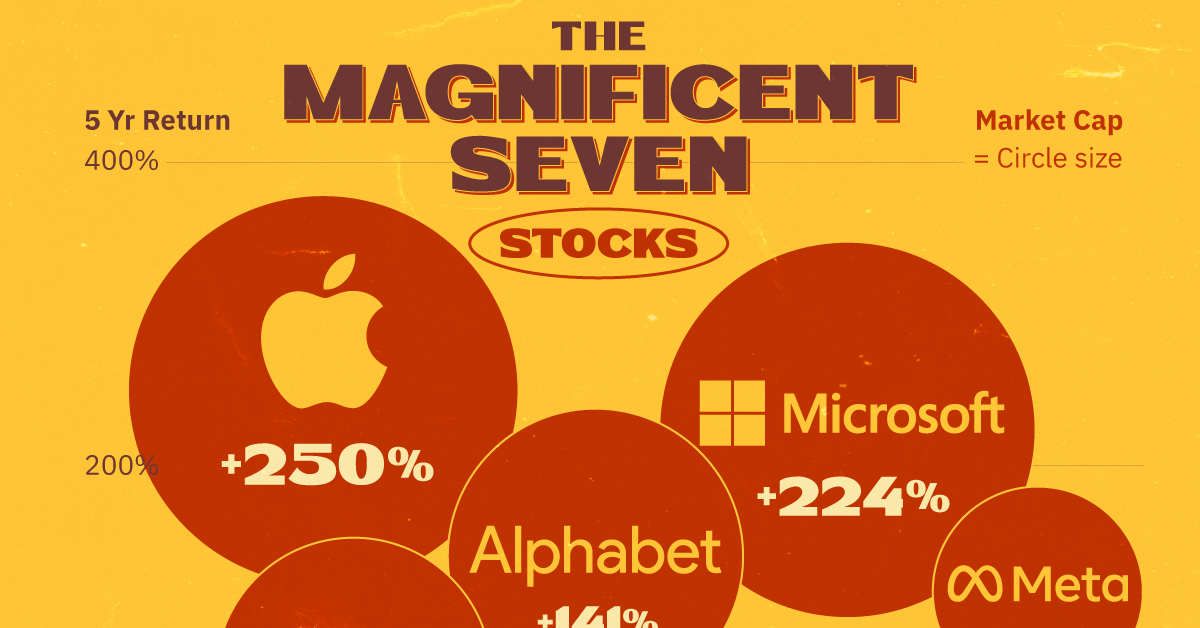
We visualize the recent performance of the Magnificent Seven stocks, uncovering a clear divergence between the group's top and bottom names.