Jin Medical, the top IPO of the year, is set to be delisted due to a listing rule violation.


click for more →


Scan with your phone's camera or QR code app to view
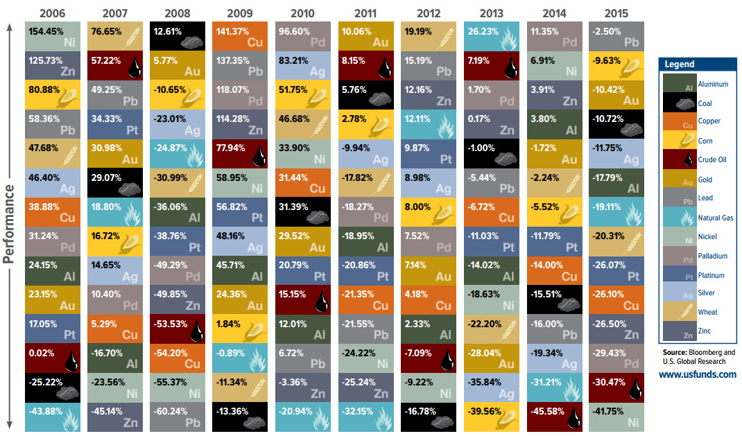
How investments in commodities have fared over the last decade, summarized in "The Periodic Table of Commodity Returns".


The media landscape is changing. Here's how native advertising is replacing the oversaturated market for traditional ads.
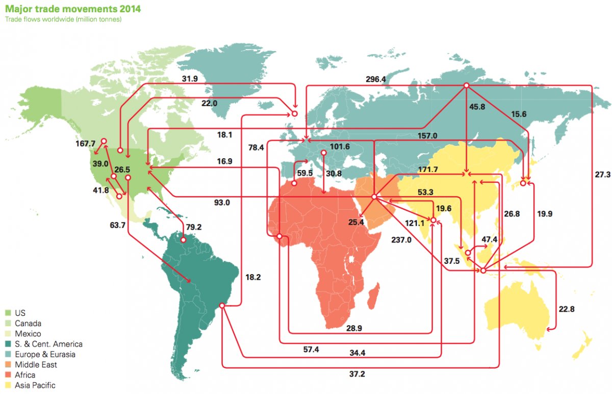
Every day, 93 million barrels of oil are consumed by the global economy. How does this oil change hands? This map visualizes the global oil trade.

Hyperinflation has happened hundreds of times throughout history, but today we present the origins of the world's most famous case in Germany after WW1.
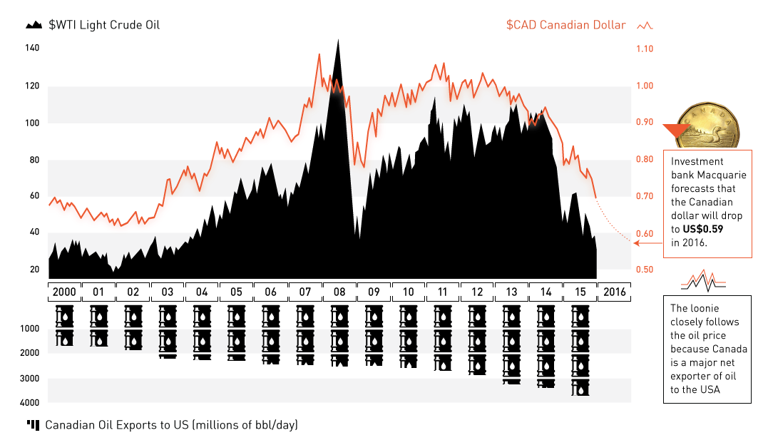
The oil plunge has wreaked havoc on the Canadian dollar. Now at 13-yr lows and expected to go lower, we explain the relationship between oil and...
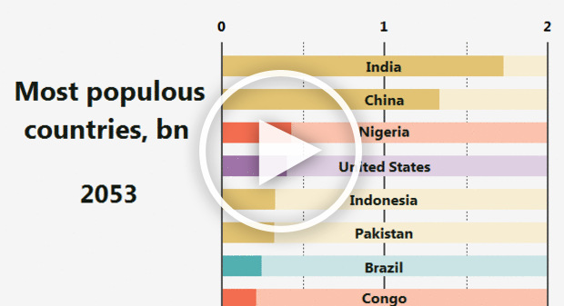
This animation shows how the ranking for the most populous countries in the world will change over more than 100 years.
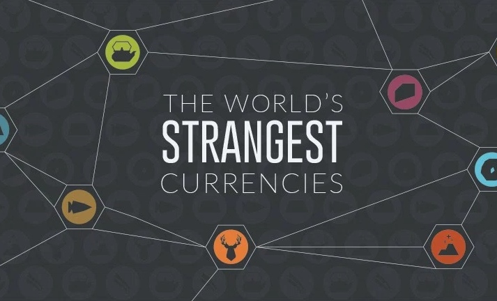
For centuries, humans from all around the world have tried to use different things as money. Here are some of the world's strangest currencies used so...
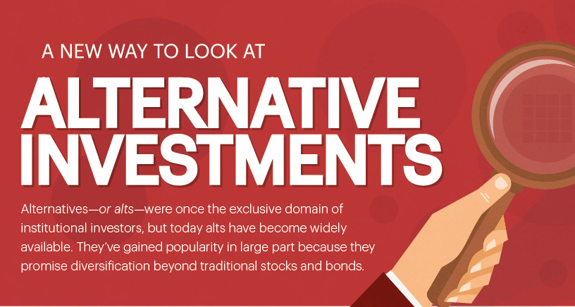
For decades, hedge fund style strategies have been used almost exclusively by wealthiest investors. Here's how regular investors can use similar tactics.

What are the world's most valuable substances? This infographic looks at everything ranging from Iranian beluga caviar to rare metals and gemstones to find out.
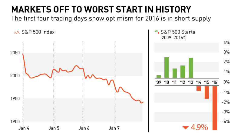
In this chart and post, we show why markets are off to their worst start in history. We also look at recent S&P 500 starts to...
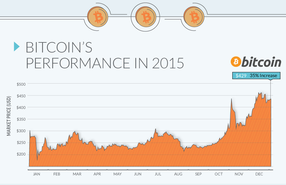
In a year that the US dollar gained on most currencies, it was the digital cryptocurrency Bitcoin that was the top performer by a significant margin.
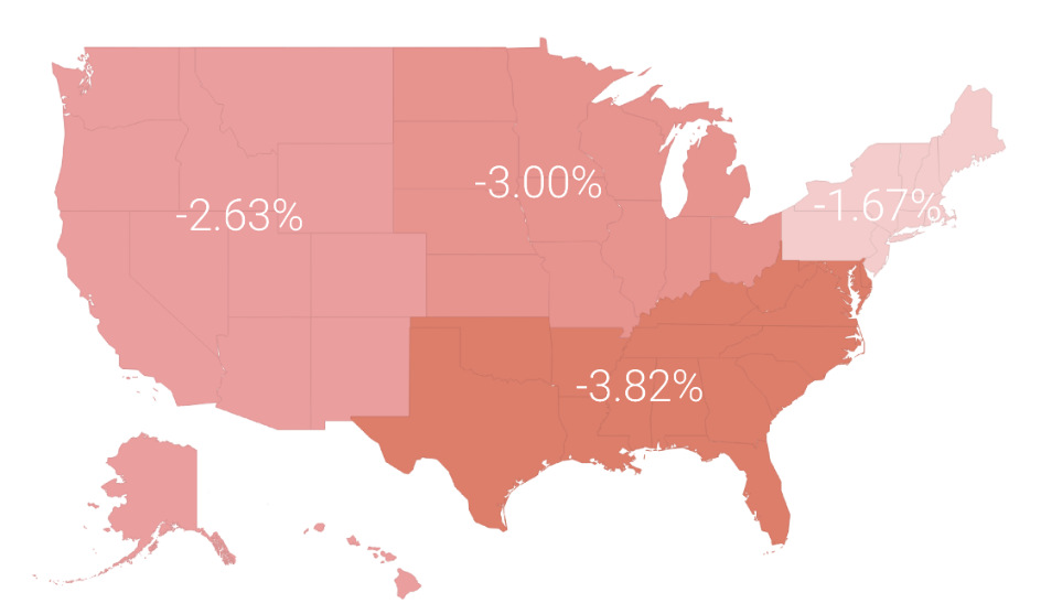
In a volatile market in 2015, the average investor lost 3.1%. In today's post, we break this performance down by region, profession, and age.

The most important stories from the world of science and technology span topics including robotics, AI, genetics, space exploration, energy storage, and more.
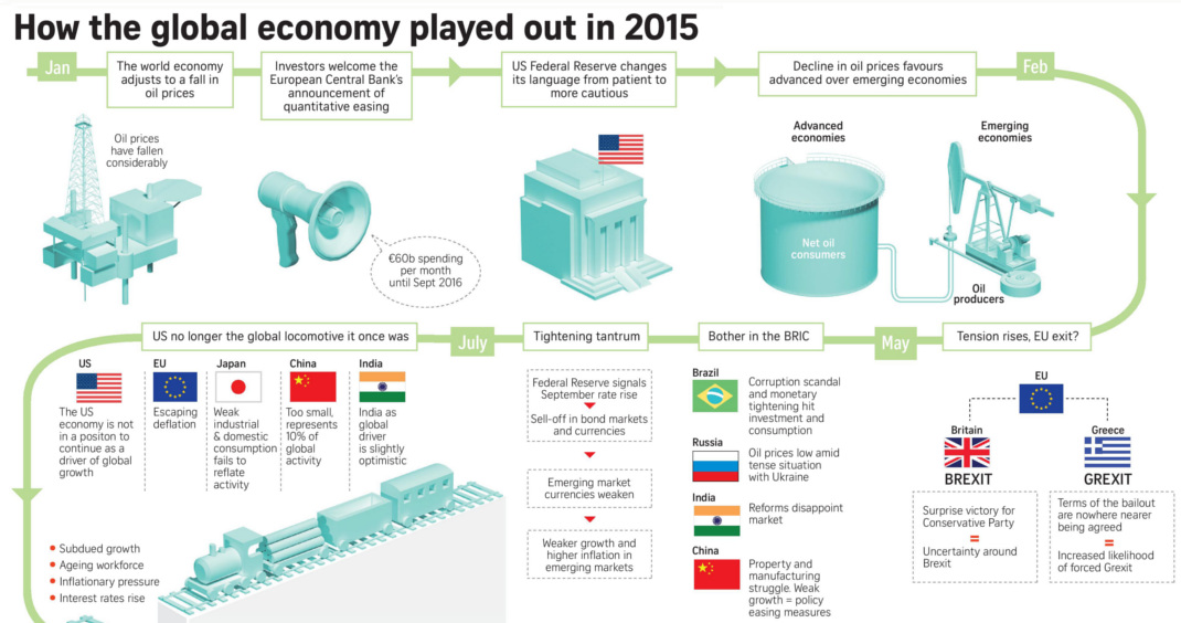
This infographic recaps economic events and sentiment in 2015. Should investors approach the new year with renewed optimism or brace for volatility?

Put down your turkey leftovers - it's time to recap Visual Capitalist's top 15 infographics, data visualizations, and charts of 2015.
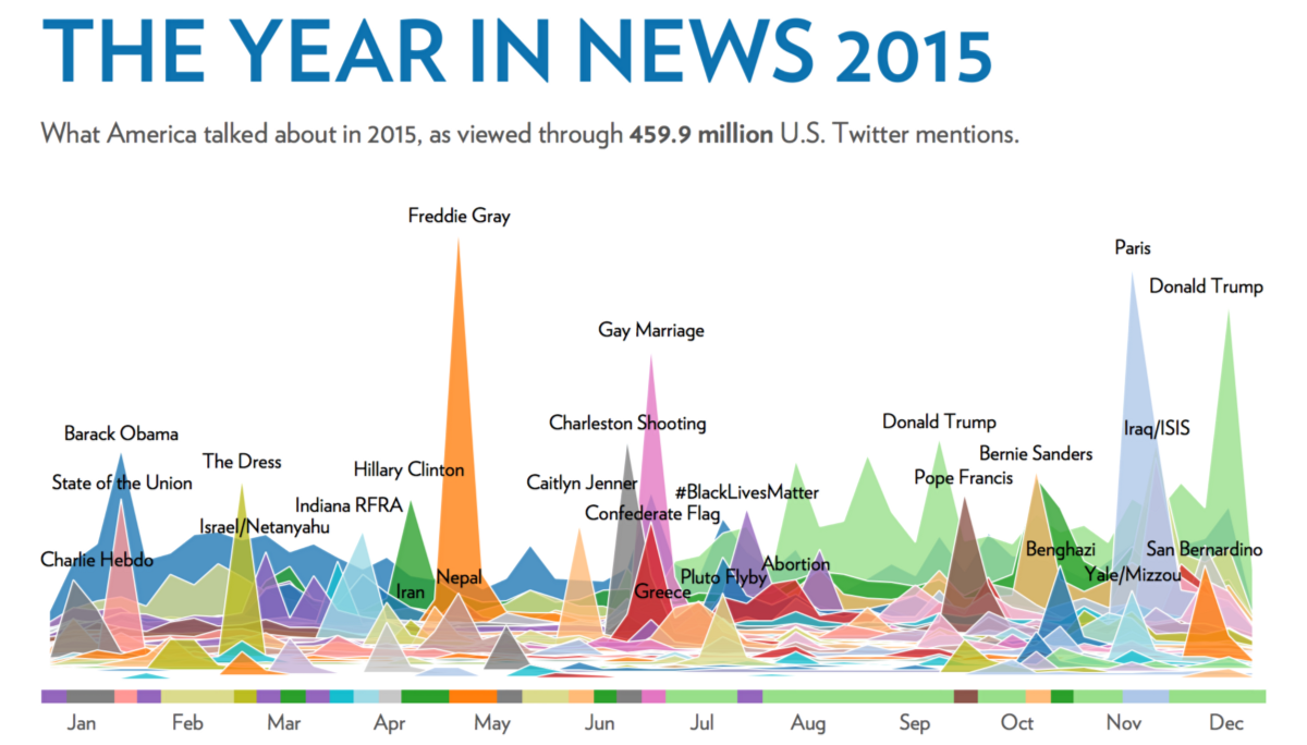
This visualization analyzes 459.9 million tweets over the course of the year to show the magnitude and timing of trending news stories in 2015.

Projecting the future of technology is notoriously hard. This infographic celebrates many of the failed tech predictions of the past made by famous people.