
The earthquake that shook buildings across New York in April 2024 was the third-largest quake in the Northeast U.S. over...


click for more →


Scan with your phone's camera or QR code app to view
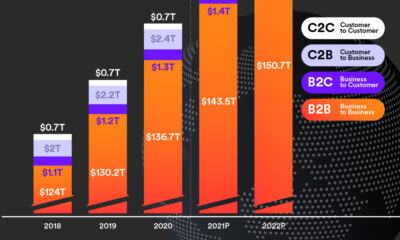

Cross-border payments grew to $150 trillion in 2022—nearly 30x the size of the global tech industry—and could hit $250 trillion by 2027.


Get Visual Capitalist's new app, Voronoi, and discover the world's most interesting data and stories, all on one trusted platform.
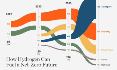

In the race to net zero, demand for hydrogen could increase to 430 Mt p.a. by 2050, but will supply be there when the world needs...
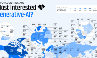

These graphics highlight interest in generative AI by country, covering interest in text, image, video, or audio generation.
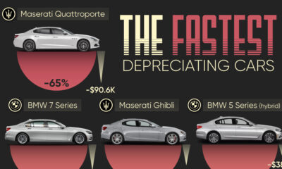

We visualize which cars depreciate the fastest based on the rate their value drops over five years. Spoiler: luxury cars don't do well.
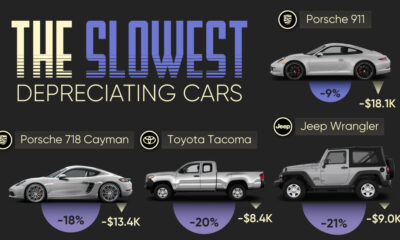

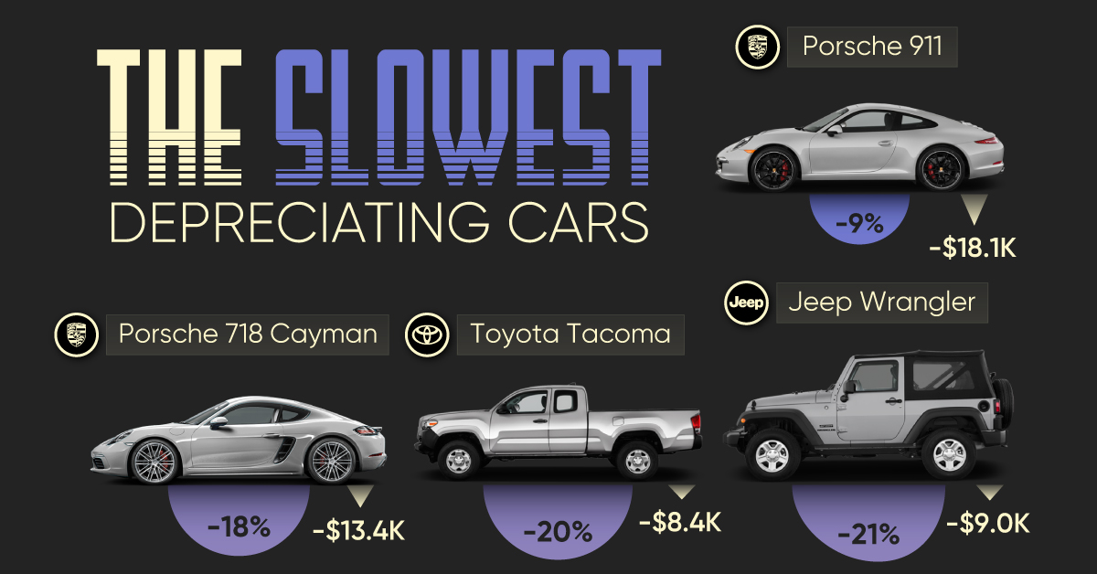
We visualize which cars have the best resale value based on the rate their value drops over five years. Spoiler: Porsche is King.
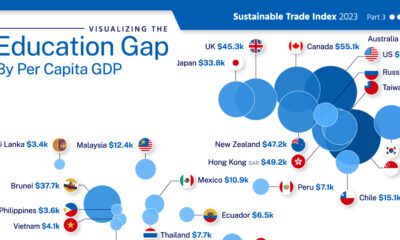

This graphic adds visual context to the global education gap, using data from 29 major economies.
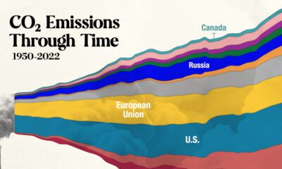

In this streamgraph, we break down global CO2 emissions between 1950 and 2022 using data from Berkeley Earth and Global Carbon Project.
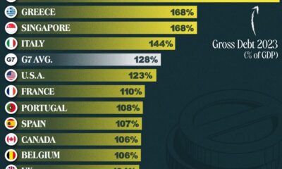

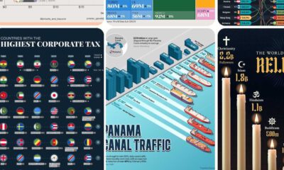
This graphic ranks government debt by country for advanced economies, using their gross debt-to-GDP ratio.
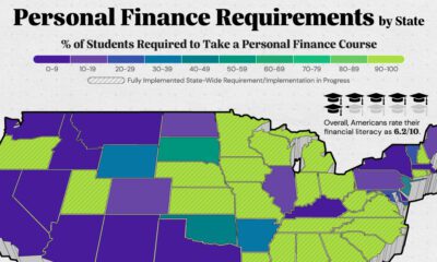

Here are the states that require high school students to take a personal finance course in order to graduate.
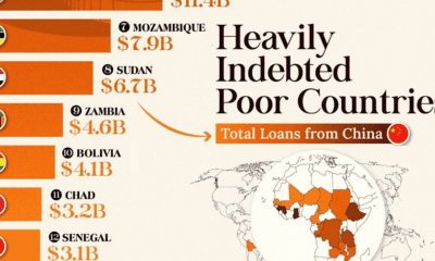

This infographic lists countries in Africa and other developing regions that received billions in loans from China.
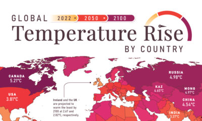

In this set of three maps, we show the global temperature rise on a national level for 2022, 2050, and 2100 based on an analysis by...
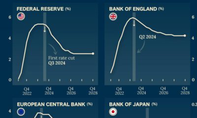

Which economies are expected to see interest rates rise, or fall? We highlight IMF forecasts for international interest rates through 2028.


Donald Trump, Mitt Romney, J.B. Pritzker. This infographic is a snapshot of the richest politicians in the U.S.
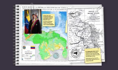

In this series of maps, we explain the dispute that has spanned nearly two centuries over the vast Essequibo region.
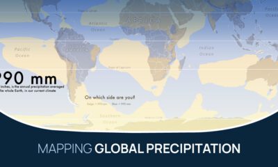

What does the global precipitation map look like if we split it in two, one half with below average rainfall and the other above?
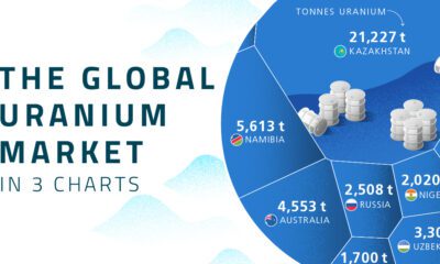

Four countries account for over 70% of global uranium production.


 Creator Program