We visualize the 20 largest consumer markets in the world in 2030—from Asian giants to North and South American powerhouses.


click for more →


Scan with your phone's camera or QR code app to view
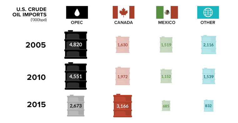
Canada is in, and OPEC is out. In this week's chart on oil imports, we also look at the declining influence of the world's most infamous...
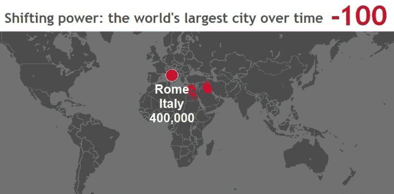
These stunning animations and interactive maps show the changing title for the world's largest city, as well as the rapid pace of urbanization in today's world.

Everything you ever wanted to know about consumer debt in one infographic. We show the historical context, as well as the latest numbers for each category.
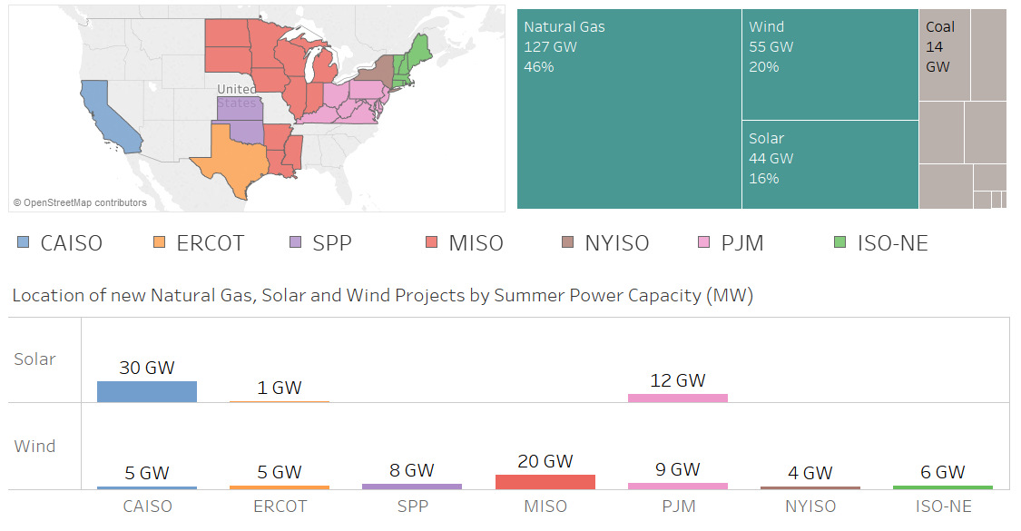
Nearly 100 GW of new power coming online is from solar and wind, making up 36% of new electrical capacity being added in these jurisdictions.
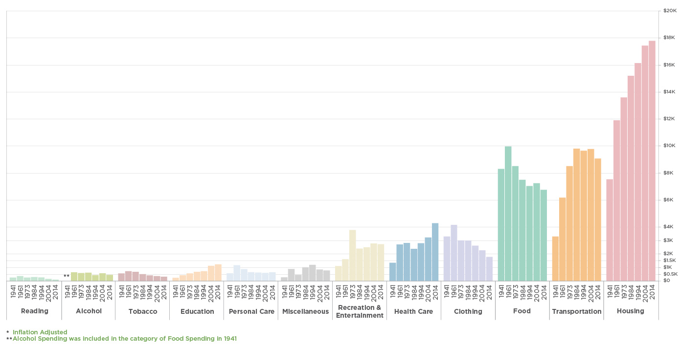
Consumers are the foundation of the economy, and how they spend money is telling. See what's changed with how Americans spend their money over the years.
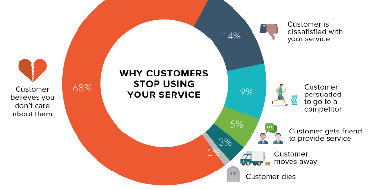
An astonishing two-thirds of your customers leave because they think you don't care about them. Here's how to change that.
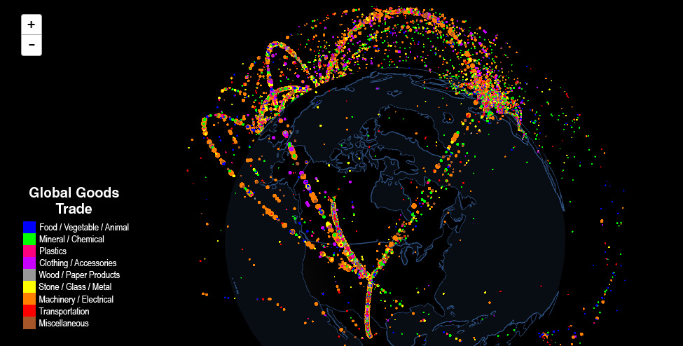
Use this interactive map to explore fascinating data on international trade. Which countries trade with each other, and which are stuck as hermits?
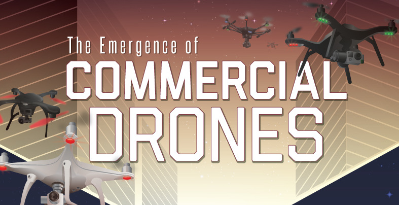
The market for commercial drones is soaring at an astonishing 19% annual growth rate - see the history of drones, and how they will impact you.

Tech is breaking down barriers to entry as the world's healthcare demands continue to grow. Here's how to capitalize on this industry's period of flux.
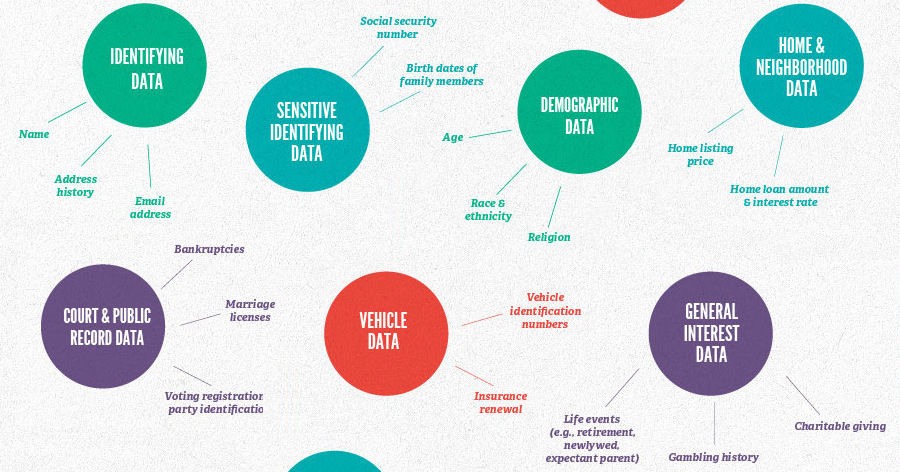
Services like Google and Facebook may seem free, but they actually come at a cost: your personal data. Find out what it's worth to marketers and...
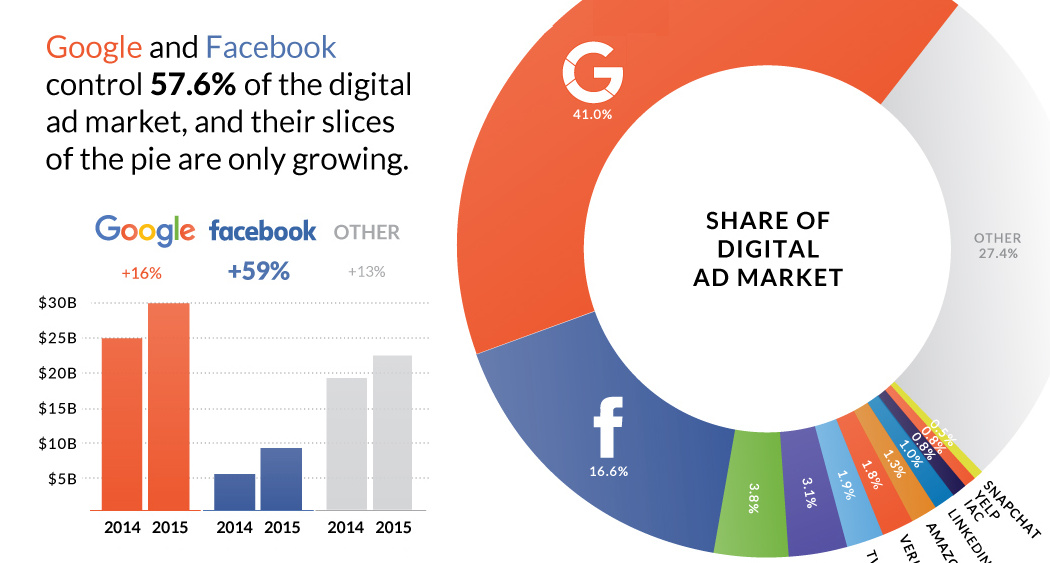
Nearly $0.60 of every $1.00 spent on digital advertising goes to Google and Facebook.
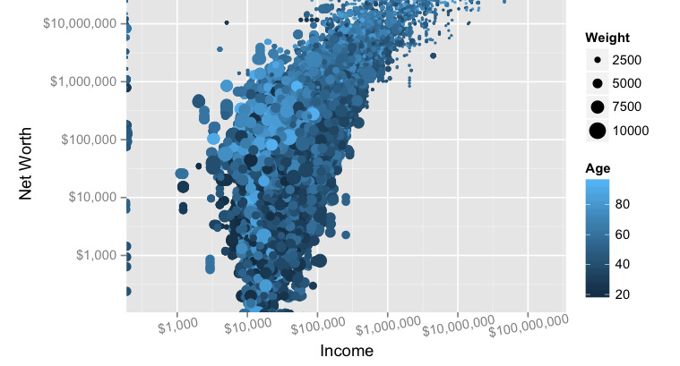
Does making a lot of money translate to actual net worth? We look at the data, and the link (or lack thereof) between income and wealth...
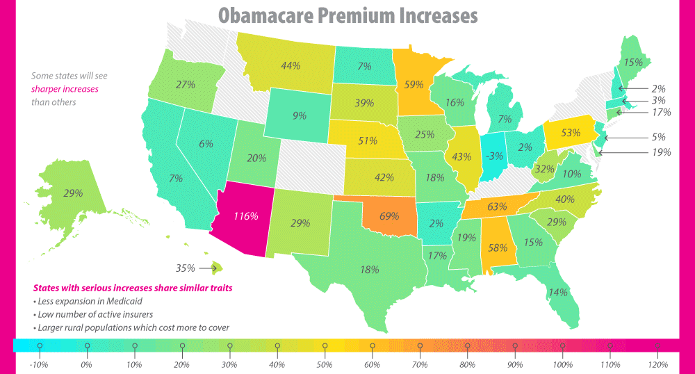
The future of Obamacare is uncertain, to say the least. See the major issues that have surfaced, including the skyrocketing premiums, in this infographic.
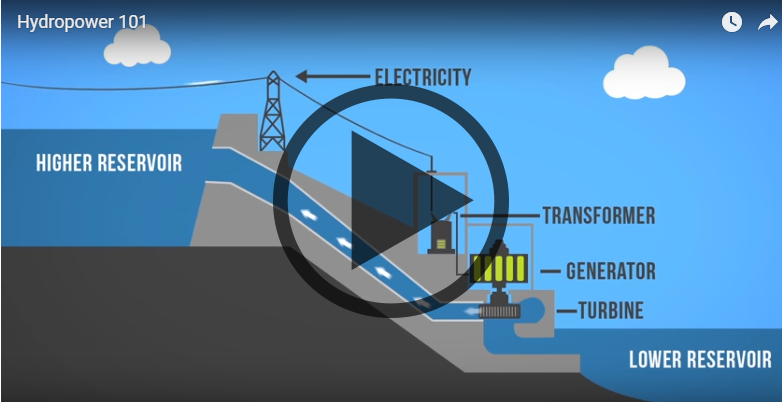
Want to learn about how different energy sources work? Check out these short, fact-driven videos on topics like oil, hydro, solar, wind, LNG, or fracking.
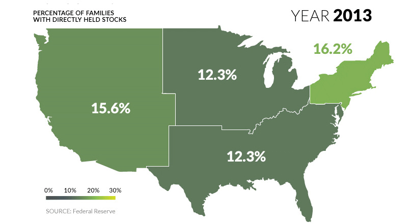
U.S. markets continue to hit all-time highs, but what percentage of population actually benefits? See stock ownership across the U.S. on this animated map.
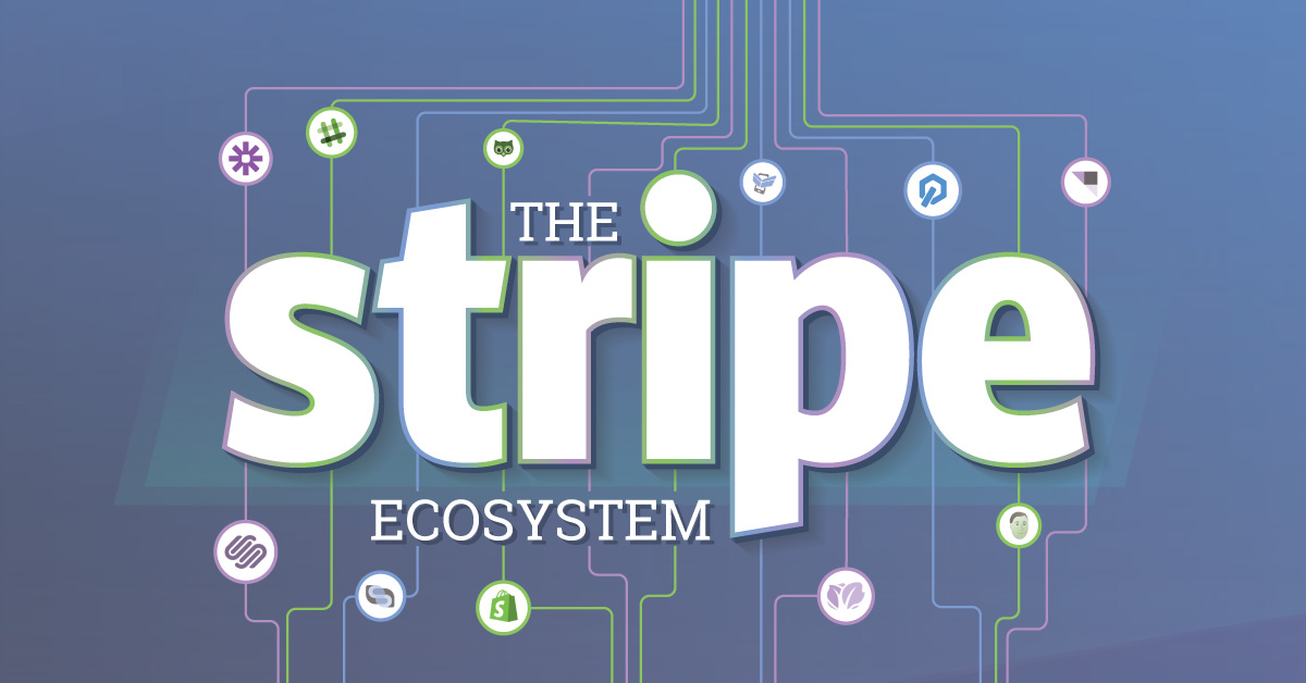
Why is payments startup Stripe worth $9B? Partly, because it's made it so easy to tap into the backend, allowing the creation of a massive Stripe...
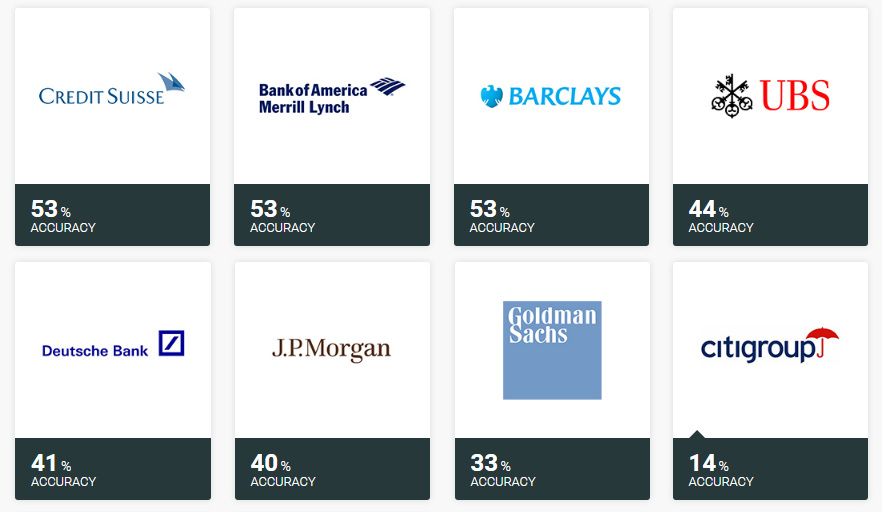
Ever wonder how accurate investment banks are with their stock picks? Here's the answer to that question, and it's not pretty.