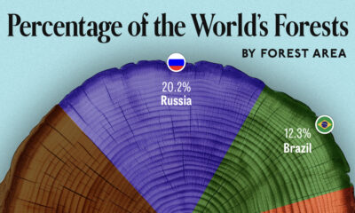
We visualize which countries have the biggest share of world forests by area—and while country size plays a factor, so...


click for more →


Scan with your phone's camera or QR code app to view
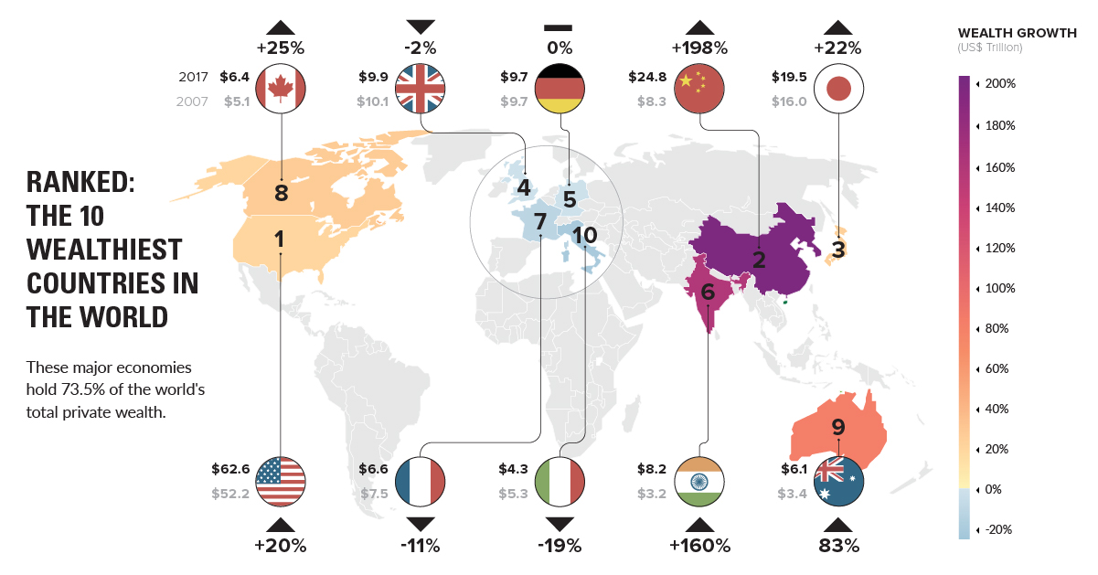
We break down the wealthiest countries in the world, which hold a whopping 73.5% of all private wealth. Also, a projection of future wealth in 10...
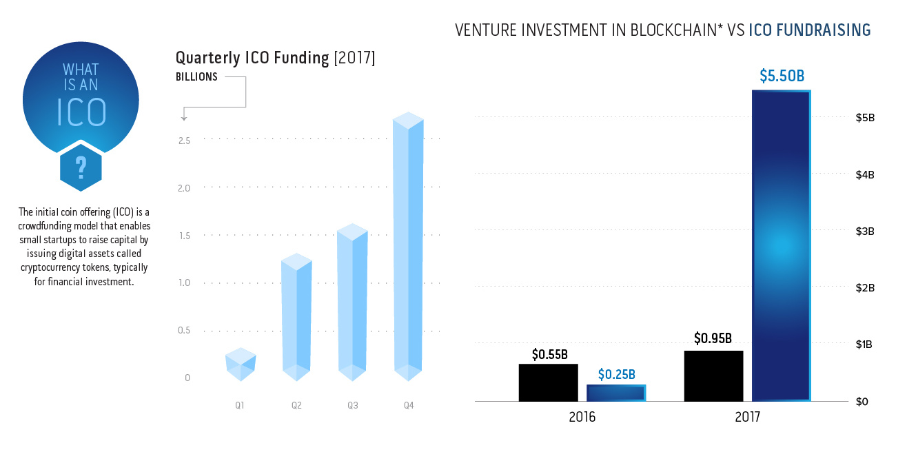
In 2017, the Initial Coin Offering (ICO) showed it could disrupt venture capital in a big way. Are VCs and institutions starting to get on board...

The traditional credit score is becoming obsolete - and now, big data and new tech are already starting to shape the modern credit landscape.
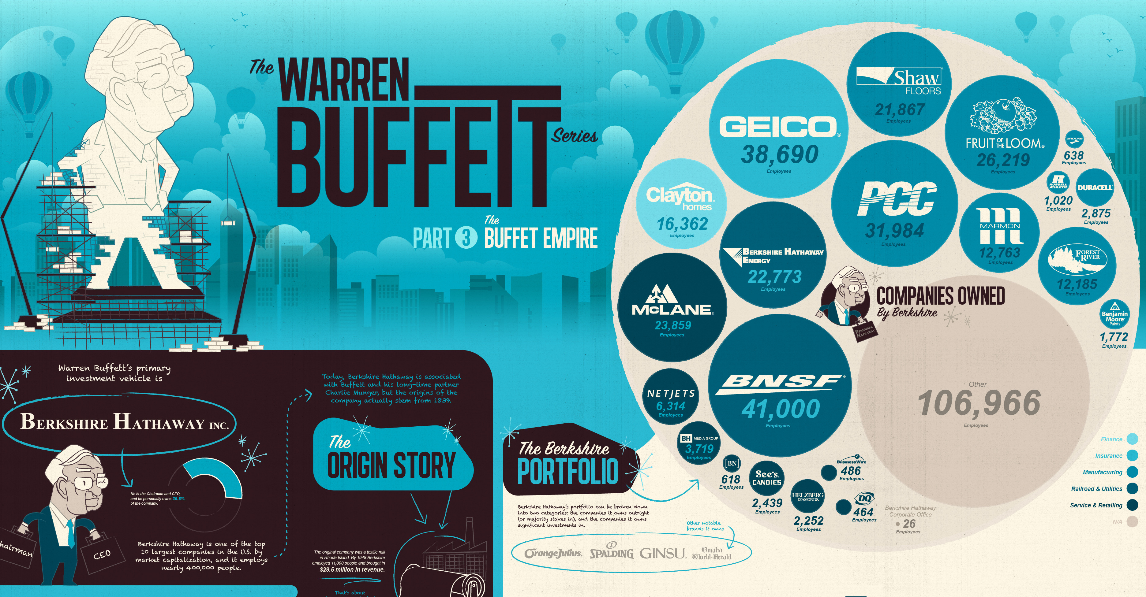
View the extent of the Warren Buffett Empire in this massive infographic, which shows the many, many household companies Berkshire Hathaway owns and controls.
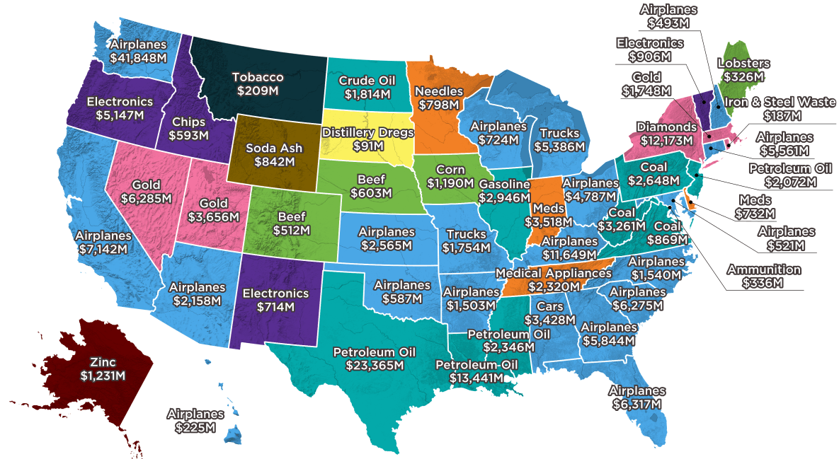
Largest state exports range from common goods, like autos, planes, and oil, to far more peculiar goods like distillery dregs, lobsters, and soda ash.

In just a half-century, Dubai has gone from a fishing village to a global real estate hub. Today's video and graphic track the city's stunning transformation.
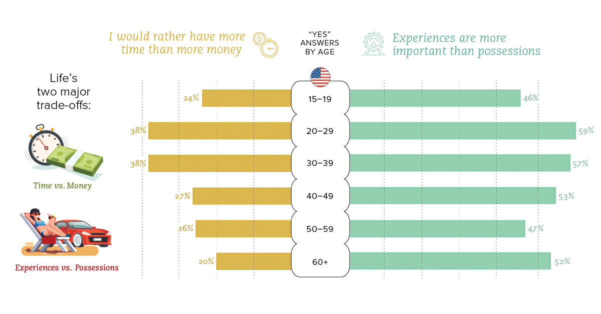
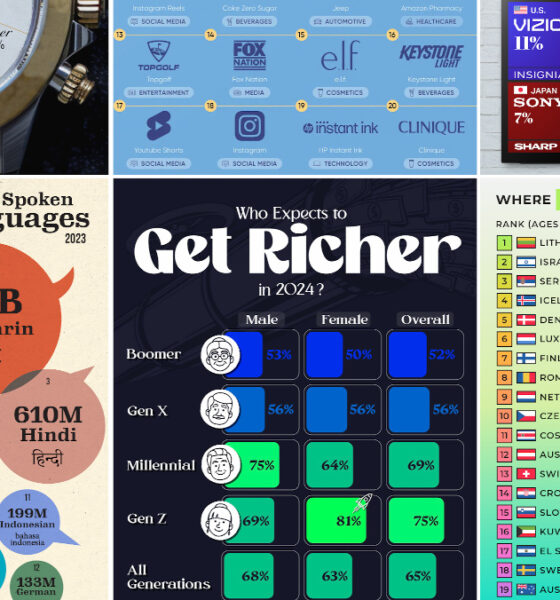
We look at how the trade-off of time and money is viewed between different generations, as well as the international differences between countries.

The third infographic in our Rise of Tesla Series showcases Musk's ambitious vision for the future of Tesla, along with the products that will make it...
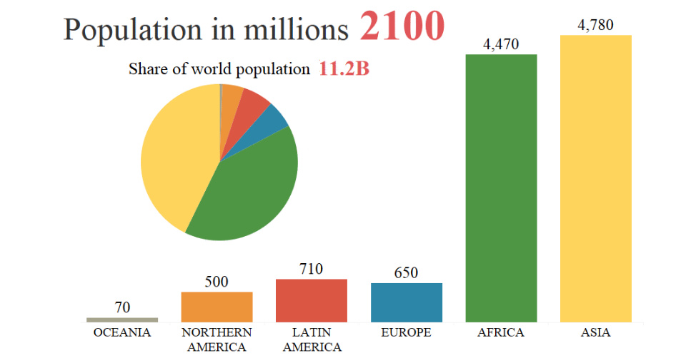
By 2100, the global population is projected to rise from 7.6 billion to 11.2 billion people. This animation shows how that growth will occur by region.

It's not the first time tech has tried to gain a foothold in the healthcare market - but in today's data-obsessed era, things might be different.
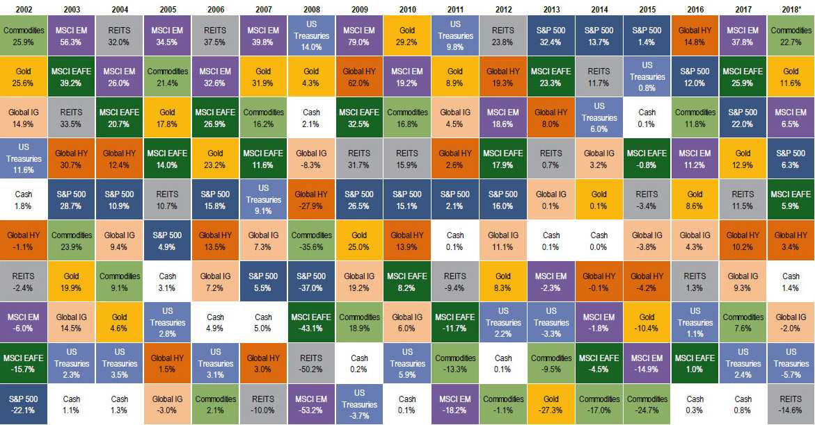
Commodities have kicked off the year as the top performing asset class. Could the commodity supercycle be back from the dead?
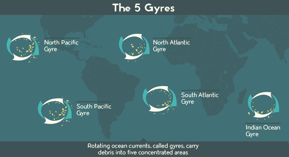
There is a staggering amount of plastic debris swirling around our oceans. This infographic and video help put this plastic problem in perspective.
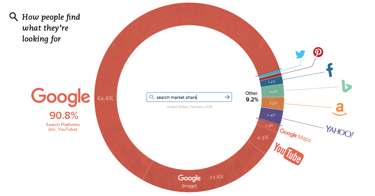
Yes, it's a given that Google dominates the search market - but the fact is, Google is probably even more dominant than you would have guessed.
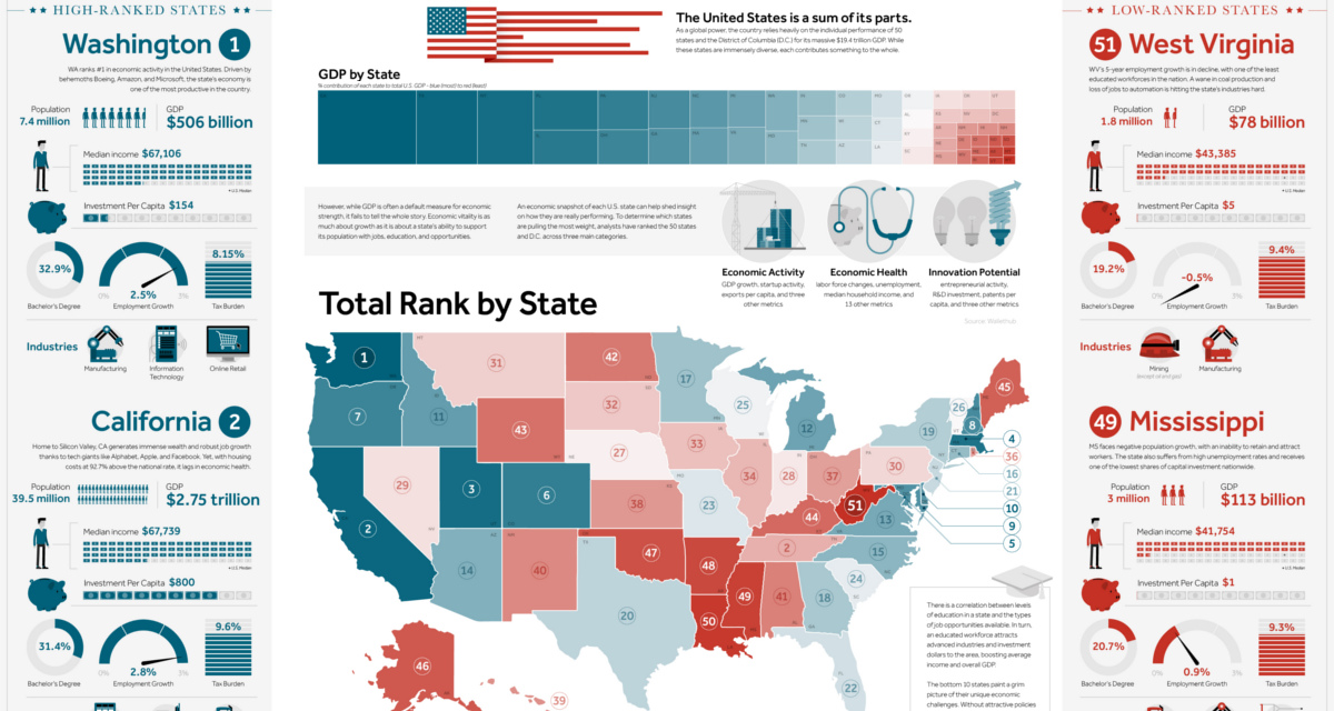
This giant infographic has state economies ranked from best to worst, based on an overall score comprised of 27 different metrics.
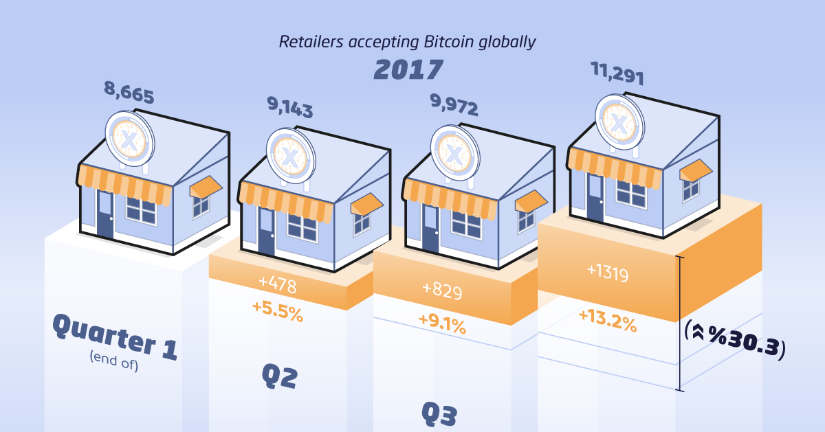
Growing acceptance of Bitcoin and other crypto hasn't yet translated to everyday transaction use. What's holding crypto payments back, and how can it be fixed?
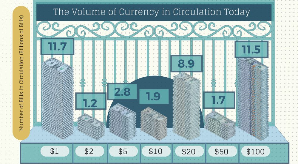
How many U.S. dollar bills exist, and how long does each type of note last? This infographic breaks down the world of physical U.S. currency.
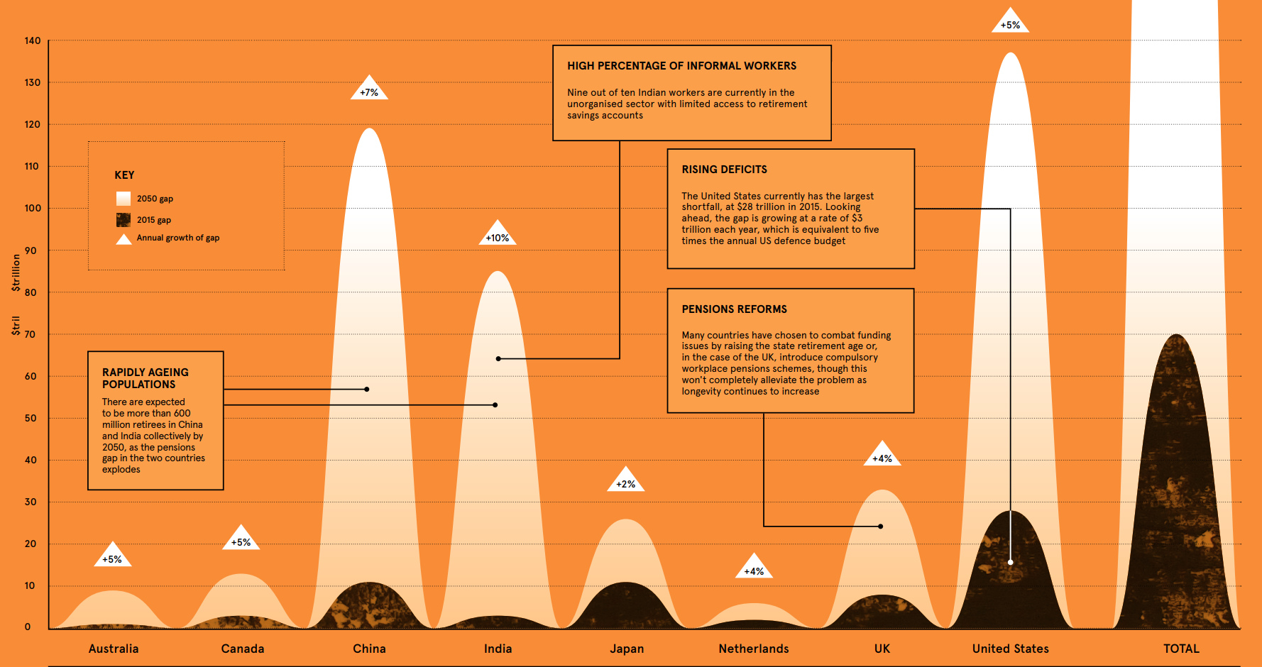
According to the WEF, the retirement savings gap is growing at $28 billion every 24 hours - and it could be the 'financial equivalent of climate...