
The earthquake that shook buildings across New York in April 2024 was the third-largest quake in the Northeast U.S. over...


click for more →


Scan with your phone's camera or QR code app to view
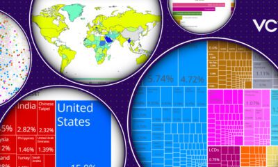

This month's VC+ special dispatches feature a visual exploration of top exporting nations and markets this month.
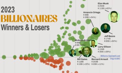

Billionaire wealth soared in 2023, but not everyone shared in these gains. This graphic shows how fortunes changed over last year.
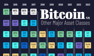

Bitcoin returns surged 156% in 2023, marking the end of the crypto winter. Here's how its performance compared to major asset classes.


We map out Africa’s population density, spotlighting the continent’s most populous countries and cities.
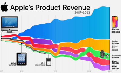

In 2023, iPhones accounted for more than half of Apple's revenue.
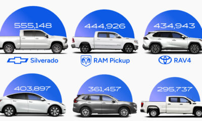

In 2023, nine of the top 10 best-selling vehicles in America were trucks or SUVs. This graphic shows the most popular vehicles overall.
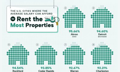

Visualizing the most affordable U.S. cities for renters by the percentage of affordable rentals available on an average salary.
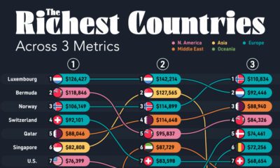

Here's how the world's richest countries stack up by different measures of GDP per capita, including adjusting for PPP and productivity.
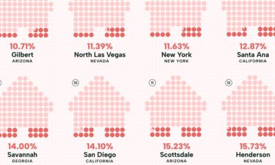

Visualizing the least affordable U.S. cities for renters by the percentage of affordable rentals available on an average salary.
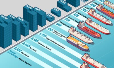

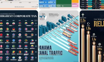
This graphic illustrates Panama Canal traffic by shipment category, looking at the total number of shipping crossings and the total tonnage.
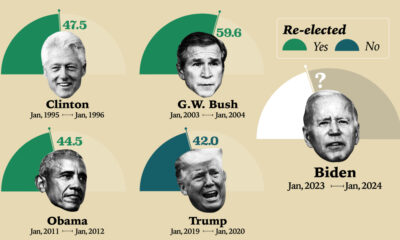

How does Biden's approval rating stack up against other presidents? This graphic compares presidents across modern history.
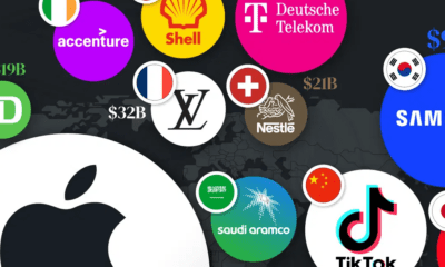

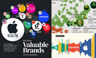
This graphic visualizes the most valuable brands by country in 12 major economies, from tech and energy giants to automakers and banks.


In this graphic, we explore the projected generation capacity of different clean electricity technologies in the U.S. for 2023 and 2024.
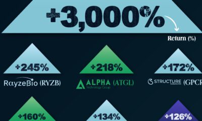

Jin Medical, the top IPO of the year, is set to be delisted due to a listing rule violation.
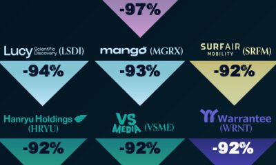

The Chinese EV battery company U Power experienced the worst IPO performance in 2023.

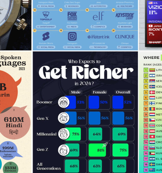
We round up the most popular, most discussed, and most liked visualizations of the month on Voronoi, our new and free data storytelling platform.
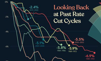

This visualization looks at how past interest rate cut cycles have gone and the rate cut forecasts by top institutions for 2024.


 Creator Program