Markets
Asia to Add 5,000 New Centimillionaires Over Next Decade [Chart]
![Asia to Add 5,000 New Centimillionaires Over Next Decade [Chart]](https://www.visualcapitalist.com/wp-content/uploads/2015/10/asia-centimillionaires-chart.jpg)
Asia to Add 5,000 New Centimillionaires Over Next Decade [Chart]
The Chart of the Week is a weekly Visual Capitalist feature on Fridays.
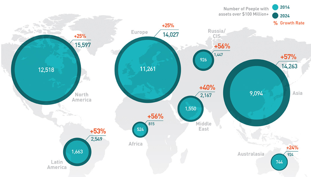
Where in the world should a speculator go to make it big?
Back in the old days, the plan was to follow the gold rushes. Your travels may have taken you to California, Colorado, or maybe even the Klondike.
Today, the places to go are arguably the emerging markets, or as we recently detailed: the “emerging” emerging markets. Doug Casey, the famous speculator and best-selling author, is a fan of this strategy. He has routinely said that if he were a young man, he’d look at going to Africa rather than going to college.
The data reinforces this notion. In today’s chart, we summarize some of the findings of Knight Frank’s Wealth Report 2015, which looks at how many millionaires, centimillionaires, and billionaires will be made in different regions over the next decade. All of this is based on how many assets are accumulated by an individual. To be counted as a centimillionaire, one would need over $100 million in assets.
In our mind, there are three major takeaways from today’s chart:
First, the growth rate for these elite groups of wealthy people are the lowest in Western countries. For example, regions like North America, Europe, and Australasia will all add new centimillionaires to their ranks at about a 25% clip over the next decade. In these areas, most of the big opportunities have been taken advantage of, and the economic growth rates of advanced economies are lower.
Next, Asia leads in every category in absolute terms for adding new millionaires, centimillionaires, and billionaires. The region is projected to add 342 new billionaires at a 70% growth rate over the next decade, which is more than North America, Europe, Australasia, and Latin America combined. Also astounding is the fact that there will be 5,169 individuals that accumulate over $100 million in assets in Asia over the next 10 years. In contrast, North America will add 3,079 at less than half of the growth rate (25%).
Lastly, while the absolute numbers of Asia are stunning in sheer size, it is the relative numbers that in Africa that also catch our eye. Africa will add millionaires at the highest clip of all regions in the next decade at a 53% growth rate. This speaks more to Doug’s point, which is that Africa’s growth is just beginning.
For those that are willing to take the risk and get in on the ground floor, it could pay off.


Markets
U.S. Debt Interest Payments Reach $1 Trillion
U.S. debt interest payments have surged past the $1 trillion dollar mark, amid high interest rates and an ever-expanding debt burden.


U.S. Debt Interest Payments Reach $1 Trillion
This was originally posted on our Voronoi app. Download the app for free on iOS or Android and discover incredible data-driven charts from a variety of trusted sources.
The cost of paying for America’s national debt crossed the $1 trillion dollar mark in 2023, driven by high interest rates and a record $34 trillion mountain of debt.
Over the last decade, U.S. debt interest payments have more than doubled amid vast government spending during the pandemic crisis. As debt payments continue to soar, the Congressional Budget Office (CBO) reported that debt servicing costs surpassed defense spending for the first time ever this year.
This graphic shows the sharp rise in U.S. debt payments, based on data from the Federal Reserve.
A $1 Trillion Interest Bill, and Growing
Below, we show how U.S. debt interest payments have risen at a faster pace than at another time in modern history:
| Date | Interest Payments | U.S. National Debt |
|---|---|---|
| 2023 | $1.0T | $34.0T |
| 2022 | $830B | $31.4T |
| 2021 | $612B | $29.6T |
| 2020 | $518B | $27.7T |
| 2019 | $564B | $23.2T |
| 2018 | $571B | $22.0T |
| 2017 | $493B | $20.5T |
| 2016 | $460B | $20.0T |
| 2015 | $435B | $18.9T |
| 2014 | $442B | $18.1T |
| 2013 | $425B | $17.2T |
| 2012 | $417B | $16.4T |
| 2011 | $433B | $15.2T |
| 2010 | $400B | $14.0T |
| 2009 | $354B | $12.3T |
| 2008 | $380B | $10.7T |
| 2007 | $414B | $9.2T |
| 2006 | $387B | $8.7T |
| 2005 | $355B | $8.2T |
| 2004 | $318B | $7.6T |
| 2003 | $294B | $7.0T |
| 2002 | $298B | $6.4T |
| 2001 | $318B | $5.9T |
| 2000 | $353B | $5.7T |
| 1999 | $353B | $5.8T |
| 1998 | $360B | $5.6T |
| 1997 | $368B | $5.5T |
| 1996 | $362B | $5.3T |
| 1995 | $357B | $5.0T |
| 1994 | $334B | $4.8T |
| 1993 | $311B | $4.5T |
| 1992 | $306B | $4.2T |
| 1991 | $308B | $3.8T |
| 1990 | $298B | $3.4T |
| 1989 | $275B | $3.0T |
| 1988 | $254B | $2.7T |
| 1987 | $240B | $2.4T |
| 1986 | $225B | $2.2T |
| 1985 | $219B | $1.9T |
| 1984 | $205B | $1.7T |
| 1983 | $176B | $1.4T |
| 1982 | $157B | $1.2T |
| 1981 | $142B | $1.0T |
| 1980 | $113B | $930.2B |
| 1979 | $96B | $845.1B |
| 1978 | $84B | $789.2B |
| 1977 | $69B | $718.9B |
| 1976 | $61B | $653.5B |
| 1975 | $55B | $576.6B |
| 1974 | $50B | $492.7B |
| 1973 | $45B | $469.1B |
| 1972 | $39B | $448.5B |
| 1971 | $36B | $424.1B |
| 1970 | $35B | $389.2B |
| 1969 | $30B | $368.2B |
| 1968 | $25B | $358.0B |
| 1967 | $23B | $344.7B |
| 1966 | $21B | $329.3B |
Interest payments represent seasonally adjusted annual rate at the end of Q4.
At current rates, the U.S. national debt is growing by a remarkable $1 trillion about every 100 days, equal to roughly $3.6 trillion per year.
As the national debt has ballooned, debt payments even exceeded Medicaid outlays in 2023—one of the government’s largest expenditures. On average, the U.S. spent more than $2 billion per day on interest costs last year. Going further, the U.S. government is projected to spend a historic $12.4 trillion on interest payments over the next decade, averaging about $37,100 per American.
Exacerbating matters is that the U.S. is running a steep deficit, which stood at $1.1 trillion for the first six months of fiscal 2024. This has accelerated due to the 43% increase in debt servicing costs along with a $31 billion dollar increase in defense spending from a year earlier. Additionally, a $30 billion increase in funding for the Federal Deposit Insurance Corporation in light of the regional banking crisis last year was a major contributor to the deficit increase.
Overall, the CBO forecasts that roughly 75% of the federal deficit’s increase will be due to interest costs by 2034.

-

 Real Estate2 weeks ago
Visualizing America’s Shortage of Affordable Homes
-

 Technology1 week ago
Ranked: Semiconductor Companies by Industry Revenue Share
-

 Money1 week ago
Which States Have the Highest Minimum Wage in America?
-

 Real Estate1 week ago
Ranked: The Most Valuable Housing Markets in America
-

 Business2 weeks ago
Charted: Big Four Market Share by S&P 500 Audits
-

 AI2 weeks ago
The Stock Performance of U.S. Chipmakers So Far in 2024
-

 Misc2 weeks ago
Almost Every EV Stock is Down After Q1 2024
-

 Money2 weeks ago
Where Does One U.S. Tax Dollar Go?