Best of
Our Top Infographics of 2018
This year, we published more than 300 posts on Visual Capitalist, getting well over 20 million views along the way.
While all of these posts are driven by powerful visuals and data-driven content, we can only select 18 of them on our hand-picked, annual list of our best work. Below, you’ll find our Top Infographics of 2018 List, which contains some of our most popular infographics, as well as a curation of staff favorites for the year.
If you like what you see on the following list, make sure to subscribe to our mailing list or connect via Facebook, Twitter, or LinkedIn to get our free content daily.
Important Notes:
Below are the top posts of 2018. But first, a few quick notes:
- Images below are small preview images for each large infographic and article
- To view any post in full, click the image or link in the text. All links open in a new tab.
- At the end, we’ll link to some honorable mentions, as well as the year-end lists for 2014, 2015, 2016 and 2017.
Wishing you the best in the new year!
– The Visual Capitalist Team
18. The Social Media Universe
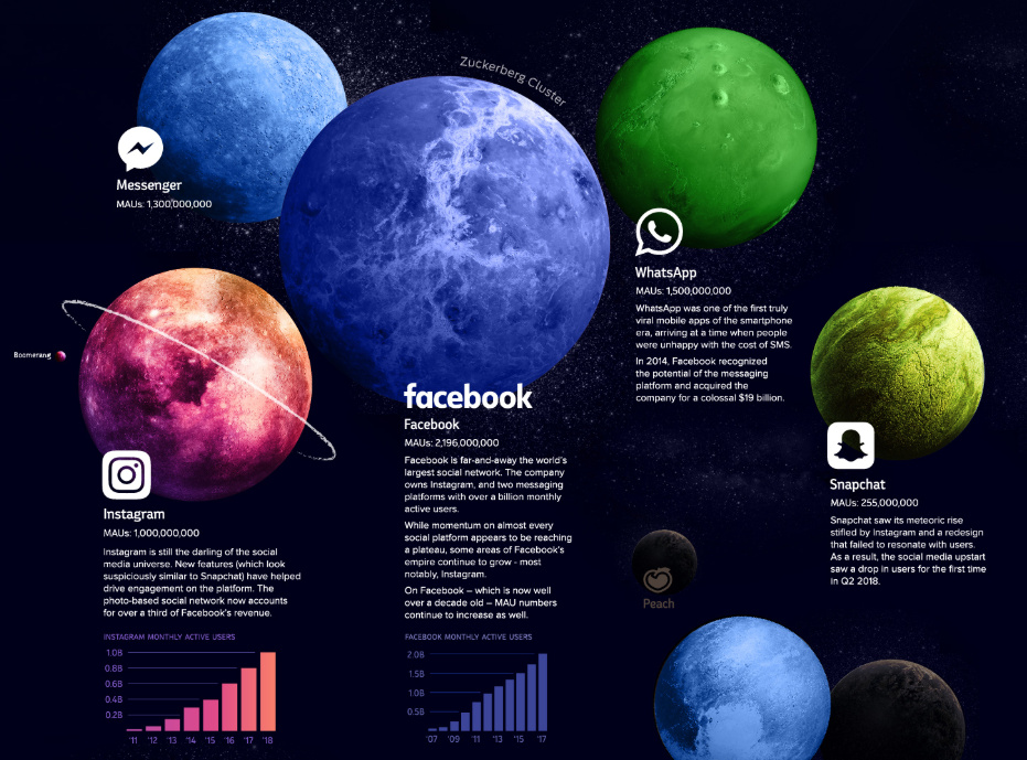
This infographic is from another world, showing the vast scope of the social media universe. In particular, the size of the “Zuckerberg Cluster” stands out, as Facebook, Instagram, WhatsApp, and Messenger dominate the list of apps with more than a billion monthly active users.
17. The World’s Biggest Real Estate Bubbles in 2018
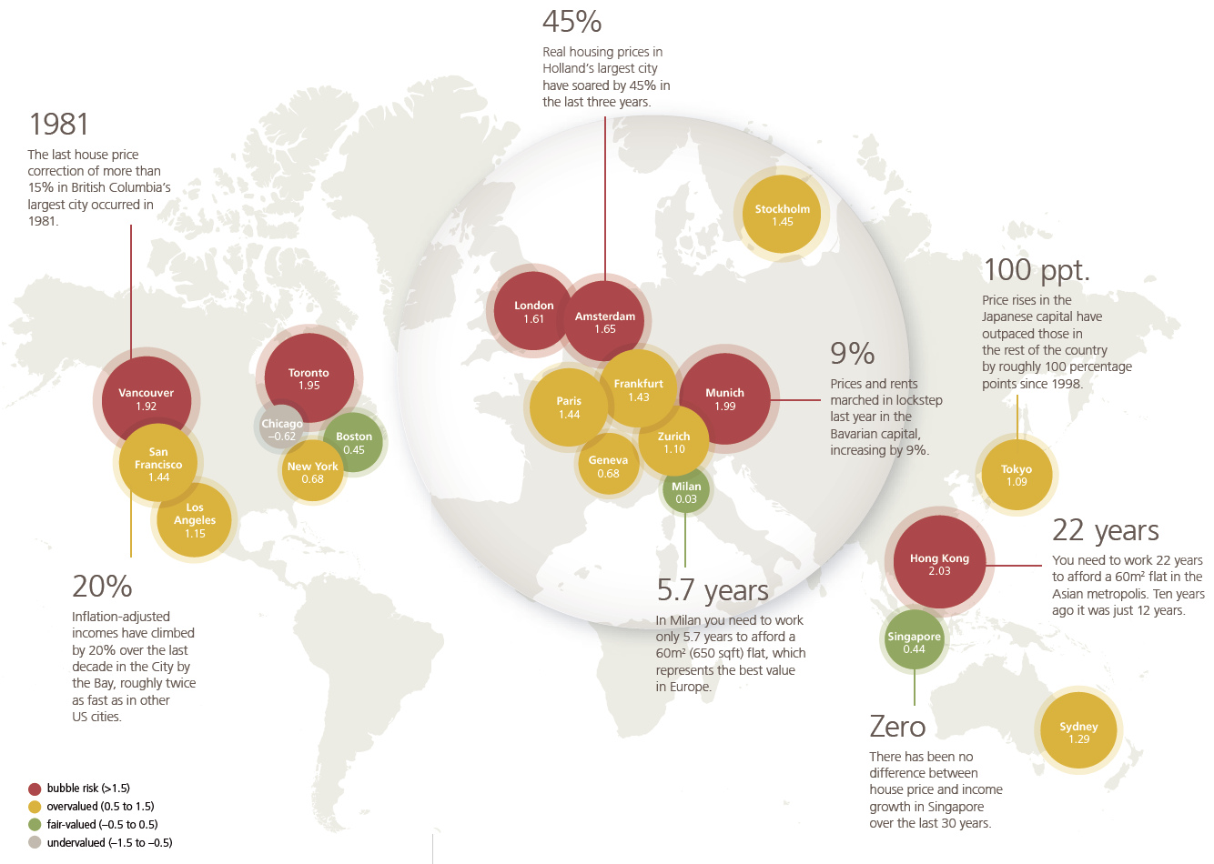
Ever wanted to know which key real estate markets are the closest to popping, and which are potentially undervalued?
These maps and charts show the six major cities currently in “bubble risk” territory, and how they compare to the markets of other important global cities.
16. The Raw Materials that Fuel the Green Revolution
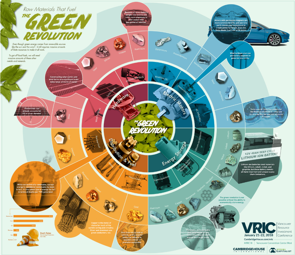
To get off fossil fuels, we’ll need other finite resources such as rare metals and minerals. We show the resources that will power the green revolution in this giant infographic.
15. The Business Value of the Blockchain
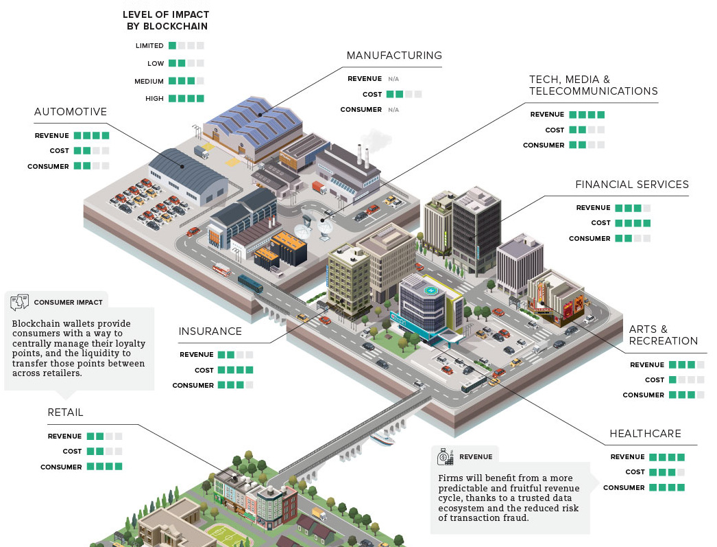
While 2018 has been a year to forget for cryptocurrencies, the blockchain is here to stay and will impact a wide variety of industries. This graphic uses data from McKinsey to show the potential business value of the technology.
14. Visualizing 40 Years of Music Industry Sales
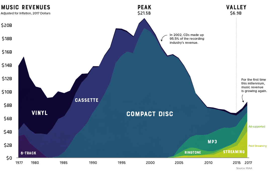
This chart that shows the composition of music industry sales was an unexpected blockbuster, but it seems to have captured the hearts and minds of music lovers from around the world.
13. The Relationship Between Money and Happiness
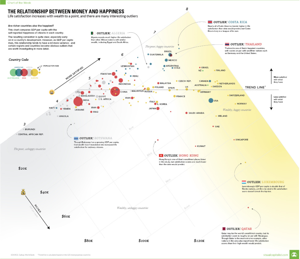
This was one of our more controversial charts of 2018, partially because of an experimental design decision we made.
Instead of aligning the x and y axes in the traditional way, we oriented the chart so that the trend line was horizontal – making it so countries that were “happier” with what they had (GDP per capita) appeared above the line, while countries that were “less satisfied” appeared below.
12. Elon Musk’s Vision for the Future of Tesla
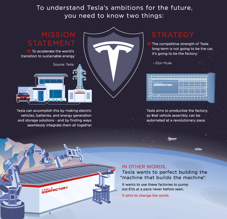
This infographic is the conclusion of our Rise of Tesla Series, showing Elon Musk’s vision for the company. Don’t forget to view Part 1 and Part 2 of the series as well.
11. Mapped: The World’s Largest Megacities by 2100
Economic growth is anchored in cities – and the world’s urban landscape will shift dramatically as we move towards the end of the 21st century. This powerful animation shows where the world’s biggest megacities will be in 2100.
10. How Different Generations Would Invest $10k
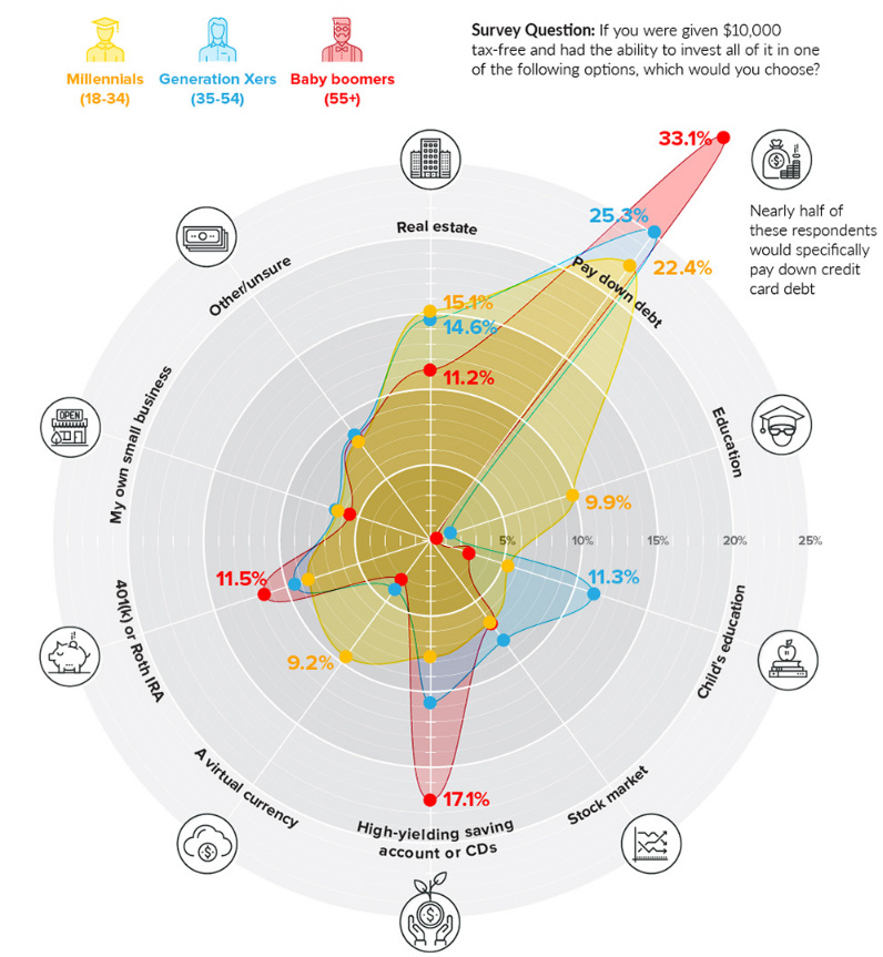
Boomers, Gen Xers, and Millennials do not think the same way about money. This is partly because they are at different points in their adult lives, but it also has to do with differing attitudes towards wealth and risk.
This nifty visualization charts how these generations would each invest $10,000, and it helps reveal what makes each generation unique.
9. Seven Facts to Free You From Your Fear of Market Crashes
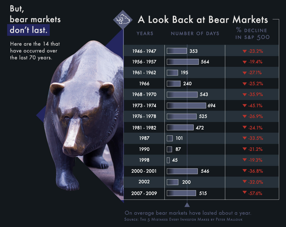
Even when there is extreme volatility occurring in the stock market, this infographic may be the cure to make you a more rational investor. It goes through the math of corrections and bear markets in a simple and straightforward way that can calm the nerves of experts and beginners alike.
8. A World of Languages
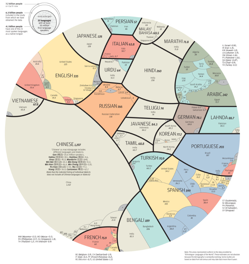
There are 4.1 billion people that speak the 23 most common native tongues – and this widely popular infographic breaks down where they are spoken by country.
7. The Extraordinary Power of Compound Interest
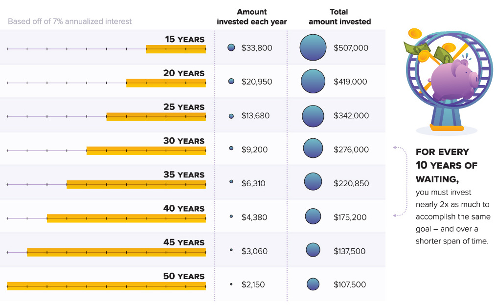
According to Albert Einstein, compound interest is the “most powerful force in the universe”.
However, understanding its power is not intuitive to many. That’s why we created this explainer infographic on compound interest as a part of our Wealth 101 channel, which is geared to younger generations.
6. The Multi-Billion Dollar Personal Data Ecosystem
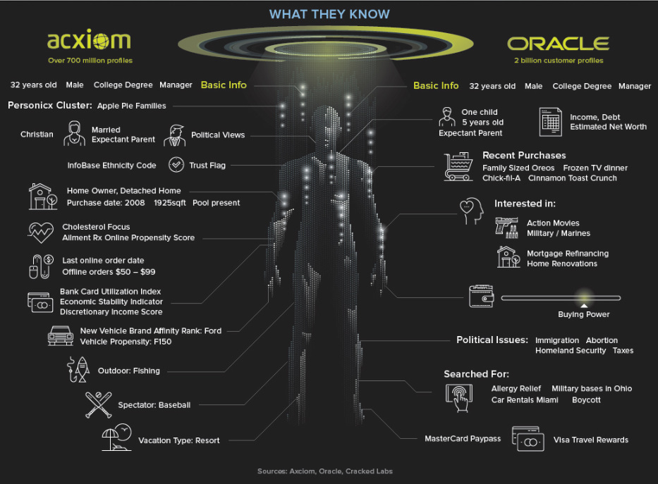
Personal data was a popular and recurring theme throughout the 2018 news cycle.
But how does this ecosystem actually work, and what are the components of personal data in the digital age? This infographic aims to break it all down in an easy and simple way.
5. The Longest Bull Markets of the Modern Era
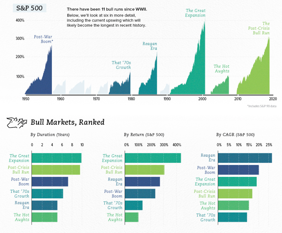
This chart we published in June became very relevant as markets struggled in late-2018.
It documents the six longest bull markets since World War II, and compares them using several factors such as length, total return, and average annual return. It also shows key events that occurred in each bull market, giving great perspective on how the stock market works over time.
4. The Warren Buffett Empire
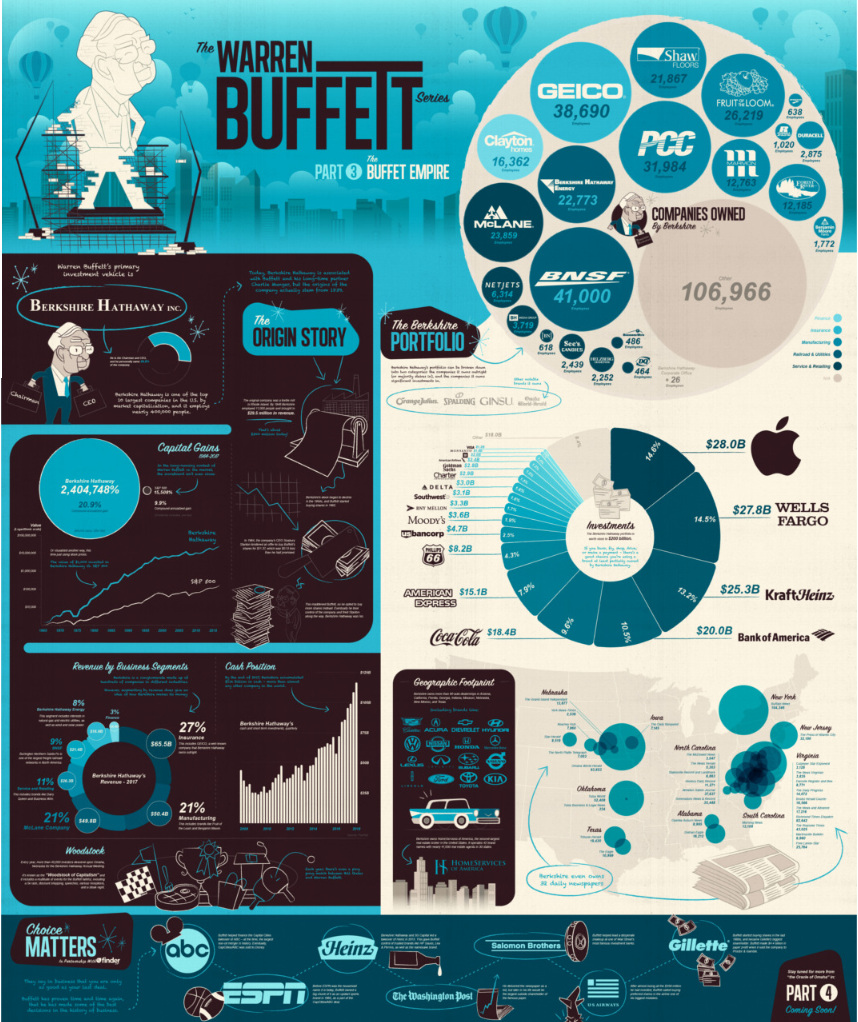
Most people know Berkshire Hathaway as the massive conglomerate that serves as the investment vehicle for Warren Buffett’s $83 billion fortune. However, far fewer people know what this giant does, and how it actually makes its money!
This massive infographic attempts to put it all in perspective.
3. This World Map was Drawn Based on Country Populations
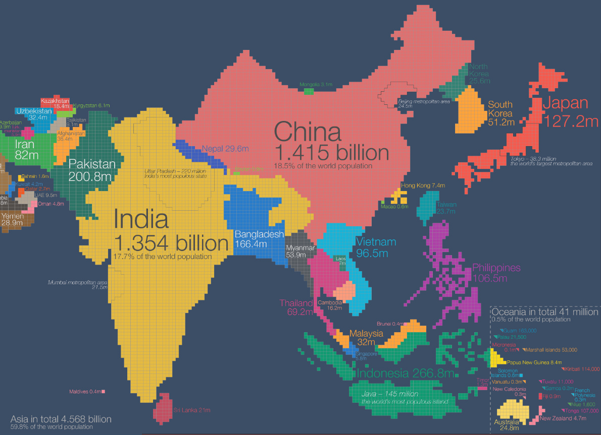
There are many routes to creating an insightful data visualization, but one tried-and-true one is to take something familiar (like a map) and to redraw it based on another data set. In this case, this world map is redrawn based on countries’ populations to give us a whole new way to think about human geography.
2. The $80 Trillion World Economy in One Chart
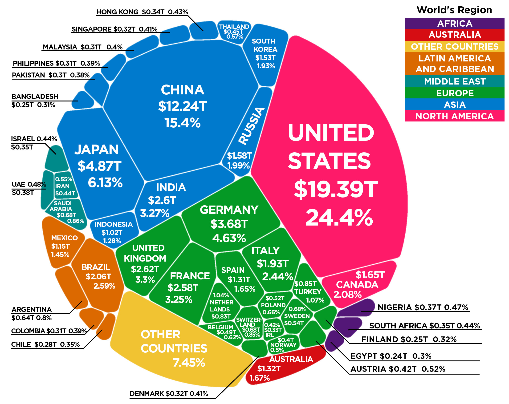
This memorable chart that breaks down global GDP was one of our most shared posts of the year, with 37,000 social shares and 750,000 views.
1. The Forces Shaping the Future of the Global Economy
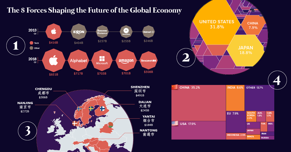
Powerful, data-driven visuals can really help to tell a story that words alone cannot.
This iconic post leans on the ideas and graphics from our new book Visualizing Change, and it does a great job summarizing the forces that we see shaping our economic future.
Honorable mentions:
Animation: The World’s 10 Largest Economies by GDP (1960-Today)
This enthralling animation shows the rise and fall of economies over many decades.
The 6 Forces Transforming the Future of Healthcare
Healthcare is a massive industry – and it’s undergoing tremendous change.
24 Cognitive Biases That Are Warping Your Perception of Reality
Think you see things objectively? Check out this list of common cognitive biases that mess with even the best of us.
The 6,000 Year History of Medical Cannabis on One Map
This giant map plots the entire history of medical cannabis through many millennia.
An Illustrated Subway Map of Human Anatomy
Ever wanted to visualize the complexity of the human body? This neat map does the trick.
And lastly, don’t forget to check out our roundups from previous years!
The Top 17 Infographics of 2017
The Top 16 Infographics of 2016
The Top 15 Infographics of 2015
The Top 14 Infographics of 2014
And if you haven’t subscribed to our free mailing list or social feeds, make sure you do so below.
Good luck in 2019!


Best of
Best Visualizations of March on the Voronoi App
We round up the most popular, most discussed, and most liked visualizations of the month on Voronoi, our new data storytelling platform.
At the end of 2023, we publicly launched Voronoi, our free new data discovery app!
The initial response from both users and creators has been incredible. We now have millions of in-app views, and there are already more than 700 interesting visualizations to discover, many of which will never be published on Visual Capitalist.
For that reason, we’ve chosen to highlight some of the most popular visualizations and creators from March in this roundup. To see them and many others, make sure to download the app!
Let’s take a look at a popular creator worth highlighting, as well as the most viewed, most discussed, and most liked posts of the month.
POPULAR CREATOR
Ehsan Soltani
Visual Capitalist isn’t the only creator on the Voronoi app.
Instead, it features incredible data-driven charts and stories from many of the world’s best creators, like Ehsan Soltani.
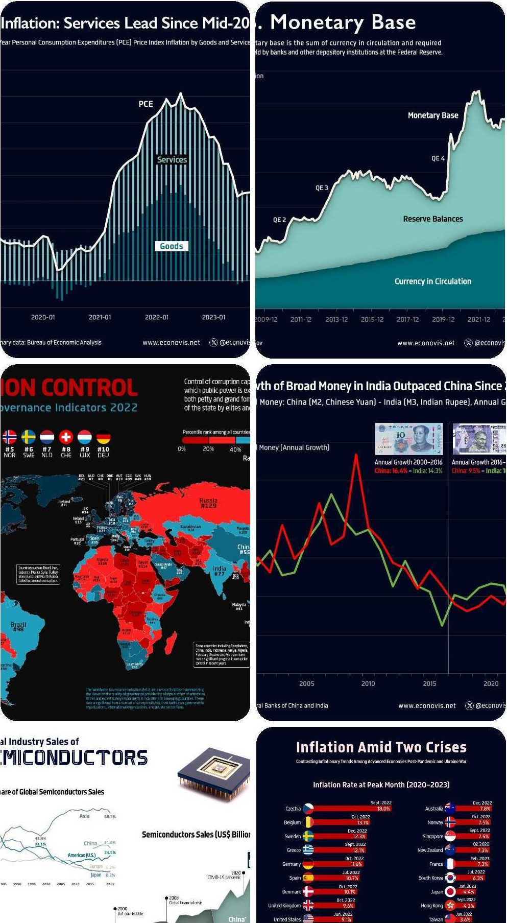
Ehsan is an economist, and one of the most prolific creators on Voronoi so far. He’s published 41 visualizations on wide-ranging subjects such as:
- The world’s biggest “money printer” economies
- Global commodity returns
- Corruption by country
- Inflation rates in advanced economies
For those interested in what’s happening with the global economy, Ehsan Soltani is definitely worth a follow!
![]() View all of Ehsan’s visuals on Voronoi today.
View all of Ehsan’s visuals on Voronoi today.
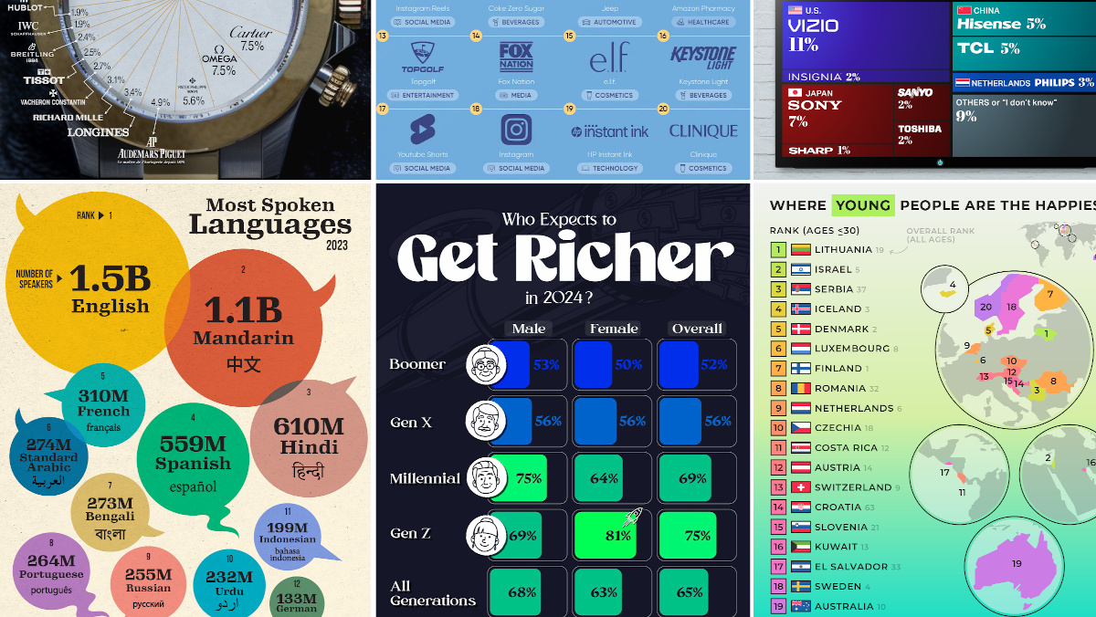
MOST VIEWED
The 12 Most Spoken Languages in 2023
Which languages are most commonly spoken around the world by native speakers?
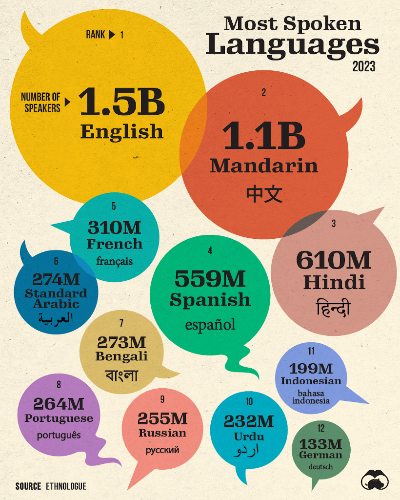
This visualization from Visual Capitalist was one of the most viewed by users, and it highlights the top languages spoken around the world.
Data here comes from the Ethnologue database, the most rigorous and comprehensive language database globally. It’s worth noting that it highlights languages spoken by native speakers only, so second languages are not counted here.
![]() Get the data behind this visual on Voronoi today.
Get the data behind this visual on Voronoi today.
MOST DISCUSSED
Where Young People are Happiest
The most commented on visualization from Visual Capitalist showed the countries with the happiest young people (under 30 years old).
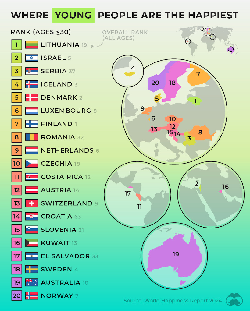
This comes from the World Happiness Report, which Visual Capitalist covers extensively every year.
In this year’s edition, one particularly interesting feature focused on happiness discrepancies between age groups. For example, in some countries, younger people were much happier than the average population—in others, older populations were far happier.
![]() To join the conversation, download Voronoi today.
To join the conversation, download Voronoi today.
MOST LIKED
The Fastest Growing Brands in the U.S.
The most liked visual on Voronoi in March came from Visual Capitalist, showing the brands that are growing the fastest in the United States.
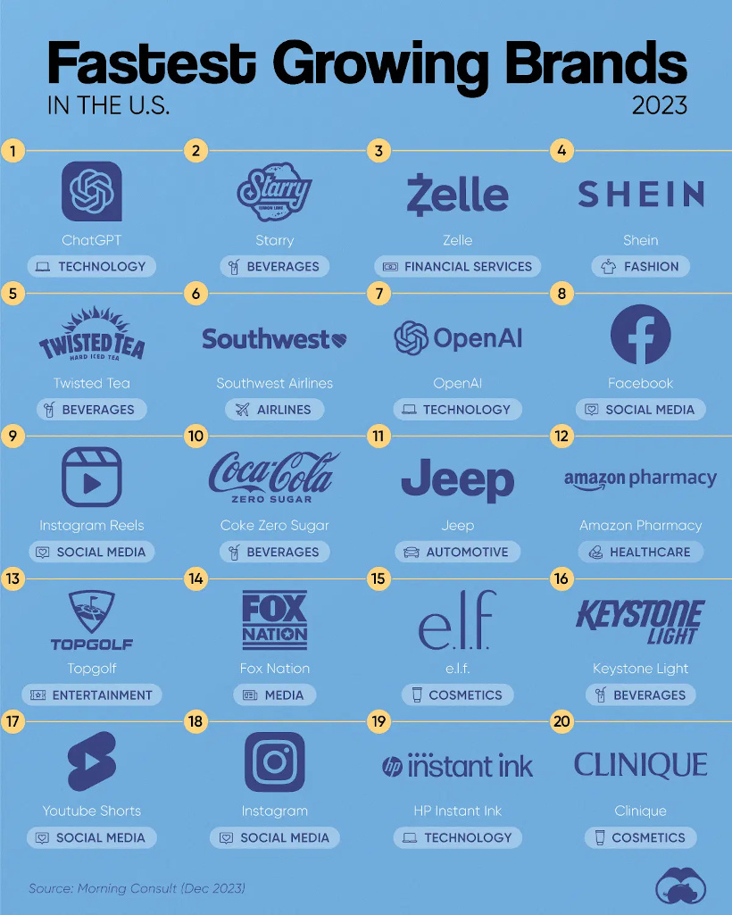
The data here comes from Morning Consult, and shows the share of customers that were considering purchasing a brand in October 1-24, 2023, and subtracted the share of those who said the same between Jan 1-31, 2023.
![]() Get the data behind this visual on Voronoi today.
Get the data behind this visual on Voronoi today.

-

 Maps2 weeks ago
Mapped: Average Wages Across Europe
-

 Money1 week ago
Which States Have the Highest Minimum Wage in America?
-

 Real Estate1 week ago
Ranked: The Most Valuable Housing Markets in America
-

 Markets1 week ago
Charted: Big Four Market Share by S&P 500 Audits
-

 AI1 week ago
The Stock Performance of U.S. Chipmakers So Far in 2024
-

 Automotive2 weeks ago
Almost Every EV Stock is Down After Q1 2024
-

 Money2 weeks ago
Where Does One U.S. Tax Dollar Go?
-

 Green2 weeks ago
Ranked: Top Countries by Total Forest Loss Since 2001