Markets
Craft Beer Boom: The Numbers Behind the Industry’s Explosive Growth
All movements start with rebellion, and the craft beer revolution is no different.
Born from the frustration of mass-produced beer made from cheap ingredients, entrepreneurs went head-to-head with global brewery giants to showcase local and independent craftsmanship.
Suddenly, drinking beer became less about the alcoholic content and more about the quality and experience. Craft beer allowed for constantly changing flavors, recipes, and stories. With sales accounting for 24% of U.S. beer market worth over $114 billion, the global craft beer movement has been historic.
Which States Bring Home the Beer?
Today’s map from C+R research demonstrates the growth of the craft beer market, by ranking the U.S. states based on craft breweries per capita.
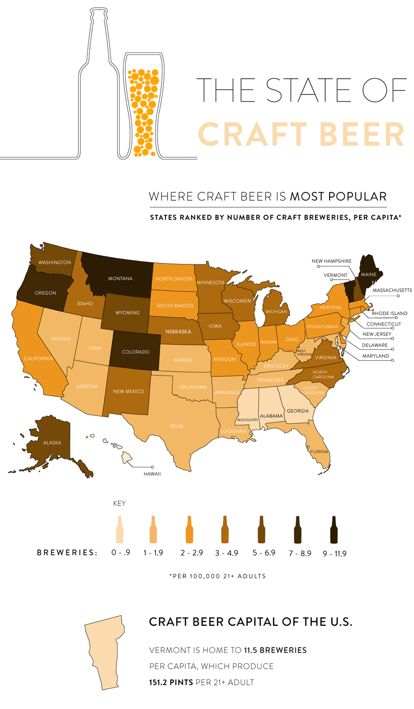
The data for this visualization comes from The Brewers Association—an American trade group of over 7,200 craft brewers, suppliers, and distributors, as well as the Alcohol and Tobacco Tax and Trade Bureau.
According to the data, Vermont has emerged as the craft beer capital of the U.S. with 11.5 breweries per 100,000 people. That’s equal to 151 pints of beer produced per drinking-age adult. Following closely behind are Montana and Maine, each with 9.6 breweries per capita.
You’ll notice that in Southern states such as Alabama, Georgia, and Mississippi, that there are only 0-0.9 breweries per capita. This is actually because of tighter liquor laws—for example, only 10 years ago, it was illegal to sell specialty beer in South Carolina that contained more alcohol content than a typical Budweiser.
Becoming a Brewery Nation
In 2008, there were only 1,574 breweries across the United States.
However, as you can see in the below data from the Brewers Association, the total amount of craft breweries, microbreweries, and brewpubs has climbed to 7,346 in just a decade.
| 2014 | 2015 | 2016 | 2017 | 2018 | Change ('17-'18) | |
|---|---|---|---|---|---|---|
| Regional Craft | 135 | 178 | 186 | 202 | 230 | 13.9% |
| Microbreweries | 2,076 | 2,626 | 3,251 | 3,933 | 4,522 | 15% |
| Brewpubs | 1,603 | 1,824 | 2,102 | 2,355 | 2,594 | 10.1% |
| Total Craft | 3,814 | 4,628 | 5,539 | 6,490 | 7,346 | 13.2% |
| Large/Non-craft | 46 | 44 | 67 | 106 | 104 | 1.9% |
| Total U.S. | 3,869 | 4,672 | 5,606 | 6,596 | 7,450 | 12.9% |
Of the three categories of craft beer, microbreweries have contributed the most to recent production growth. Last year, they accounted for 80% of this growth, up from 60% in 2017.
The term microbrewery refers to the maximum amount of beer the brewery can produce. For microbreweries, that number is 15,000 barrels (460,000 U.S. gallons) of beer per year. They also have to sell 25% or more of their beer on site, which is why we are witnessing a surge in breweries that double up as a restaurant or bar.
Comparing this data to figures on larger breweries available from the Breweries Association, it is clear that it is the larger, more established breweries that are feeling the heat. While their growth slows, more small breweries open, and sales are further cannibalized.
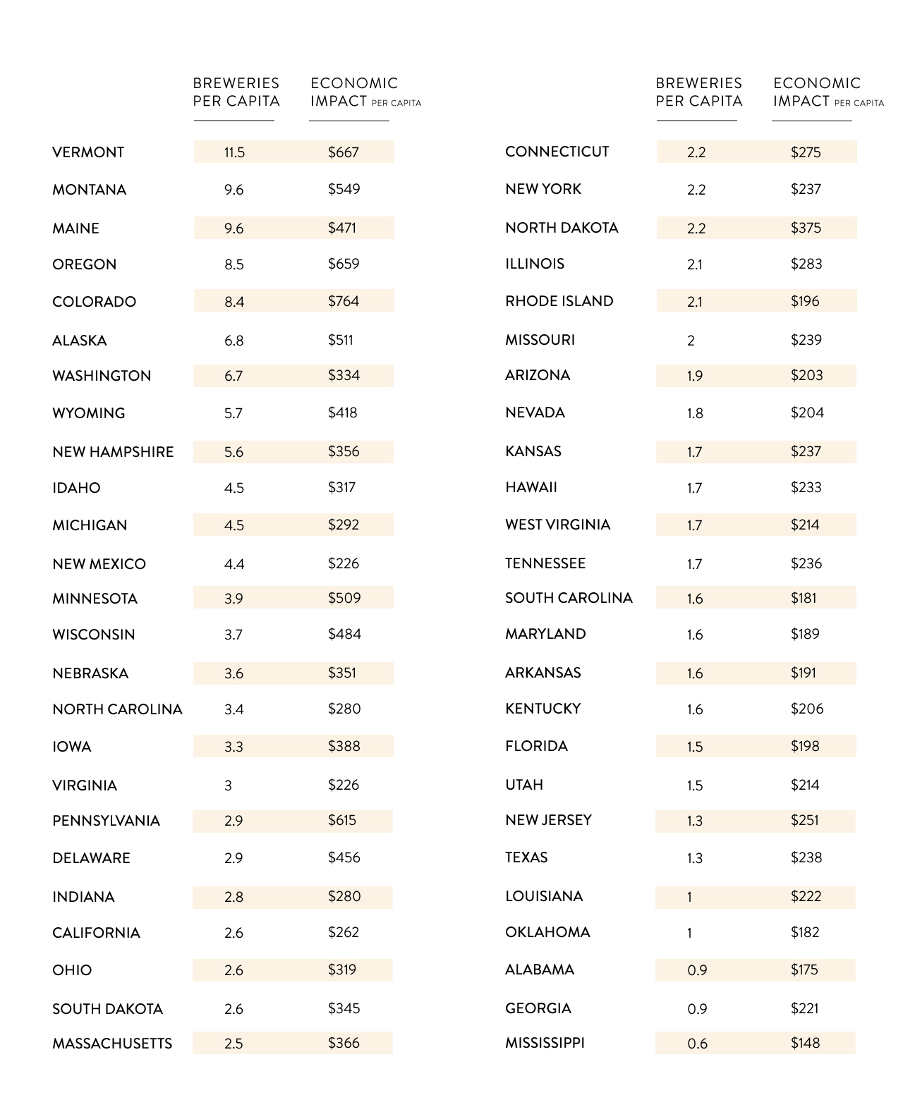
The Economic Impact of the Craft Beer Market
When it comes to pure dollars, C+R Research notes that Colorado comes in at #1 with an economic impact of $764 per person. Vermont is at the #2 spot with an economic impact of $667 per person, despite having a higher concentration of breweries per capita.
How do the rest of the states compare?
The global craft beer market is expected to reach $502.9 billion by 2025—while the craft brewing industry contributed $76.2 billion to the U.S. economy in 2017, including more than 500,000 jobs.
Will Craft Remain a Growth Category?
While many argue that craft beer is approaching its peak, the data is promising. Experimentation with new processes and ingredients will continue to drive the market forward.
Craft brewers all over the world are tapping into the novelty factor by exploring weird and wonderful innovations, like deer antler-infused beer and take-home brewing kits.
While the overall beer market lagged in sales by 0.8% last year, the craft brew category grew by 3.9% using the same measure. Further, craft still only makes up 13.2% in total beer volume in the U.S., meaning there is still plenty of market share to gain.


Markets
U.S. Debt Interest Payments Reach $1 Trillion
U.S. debt interest payments have surged past the $1 trillion dollar mark, amid high interest rates and an ever-expanding debt burden.


U.S. Debt Interest Payments Reach $1 Trillion
This was originally posted on our Voronoi app. Download the app for free on iOS or Android and discover incredible data-driven charts from a variety of trusted sources.
The cost of paying for America’s national debt crossed the $1 trillion dollar mark in 2023, driven by high interest rates and a record $34 trillion mountain of debt.
Over the last decade, U.S. debt interest payments have more than doubled amid vast government spending during the pandemic crisis. As debt payments continue to soar, the Congressional Budget Office (CBO) reported that debt servicing costs surpassed defense spending for the first time ever this year.
This graphic shows the sharp rise in U.S. debt payments, based on data from the Federal Reserve.
A $1 Trillion Interest Bill, and Growing
Below, we show how U.S. debt interest payments have risen at a faster pace than at another time in modern history:
| Date | Interest Payments | U.S. National Debt |
|---|---|---|
| 2023 | $1.0T | $34.0T |
| 2022 | $830B | $31.4T |
| 2021 | $612B | $29.6T |
| 2020 | $518B | $27.7T |
| 2019 | $564B | $23.2T |
| 2018 | $571B | $22.0T |
| 2017 | $493B | $20.5T |
| 2016 | $460B | $20.0T |
| 2015 | $435B | $18.9T |
| 2014 | $442B | $18.1T |
| 2013 | $425B | $17.2T |
| 2012 | $417B | $16.4T |
| 2011 | $433B | $15.2T |
| 2010 | $400B | $14.0T |
| 2009 | $354B | $12.3T |
| 2008 | $380B | $10.7T |
| 2007 | $414B | $9.2T |
| 2006 | $387B | $8.7T |
| 2005 | $355B | $8.2T |
| 2004 | $318B | $7.6T |
| 2003 | $294B | $7.0T |
| 2002 | $298B | $6.4T |
| 2001 | $318B | $5.9T |
| 2000 | $353B | $5.7T |
| 1999 | $353B | $5.8T |
| 1998 | $360B | $5.6T |
| 1997 | $368B | $5.5T |
| 1996 | $362B | $5.3T |
| 1995 | $357B | $5.0T |
| 1994 | $334B | $4.8T |
| 1993 | $311B | $4.5T |
| 1992 | $306B | $4.2T |
| 1991 | $308B | $3.8T |
| 1990 | $298B | $3.4T |
| 1989 | $275B | $3.0T |
| 1988 | $254B | $2.7T |
| 1987 | $240B | $2.4T |
| 1986 | $225B | $2.2T |
| 1985 | $219B | $1.9T |
| 1984 | $205B | $1.7T |
| 1983 | $176B | $1.4T |
| 1982 | $157B | $1.2T |
| 1981 | $142B | $1.0T |
| 1980 | $113B | $930.2B |
| 1979 | $96B | $845.1B |
| 1978 | $84B | $789.2B |
| 1977 | $69B | $718.9B |
| 1976 | $61B | $653.5B |
| 1975 | $55B | $576.6B |
| 1974 | $50B | $492.7B |
| 1973 | $45B | $469.1B |
| 1972 | $39B | $448.5B |
| 1971 | $36B | $424.1B |
| 1970 | $35B | $389.2B |
| 1969 | $30B | $368.2B |
| 1968 | $25B | $358.0B |
| 1967 | $23B | $344.7B |
| 1966 | $21B | $329.3B |
Interest payments represent seasonally adjusted annual rate at the end of Q4.
At current rates, the U.S. national debt is growing by a remarkable $1 trillion about every 100 days, equal to roughly $3.6 trillion per year.
As the national debt has ballooned, debt payments even exceeded Medicaid outlays in 2023—one of the government’s largest expenditures. On average, the U.S. spent more than $2 billion per day on interest costs last year. Going further, the U.S. government is projected to spend a historic $12.4 trillion on interest payments over the next decade, averaging about $37,100 per American.
Exacerbating matters is that the U.S. is running a steep deficit, which stood at $1.1 trillion for the first six months of fiscal 2024. This has accelerated due to the 43% increase in debt servicing costs along with a $31 billion dollar increase in defense spending from a year earlier. Additionally, a $30 billion increase in funding for the Federal Deposit Insurance Corporation in light of the regional banking crisis last year was a major contributor to the deficit increase.
Overall, the CBO forecasts that roughly 75% of the federal deficit’s increase will be due to interest costs by 2034.

-

 Real Estate2 weeks ago
Visualizing America’s Shortage of Affordable Homes
-

 Technology1 week ago
Ranked: Semiconductor Companies by Industry Revenue Share
-

 Money1 week ago
Which States Have the Highest Minimum Wage in America?
-

 Real Estate1 week ago
Ranked: The Most Valuable Housing Markets in America
-

 Business1 week ago
Charted: Big Four Market Share by S&P 500 Audits
-

 AI2 weeks ago
The Stock Performance of U.S. Chipmakers So Far in 2024
-

 Misc2 weeks ago
Almost Every EV Stock is Down After Q1 2024
-

 Money2 weeks ago
Where Does One U.S. Tax Dollar Go?