VC+
NEW: VC+ Just Got Even Better This Month
In 2019, we launched our premium newsletter and community, called VC+, as a way to give our most passionate supporters even more visuals that help in explaining the world.

But we’re a data-driven brand—and we’ve been listening closely to our thousands of VC+ members. Based on their feedback, it was very clear how we could make the VC+ experience far more valuable and worthwhile for our members.
So, we’ve doubled down on the most popular part of VC+ and we think you’re going to like how it makes your life easier.
Learn about it more below, see what’s on tap for November, and get free samples of what’s been sent to VC+ members recently.
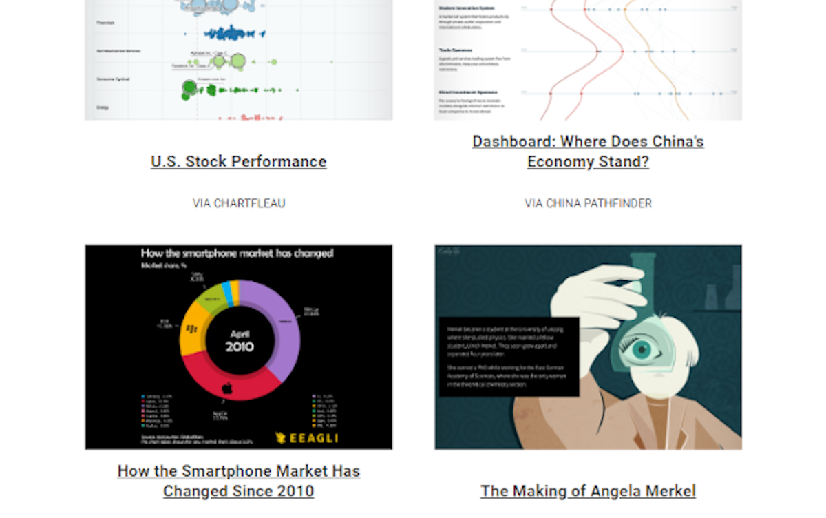
The Trendline
PREMIUM NEWSLETTER: Our Bi-Weekly Newsletter for VC+ Members
The Sunday Edition The Midweek Edition
The Best Visualizations Each Week The Best Data and Reports Each Week
>> View free sample >> View free sample
Before, members received The Trendline newsletter once a week. But now, we’ve doubled the dose—members now receive The Trendline twice a week.
On Sundays, we highlight the best visualizations on business, investing, and global trends that our editors have uncovered. On Thursdays in the Midweek Edition, we send you a round-up of the most interesting reports we find along with key charts and commentary.
In addition to The Trendline, we’ll also be serving up two special features each month. What’s on for November?
“The Best of… The Pudding”
SPECIAL DISPATCH: A Roundup From Our Favorite Publishers

During our research and writing processes, we often stumble upon resources that catch our attention—and sometimes, make us wish we’d thought of it first.
In this VC+ Special Dispatch, we curate the best of content libraries that we’ve come across in our internet journeys, for your easy viewing.
This edition looks at The Pudding—an online collection of visual essays founded by Matt Daniels that covers everything from demographics to pop culture.
“How We Made This: All the Biomass on Earth, In One Graphic – Part 2”
SPECIAL DISPATCH: Behind the Scenes on Content Creation
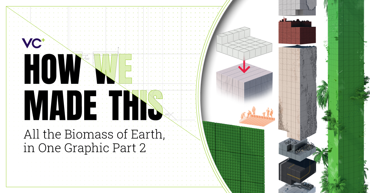
For over a decade, the Visual Capitalist team has worked on thousands of infographics. We’ve learned a lot along the way, and we’re excited to share our process with you.
This month our Visual Scientific Communications Specialist, Mark Belan, takes us behind the scenes of his latest project—a detailed graphic that outlines the different types of biomass on Earth and shows how much of it is human-made.
Limited Time Offer
Get access to these upcoming features by becoming a VC+ member.
For a limited time get 25% off, making your subscription the same price as a coffee each month:
P.S. – We look forward to sending you even more great visuals and data!


VC+
VC+: Get Our Key Takeaways From the IMF’s World Economic Outlook
A sneak preview of the exclusive VC+ Special Dispatch—your shortcut to understanding IMF’s World Economic Outlook report.

Have you read IMF’s latest World Economic Outlook yet? At a daunting 202 pages, we don’t blame you if it’s still on your to-do list.
But don’t worry, you don’t need to read the whole April release, because we’ve already done the hard work for you.
To save you time and effort, the Visual Capitalist team has compiled a visual analysis of everything you need to know from the report—and our upcoming VC+ Special Dispatch will be available exclusively to VC+ members on Thursday, April 25th.
If you’re not already subscribed to VC+, make sure you sign up now to receive the full analysis of the IMF report, and more (we release similar deep dives every week).
For now, here’s what VC+ members can expect to receive.
Your Shortcut to Understanding IMF’s World Economic Outlook
With long and short-term growth prospects declining for many countries around the world, this Special Dispatch offers a visual analysis of the key figures and takeaways from the IMF’s report including:
- The global decline in economic growth forecasts
- Real GDP growth and inflation forecasts for major nations in 2024
- When interest rate cuts will happen and interest rate forecasts
- How debt-to-GDP ratios have changed since 2000
- And much more!

Get the Full Breakdown in the Next VC+ Special Dispatch
VC+ members will receive the full Special Dispatch on Thursday, April 25th.
Make sure you join VC+ now to receive exclusive charts and the full analysis of key takeaways from IMF’s World Economic Outlook.
Don’t miss out. Become a VC+ member today.
What You Get When You Become a VC+ Member
VC+ is Visual Capitalist’s premium subscription. As a member, you’ll get the following:
- Special Dispatches: Deep dive visual briefings on crucial reports and global trends
- Markets This Month: A snappy summary of the state of the markets and what to look out for
- The Trendline: Weekly curation of the best visualizations from across the globe
- Global Forecast Series: Our flagship annual report that covers everything you need to know related to the economy, markets, geopolitics, and the latest tech trends
- VC+ Archive: Hundreds of previously released VC+ briefings and reports that you’ve been missing out on, all in one dedicated hub
You can get all of the above, and more, by joining VC+ today.

-

 Green1 week ago
Ranked: The Countries With the Most Air Pollution in 2023
-

 Automotive2 weeks ago
Almost Every EV Stock is Down After Q1 2024
-

 AI2 weeks ago
The Stock Performance of U.S. Chipmakers So Far in 2024
-

 Markets2 weeks ago
Charted: Big Four Market Share by S&P 500 Audits
-

 Real Estate2 weeks ago
Ranked: The Most Valuable Housing Markets in America
-

 Money2 weeks ago
Which States Have the Highest Minimum Wage in America?
-

 AI2 weeks ago
Ranked: Semiconductor Companies by Industry Revenue Share
-

 Travel2 weeks ago
Ranked: The World’s Top Flight Routes, by Revenue