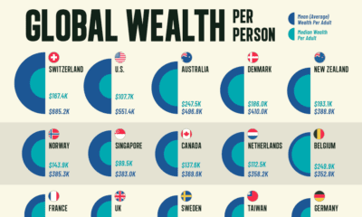
Money
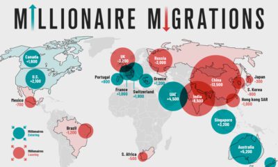
Mapping the Migration of the World’s Millionaires


Mapping the Migration of the World’s Millionaires
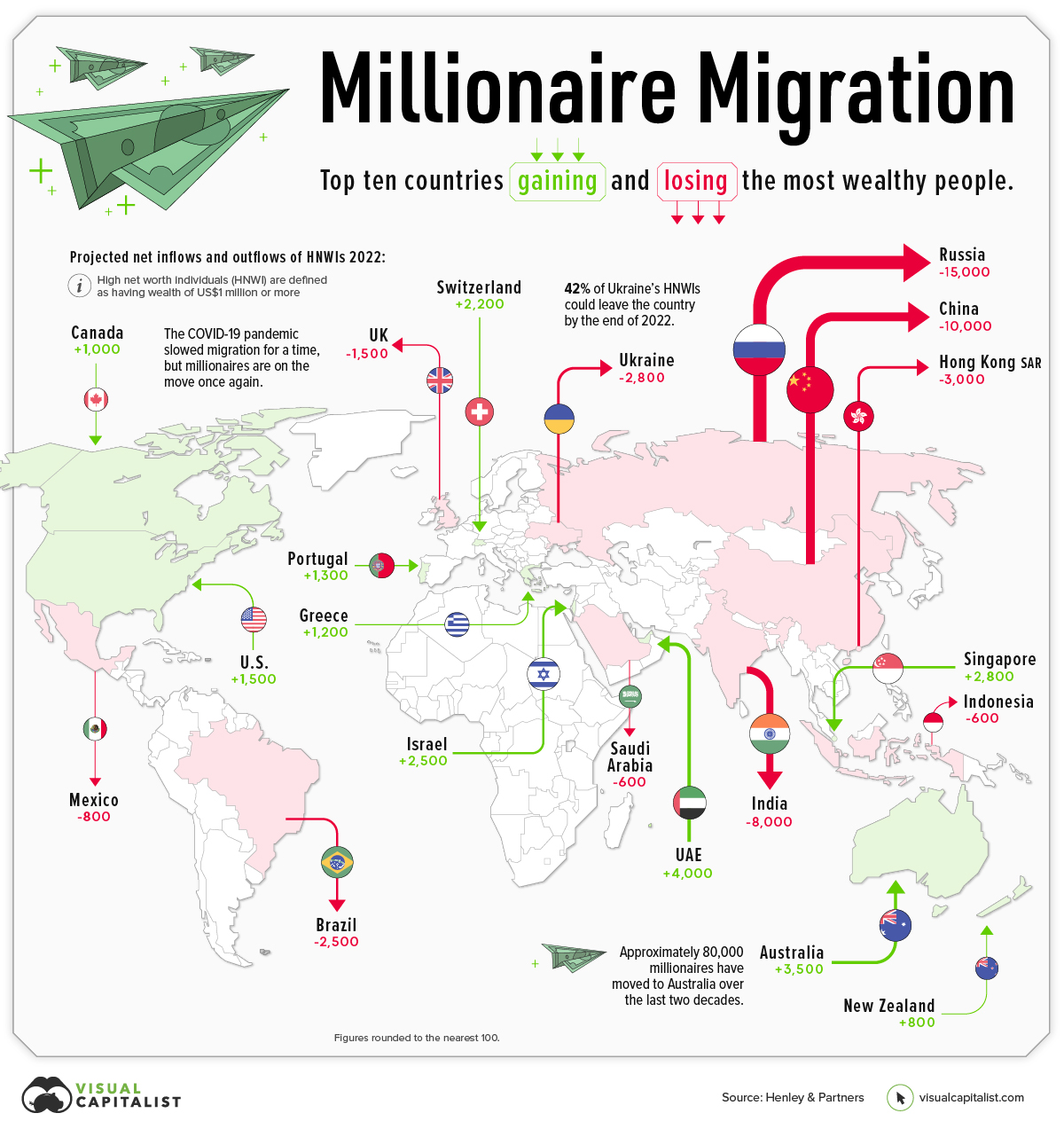
Throughout 2022, a projected 88,000 millionaires will move to a new country, according to the latest Henley Global Citizens Report.
Which countries are these millionaires moving to, and where in the world are they coming from?
This graphic maps the migration of high net worth individuals (HNWIs)—people with a net worth of over US$1 million—showing where rich people are flocking, and where they’re fleeing.
Migration of Millionaires is Back
Before diving into the country-specific data, it’s worth taking a step back to look at overall millionaire migration trends, and how things are changing this year.
2020 saw a drastic drop in the number of millionaire migrants, as pandemic-induced lockdowns kept people from leaving their home countries—and at times, their homes in general.
But as restrictions ease and countries begin to open up their borders again, the migration of millionaires is beginning to gather steam once again:
| Year | # of HNWIs that migrated | Y-o-y change |
|---|---|---|
| 2018 | 108,000 | 14% |
| 2019 | 110,000 | 2% |
| 2020 | 12,000 | -89% |
| 2021 | 25,000 | 108% |
| 2022P | 88,000 | 252% |
| 2023P | 125,000 | 42% |
Below, we’ll dive into which countries are seeing the highest number of HNWI migrants, and which ones are losing the most HNWIs.
Which Countries Are Millionaires Leaving?
There are a plethora of reasons why the ultra-rich move countries. Escaping conflict is one of them, which is why it’s no surprise to see Russia and Ukraine are projected to see some of the biggest emigration numbers by the end of 2022.
Here are the top 10 countries by millionaire outflows:
| Country | Projected net outflows of HNWIs (2022) | % of HNWIs lost |
|---|---|---|
| 🇷🇺 Russia | 15,000 | 15% |
| 🇨🇳 China | 10,000 | 1% |
| 🇮🇳 India | 8,000 | 2% |
| 🇭🇰 Hong Kong | 3,000 | 2% |
| 🇺🇦 Ukraine | 2,800 | 42% |
| 🇧🇷 Brazil | 2,500 | 2% |
| 🇬🇧 UK | 1,500 | 0% |
| 🇲🇽 Mexico | 800 | 0% |
| 🇸🇦 Saudi Arabia | 600 | 1% |
| 🇮🇩 Indonesia | 600 | 1% |
Figures rounded to the nearest 100.
While Russia is expected to see 15,000 millionaires leaving the country, Ukraine is projected to experience the highest loss in percentage terms—a whopping 42% of its HNWIs could leave the country by the end of 2022.
China could also see a big loss in its millionaire population, with a projected loss of 10,000.
According to Andrew Amoils, Head of Research at New World Wealth, this could be more damaging to the country than in previous years, since general wealth growth in China has declined recently.
Where Are The Ultra-Rich Moving?
The United Arab Emirates (UAE) has become a millionaire magnet, with a projected 4,000 HNWIs flowing into the country by the end of 2022. This influx of ultra-wealthy people is partly because of the country’s accommodating immigration policies that are specially tailored to attract private wealth and international talent.
Here are the top 10 countries that saw millionaire inflows:
| Country | Projected net inflows of HNWIs (2022) | % of HNWI Gained |
|---|---|---|
| 🇦🇪 UAE | 4,000 | 4% |
| 🇦🇺 Australia | 3,500 | 1% |
| 🇸🇬 Singapore | 2,800 | 1% |
| 🇮🇱 Israel | 2,500 | 2% |
| 🇺🇸 USA | 1,500 | 0% |
| 🇵🇹 Portugal | 1,300 | 2% |
| 🇬🇷 Greece | 1,200 | 3% |
| 🇨🇦 Canada | 1,000 | 0% |
| 🇳🇿 New Zealand | 800 | 1% |
Australia continues to attract HNWIs, coming in second behind the UAE. According to New World Wealth, approximately 80,000 millionaires have moved to the Land Down Under in the last two decades.
A few things that attract migrants to Australia are the country’s low costs of healthcare, its lack of inheritance tax, and its generally prosperous economy.
Where does this data come from?
Source: Henley Global Citizens Report 2022
Data notes: As countries reopen, and the invasion of Ukraine wears on, this will have ripple effects on where people choose to live. There are two main things to keep in mind when view the information above. 1) Individuals need to remain in a country for six months in order to be updated in the database. In many cases, it’s not yet clear where people leaving certain countries choosing to relocate. 2) In the graphic above, we’ve visualized the top 10 countries for inflows and outflows.
Update: This article and graphic have been updated to more clearly explain what’s being shown, and list the data source in a more prominent way. We appreciate your feedback.


Money
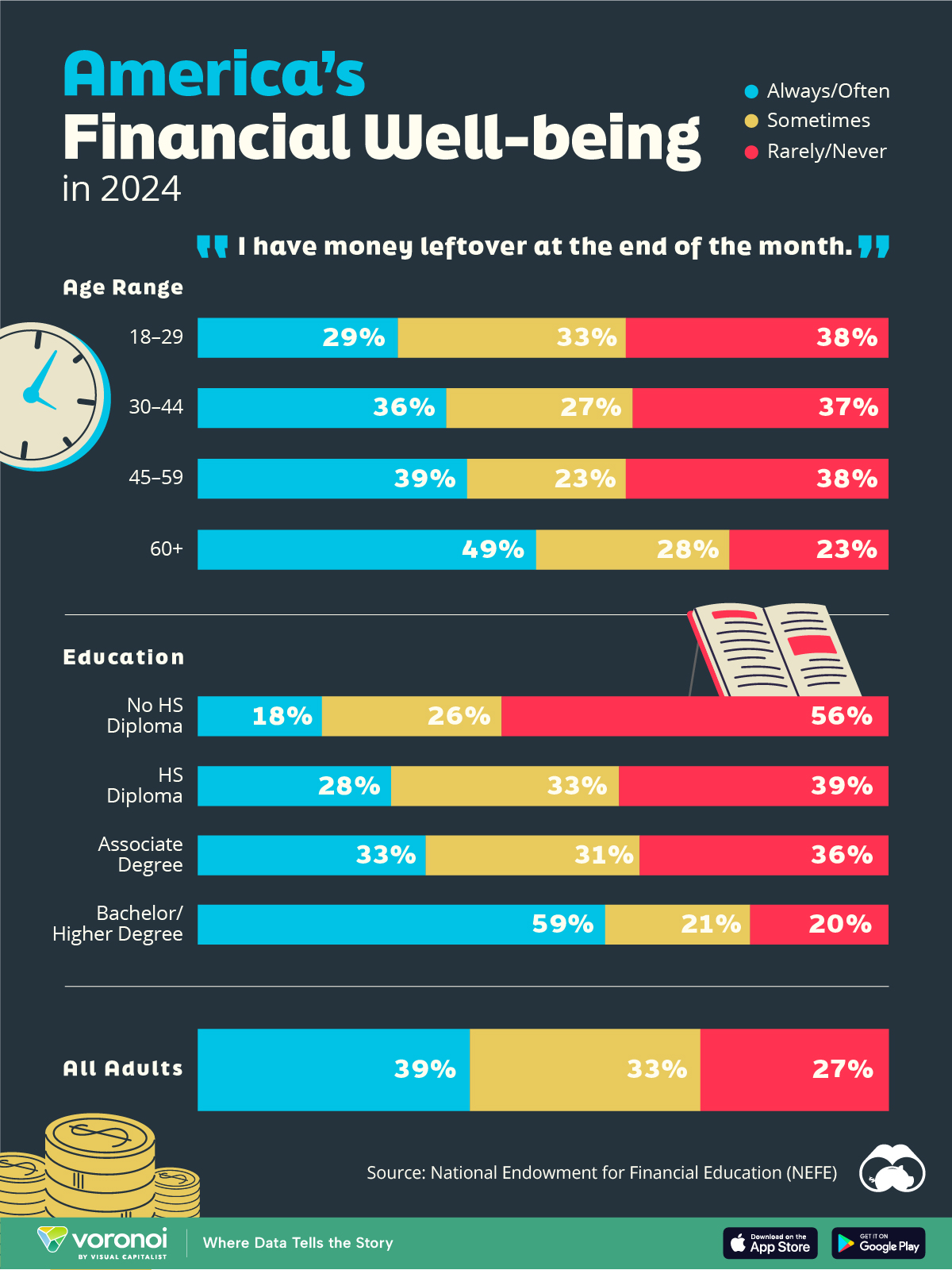
Charted: Who Has Savings in This Economy?
Older, better-educated adults are winning the savings game, reveals a January survey by the National Opinion Research Center at the University of Chicago.
Who Has Savings in This Economy?
This was originally posted on our Voronoi app. Download the app for free on iOS or Android and discover incredible data-driven charts from a variety of trusted sources.
Two full years of inflation have taken their toll on American households. In 2023, the country’s collective credit card debt crossed $1 trillion for the first time. So who is managing to save money in the current economic environment?
We visualize the percentage of respondents to the statement “I have money leftover at the end of the month” categorized by age and education qualifications. Data is sourced from a National Endowment for Financial Education (NEFE) report, published last month.
The survey for NEFE was conducted from January 12-14, 2024, by the National Opinion Research Center at the University of Chicago. It involved 1,222 adults aged 18+ and aimed to be representative of the U.S. population.
Older Americans Save More Than Their Younger Counterparts
General trends from this dataset indicate that as respondents get older, a higher percentage of them are able to save.
| Age | Always/Often | Sometimes | Rarely/Never |
|---|---|---|---|
| 18–29 | 29% | 33% | 38% |
| 30–44 | 36% | 27% | 37% |
| 45–59 | 39% | 23% | 38% |
| Above 60 | 49% | 28% | 23% |
| All Adults | 39% | 33% | 27% |
Note: Percentages are rounded and may not sum to 100.
Perhaps not surprisingly, those aged 60+ are the age group with the highest percentage saying they have leftover money at the end of the month. This age group spent the most time making peak earnings in their careers, are more likely to have investments, and are more likely to have paid off major expenses like a mortgage or raising a family.
The Impact of Higher Education on Earnings and Savings
Based on this survey, higher education dramatically improves one’s ability to save. Shown in the table below, those with a bachelor’s degree or higher are three times more likely to have leftover money than those without a high school diploma.
| Education | Always/Often | Sometimes | Rarely/Never |
|---|---|---|---|
| No HS Diploma | 18% | 26% | 56% |
| HS Diploma | 28% | 33% | 39% |
| Associate Degree | 33% | 31% | 36% |
| Bachelor/Higher Degree | 59% | 21% | 20% |
| All Adults | 39% | 33% | 27% |
Note: Percentages are rounded and may not sum to 100.
As the Bureau of Labor Statistics notes, earnings improve with every level of education completed.
For example, those with a high school diploma made 25% more than those without in 2022. And as the qualifications increase, the effects keep stacking.
Meanwhile, a Federal Reserve study also found that those with more education tended to make financial decisions that contributed to building wealth, of which the first step is to save.

-

 Markets1 week ago
U.S. Debt Interest Payments Reach $1 Trillion
-

 Markets2 weeks ago
Ranked: The Most Valuable Housing Markets in America
-

 Money2 weeks ago
Which States Have the Highest Minimum Wage in America?
-

 AI2 weeks ago
Ranked: Semiconductor Companies by Industry Revenue Share
-

 Markets2 weeks ago
Ranked: The World’s Top Flight Routes, by Revenue
-

 Countries2 weeks ago
Population Projections: The World’s 6 Largest Countries in 2075
-

 Markets2 weeks ago
The Top 10 States by Real GDP Growth in 2023
-

 Money2 weeks ago
The Smallest Gender Wage Gaps in OECD Countries