Markets
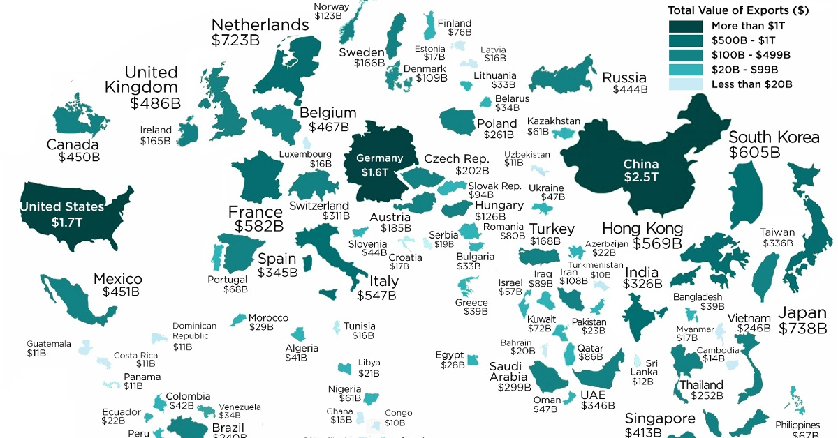
Mapped: The World’s Largest Exporters in 2018
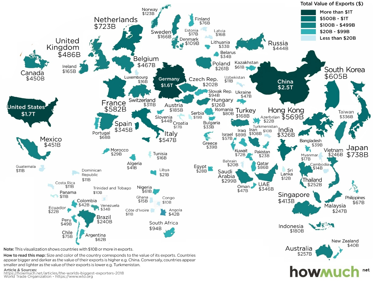
Visualizing the World’s Largest Exporters in 2018
Trillions of dollars of goods get traded around the world every year.
In 2018, total global exports exceeded $19 trillion, including specialized goods falling into almost every possible category imaginable.
Whether you’re talking about German cars, Bangladeshi t-shirts, Saudi oil, or Swiss milk chocolate, just about anything is available on the world market for a price – and the world’s largest exporting countries aim to take advantage.
Ranked: The 15 Largest Exporters in 2018
Today’s visualization comes to us from HowMuch.net, and it resizes countries based on their most recent export numbers, as per data from the World Trade Organization (WTO).
Let’s take a look at how the field breaks down:
| Rank | Country | Exports (2018, $M) | Share of Global Total |
|---|---|---|---|
| #1 | 🇨🇳 China | $2,487,045 | 12.8% |
| #2 | 🇺🇸 United States | $1,664,085 | 8.6% |
| #3 | 🇩🇪 Germany | $1,560,816 | 8.0% |
| #4 | 🇯🇵 Japan | $738,403 | 3.8% |
| #5 | 🇳🇱 Netherlands | $722,668 | 3.7% |
| #6 | 🇰🇷 Korea, Rep. | $604,860 | 3.1% |
| #7 | 🇫🇷 France | $581,816 | 3.0% |
| #8 | 🇭🇰 Hong Kong, China | $569,241 | 2.9% |
| #9 | 🇮🇹 Italy | $546,643 | 2.8% |
| #10 | 🇬🇧 United Kingdom | $485,711 | 2.5% |
| #11 | 🇧🇪 Belgium | $466,724 | 2.4% |
| #12 | 🇲🇽 Mexico | $450,572 | 2.3% |
| #13 | 🇨🇦 Canada | $449,845 | 2.3% |
| #14 | 🇷🇺 Russia | $444,008 | 2.3% |
| #15 | 🇸🇬 Singapore | $412,629 | 2.1% |
Leading the list of the world’s largest exporters is China, with a whopping $2.5 trillion of goods sent abroad in 2018. If you add in Hong Kong’s numbers, China holds 15.7% of the global export total — roughly equal to Japan, Netherlands, South Korea, France, and Singapore combined.
Coming next on the list is the U.S., which exports about $1.7 trillion of goods each year. After that comes Germany, which is the only other country to export over $1 trillion of goods per year.
Comparing U.S. and Chinese Exports
What does China export, and how does that compare to a more developed economy such as the United States?
Using data from MIT’s Observatory of Economic Complexity, we can see the broad breakdown of exports in both countries:
| 🇨🇳 China (Exports) | Share | 🇺🇸 U.S. (Exports) | Share | |
|---|---|---|---|---|
| Machines | 48.5% | Machines | 22.1% | |
| Textiles | 9.9% | Transportation | 14.9% | |
| Metals | 7.1% | Chemical Products | 13.7% | |
| Chemical Products | 4.9% | Mineral Products | 11.4% | |
| Plastics and Rubbers | 4.0% | Instruments | 6.8% | |
| Instruments | 3.2% | Plastics and Rubbers | 5.5% | |
| Transportation | 3.2% | Vegetable Products | 5.1% | |
| Footwear and Headwear | 2.6% | Metals | 4.8% | |
| Stone and Glass | 1.7% | Foodstuffs | 3.3% | |
| Mineral Products | 1.3% | Precious Metals | 3.1% | |
| Animal Hides | 1.2% | Animal Products | 2.2% | |
| Other/Misc | 12.4% | Paper Goods | 2.1% | |
| Textiles | 1.7% | |||
| Other/Misc | 3.3% |
On first glance, it’s clear that China’s exports are reliant on one heavy-hitting category (Machines) to drive a whopping 48.5% of total export value. Within that broad category of machines, there are many narrower categories, including:
- Broadcasting equipment (9.6% of total exports)
- Computers (6.1%)
- Office machine parts (3.8%)
- Integrated circuits (3.3%)
- Telephones (2.6%)
- Electrical transformers (1.3%)
- Semiconductor devices (1.2%)
- Video displays (1.1%)
For the United States, machines are still important at 22.1% of exports, but three other broad categories also surpass the 10% mark: transportation, chemical products, and mineral products. This means the U.S. is generally more diversified in its major exports.
For more, see the largest export of each state on this map.


Markets
U.S. Debt Interest Payments Reach $1 Trillion
U.S. debt interest payments have surged past the $1 trillion dollar mark, amid high interest rates and an ever-expanding debt burden.


U.S. Debt Interest Payments Reach $1 Trillion
This was originally posted on our Voronoi app. Download the app for free on iOS or Android and discover incredible data-driven charts from a variety of trusted sources.
The cost of paying for America’s national debt crossed the $1 trillion dollar mark in 2023, driven by high interest rates and a record $34 trillion mountain of debt.
Over the last decade, U.S. debt interest payments have more than doubled amid vast government spending during the pandemic crisis. As debt payments continue to soar, the Congressional Budget Office (CBO) reported that debt servicing costs surpassed defense spending for the first time ever this year.
This graphic shows the sharp rise in U.S. debt payments, based on data from the Federal Reserve.
A $1 Trillion Interest Bill, and Growing
Below, we show how U.S. debt interest payments have risen at a faster pace than at another time in modern history:
| Date | Interest Payments | U.S. National Debt |
|---|---|---|
| 2023 | $1.0T | $34.0T |
| 2022 | $830B | $31.4T |
| 2021 | $612B | $29.6T |
| 2020 | $518B | $27.7T |
| 2019 | $564B | $23.2T |
| 2018 | $571B | $22.0T |
| 2017 | $493B | $20.5T |
| 2016 | $460B | $20.0T |
| 2015 | $435B | $18.9T |
| 2014 | $442B | $18.1T |
| 2013 | $425B | $17.2T |
| 2012 | $417B | $16.4T |
| 2011 | $433B | $15.2T |
| 2010 | $400B | $14.0T |
| 2009 | $354B | $12.3T |
| 2008 | $380B | $10.7T |
| 2007 | $414B | $9.2T |
| 2006 | $387B | $8.7T |
| 2005 | $355B | $8.2T |
| 2004 | $318B | $7.6T |
| 2003 | $294B | $7.0T |
| 2002 | $298B | $6.4T |
| 2001 | $318B | $5.9T |
| 2000 | $353B | $5.7T |
| 1999 | $353B | $5.8T |
| 1998 | $360B | $5.6T |
| 1997 | $368B | $5.5T |
| 1996 | $362B | $5.3T |
| 1995 | $357B | $5.0T |
| 1994 | $334B | $4.8T |
| 1993 | $311B | $4.5T |
| 1992 | $306B | $4.2T |
| 1991 | $308B | $3.8T |
| 1990 | $298B | $3.4T |
| 1989 | $275B | $3.0T |
| 1988 | $254B | $2.7T |
| 1987 | $240B | $2.4T |
| 1986 | $225B | $2.2T |
| 1985 | $219B | $1.9T |
| 1984 | $205B | $1.7T |
| 1983 | $176B | $1.4T |
| 1982 | $157B | $1.2T |
| 1981 | $142B | $1.0T |
| 1980 | $113B | $930.2B |
| 1979 | $96B | $845.1B |
| 1978 | $84B | $789.2B |
| 1977 | $69B | $718.9B |
| 1976 | $61B | $653.5B |
| 1975 | $55B | $576.6B |
| 1974 | $50B | $492.7B |
| 1973 | $45B | $469.1B |
| 1972 | $39B | $448.5B |
| 1971 | $36B | $424.1B |
| 1970 | $35B | $389.2B |
| 1969 | $30B | $368.2B |
| 1968 | $25B | $358.0B |
| 1967 | $23B | $344.7B |
| 1966 | $21B | $329.3B |
Interest payments represent seasonally adjusted annual rate at the end of Q4.
At current rates, the U.S. national debt is growing by a remarkable $1 trillion about every 100 days, equal to roughly $3.6 trillion per year.
As the national debt has ballooned, debt payments even exceeded Medicaid outlays in 2023—one of the government’s largest expenditures. On average, the U.S. spent more than $2 billion per day on interest costs last year. Going further, the U.S. government is projected to spend a historic $12.4 trillion on interest payments over the next decade, averaging about $37,100 per American.
Exacerbating matters is that the U.S. is running a steep deficit, which stood at $1.1 trillion for the first six months of fiscal 2024. This has accelerated due to the 43% increase in debt servicing costs along with a $31 billion dollar increase in defense spending from a year earlier. Additionally, a $30 billion increase in funding for the Federal Deposit Insurance Corporation in light of the regional banking crisis last year was a major contributor to the deficit increase.
Overall, the CBO forecasts that roughly 75% of the federal deficit’s increase will be due to interest costs by 2034.

-

 Travel1 week ago
Airline Incidents: How Do Boeing and Airbus Compare?
-

 Markets3 weeks ago
Visualizing America’s Shortage of Affordable Homes
-

 Green3 weeks ago
Ranked: Top Countries by Total Forest Loss Since 2001
-

 Money2 weeks ago
Where Does One U.S. Tax Dollar Go?
-

 Misc2 weeks ago
Almost Every EV Stock is Down After Q1 2024
-

 AI2 weeks ago
The Stock Performance of U.S. Chipmakers So Far in 2024
-

 Markets2 weeks ago
Charted: Big Four Market Share by S&P 500 Audits
-

 Real Estate2 weeks ago
Ranked: The Most Valuable Housing Markets in America