Energy
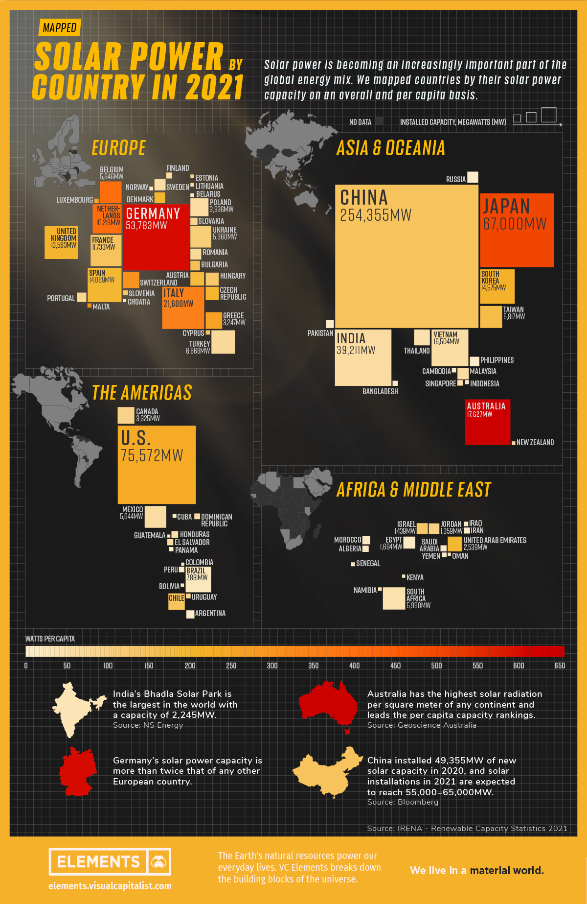
Mapped: Solar Power by Country in 2021
![]() Subscribe to the Elements free mailing list for more like this
Subscribe to the Elements free mailing list for more like this


Mapped: Solar Power by Country in 2021
This was originally posted on Elements. Sign up to the free mailing list to get beautiful visualizations on natural resource megatrends in your email every week.
The world is adopting renewable energy at an unprecedented pace, and solar power is the energy source leading the way.
Despite a 4.5% fall in global energy demand in 2020, renewable energy technologies showed promising progress. While the growth in renewables was strong across the board, solar power led from the front with 127 gigawatts installed in 2020, its largest-ever annual capacity expansion.
The above infographic uses data from the International Renewable Energy Agency (IRENA) to map solar power capacity by country in 2021. This includes both solar photovoltaic (PV) and concentrated solar power capacity.
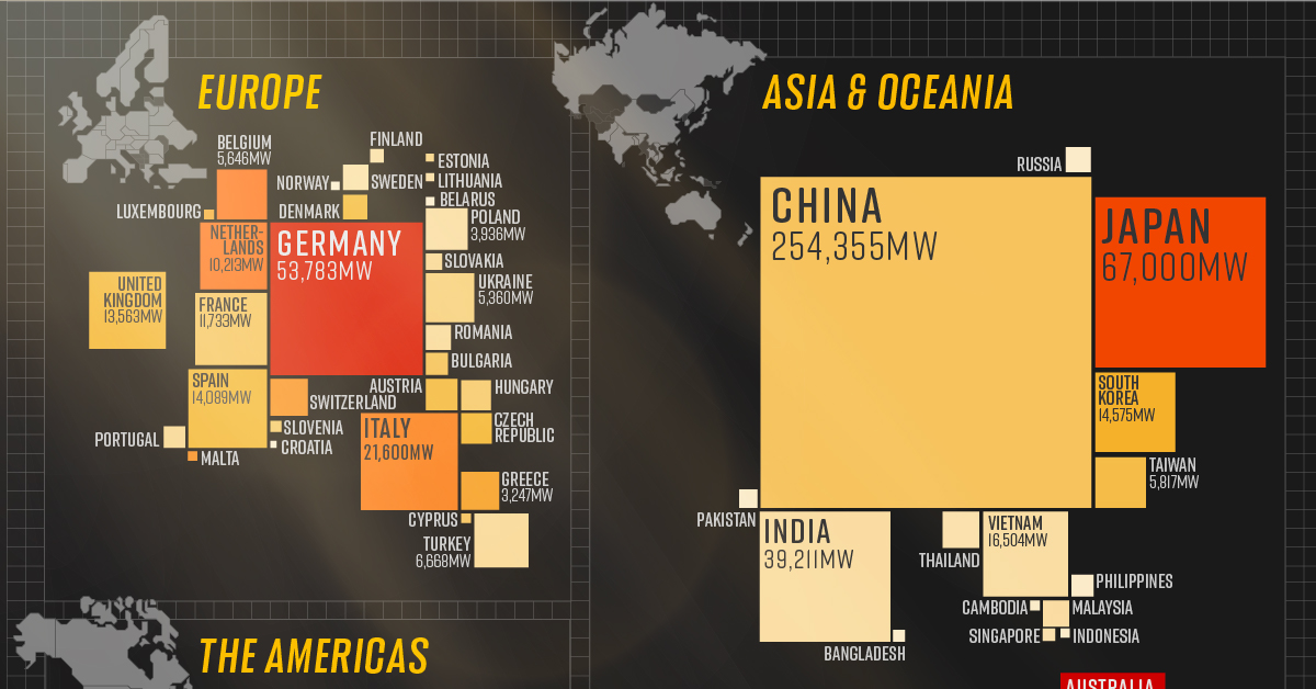
The Solar Power Leaderboard
From the Americas to Oceania, countries in virtually every continent (except Antarctica) added more solar to their mix last year. Here’s a snapshot of solar power capacity by country at the beginning of 2021:
| Country | Installed capacity, megawatts | Watts* per capita | % of world total |
|---|---|---|---|
| China 🇨🇳 | 254,355 | 147 | 35.6% |
| U.S. 🇺🇸 | 75,572 | 231 | 10.6% |
| Japan 🇯🇵 | 67,000 | 498 | 9.4% |
| Germany 🇩🇪 | 53,783 | 593 | 7.5% |
| India 🇮🇳 | 39,211 | 32 | 5.5% |
| Italy 🇮🇹 | 21,600 | 345 | 3.0% |
| Australia 🇦🇺 | 17,627 | 637 | 2.5% |
| Vietnam 🇻🇳 | 16,504 | 60 | 2.3% |
| South Korea 🇰🇷 | 14,575 | 217 | 2.0% |
| Spain 🇪🇸 | 14,089 | 186 | 2.0% |
| United Kingdom 🇬🇧 | 13,563 | 200 | 1.9% |
| France 🇫🇷 | 11,733 | 148 | 1.6% |
| Netherlands 🇳🇱 | 10,213 | 396 | 1.4% |
| Brazil 🇧🇷 | 7,881 | 22 | 1.1% |
| Turkey 🇹🇷 | 6,668 | 73 | 0.9% |
| South Africa 🇿🇦 | 5,990 | 44 | 0.8% |
| Taiwan 🇹🇼 | 5,817 | 172 | 0.8% |
| Belgium 🇧🇪 | 5,646 | 394 | 0.8% |
| Mexico 🇲🇽 | 5,644 | 35 | 0.8% |
| Ukraine 🇺🇦 | 5,360 | 114 | 0.8% |
| Poland 🇵🇱 | 3,936 | 34 | 0.6% |
| Canada 🇨🇦 | 3,325 | 88 | 0.5% |
| Greece 🇬🇷 | 3,247 | 258 | 0.5% |
| Chile 🇨🇱 | 3,205 | 142 | 0.4% |
| Switzerland 🇨🇭 | 3,118 | 295 | 0.4% |
| Thailand 🇹🇭 | 2,988 | 43 | 0.4% |
| United Arab Emirates 🇦🇪 | 2,539 | 185 | 0.4% |
| Austria 🇦🇹 | 2,220 | 178 | 0.3% |
| Czech Republic 🇨🇿 | 2,073 | 194 | 0.3% |
| Hungary 🇭🇺 | 1,953 | 131 | 0.3% |
| Egypt 🇪🇬 | 1,694 | 17 | 0.2% |
| Malaysia 🇲🇾 | 1,493 | 28 | 0.2% |
| Israel 🇮🇱 | 1,439 | 134 | 0.2% |
| Russia 🇷🇺 | 1,428 | 7 | 0.2% |
| Sweden 🇸🇪 | 1,417 | 63 | 0.2% |
| Romania 🇷🇴 | 1,387 | 71 | 0.2% |
| Jordan 🇯🇴 | 1,359 | 100 | 0.2% |
| Denmark 🇩🇰 | 1,300 | 186 | 0.2% |
| Bulgaria 🇧🇬 | 1,073 | 152 | 0.2% |
| Philippines 🇵🇭 | 1,048 | 9 | 0.1% |
| Portugal 🇵🇹 | 1,025 | 81 | 0.1% |
| Argentina 🇦🇷 | 764 | 17 | 0.1% |
| Pakistan 🇵🇰 | 737 | 6 | 0.1% |
| Morocco 🇲🇦 | 734 | 6 | 0.1% |
| Slovakia 🇸🇰 | 593 | 87 | 0.1% |
| Honduras 🇭🇳 | 514 | 53 | 0.1% |
| Algeria 🇩🇿 | 448 | 10 | 0.1% |
| El Salvador 🇸🇻 | 429 | 66 | 0.1% |
| Iran 🇮🇷 | 414 | 5 | 0.1% |
| Saudi Arabia 🇸🇦 | 409 | 12 | 0.1% |
| Finland 🇫🇮 | 391 | 39 | 0.1% |
| Dominican Republic 🇩🇴 | 370 | 34 | 0.1% |
| Peru 🇵🇪 | 331 | 10 | 0.05% |
| Singapore 🇸🇬 | 329 | 45 | 0.05% |
| Bangladesh 🇧🇩 | 301 | 2 | 0.04% |
| Slovenia 🇸🇮 | 267 | 128 | 0.04% |
| Uruguay 🇺🇾 | 256 | 74 | 0.04% |
| Yemen 🇾🇪 | 253 | 8 | 0.04% |
| Iraq 🇮🇶 | 216 | 5 | 0.03% |
| Cambodia 🇰🇭 | 208 | 12 | 0.03% |
| Cyprus 🇨🇾 | 200 | 147 | 0.03% |
| Panama 🇵🇦 | 198 | 46 | 0.03% |
| Luxembourg 🇱🇺 | 195 | 244 | 0.03% |
| Malta 🇲🇹 | 184 | 312 | 0.03% |
| Indonesia 🇮🇩 | 172 | 1 | 0.02% |
| Cuba 🇨🇺 | 163 | 14 | 0.02% |
| Belarus 🇧🇾 | 159 | 17 | 0.02% |
| Senegal 🇸🇳 | 155 | 8 | 0.02% |
| Norway 🇳🇴 | 152 | 17 | 0.02% |
| Lithuania 🇱🇹 | 148 | 37 | 0.02% |
| Namibia 🇳🇦 | 145 | 55 | 0.02% |
| New Zealand 🇳🇿 | 142 | 29 | 0.02% |
| Estonia 🇪🇪 | 130 | 98 | 0.02% |
| Bolivia 🇧🇴 | 120 | 10 | 0.02% |
| Oman 🇴🇲 | 109 | 21 | 0.02% |
| Colombia 🇨🇴 | 107 | 2 | 0.01% |
| Kenya 🇰🇪 | 106 | 2 | 0.01% |
| Guatemala 🇬🇹 | 101 | 6 | 0.01% |
| Croatia 🇭🇷 | 85 | 17 | 0.01% |
| World total 🌎 | 713,970 | 83 | 100.0% |
*1 megawatt = 1,000,000 watts.
China is the undisputed leader in solar installations, with over 35% of global capacity. What’s more, the country is showing no signs of slowing down. It has the world’s largest wind and solar project in the pipeline, which could add another 400,000MW to its clean energy capacity.
Following China from afar is the U.S., which recently surpassed 100,000MW of solar power capacity after installing another 50,000MW in the first three months of 2021. Annual solar growth in the U.S. has averaged an impressive 42% over the last decade. Policies like the solar investment tax credit, which offers a 26% tax credit on residential and commercial solar systems, have helped propel the industry forward.
Although Australia hosts a fraction of China’s solar capacity, it tops the per capita rankings due to its relatively low population of 26 million people. The Australian continent receives the highest amount of solar radiation of any continent, and over 30% of Australian households now have rooftop solar PV systems.
China: The Solar Champion
In 2020, President Xi Jinping stated that China aims to be carbon neutral by 2060, and the country is taking steps to get there.
China is a leader in the solar industry, and it seems to have cracked the code for the entire solar supply chain. In 2019, Chinese firms produced 66% of the world’s polysilicon, the initial building block of silicon-based photovoltaic (PV) panels. Furthermore, more than three-quarters of solar cells came from China, along with 72% of the world’s PV panels.
With that said, it’s no surprise that 5 of the world’s 10 largest solar parks are in China, and it will likely continue to build more as it transitions to carbon neutrality.
What’s Driving the Rush for Solar Power?
The energy transition is a major factor in the rise of renewables, but solar’s growth is partly due to how cheap it has become over time. Solar energy costs have fallen exponentially over the last decade, and it’s now the cheapest source of new energy generation.
Since 2010, the cost of solar power has seen a 85% decrease, down from $0.28 to $0.04 per kWh. According to MIT researchers, economies of scale have been the single-largest factor in continuing the cost decline for the last decade. In other words, as the world installed and made more solar panels, production became cheaper and more efficient.
This year, solar costs are rising due to supply chain issues, but the rise is likely to be temporary as bottlenecks resolve.


Energy
Charted: 4 Reasons Why Lithium Could Be the Next Gold Rush
Visual Capitalist has partnered with EnergyX to show why drops in prices and growing demand may make now the right time to invest in lithium.
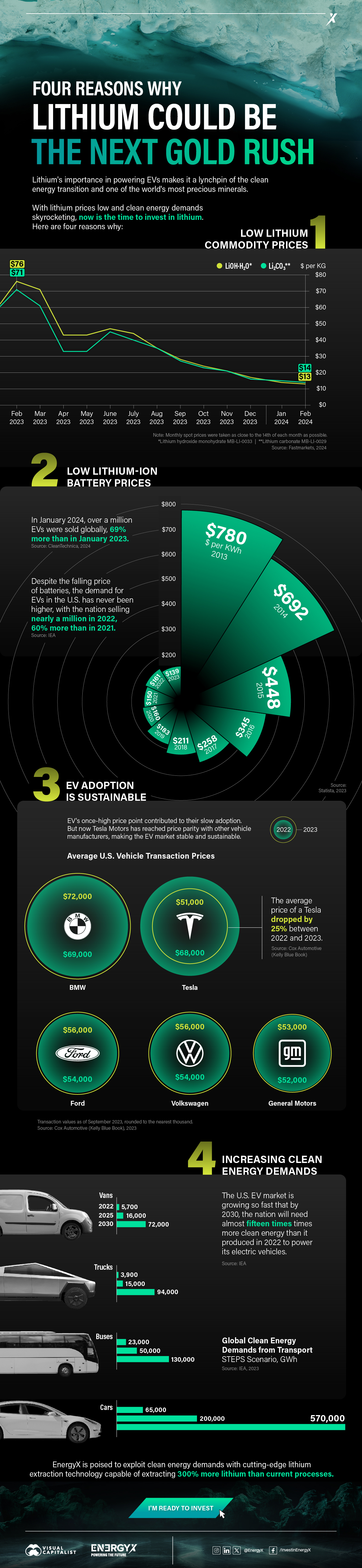
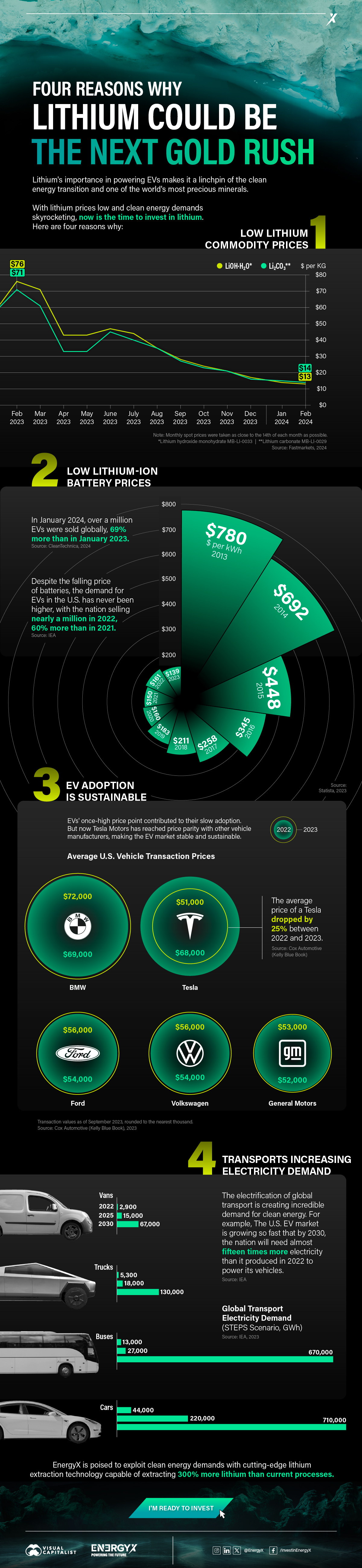
4 Reasons Why You Should Invest in Lithium
Lithium’s importance in powering EVs makes it a linchpin of the clean energy transition and one of the world’s most precious minerals.
In this graphic, Visual Capitalist partnered with EnergyX to explore why now may be the time to invest in lithium.
1. Lithium Prices Have Dropped
One of the most critical aspects of evaluating an investment is ensuring that the asset’s value is higher than its price would indicate. Lithium is integral to powering EVs, and, prices have fallen fast over the last year:
| Date | LiOH·H₂O* | Li₂CO₃** |
|---|---|---|
| Feb 2023 | $76 | $71 |
| March 2023 | $71 | $61 |
| Apr 2023 | $43 | $33 |
| May 2023 | $43 | $33 |
| June 2023 | $47 | $45 |
| July 2023 | $44 | $40 |
| Aug 2023 | $35 | $35 |
| Sept 2023 | $28 | $27 |
| Oct 2023 | $24 | $23 |
| Nov 2023 | $21 | $21 |
| Dec 2023 | $17 | $16 |
| Jan 2024 | $14 | $15 |
| Feb 2024 | $13 | $14 |
Note: Monthly spot prices were taken as close to the 14th of each month as possible.
*Lithium hydroxide monohydrate MB-LI-0033
**Lithium carbonate MB-LI-0029
2. Lithium-Ion Battery Prices Are Also Falling
The drop in lithium prices is just one reason to invest in the metal. Increasing economies of scale, coupled with low commodity prices, have caused the cost of lithium-ion batteries to drop significantly as well.
In fact, BNEF reports that between 2013 and 2023, the price of a Li-ion battery dropped by 82%.
| Year | Price per KWh |
|---|---|
| 2023 | $139 |
| 2022 | $161 |
| 2021 | $150 |
| 2020 | $160 |
| 2019 | $183 |
| 2018 | $211 |
| 2017 | $258 |
| 2016 | $345 |
| 2015 | $448 |
| 2014 | $692 |
| 2013 | $780 |

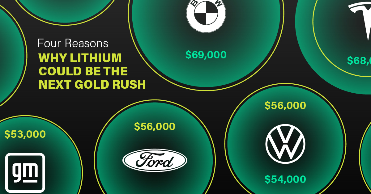
3. EV Adoption is Sustainable
One of the best reasons to invest in lithium is that EVs, one of the main drivers behind the demand for lithium, have reached a price point similar to that of traditional vehicle.
According to the Kelly Blue Book, Tesla’s average transaction price dropped by 25% between 2022 and 2023, bringing it in line with many other major manufacturers and showing that EVs are a realistic transport option from a consumer price perspective.
| Manufacturer | September 2022 | September 2023 |
|---|---|---|
| BMW | $69,000 | $72,000 |
| Ford | $54,000 | $56,000 |
| Volkswagon | $54,000 | $56,000 |
| General Motors | $52,000 | $53,000 |
| Tesla | $68,000 | $51,000 |
4. Electricity Demand in Transport is Growing
As EVs become an accessible transport option, there’s an investment opportunity in lithium. But possibly the best reason to invest in lithium is that the IEA reports global demand for the electricity in transport could grow dramatically by 2030:
| Transport Type | 2022 | 2025 | 2030 |
|---|---|---|---|
| Buses 🚌 | 23,000 GWh | 50,000 GWh | 130,000 GWh |
| Cars 🚙 | 65,000 GWh | 200,000 GWh | 570,000 GWh |
| Trucks 🛻 | 4,000 GWh | 15,000 GWh | 94,000 GWh |
| Vans 🚐 | 6,000 GWh | 16,000 GWh | 72,000 GWh |
The Lithium Investment Opportunity
Lithium presents a potentially classic investment opportunity. Lithium and battery prices have dropped significantly, and recently, EVs have reached a price point similar to other vehicles. By 2030, the demand for clean energy, especially in transport, will grow dramatically.
With prices dropping and demand skyrocketing, now is the time to invest in lithium.
EnergyX is poised to exploit lithium demand with cutting-edge lithium extraction technology capable of extracting 300% more lithium than current processes.

-

 Lithium2 days ago
Ranked: The Top 10 EV Battery Manufacturers in 2023
Asia dominates this ranking of the world’s largest EV battery manufacturers in 2023.
-

 Energy7 days ago
The World’s Biggest Nuclear Energy Producers
China has grown its nuclear capacity over the last decade, now ranking second on the list of top nuclear energy producers.
-

 Energy4 weeks ago
The World’s Biggest Oil Producers in 2023
Just three countries accounted for 40% of global oil production last year.
-
 Energy1 month ago
How Much Does the U.S. Depend on Russian Uranium?
Currently, Russia is the largest foreign supplier of nuclear power fuel to the U.S.
-
 Uranium2 months ago
Charted: Global Uranium Reserves, by Country
We visualize the distribution of the world’s uranium reserves by country, with 3 countries accounting for more than half of total reserves.
-
 Energy2 months ago
Visualizing the Rise of the U.S. as Top Crude Oil Producer
Over the last decade, the United States has established itself as the world’s top producer of crude oil, surpassing Saudi Arabia and Russia.


-

 Green1 week ago
Ranked: The Countries With the Most Air Pollution in 2023
-

 Automotive2 weeks ago
Almost Every EV Stock is Down After Q1 2024
-

 AI2 weeks ago
The Stock Performance of U.S. Chipmakers So Far in 2024
-

 Markets2 weeks ago
Charted: Big Four Market Share by S&P 500 Audits
-

 Real Estate2 weeks ago
Ranked: The Most Valuable Housing Markets in America
-

 Money2 weeks ago
Which States Have the Highest Minimum Wage in America?
-

 AI2 weeks ago
Ranked: Semiconductor Companies by Industry Revenue Share
-

 Travel2 weeks ago
Ranked: The World’s Top Flight Routes, by Revenue