Markets
Mapped: Foreign Direct Investment by Country
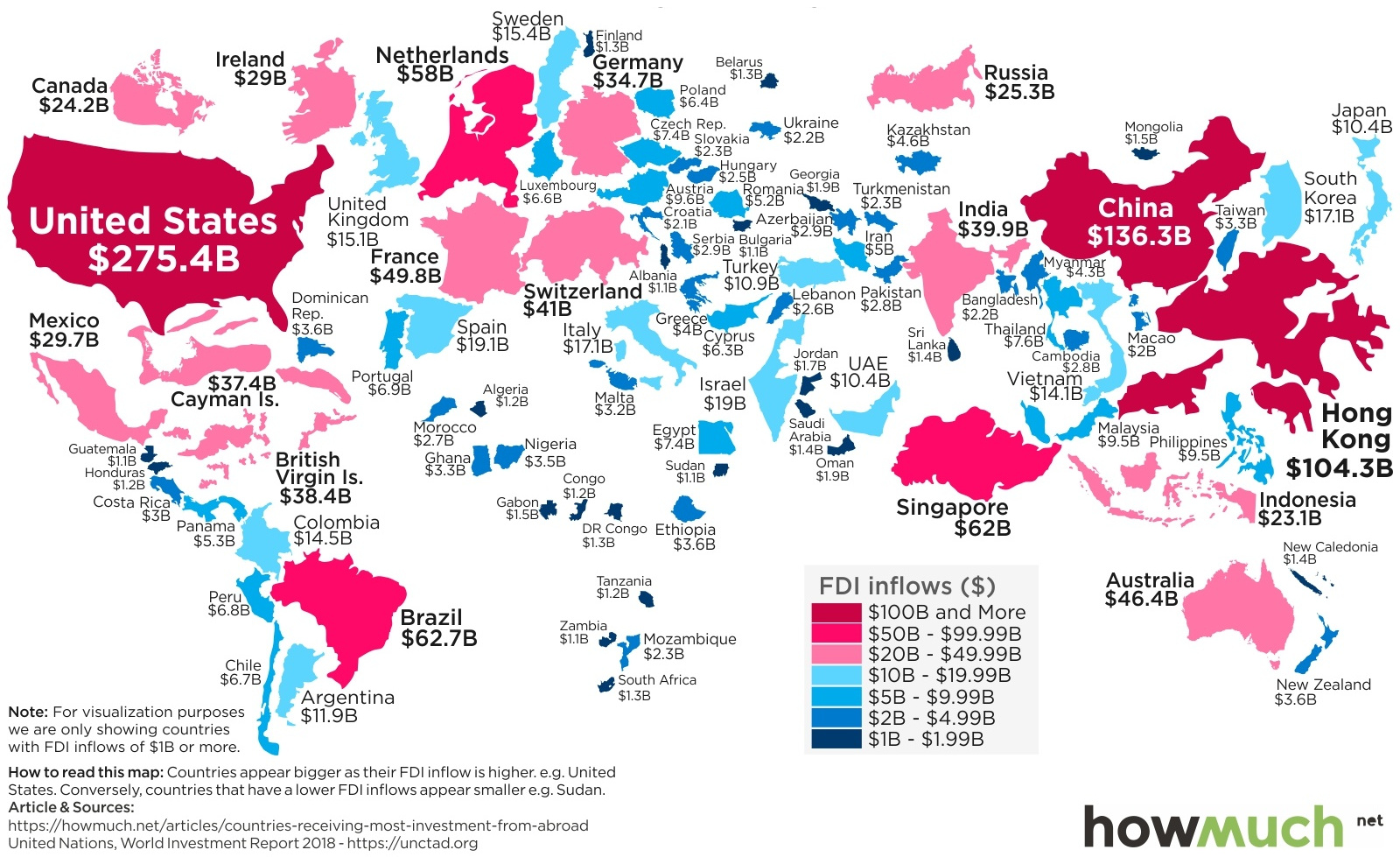
Map: Foreign Direct Investment by Country
For many of the world’s companies, the best investment opportunities aren’t always located within their own domestic borders.
Whether it is building a new Starbucks store in Abu Dhabi or Tata Motors acquiring Land Rover, foreign direct investment (FDI) is a measure of how much business capital is flowing in and out of countries.
In 2017, total foreign direct investment was $1.43 trillion globally, and today’s map from HowMuch.net breaks down where this money went by country.
The Countries Getting FDI
The following data comes from a recent report by the United Nations Conference on Trade and Development.
At a high level, here is where foreign direct investment flows went, based on the type of economy:
| FDI Inflows | FDI Outflows | |
|---|---|---|
| Developed economies | $712.4 billion | $1,009.2 billion |
| Developing economies | $670.7 billion | $380.8 billion |
Most money flows out of wealthier countries, and it flows into both developed and developing nations.
Foreign direct investment is often considered a win-win that brings new capital and jobs to developing nations, while simultaneously creating opportunities for corporations and investors.
Now, let’s look at the top 15 countries and jurisdictions receiving FDI inflows:
| Rank | Jurisdiction | FDI Inflows |
|---|---|---|
| #1 | United States | $275.4 billion |
| #2 | China | $136.3 billion |
| #3 | Hong Kong (SAR) | $104.3 billion |
| #4 | Brazil | $62.7 billion |
| #5 | Singapore | $62.0 billion |
| #6 | Netherlands | $58.0 billion |
| #7 | France | $49.8 billion |
| #8 | Australia | $46.4 billion |
| #9 | Switzerland | $41.0 billion |
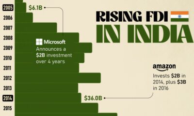
| #10 | India | $39.9 billion |
| #11 | British Virgin Islands | $38.4 billion |
| #12 | Cayman Islands | $37.4 billion |
| #13 | Germany | $34.7 billion |
| #14 | Mexico | $29.7 billion |
| #15 | Ireland | $29.0 billion |
At the top of the list are the United States ($275.4 billion) as well as China and Hong Kong ($240.6 billion), which is not surprising to see.
Further down the list, things become more interesting. Tax havens such as the British Virgin Islands and the Cayman Islands rank higher than developed economies like Canada, United Kingdom, and Japan, which don’t even come close to cracking the top 15.
Meanwhile, Brazil’s ranking in fourth place is also quite impressive with $62.7 billion of foreign direct investment inflows in 2017 – this is not a one-time thing either, since the economy had $58 billion of inflows in 2016 as well.


Markets
U.S. Debt Interest Payments Reach $1 Trillion
U.S. debt interest payments have surged past the $1 trillion dollar mark, amid high interest rates and an ever-expanding debt burden.


U.S. Debt Interest Payments Reach $1 Trillion
This was originally posted on our Voronoi app. Download the app for free on iOS or Android and discover incredible data-driven charts from a variety of trusted sources.
The cost of paying for America’s national debt crossed the $1 trillion dollar mark in 2023, driven by high interest rates and a record $34 trillion mountain of debt.
Over the last decade, U.S. debt interest payments have more than doubled amid vast government spending during the pandemic crisis. As debt payments continue to soar, the Congressional Budget Office (CBO) reported that debt servicing costs surpassed defense spending for the first time ever this year.
This graphic shows the sharp rise in U.S. debt payments, based on data from the Federal Reserve.
A $1 Trillion Interest Bill, and Growing
Below, we show how U.S. debt interest payments have risen at a faster pace than at another time in modern history:
| Date | Interest Payments | U.S. National Debt |
|---|---|---|
| 2023 | $1.0T | $34.0T |
| 2022 | $830B | $31.4T |
| 2021 | $612B | $29.6T |
| 2020 | $518B | $27.7T |
| 2019 | $564B | $23.2T |
| 2018 | $571B | $22.0T |
| 2017 | $493B | $20.5T |
| 2016 | $460B | $20.0T |
| 2015 | $435B | $18.9T |
| 2014 | $442B | $18.1T |
| 2013 | $425B | $17.2T |
| 2012 | $417B | $16.4T |
| 2011 | $433B | $15.2T |
| 2010 | $400B | $14.0T |
| 2009 | $354B | $12.3T |
| 2008 | $380B | $10.7T |
| 2007 | $414B | $9.2T |
| 2006 | $387B | $8.7T |
| 2005 | $355B | $8.2T |
| 2004 | $318B | $7.6T |
| 2003 | $294B | $7.0T |
| 2002 | $298B | $6.4T |
| 2001 | $318B | $5.9T |
| 2000 | $353B | $5.7T |
| 1999 | $353B | $5.8T |
| 1998 | $360B | $5.6T |
| 1997 | $368B | $5.5T |
| 1996 | $362B | $5.3T |
| 1995 | $357B | $5.0T |
| 1994 | $334B | $4.8T |
| 1993 | $311B | $4.5T |
| 1992 | $306B | $4.2T |
| 1991 | $308B | $3.8T |
| 1990 | $298B | $3.4T |
| 1989 | $275B | $3.0T |
| 1988 | $254B | $2.7T |
| 1987 | $240B | $2.4T |
| 1986 | $225B | $2.2T |
| 1985 | $219B | $1.9T |
| 1984 | $205B | $1.7T |
| 1983 | $176B | $1.4T |
| 1982 | $157B | $1.2T |
| 1981 | $142B | $1.0T |
| 1980 | $113B | $930.2B |
| 1979 | $96B | $845.1B |
| 1978 | $84B | $789.2B |
| 1977 | $69B | $718.9B |
| 1976 | $61B | $653.5B |
| 1975 | $55B | $576.6B |
| 1974 | $50B | $492.7B |
| 1973 | $45B | $469.1B |
| 1972 | $39B | $448.5B |
| 1971 | $36B | $424.1B |
| 1970 | $35B | $389.2B |
| 1969 | $30B | $368.2B |
| 1968 | $25B | $358.0B |
| 1967 | $23B | $344.7B |
| 1966 | $21B | $329.3B |
Interest payments represent seasonally adjusted annual rate at the end of Q4.
At current rates, the U.S. national debt is growing by a remarkable $1 trillion about every 100 days, equal to roughly $3.6 trillion per year.
As the national debt has ballooned, debt payments even exceeded Medicaid outlays in 2023—one of the government’s largest expenditures. On average, the U.S. spent more than $2 billion per day on interest costs last year. Going further, the U.S. government is projected to spend a historic $12.4 trillion on interest payments over the next decade, averaging about $37,100 per American.
Exacerbating matters is that the U.S. is running a steep deficit, which stood at $1.1 trillion for the first six months of fiscal 2024. This has accelerated due to the 43% increase in debt servicing costs along with a $31 billion dollar increase in defense spending from a year earlier. Additionally, a $30 billion increase in funding for the Federal Deposit Insurance Corporation in light of the regional banking crisis last year was a major contributor to the deficit increase.
Overall, the CBO forecasts that roughly 75% of the federal deficit’s increase will be due to interest costs by 2034.

-

 Markets1 week ago
Ranked: The Largest U.S. Corporations by Number of Employees
-

 Green3 weeks ago
Ranked: Top Countries by Total Forest Loss Since 2001
-

 Money2 weeks ago
Where Does One U.S. Tax Dollar Go?
-

 Automotive2 weeks ago
Almost Every EV Stock is Down After Q1 2024
-

 AI2 weeks ago
The Stock Performance of U.S. Chipmakers So Far in 2024
-

 Markets2 weeks ago
Charted: Big Four Market Share by S&P 500 Audits
-

 Real Estate2 weeks ago
Ranked: The Most Valuable Housing Markets in America
-

 Money2 weeks ago
Which States Have the Highest Minimum Wage in America?