Misc
Mapped: Where America’s Truckers Live, by State
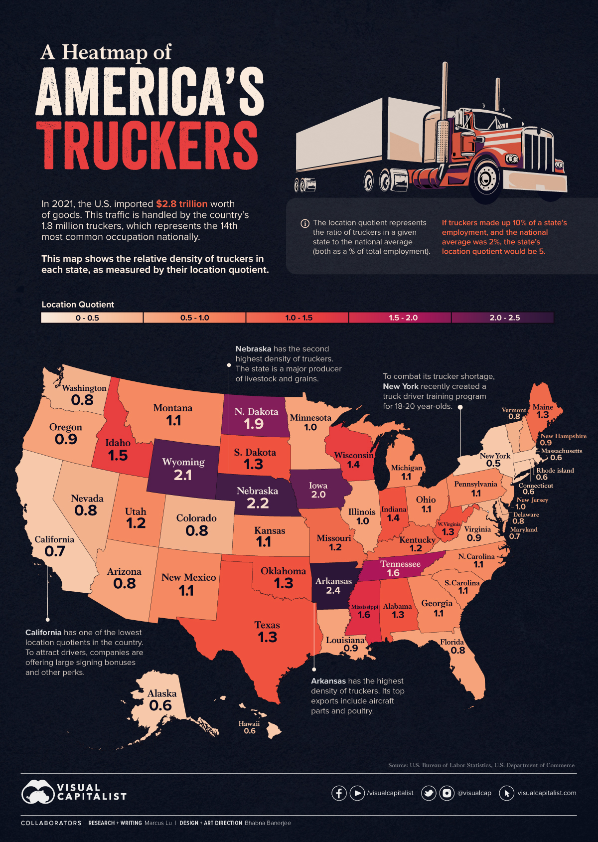


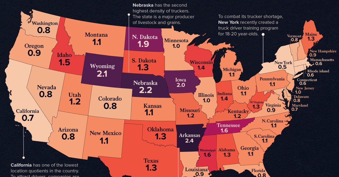
A Heatmap of America’s Truckers
In 2021, the U.S. imported $2.8 trillion worth of goods.
This incredible quantity of goods—along with much of what is produced domestically—is handled by the country’s 1.8 million truckers, which represents the 14th most common occupation nationally.
To see how these truckers are distributed across the nation, we’ve visualized data from the U.S. Bureau of Labor Statistics (BLS) to create two separate heat maps.
Key Findings from the Data
The relative density of each state’s truckers is measured by their location quotient.
This represents the ratio of truckers in a state compared to the national average (both as a % of total employment). For example, if truckers made up 10% of a state’s employment, and the national average was 2%, the location quotient for that state would be 5.
This data is listed in the table below.
| State | Location Quotient |
|---|---|
| Arkansas | 2.4 |
| Nebraska | 2.2 |
| Wyoming | 2.1 |
| Iowa | 2 |
| North Dakota | 1.9 |
| Tennessee | 1.6 |
| Mississippi | 1.6 |
| Idaho | 1.5 |
| Wisconsin | 1.4 |
| Indiana | 1.4 |
| Alabama | 1.3 |
| South Dakota | 1.3 |
| West Virginia | 1.3 |
| Oklahoma | 1.3 |
| Texas | 1.3 |
| Maine | 1.3 |
| Missouri | 1.2 |
| Kentucky | 1.2 |
| Utah | 1.2 |
| Pennsylvania | 1.1 |
| Kansas | 1.1 |
| New Mexico | 1.1 |
| Georgia | 1.1 |
| Ohio | 1.1 |
| Michigan | 1.1 |
| Montana | 1.1 |
| South Carolina | 1.1 |
| North Carolina | 1.1 |
| New Jersey | 1 |
| Minnesota | 1 |
| Illinois | 1 |
| Oregon | 0.9 |
| Louisiana | 0.9 |
| Virginia | 0.9 |
| New Hampshire | 0.9 |
| Arizona | 0.8 |
| Delaware | 0.8 |
| Florida | 0.8 |
| Vermont | 0.8 |
| Colorado | 0.8 |
| Washington | 0.8 |
| Nevada | 0.8 |
| Maryland | 0.7 |
| California | 0.7 |
| Connecticut | 0.6 |
| Rhode Island | 0.6 |
| Alaska | 0.6 |
| Massachusetts | 0.6 |
| Hawaii | 0.6 |
| New York | 0.5 |
| District of Columbia | 0.1 |
There are four states with a location quotient of two or more: Arkansas, Nebraska, Wyoming, and Iowa. This means that their trucker workforce (as a % of total employment) is at least double the national average.
On the other hand, California and New York have some of the lowest location quotients in the country. Trucking companies have been competing fiercely to attract drivers in these areas, but with limited success.
At a time when the whole American population is aging, truck drivers tend to be older than average. The work is stressful, lonely, exhausting and long plagued by a pay system that can make drivers feel they can’t get ahead of the game.
– Los Angeles Times
To entice more young people to enter the industry, New York recently created a truck driver training program for 18-20 year olds. Some have voiced their concerns about safety, though few alternatives exist. In October 2021, the American Trucking Association (ATA) announced that the national driver shortage had reached a record-breaking 80,000.
A Different Perspective
The location quotient is an effective measure because it controls for the differences in each state’s population. Seeing the raw data, though, can still add useful perspective.
The following image shows the number of trucker’s in each state. As a reminder, the national total is 1.8 million.
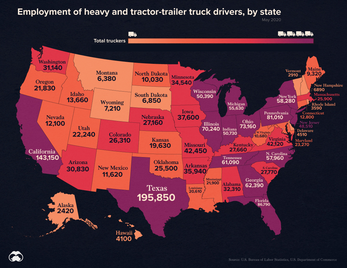
With these numbers, we can gain a more practical understanding of the location quotient. For instance, California has the second highest number of truckers, but it’s dwarfed by the state’s massive population of 40 million.
Occupation Outlook
The BLS expects employment of truck drivers to grow by 6% from 2020 to 2030, which is close to the national average for all jobs. Based on total employment of 1.8 million, this would translate to 108,000 new openings.
Whether these openings will be filled is an entirely different story.
In the American Trucking Association’s latest report, analysts estimate that the industry will need to recruit 1 million drivers just to replace retiring drivers, or those that leave voluntarily.


Misc
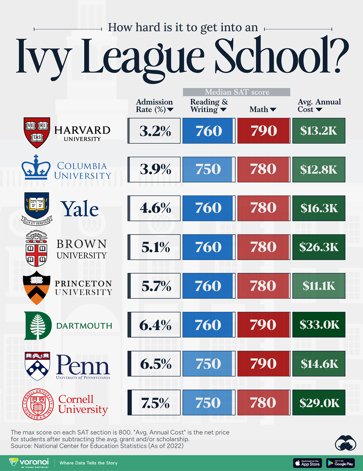
How Hard Is It to Get Into an Ivy League School?
We detail the admission rates and average annual cost for Ivy League schools, as well as the median SAT scores required to be accepted.
How Hard Is It to Get Into an Ivy League School?
This was originally posted on our Voronoi app. Download the app for free on iOS or Android and discover incredible data-driven charts from a variety of trusted sources.
Ivy League institutions are renowned worldwide for their academic excellence and long-standing traditions. But how hard is it to get into one of the top universities in the U.S.?
In this graphic, we detail the admission rates and average annual cost for Ivy League schools, as well as the median SAT scores required to be accepted. The data comes from the National Center for Education Statistics and was compiled by 24/7 Wall St.
Note that “average annual cost” represents the net price a student pays after subtracting the average value of grants and/or scholarships received.
Harvard is the Most Selective
The SAT is a standardized test commonly used for college admissions in the United States. It’s taken by high school juniors and seniors to assess their readiness for college-level academic work.
When comparing SAT scores, Harvard and Dartmouth are among the most challenging universities to gain admission to. The median SAT scores for their students are 760 for reading and writing and 790 for math. Still, Harvard has half the admission rate (3.2%) compared to Dartmouth (6.4%).
| School | Admission rate (%) | SAT Score: Reading & Writing | SAT Score: Math | Avg Annual Cost* |
|---|---|---|---|---|
| Harvard University | 3.2 | 760 | 790 | $13,259 |
| Columbia University | 3.9 | 750 | 780 | $12,836 |
| Yale University | 4.6 | 760 | 780 | $16,341 |
| Brown University | 5.1 | 760 | 780 | $26,308 |
| Princeton University | 5.7 | 760 | 780 | $11,080 |
| Dartmouth College | 6.4 | 760 | 790 | $33,023 |
| University of Pennsylvania | 6.5 | 750 | 790 | $14,851 |
| Cornell University | 7.5 | 750 | 780 | $29,011 |
*Costs after receiving federal financial aid.
Additionally, Dartmouth has the highest average annual cost at $33,000. Princeton has the lowest at $11,100.
While student debt has surged in the United States in recent years, hitting $1.73 trillion in 2023, the worth of obtaining a degree from any of the schools listed surpasses mere academics. This is evidenced by the substantial incomes earned by former students.
Harvard grads, for example, have the highest average starting salary in the country, at $91,700.

-

 Real Estate2 weeks ago
Visualizing America’s Shortage of Affordable Homes
-

 Technology1 week ago
Ranked: Semiconductor Companies by Industry Revenue Share
-

 Money1 week ago
Which States Have the Highest Minimum Wage in America?
-

 Real Estate1 week ago
Ranked: The Most Valuable Housing Markets in America
-

 Business2 weeks ago
Charted: Big Four Market Share by S&P 500 Audits
-

 AI2 weeks ago
The Stock Performance of U.S. Chipmakers So Far in 2024
-

 Misc2 weeks ago
Almost Every EV Stock is Down After Q1 2024
-

 Money2 weeks ago
Where Does One U.S. Tax Dollar Go?