Misc
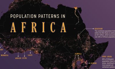
Mapped: Visualizing the True Size of Africa
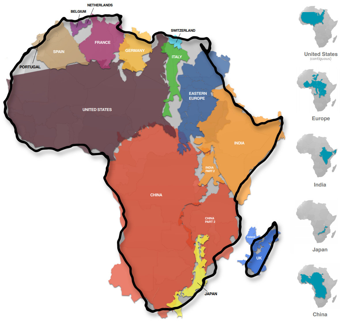
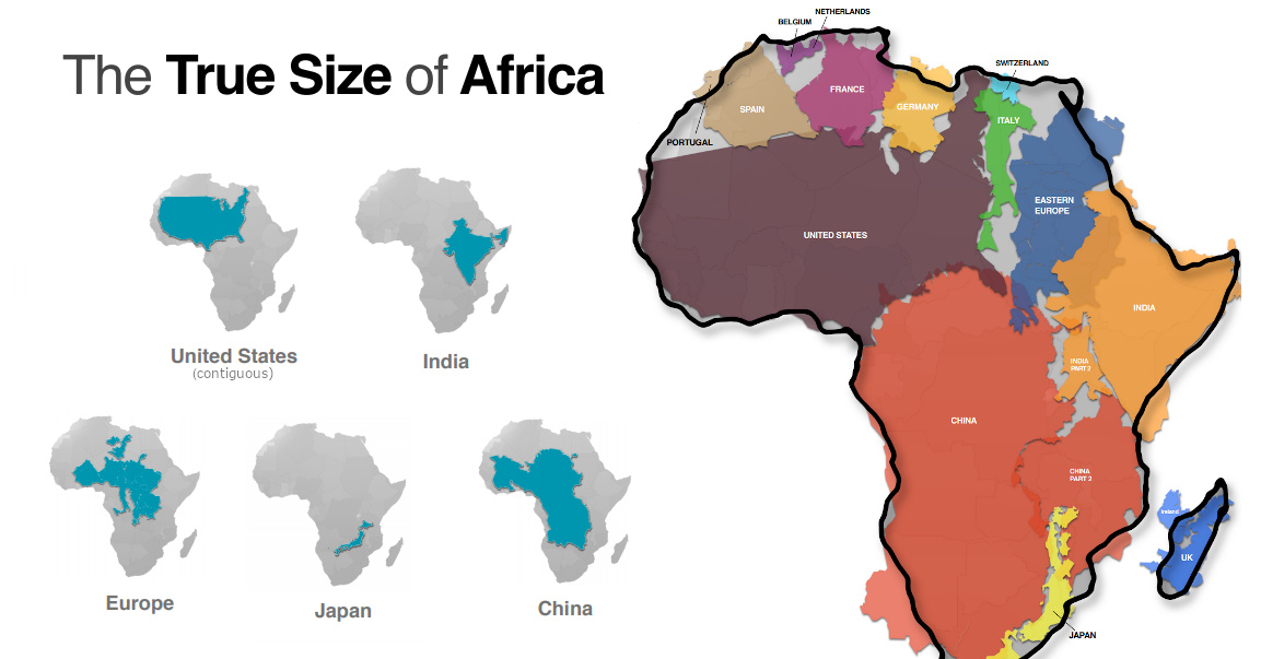
Mapped: The True Size of Africa
Take a look at any map, and it’s clear that the African continent is a big place.
However, despite the common perception that Africa is a large landmass, it’s still one that is vastly underestimated by most casual map viewers.
The reason for this is that the familiar Mercator map projection tends to distort our geographical view of the world in a crucial way — one that often leads to misconceptions about the relative sizes of both countries and continents.
A Geographical Jigsaw
Today’s infographic comes from Kai Krause and it shows the true size of Africa, as revealed by the borders of the countries that can fit within the continent’s shape.
The African continent has a land area of 30.37 million sq km (11.7 million sq mi) — enough to fit in the U.S., China, India, Japan, Mexico, and many European nations, combined.
| Country | Land Area (sq. km) | Land Area (sq. mi) | % of Africa |
|---|---|---|---|
| 🇺🇸 United States | 9.83 million | 3.80 million | 32.4% |
| 🇨🇳 China | 9.60 million | 3.71 million | 31.6% |
| 🇮🇳 India | 3.29 million | 1.27 million | 10.8% |
| 🇲🇽 Mexico | 1.96 million | 0.76 million | 6.5% |
| 🇵🇪 Peru | 1.29 million | 0.50 million | 4.2% |
| 🇫🇷 France | 0.64 million | 0.25 million | 2.1% |
| 🇪🇸 Spain | 0.51 million | 0.20 million | 1.7% |
| 🇵🇬 Papua New Guinea | 0.46 million | 0.18 million | 1.5% |
| 🇸🇪 Sweden | 0.45 million | 0.17 million | 1.5% |
| 🇯🇵 Japan | 0.38 million | 0.15 million | 1.3% |
| 🇩🇪 Germany | 0.36 million | 0.14 million | 1.2% |
| 🇳🇴 Norway | 0.32 million | 0.13 million | 1.1% |
| 🇮🇹 Italy | 0.30 million | 0.12 million | 1.0% |
| 🇳🇿 New Zealand | 0.27 million | 0.10 million | 0.9% |
| 🇬🇧 United Kingdom | 0.24 million | 0.09 million | 0.8% |
| 🇳🇵 Nepal | 0.15 million | 0.06 million | 0.5% |
| 🇧🇩 Bangladesh | 0.15 million | 0.06 million | 0.5% |
| 🇬🇷 Greece | 0.13 million | 0.05 million | 0.4% |
| Total | 30.33 million sq. km | 11.71 million sq. mi | 99.9% |
You could add together all of the landmasses above and they would not equate to the geographical footprint of Africa, which itself is home to 54 countries and 1.2 billion people.
Editor’s note: The above table is slightly different from the countries shown in the visualization, which focuses more on fitting recognizable country shapes into the geographical shape of Africa.
Why the Misconception?
Interestingly, the problem with maps is not that Africa is sized incorrectly.
Using the animation below, you’ll see that Africa is actually the most accurately sized continent using the common Mercator map projection:
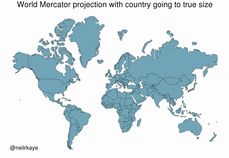
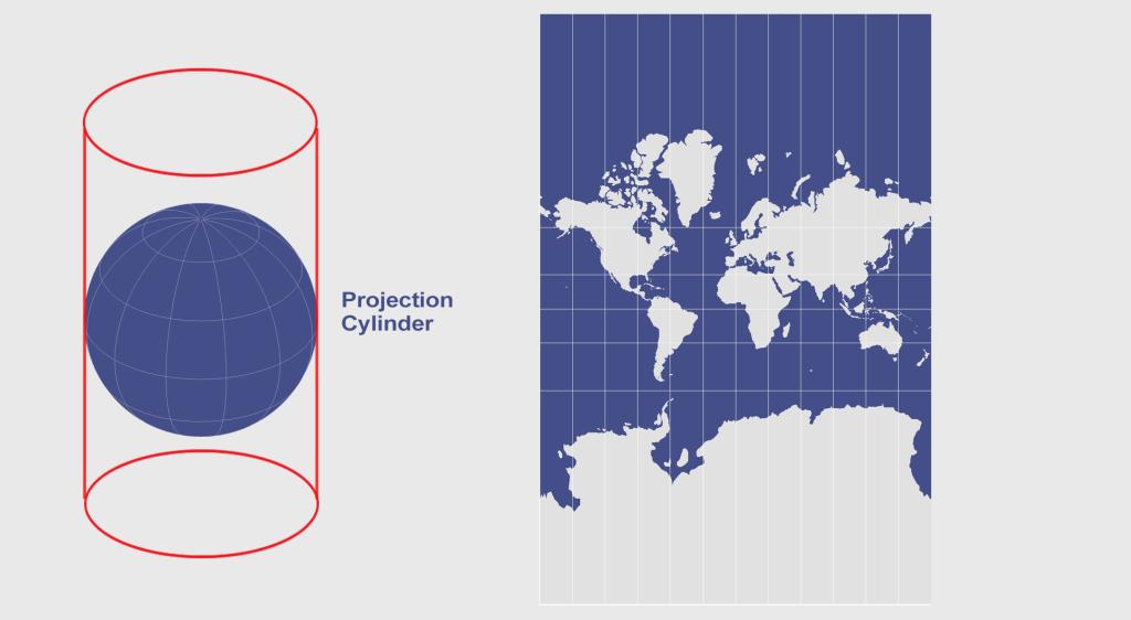
The Mercator projection attempts to place the spherical shape of the world onto a cylinder, causing areas closest to the poles to be “stretched”.
Africa, which straddles the Equator, barely changes in size — meanwhile, the countries furthest from the Equator become inflated from their true sizes on this type of map.
For those of us living in Western countries, this is an interesting dilemma to consider.
This means that the sizes of European and North American countries are distorted, giving us an inaccurate mental “measuring stick” for judging the relative sizes of other countries.
This has implications not only for Africa, but for the whole Southern Hemisphere: South America, India, the Middle East, and even Australia are “bigger” than they may initially appear on a map.


Misc
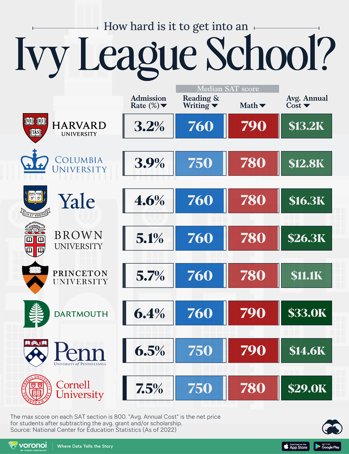
How Hard Is It to Get Into an Ivy League School?
We detail the admission rates and average annual cost for Ivy League schools, as well as the median SAT scores required to be accepted.
How Hard Is It to Get Into an Ivy League School?
This was originally posted on our Voronoi app. Download the app for free on iOS or Android and discover incredible data-driven charts from a variety of trusted sources.
Ivy League institutions are renowned worldwide for their academic excellence and long-standing traditions. But how hard is it to get into one of the top universities in the U.S.?
In this graphic, we detail the admission rates and average annual cost for Ivy League schools, as well as the median SAT scores required to be accepted. The data comes from the National Center for Education Statistics and was compiled by 24/7 Wall St.
Note that “average annual cost” represents the net price a student pays after subtracting the average value of grants and/or scholarships received.
Harvard is the Most Selective
The SAT is a standardized test commonly used for college admissions in the United States. It’s taken by high school juniors and seniors to assess their readiness for college-level academic work.
When comparing SAT scores, Harvard and Dartmouth are among the most challenging universities to gain admission to. The median SAT scores for their students are 760 for reading and writing and 790 for math. Still, Harvard has half the admission rate (3.2%) compared to Dartmouth (6.4%).
| School | Admission rate (%) | SAT Score: Reading & Writing | SAT Score: Math | Avg Annual Cost* |
|---|---|---|---|---|
| Harvard University | 3.2 | 760 | 790 | $13,259 |
| Columbia University | 3.9 | 750 | 780 | $12,836 |
| Yale University | 4.6 | 760 | 780 | $16,341 |
| Brown University | 5.1 | 760 | 780 | $26,308 |
| Princeton University | 5.7 | 760 | 780 | $11,080 |
| Dartmouth College | 6.4 | 760 | 790 | $33,023 |
| University of Pennsylvania | 6.5 | 750 | 790 | $14,851 |
| Cornell University | 7.5 | 750 | 780 | $29,011 |
*Costs after receiving federal financial aid.
Additionally, Dartmouth has the highest average annual cost at $33,000. Princeton has the lowest at $11,100.
While student debt has surged in the United States in recent years, hitting $1.73 trillion in 2023, the worth of obtaining a degree from any of the schools listed surpasses mere academics. This is evidenced by the substantial incomes earned by former students.
Harvard grads, for example, have the highest average starting salary in the country, at $91,700.

-

 Mining2 weeks ago
Charted: The Value Gap Between the Gold Price and Gold Miners
-

 Real Estate1 week ago
Ranked: The Most Valuable Housing Markets in America
-

 Business1 week ago
Charted: Big Four Market Share by S&P 500 Audits
-

 AI1 week ago
The Stock Performance of U.S. Chipmakers So Far in 2024
-

 Misc1 week ago
Almost Every EV Stock is Down After Q1 2024
-

 Money2 weeks ago
Where Does One U.S. Tax Dollar Go?
-

 Green2 weeks ago
Ranked: Top Countries by Total Forest Loss Since 2001
-

 Real Estate2 weeks ago
Visualizing America’s Shortage of Affordable Homes