Mining
Junior Miners: Doom, Gloom, or Boom? [Chart]
![Junior Miners: Doom, Gloom, or Boom? [Chart]](https://www.visualcapitalist.com/wp-content/uploads/2015/10/doom-gloom-boom-juniors.jpg)
Junior Miners: Doom, Gloom, or Boom? [Chart]
PwC report recaps malaise, but recent traction may indicate signs of life
The Chart of the Week is a weekly Visual Capitalist feature on Fridays.
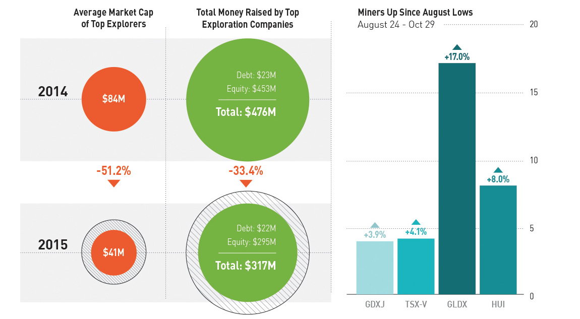
If it wasn’t already clear, the junior companies that explore, develop, and mine the world’s metals are struggling. PwC recently recapped the malaise of these companies in its latest Junior Mine 2015 report, along with highlighting some success stories of those that have been able to bypass the onslaught.
The report, which looks at the Top 100 junior mining companies traded on the TSX Venture exchange, had findings that makes junior mining executives want to bury their heads in the sand. The average market capitalization of exploration companies is down -51.2% from 2014 to 2015. The amount of money raised in equity and debt markets for exploration companies is down -33.4% over the same timeframe.
Furthermore, the average company on the Top 100 list has $7 million cash, which is down from $10 million last year. In 2011 the average cash in the bank was $22.7 million.
Remember, these are the results of the “best” companies in the space. This doesn’t include the zombies or any of the other hurting companies.
Signs of Life?
Every coin has two sides, and here’s the other side to this one. Over the last two months, data shows that things aren’t getting worse. In fact, it could even be argued that things are getting better.
Since the end of the “flash crash” that hit markets on August 24th, when the Dow dropped 1,100 points in the first five minutes of trading, miners have been up. The TSX Venture is up 4.1%, the GDXJ (Junior Gold Miners ETF) is up 3.9%, and the HUI (Basket of Unhedged Gold Stocks) is up 8.0%. Even more spectacular is the GLDX (Global X Gold Explorers ETF), which is up a solid 17.0% since the August lows.
This is obviously not anything definitive. However, seeing all four of these major indices up at the same time is a good sign.
Now we just need a rags-to-riches story like that of Voisey’s Bay to get the market really humming.


Lithium
Ranked: The Top 10 EV Battery Manufacturers in 2023
Asia dominates this ranking of the world’s largest EV battery manufacturers in 2023.
The Top 10 EV Battery Manufacturers in 2023
This was originally posted on our Voronoi app. Download the app for free on iOS or Android and discover incredible data-driven charts from a variety of trusted sources.
Despite efforts from the U.S. and EU to secure local domestic supply, all major EV battery manufacturers remain based in Asia.
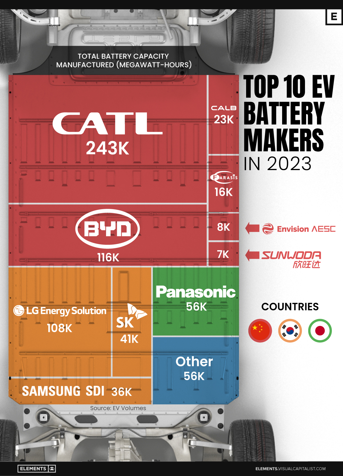
In this graphic we rank the top 10 EV battery manufacturers by total battery deployment (measured in megawatt-hours) in 2023. The data is from EV Volumes.
Chinese Dominance
Contemporary Amperex Technology Co. Limited (CATL) has swiftly risen in less than a decade to claim the title of the largest global battery group.
The Chinese company now has a 34% share of the market and supplies batteries to a range of made-in-China vehicles, including the Tesla Model Y, SAIC’s MG4/Mulan, and various Li Auto models.
| Company | Country | 2023 Production (megawatt-hour) | Share of Total Production |
|---|---|---|---|
| CATL | 🇨🇳 China | 242,700 | 34% |
| BYD | 🇨🇳 China | 115,917 | 16% |
| LG Energy Solution | 🇰🇷 Korea | 108,487 | 15% |
| Panasonic | 🇯🇵 Japan | 56,560 | 8% |
| SK On | 🇰🇷 Korea | 40,711 | 6% |
| Samsung SDI | 🇰🇷 Korea | 35,703 | 5% |
| CALB | 🇨🇳 China | 23,493 | 3% |
| Farasis Energy | 🇨🇳 China | 16,527 | 2% |
| Envision AESC | 🇨🇳 China | 8,342 | 1% |
| Sunwoda | 🇨🇳 China | 6,979 | 1% |
| Other | - | 56,040 | 8% |
In 2023, BYD surpassed LG Energy Solution to claim second place. This was driven by demand from its own models and growth in third-party deals, including providing batteries for the made-in-Germany Tesla Model Y, Toyota bZ3, Changan UNI-V, Venucia V-Online, as well as several Haval and FAW models.
The top three battery makers (CATL, BYD, LG) collectively account for two-thirds (66%) of total battery deployment.
Once a leader in the EV battery business, Panasonic now holds the fourth position with an 8% market share, down from 9% last year. With its main client, Tesla, now sourcing batteries from multiple suppliers, the Japanese battery maker seems to be losing its competitive edge in the industry.
Overall, the global EV battery market size is projected to grow from $49 billion in 2022 to $98 billion by 2029, according to Fortune Business Insights.

-

 Markets1 week ago
Ranked: The Largest U.S. Corporations by Number of Employees
-

 Green3 weeks ago
Ranked: Top Countries by Total Forest Loss Since 2001
-

 Money2 weeks ago
Where Does One U.S. Tax Dollar Go?
-

 Misc2 weeks ago
Almost Every EV Stock is Down After Q1 2024
-

 AI2 weeks ago
The Stock Performance of U.S. Chipmakers So Far in 2024
-

 Markets2 weeks ago
Charted: Big Four Market Share by S&P 500 Audits
-

 Real Estate2 weeks ago
Ranked: The Most Valuable Housing Markets in America
-

 Money2 weeks ago
Which States Have the Highest Minimum Wage in America?