Markets
Chart: Investing in the Finer Things in Life
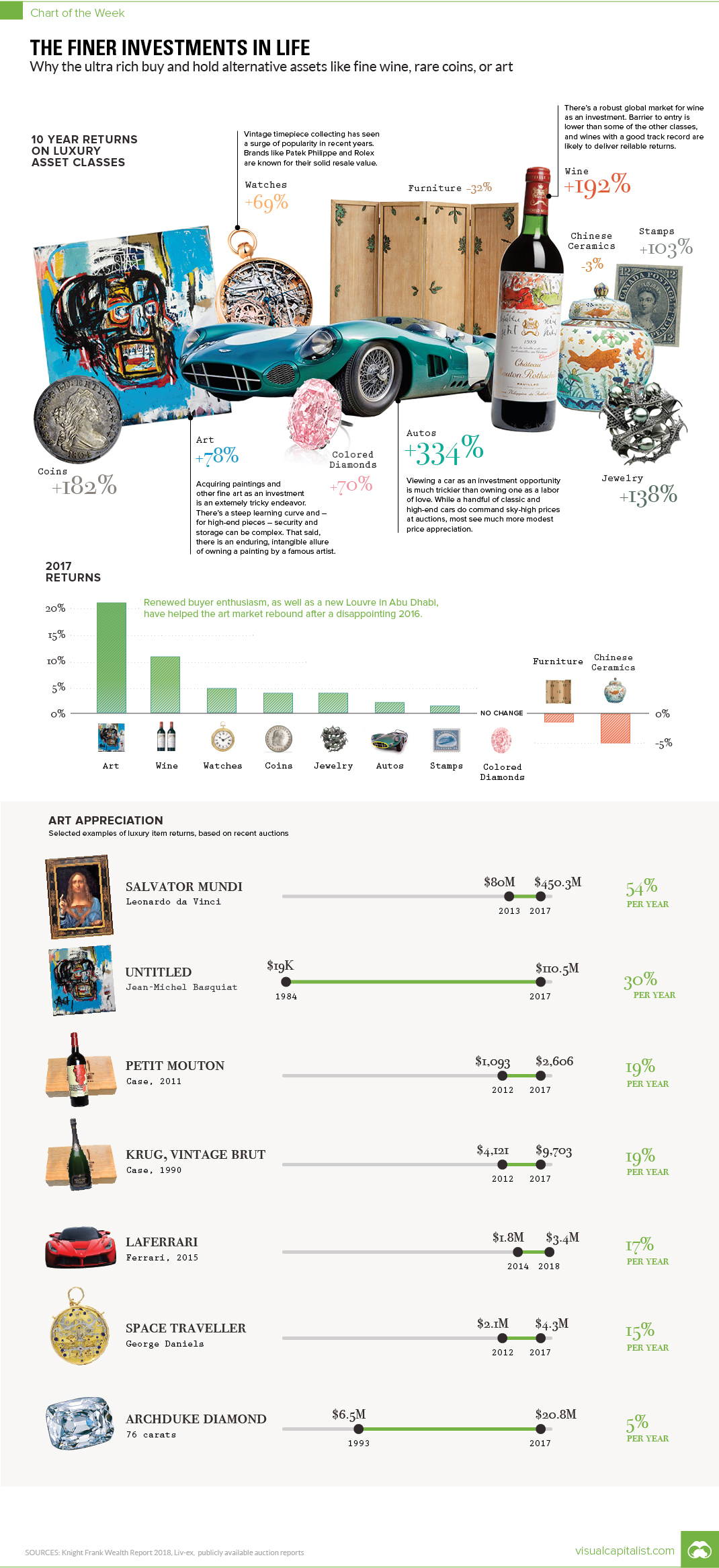
The Finer Investments in Life
The Chart of the Week is a weekly Visual Capitalist feature on Fridays.
Outside of the mainstream world of stocks and bonds, there exists an interesting cross-section of alternative assets that only really gain appreciation from a relatively small group of elite investors.
These luxury collectibles – things like fine wine, classic cars, rare stamps, colored diamonds, Chinese ceramics, and fine art – are unquestionably fun to hold as investments and even to talk about. But do these alternative assets also perform as investments over time?
Eye of the Beholder
The obvious challenge with valuing an item like a prized Picasso painting is that beauty is in the eye of the beholder.
Investors can rely on expert opinions, their own experience, historical evidence, and longstanding markets for these asset classes. However, at the end of the day, the price an investor is willing to pay is ultimately subjective, which can get compounded by the fact that these markets also tend to be illiquid.
If you’re buying or selling one of these assets, this can either work in your favor – or you can be stuck with a classic car in your garage that never really panned out in terms of price.
Here is a graph showing the sale dates of some of the most expensive paintings:
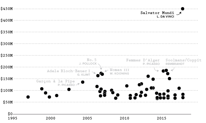
Recently, you may remember the sale of Leonardo da Vinci’s re-discovered masterpiece, Salvator Mundi, as an event that topped headlines in late-2017. The painting was bought for $450 million by Abu Dhabi’s department of culture and tourism, and it’s to be displayed in the Abu Dhabi Louvre.
Investments that Age Well
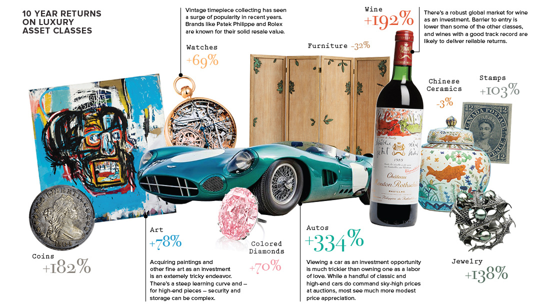
Despite the challenges involved in valuing these assets, as well as other costs such as setting up the storage and security systems needed to protect them, time has been kind to many of these luxury assets.
Here are the returns of luxury items over the last decade, based on the 2018 Wealth Report by Knight Frank:
| Ten Year Returns | CAGR | |
|---|---|---|
| Autos | 334% | 15.8% |
| Fine Wine | 192% | 11.3% |
| Rare Coins | 182% | 10.9% |
| Jewelry | 138% | 9.1% |
| Rare Stamps | 103% | 7.4% |
| Fine Art | 78% | 5.9% |
| Colored Diamonds | 70% | 5.5% |
| Watches | 69% | 5.4% |
| Chinese Ceramics | -3% | -0.3% |
| Furniture | -32% | -3.8% |
Keep in mind these investment categories are pretty narrow – for example, a Toyota Corolla doesn’t count towards the auto category. Instead, we’re talking about cars like the Lancia Aurelia B24 “Spider”, of which only 761 models were made in the 1950s.
In any case, as you can see from the above table, most of these assets have not only continued to hold their value, but they’ve also appreciated in price significantly. Autos topped the list, but fine wine and rare coins (two more accessible options for investors) also did quite well with 11.3% and 10.9% annual gains, respectively.
Correction: A previous version of the graphic showed an incorrect Jean-Michel Basquiat painting.


Markets
U.S. Debt Interest Payments Reach $1 Trillion
U.S. debt interest payments have surged past the $1 trillion dollar mark, amid high interest rates and an ever-expanding debt burden.


U.S. Debt Interest Payments Reach $1 Trillion
This was originally posted on our Voronoi app. Download the app for free on iOS or Android and discover incredible data-driven charts from a variety of trusted sources.
The cost of paying for America’s national debt crossed the $1 trillion dollar mark in 2023, driven by high interest rates and a record $34 trillion mountain of debt.
Over the last decade, U.S. debt interest payments have more than doubled amid vast government spending during the pandemic crisis. As debt payments continue to soar, the Congressional Budget Office (CBO) reported that debt servicing costs surpassed defense spending for the first time ever this year.
This graphic shows the sharp rise in U.S. debt payments, based on data from the Federal Reserve.
A $1 Trillion Interest Bill, and Growing
Below, we show how U.S. debt interest payments have risen at a faster pace than at another time in modern history:
| Date | Interest Payments | U.S. National Debt |
|---|---|---|
| 2023 | $1.0T | $34.0T |
| 2022 | $830B | $31.4T |
| 2021 | $612B | $29.6T |
| 2020 | $518B | $27.7T |
| 2019 | $564B | $23.2T |
| 2018 | $571B | $22.0T |
| 2017 | $493B | $20.5T |
| 2016 | $460B | $20.0T |
| 2015 | $435B | $18.9T |
| 2014 | $442B | $18.1T |
| 2013 | $425B | $17.2T |
| 2012 | $417B | $16.4T |
| 2011 | $433B | $15.2T |
| 2010 | $400B | $14.0T |
| 2009 | $354B | $12.3T |
| 2008 | $380B | $10.7T |
| 2007 | $414B | $9.2T |
| 2006 | $387B | $8.7T |
| 2005 | $355B | $8.2T |
| 2004 | $318B | $7.6T |
| 2003 | $294B | $7.0T |
| 2002 | $298B | $6.4T |
| 2001 | $318B | $5.9T |
| 2000 | $353B | $5.7T |
| 1999 | $353B | $5.8T |
| 1998 | $360B | $5.6T |
| 1997 | $368B | $5.5T |
| 1996 | $362B | $5.3T |
| 1995 | $357B | $5.0T |
| 1994 | $334B | $4.8T |
| 1993 | $311B | $4.5T |
| 1992 | $306B | $4.2T |
| 1991 | $308B | $3.8T |
| 1990 | $298B | $3.4T |
| 1989 | $275B | $3.0T |
| 1988 | $254B | $2.7T |
| 1987 | $240B | $2.4T |
| 1986 | $225B | $2.2T |
| 1985 | $219B | $1.9T |
| 1984 | $205B | $1.7T |
| 1983 | $176B | $1.4T |
| 1982 | $157B | $1.2T |
| 1981 | $142B | $1.0T |
| 1980 | $113B | $930.2B |
| 1979 | $96B | $845.1B |
| 1978 | $84B | $789.2B |
| 1977 | $69B | $718.9B |
| 1976 | $61B | $653.5B |
| 1975 | $55B | $576.6B |
| 1974 | $50B | $492.7B |
| 1973 | $45B | $469.1B |
| 1972 | $39B | $448.5B |
| 1971 | $36B | $424.1B |
| 1970 | $35B | $389.2B |
| 1969 | $30B | $368.2B |
| 1968 | $25B | $358.0B |
| 1967 | $23B | $344.7B |
| 1966 | $21B | $329.3B |
Interest payments represent seasonally adjusted annual rate at the end of Q4.
At current rates, the U.S. national debt is growing by a remarkable $1 trillion about every 100 days, equal to roughly $3.6 trillion per year.
As the national debt has ballooned, debt payments even exceeded Medicaid outlays in 2023—one of the government’s largest expenditures. On average, the U.S. spent more than $2 billion per day on interest costs last year. Going further, the U.S. government is projected to spend a historic $12.4 trillion on interest payments over the next decade, averaging about $37,100 per American.
Exacerbating matters is that the U.S. is running a steep deficit, which stood at $1.1 trillion for the first six months of fiscal 2024. This has accelerated due to the 43% increase in debt servicing costs along with a $31 billion dollar increase in defense spending from a year earlier. Additionally, a $30 billion increase in funding for the Federal Deposit Insurance Corporation in light of the regional banking crisis last year was a major contributor to the deficit increase.
Overall, the CBO forecasts that roughly 75% of the federal deficit’s increase will be due to interest costs by 2034.

-

 Markets2 weeks ago
Visualizing America’s Shortage of Affordable Homes
-

 Technology1 week ago
Ranked: Semiconductor Companies by Industry Revenue Share
-

 Money1 week ago
Which States Have the Highest Minimum Wage in America?
-

 Real Estate1 week ago
Ranked: The Most Valuable Housing Markets in America
-

 Business2 weeks ago
Charted: Big Four Market Share by S&P 500 Audits
-

 AI2 weeks ago
The Stock Performance of U.S. Chipmakers So Far in 2024
-

 Misc2 weeks ago
Almost Every EV Stock is Down After Q1 2024
-

 Money2 weeks ago
Where Does One U.S. Tax Dollar Go?