Technology
What Happens in an Internet Minute in 2018?
In your everyday life, a minute might not seem like much.
But when it comes to the vast scale of the internet, a minute of time goes much further than you ever could have imagined. That’s because the internet has a degree of scale that our linear human brains are unaccustomed to operating on.
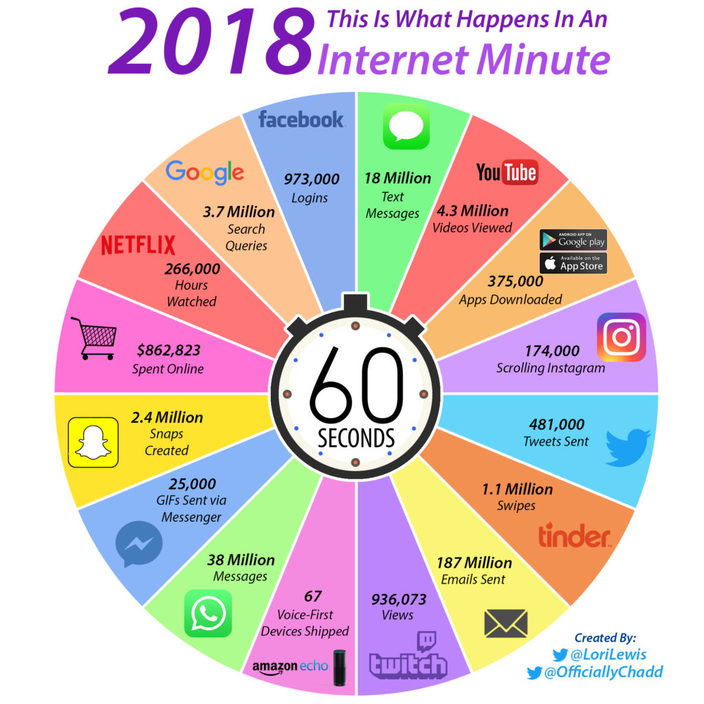
An Internet Minute in 2018
Today’s infographic is from Lori Lewis and Chadd Callahan of Cumulus Media, and it shows the activity taking place on various platforms such as Facebook or Google in each 60 second span.
It really helps put an internet minute in perspective.
Just a Minute, Please
The numbers for these services are so enormous that they can only be shown using the 60 second time scale.
Any bigger, and our brains can’t even process these massive quantities in any useful capacity. Here are just a few key numbers scaled to a monthly basis, for fun:
- 42,033,600,000 Facebook logins
- 159,840,000,000 Google searches
- 1,641,600,000,000 WhatsApp messages sent
- 8,078,400,000,000 emails sent
On an annualized basis, the data becomes even more ridiculous, with something close to 100 trillion emails sent. (No wonder it’s so hard to get to inbox zero!)
Previous Minutes
If the internet minute visualization looks familiar, that’s because it gets updated and re-released every year using the latest data available. See below for a direct comparison of the last two years:
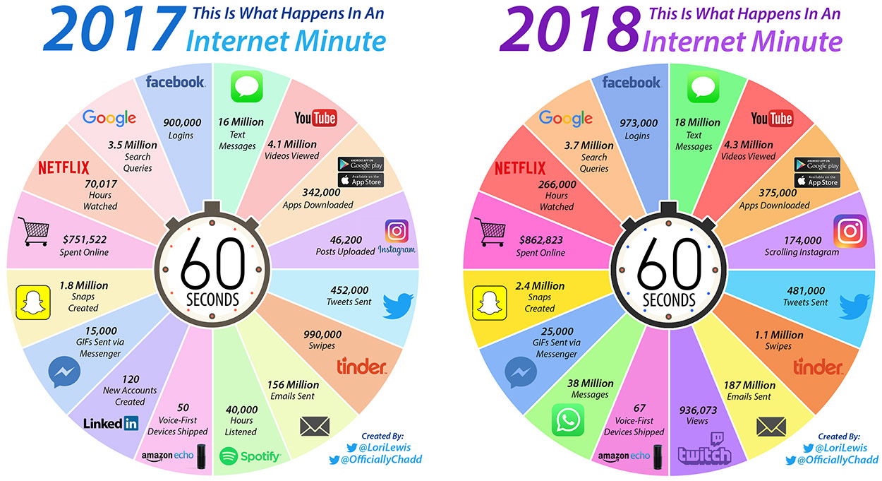
The biggest and most noticeable jump comes in Netflix hours watched – a number which we believe may be too good to be true. While we have not seen the exact methodology of these calculations, we do know that in December it was announced by Netflix that users were watching approximately 140 million hours per day. This works out to roughly 100,000 hours per minute according to our math, which is still mind-boggling.
See the additional evolution of this chart by checking out the 2016 version as well.


Technology
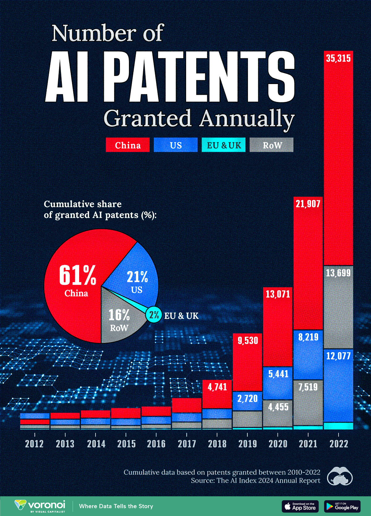
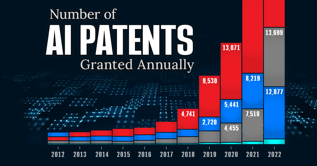
Visualizing AI Patents by Country
See which countries have been granted the most AI patents each year, from 2012 to 2022.
Visualizing AI Patents by Country
This was originally posted on our Voronoi app. Download the app for free on iOS or Android and discover incredible data-driven charts from a variety of trusted sources.
This infographic shows the number of AI-related patents granted each year from 2010 to 2022 (latest data available). These figures come from the Center for Security and Emerging Technology (CSET), accessed via Stanford University’s 2024 AI Index Report.
From this data, we can see that China first overtook the U.S. in 2013. Since then, the country has seen enormous growth in the number of AI patents granted each year.
| Year | China | EU and UK | U.S. | RoW | Global Total |
|---|---|---|---|---|---|
| 2010 | 307 | 137 | 984 | 571 | 1,999 |
| 2011 | 516 | 129 | 980 | 581 | 2,206 |
| 2012 | 926 | 112 | 950 | 660 | 2,648 |
| 2013 | 1,035 | 91 | 970 | 627 | 2,723 |
| 2014 | 1,278 | 97 | 1,078 | 667 | 3,120 |
| 2015 | 1,721 | 110 | 1,135 | 539 | 3,505 |
| 2016 | 1,621 | 128 | 1,298 | 714 | 3,761 |
| 2017 | 2,428 | 144 | 1,489 | 1,075 | 5,136 |
| 2018 | 4,741 | 155 | 1,674 | 1,574 | 8,144 |
| 2019 | 9,530 | 322 | 3,211 | 2,720 | 15,783 |
| 2020 | 13,071 | 406 | 5,441 | 4,455 | 23,373 |
| 2021 | 21,907 | 623 | 8,219 | 7,519 | 38,268 |
| 2022 | 35,315 | 1,173 | 12,077 | 13,699 | 62,264 |
In 2022, China was granted more patents than every other country combined.
While this suggests that the country is very active in researching the field of artificial intelligence, it doesn’t necessarily mean that China is the farthest in terms of capability.
Key Facts About AI Patents
According to CSET, AI patents relate to mathematical relationships and algorithms, which are considered abstract ideas under patent law. They can also have different meaning, depending on where they are filed.
In the U.S., AI patenting is concentrated amongst large companies including IBM, Microsoft, and Google. On the other hand, AI patenting in China is more distributed across government organizations, universities, and tech firms (e.g. Tencent).
In terms of focus area, China’s patents are typically related to computer vision, a field of AI that enables computers and systems to interpret visual data and inputs. Meanwhile America’s efforts are more evenly distributed across research fields.
Learn More About AI From Visual Capitalist
If you want to see more data visualizations on artificial intelligence, check out this graphic that shows which job departments will be impacted by AI the most.

-

 Markets1 week ago
U.S. Debt Interest Payments Reach $1 Trillion
-

 Markets2 weeks ago
Ranked: The Most Valuable Housing Markets in America
-

 Money2 weeks ago
Which States Have the Highest Minimum Wage in America?
-

 AI2 weeks ago
Ranked: Semiconductor Companies by Industry Revenue Share
-

 Markets2 weeks ago
Ranked: The World’s Top Flight Routes, by Revenue
-

 Countries2 weeks ago
Population Projections: The World’s 6 Largest Countries in 2075
-

 Markets2 weeks ago
The Top 10 States by Real GDP Growth in 2023
-

 Money2 weeks ago
The Smallest Gender Wage Gaps in OECD Countries