Technology
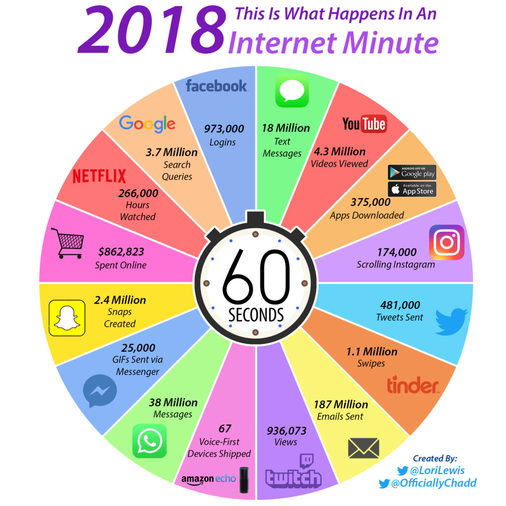
What Happens in an Internet Minute in 2018?
In your everyday life, a minute might not seem like much.
But when it comes to the vast scale of the internet, a minute of time goes much further than you ever could have imagined. That’s because the internet has a degree of scale that our linear human brains are unaccustomed to operating on.
An Internet Minute in 2018
Today’s infographic is from Lori Lewis and Chadd Callahan of Cumulus Media, and it shows the activity taking place on various platforms such as Facebook or Google in each 60 second span.
It really helps put an internet minute in perspective.
Just a Minute, Please
The numbers for these services are so enormous that they can only be shown using the 60 second time scale.
Any bigger, and our brains can’t even process these massive quantities in any useful capacity. Here are just a few key numbers scaled to a monthly basis, for fun:
- 42,033,600,000 Facebook logins
- 159,840,000,000 Google searches
- 1,641,600,000,000 WhatsApp messages sent
- 8,078,400,000,000 emails sent
On an annualized basis, the data becomes even more ridiculous, with something close to 100 trillion emails sent. (No wonder it’s so hard to get to inbox zero!)
Previous Minutes
If the internet minute visualization looks familiar, that’s because it gets updated and re-released every year using the latest data available. See below for a direct comparison of the last two years:
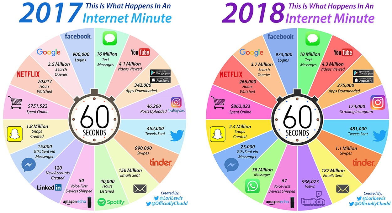
The biggest and most noticeable jump comes in Netflix hours watched – a number which we believe may be too good to be true. While we have not seen the exact methodology of these calculations, we do know that in December it was announced by Netflix that users were watching approximately 140 million hours per day. This works out to roughly 100,000 hours per minute according to our math, which is still mind-boggling.
See the additional evolution of this chart by checking out the 2016 version as well.


Brands
How Tech Logos Have Evolved Over Time
From complete overhauls to more subtle tweaks, these tech logos have had quite a journey. Featuring: Google, Apple, and more.


How Tech Logos Have Evolved Over Time
This was originally posted on our Voronoi app. Download the app for free on iOS or Android and discover incredible data-driven charts from a variety of trusted sources.
One would be hard-pressed to find a company that has never changed its logo. Granted, some brands—like Rolex, IBM, and Coca-Cola—tend to just have more minimalistic updates. But other companies undergo an entire identity change, thus necessitating a full overhaul.
In this graphic, we visualized the evolution of prominent tech companies’ logos over time. All of these brands ranked highly in a Q1 2024 YouGov study of America’s most famous tech brands. The logo changes are sourced from 1000logos.net.
How Many Times Has Google Changed Its Logo?
Google and Facebook share a 98% fame rating according to YouGov. But while Facebook’s rise was captured in The Social Network (2010), Google’s history tends to be a little less lionized in popular culture.
For example, Google was initially called “Backrub” because it analyzed “back links” to understand how important a website was. Since its founding, Google has undergone eight logo changes, finally settling on its current one in 2015.
| Company | Number of Logo Changes |
|---|---|
| 8 | |
| HP | 8 |
| Amazon | 6 |
| Microsoft | 6 |
| Samsung | 6 |
| Apple | 5* |
Note: *Includes color changes. Source: 1000Logos.net
Another fun origin story is Microsoft, which started off as Traf-O-Data, a traffic counter reading company that generated reports for traffic engineers. By 1975, the company was renamed. But it wasn’t until 2012 that Microsoft put the iconic Windows logo—still the most popular desktop operating system—alongside its name.
And then there’s Samsung, which started as a grocery trading store in 1938. Its pivot to electronics started in the 1970s with black and white television sets. For 55 years, the company kept some form of stars from its first logo, until 1993, when the iconic encircled blue Samsung logo debuted.
Finally, Apple’s first logo in 1976 featured Isaac Newton reading under a tree—moments before an apple fell on his head. Two years later, the iconic bitten apple logo would be designed at Steve Jobs’ behest, and it would take another two decades for it to go monochrome.

-

 Green1 week ago
Ranked: The Countries With the Most Air Pollution in 2023
-

 Automotive2 weeks ago
Almost Every EV Stock is Down After Q1 2024
-

 AI2 weeks ago
The Stock Performance of U.S. Chipmakers So Far in 2024
-

 Markets2 weeks ago
Charted: Big Four Market Share by S&P 500 Audits
-

 Real Estate2 weeks ago
Ranked: The Most Valuable Housing Markets in America
-

 Money2 weeks ago
Which States Have the Highest Minimum Wage in America?
-

 AI2 weeks ago
Ranked: Semiconductor Companies by Industry Revenue Share
-

 Travel2 weeks ago
Ranked: The World’s Top Flight Routes, by Revenue