Markets
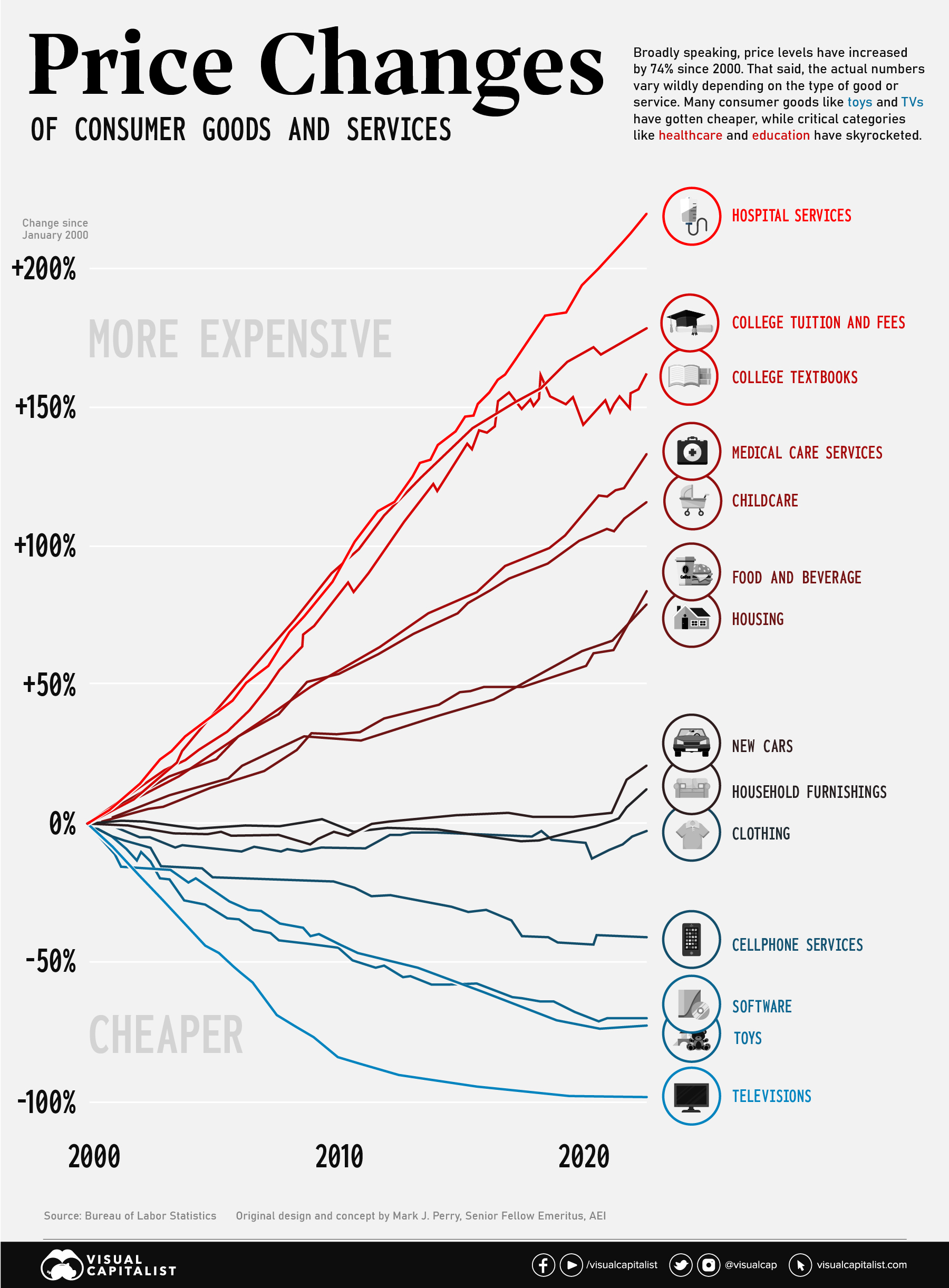
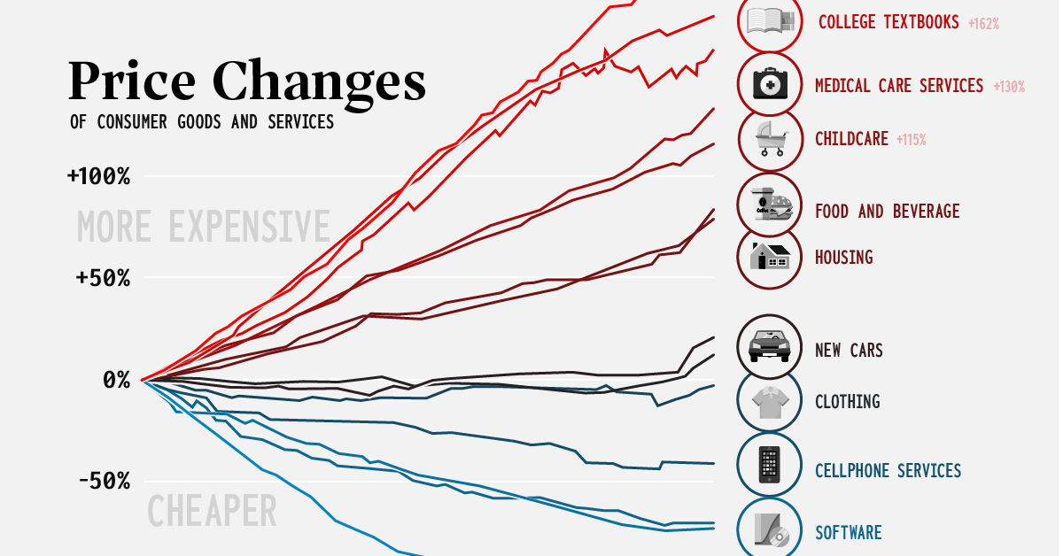
Consumer Price Inflation, by Type of Good or Service (2000-2022)
Consumer Price Inflation, by Type of Good or Service (2000-2022)
The Consumer Price Index (CPI) provides a steady indication of how inflation is affecting the economy. This big picture number is useful for policymakers and professionals in the financial sector, but most people experience inflation at the cash register or checkout screen.
Since the start of the 21st century, U.S. consumers have seen a divergence of price movements across various categories. Nowhere is this better illustrated than on this chart concept thought up by AEI’s Mark J. Perry. It’s sometimes referred to as the “chart of the century” because it provides such a clear and impactful jump-off point to discuss a number of economic forces.
The punchline is that many consumer goods—particularly those that were easily outsourced—saw price drops, while key “non-tradable” categories saw massive increases. We’ll look at both situations in more detail below.
Race to the Top: Inflation in Healthcare and Education
Since the beginning of this century, two types of essential categories have been marching steadily upward in price: healthcare and education.
America has a well documented “medical inflation” issue. There are a number of reasons why costs in the healthcare sector keep rising, including rising labor costs, an aging population, better technology, and medical tourism. The pricing of pharmaceutical products and hospital services are also a major contributor to increases. As Barry Ritholtz has diplomatically stated, “market forces don’t work very well in this industry”.
Rising medical costs have serious consequences for the U.S. population. Recent data indicates that half of Americans now carry medical debt, with the majority owing $1,000 or more.
Also near the top of the chart are education-related categories. In the ’60s and ’70s, tuition roughly tracked with inflation, but that began to change in the mid-1980s. Since then, tuition costs have marched ever upward. Since 2000, tuition prices have increased by 178% and college textbooks have jumped 162%.
As usual, low income students are disproportionally impacted by rising tuition. Pell Grants now cover a much smaller portion of tuition than they used to, and the majority of states have cut funding to higher education in recent years.
Globalization: A Tale of Televisions and Toys
Even though essentials like education and heathcare have rocketed up, it’s not all bad news. Consumers have seen the price of some goods and services drop dramatically.
Flat screen televisions used to be a big ticket item. At the turn of the century, a flat screen TV would cost around 17% of the median income of the time ($42,148). In the early aughts though, prices began to fall quickly. Today, a new TV will cost less than 1% of the U.S. median income ($54,132).
Similarly, cellular services and software have gotten cheaper over the past two decades as well. Toys are another prime example. Not only are most toys manufactured overseas, the value proposition has changed as children have new digital options to entertain themselves with.
Over a long-term perspective, items like clothing and household furnishings have remained relatively flat in price, even after the most recent bout of inflation.


Markets
U.S. Debt Interest Payments Reach $1 Trillion
U.S. debt interest payments have surged past the $1 trillion dollar mark, amid high interest rates and an ever-expanding debt burden.


U.S. Debt Interest Payments Reach $1 Trillion
This was originally posted on our Voronoi app. Download the app for free on iOS or Android and discover incredible data-driven charts from a variety of trusted sources.
The cost of paying for America’s national debt crossed the $1 trillion dollar mark in 2023, driven by high interest rates and a record $34 trillion mountain of debt.
Over the last decade, U.S. debt interest payments have more than doubled amid vast government spending during the pandemic crisis. As debt payments continue to soar, the Congressional Budget Office (CBO) reported that debt servicing costs surpassed defense spending for the first time ever this year.
This graphic shows the sharp rise in U.S. debt payments, based on data from the Federal Reserve.
A $1 Trillion Interest Bill, and Growing
Below, we show how U.S. debt interest payments have risen at a faster pace than at another time in modern history:
| Date | Interest Payments | U.S. National Debt |
|---|---|---|
| 2023 | $1.0T | $34.0T |
| 2022 | $830B | $31.4T |
| 2021 | $612B | $29.6T |
| 2020 | $518B | $27.7T |
| 2019 | $564B | $23.2T |
| 2018 | $571B | $22.0T |
| 2017 | $493B | $20.5T |
| 2016 | $460B | $20.0T |
| 2015 | $435B | $18.9T |
| 2014 | $442B | $18.1T |
| 2013 | $425B | $17.2T |
| 2012 | $417B | $16.4T |
| 2011 | $433B | $15.2T |
| 2010 | $400B | $14.0T |
| 2009 | $354B | $12.3T |
| 2008 | $380B | $10.7T |
| 2007 | $414B | $9.2T |
| 2006 | $387B | $8.7T |
| 2005 | $355B | $8.2T |
| 2004 | $318B | $7.6T |
| 2003 | $294B | $7.0T |
| 2002 | $298B | $6.4T |
| 2001 | $318B | $5.9T |
| 2000 | $353B | $5.7T |
| 1999 | $353B | $5.8T |
| 1998 | $360B | $5.6T |
| 1997 | $368B | $5.5T |
| 1996 | $362B | $5.3T |
| 1995 | $357B | $5.0T |
| 1994 | $334B | $4.8T |
| 1993 | $311B | $4.5T |
| 1992 | $306B | $4.2T |
| 1991 | $308B | $3.8T |
| 1990 | $298B | $3.4T |
| 1989 | $275B | $3.0T |
| 1988 | $254B | $2.7T |
| 1987 | $240B | $2.4T |
| 1986 | $225B | $2.2T |
| 1985 | $219B | $1.9T |
| 1984 | $205B | $1.7T |
| 1983 | $176B | $1.4T |
| 1982 | $157B | $1.2T |
| 1981 | $142B | $1.0T |
| 1980 | $113B | $930.2B |
| 1979 | $96B | $845.1B |
| 1978 | $84B | $789.2B |
| 1977 | $69B | $718.9B |
| 1976 | $61B | $653.5B |
| 1975 | $55B | $576.6B |
| 1974 | $50B | $492.7B |
| 1973 | $45B | $469.1B |
| 1972 | $39B | $448.5B |
| 1971 | $36B | $424.1B |
| 1970 | $35B | $389.2B |
| 1969 | $30B | $368.2B |
| 1968 | $25B | $358.0B |
| 1967 | $23B | $344.7B |
| 1966 | $21B | $329.3B |
Interest payments represent seasonally adjusted annual rate at the end of Q4.
At current rates, the U.S. national debt is growing by a remarkable $1 trillion about every 100 days, equal to roughly $3.6 trillion per year.
As the national debt has ballooned, debt payments even exceeded Medicaid outlays in 2023—one of the government’s largest expenditures. On average, the U.S. spent more than $2 billion per day on interest costs last year. Going further, the U.S. government is projected to spend a historic $12.4 trillion on interest payments over the next decade, averaging about $37,100 per American.
Exacerbating matters is that the U.S. is running a steep deficit, which stood at $1.1 trillion for the first six months of fiscal 2024. This has accelerated due to the 43% increase in debt servicing costs along with a $31 billion dollar increase in defense spending from a year earlier. Additionally, a $30 billion increase in funding for the Federal Deposit Insurance Corporation in light of the regional banking crisis last year was a major contributor to the deficit increase.
Overall, the CBO forecasts that roughly 75% of the federal deficit’s increase will be due to interest costs by 2034.

-

 Misc2 weeks ago
Tesla Is Once Again the World’s Best-Selling EV Company
-

 AI1 week ago
The Stock Performance of U.S. Chipmakers So Far in 2024
-

 Misc1 week ago
Almost Every EV Stock is Down After Q1 2024
-

 Money2 weeks ago
Where Does One U.S. Tax Dollar Go?
-

 Green2 weeks ago
Ranked: Top Countries by Total Forest Loss Since 2001
-

 Real Estate2 weeks ago
Visualizing America’s Shortage of Affordable Homes
-

 Maps2 weeks ago
Mapped: Average Wages Across Europe
-

 Mining2 weeks ago
Charted: The Value Gap Between the Gold Price and Gold Miners