Technology
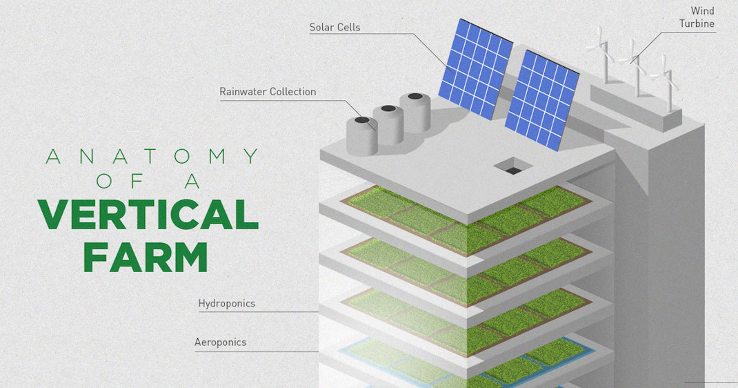
How Vertical Farming Works

Image courtesy of: Futurism
How Vertical Farming Works
By 2050, there will be 3 billion more people in existence, and close to 80% of the world’s population will live in urban areas. The demand for food will be unprecedented, and we will need to figure out how to get food to the cities in the most effective way.
Enter vertical farming – the idea of building entire skyscrapers occupied with vertically-stacked farms that produce crops twice as fast, while using 40% less power, having 80% less food waste, and using 99% less water than outdoor fields.
Is it feasible, or is it a futuristic money pit?
The Advantages of Vertical Farming
There’s no question that vertical farming has enticing potential benefits.
The first is yield. Vertical farming can produce crops year-round, which increases production efficiency by a multiplier of 4 to 6 depending on the crop. There would also be less wastage and spoilage, as most of the crops could be sold fresh in a market or restaurant from the same facility. It’s estimated that 30% of harvested crops today are lost due to spoilage or infestation.
Secondly, vertical farming has less risk associated with it. Big weather events such as floods, droughts, or storms can put a dent into agricultural activity fast, costing farmers billions of dollars. Farming indoors can reduce the risk of these types of events to as low as possible.
Lastly, vertical farming is inherently more sustainable. By stacking farms vertically, the productivity per unit of land can be many times higher and arable land can be saved for other purposes. Further, there are no transportation costs to get the crops to market, and energy and water can be recycled within the building. Methane digesters can even help convert organic waste to energy to help power the building.
On paper, vertical farming seems to have big advantages.
Too Good to be True?
Critics of vertical farming question the potential profitability of commercial operations.
They say the capital expenditures, as well as the additional energy costs for lighting and heating, could outweigh any benefits. Building complex plumbing and elevator systems to distribute food and water throughout a 30-story building is not easy.
Meanwhile, for traditional farming operations, both sunlight and heat are free. Irrigation is generally cheap as well.
The benefits of vertically-stacked farms would have to outweigh the increased costs. With billions of new people being added to cities over the next decades, this could come be sooner than later.
Original graphic by: Futurism


Brands
How Tech Logos Have Evolved Over Time
From complete overhauls to more subtle tweaks, these tech logos have had quite a journey. Featuring: Google, Apple, and more.


How Tech Logos Have Evolved Over Time
This was originally posted on our Voronoi app. Download the app for free on iOS or Android and discover incredible data-driven charts from a variety of trusted sources.
One would be hard-pressed to find a company that has never changed its logo. Granted, some brands—like Rolex, IBM, and Coca-Cola—tend to just have more minimalistic updates. But other companies undergo an entire identity change, thus necessitating a full overhaul.
In this graphic, we visualized the evolution of prominent tech companies’ logos over time. All of these brands ranked highly in a Q1 2024 YouGov study of America’s most famous tech brands. The logo changes are sourced from 1000logos.net.
How Many Times Has Google Changed Its Logo?
Google and Facebook share a 98% fame rating according to YouGov. But while Facebook’s rise was captured in The Social Network (2010), Google’s history tends to be a little less lionized in popular culture.
For example, Google was initially called “Backrub” because it analyzed “back links” to understand how important a website was. Since its founding, Google has undergone eight logo changes, finally settling on its current one in 2015.
| Company | Number of Logo Changes |
|---|---|
| 8 | |
| HP | 8 |
| Amazon | 6 |
| Microsoft | 6 |
| Samsung | 6 |
| Apple | 5* |
Note: *Includes color changes. Source: 1000Logos.net
Another fun origin story is Microsoft, which started off as Traf-O-Data, a traffic counter reading company that generated reports for traffic engineers. By 1975, the company was renamed. But it wasn’t until 2012 that Microsoft put the iconic Windows logo—still the most popular desktop operating system—alongside its name.
And then there’s Samsung, which started as a grocery trading store in 1938. Its pivot to electronics started in the 1970s with black and white television sets. For 55 years, the company kept some form of stars from its first logo, until 1993, when the iconic encircled blue Samsung logo debuted.
Finally, Apple’s first logo in 1976 featured Isaac Newton reading under a tree—moments before an apple fell on his head. Two years later, the iconic bitten apple logo would be designed at Steve Jobs’ behest, and it would take another two decades for it to go monochrome.

-

 Green1 week ago
Ranked: The Countries With the Most Air Pollution in 2023
-

 Automotive2 weeks ago
Almost Every EV Stock is Down After Q1 2024
-

 AI2 weeks ago
The Stock Performance of U.S. Chipmakers So Far in 2024
-

 Markets2 weeks ago
Charted: Big Four Market Share by S&P 500 Audits
-

 Real Estate2 weeks ago
Ranked: The Most Valuable Housing Markets in America
-

 Money2 weeks ago
Which States Have the Highest Minimum Wage in America?
-

 AI2 weeks ago
Ranked: Semiconductor Companies by Industry Revenue Share
-

 Travel2 weeks ago
Ranked: The World’s Top Flight Routes, by Revenue