Misc
Chart: A Global Look at How People Spend Their Time
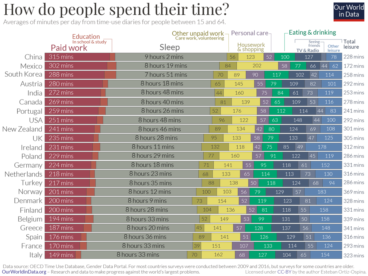
A Global Look at How People Spend Their Time
We all have the same 24 hours in a day, but we don’t spend them the same way. Some prioritize family time or household chores, while others cherish a good night’s sleep or seeing friends.
This chart from Our World in Data compares the average time allocated across various day-to-day activities, from paid work to leisurely activities.
The data for the 33 countries profiled come from the Organization for Economic Co-operation and Development (OECD)’s Time Use database, for ages 15 through 64 years old.
Countries with the Highest Time Spent Per Activity
As the chart shows, basic patterns—work, rest, and play—emerge across the board.
When it comes to paid work, Japan emerges the highest on this list with approximately 5.5 hours per day. However, this country also has some of the highest overtime in a workweek. In contrast, European countries such as France and Spain report nearly half the same hours (less than 3 hours) of paid work per day on average.
Certain trends, however, transcend cultural boundaries. Those in Mexico find themselves spending significant portions of the day (3 hours or more) on housework, as do those in Portugal.
| Activity category | Country with highest time spent | Time spent in minutes |
|---|---|---|
| Paid work | 🇯🇵 Japan | 326 (Approx. 5.5 hrs) |
| Education | 🇰🇷 South Korea | 57 |
| Care for household members | 🇮🇪 Ireland | 61 |
| Housework | 🇲🇽 Mexico | 187 (Approx. 3 hrs) |
| Shopping | 🇩🇪 Germany | 32 |
| Other unpaid work & volunteering | 🇯🇵 Japan | 98 (Approx. 1.5 hrs) |
| Sleep | 🇿🇦 South Africa | 553 (Approx. 9 hrs) |
| Eating | 🇫🇷 France | 133 (Approx. 2 hours) |
| Personal care | 🇫🇷 France | 107 (Approx. 1 hr 45 min) |
| Sports | 🇪🇸 Spain | 42 |
| Attending events | 🇮🇪 Ireland | 42 |
| Seeing friends | 🇿🇦 South Africa | 82 |
| TV and radio | 🇺🇸 U.S. | 148 (Approx. 2.5 hrs) |
| Other leisure (Religious/ civic duties, or unspecified) | 🇳🇴 Norway | 154 (Approx. 2.5 hrs) |
As the saying goes, all work and no play makes Jack a dull boy. In the realm of leisure activities, those in the U.S. spend approximately 2.5 hours consuming media in a day, a number that has risen even higher during the pandemic.
Meanwhile, another interesting cultural pattern is that people in France spend the most time eating, approximately 2 hours per day. These durations are similar to those in other Mediterranean countries such as Greece, Italy, and Spain—perhaps because meals are viewed as a social activity in these cultures.
Gender Disparities in Time Spent
Digging deeper, another way to look at how people spend their time globally is through the lens of gender.
Women spend nearly three times more in unpaid care work compared to men—a whopping total of 1.1 trillion hours each year—which means a lot less leisure time. This inequality is clearly defined by country in the following scatterplot:
In Norway, both men and women have equally high levels of leisure time—though it’s a rare example of such a case.
Meanwhile, in countries like India or China, significant gender gaps prevent women from moving up the socioeconomic ladder, potentially costing trillions of dollars to the global economy.


VC+
VC+: Get Our Key Takeaways From the IMF’s World Economic Outlook
A sneak preview of the exclusive VC+ Special Dispatch—your shortcut to understanding IMF’s World Economic Outlook report.

Have you read IMF’s latest World Economic Outlook yet? At a daunting 202 pages, we don’t blame you if it’s still on your to-do list.
But don’t worry, you don’t need to read the whole April release, because we’ve already done the hard work for you.
To save you time and effort, the Visual Capitalist team has compiled a visual analysis of everything you need to know from the report—and our upcoming VC+ Special Dispatch will be available exclusively to VC+ members on Thursday, April 25th.
If you’re not already subscribed to VC+, make sure you sign up now to receive the full analysis of the IMF report, and more (we release similar deep dives every week).
For now, here’s what VC+ members can expect to receive.
Your Shortcut to Understanding IMF’s World Economic Outlook
With long and short-term growth prospects declining for many countries around the world, this Special Dispatch offers a visual analysis of the key figures and takeaways from the IMF’s report including:
- The global decline in economic growth forecasts
- Real GDP growth and inflation forecasts for major nations in 2024
- When interest rate cuts will happen and interest rate forecasts
- How debt-to-GDP ratios have changed since 2000
- And much more!

Get the Full Breakdown in the Next VC+ Special Dispatch
VC+ members will receive the full Special Dispatch on Thursday, April 25th.
Make sure you join VC+ now to receive exclusive charts and the full analysis of key takeaways from IMF’s World Economic Outlook.
Don’t miss out. Become a VC+ member today.
What You Get When You Become a VC+ Member
VC+ is Visual Capitalist’s premium subscription. As a member, you’ll get the following:
- Special Dispatches: Deep dive visual briefings on crucial reports and global trends
- Markets This Month: A snappy summary of the state of the markets and what to look out for
- The Trendline: Weekly curation of the best visualizations from across the globe
- Global Forecast Series: Our flagship annual report that covers everything you need to know related to the economy, markets, geopolitics, and the latest tech trends
- VC+ Archive: Hundreds of previously released VC+ briefings and reports that you’ve been missing out on, all in one dedicated hub
You can get all of the above, and more, by joining VC+ today.

-

 Green1 week ago
Ranked: The Countries With the Most Air Pollution in 2023
-

 Automotive2 weeks ago
Almost Every EV Stock is Down After Q1 2024
-

 AI2 weeks ago
The Stock Performance of U.S. Chipmakers So Far in 2024
-

 Markets2 weeks ago
Charted: Big Four Market Share by S&P 500 Audits
-

 Real Estate2 weeks ago
Ranked: The Most Valuable Housing Markets in America
-

 Money2 weeks ago
Which States Have the Highest Minimum Wage in America?
-

 AI2 weeks ago
Ranked: Semiconductor Companies by Industry Revenue Share
-

 Travel2 weeks ago
Ranked: The World’s Top Flight Routes, by Revenue